Posts Tagged ‘Photoshop’
Some Summer/Fall Travels
Not really able to take much of a long vacation this year – getting ready for surgery, finances, hurricanes cancelling Delaware – lots happening, so we did manage to get a few wonderful short rides around Vermont, exploring a lot of new off-the-main-road places. I am using my camera phone and hubby uses his little point-and-shoot. A new DSLR is on the agenda for next year, but in the meantime I am understanding the difference between digital zoom and optical zoom – explains why my “close-ups” hardly ever are in focus. I also am concentrating on more interesting framing of my pictures. I find I take more pictures, and usually have one or two good ones out of each batch.
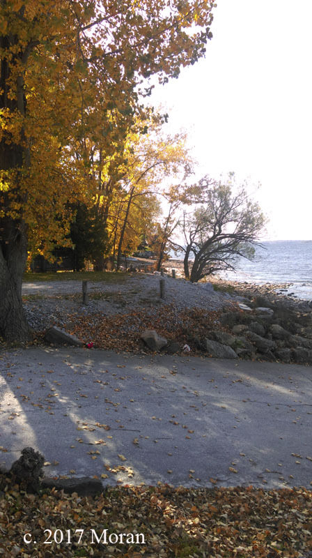
This trip was a Sunday drive down around the the town of Georgia, perched right on the eastern shore of Lake Champlain. Normally we take the road from north to south, but this time we went south to east – like it was a completely different area! Sometimes it pays to look backwards at where you’ve been Discovered this beautiful boat access that we wouldn’t have seen otherwise. Plus, we’d had so much warm weather for October that autumn was pretty sketchy for New England – then suddenly the leaves turned – almost over night. We hit a couple of good spots for leaf-peeping.
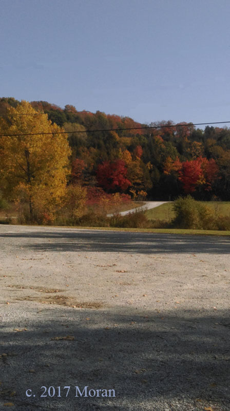
This top one benefited from cropping. I was moderately successful at removing electrical wires.
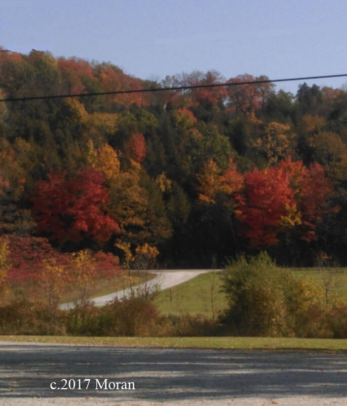
This next series was looking north on St. Alban’s Bay – you can see how the cropping helped with more interest.
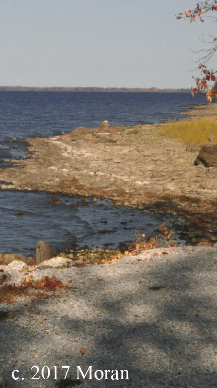
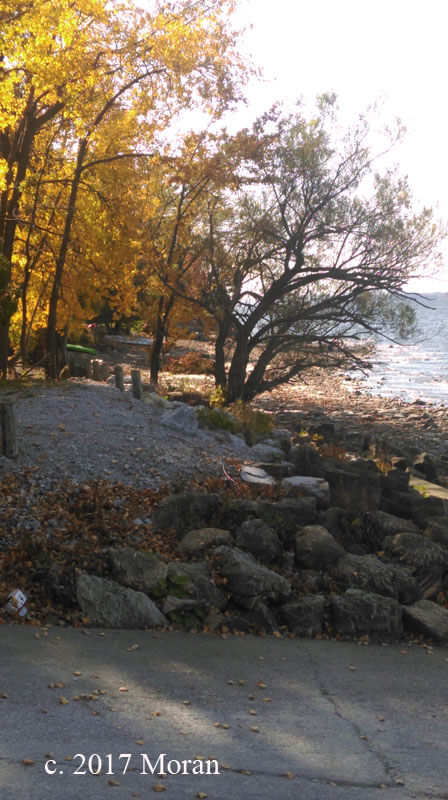
I fell in love with turning to the left to see what was there – light wasn’t perfect, but I think there’s a lot of interest in the photo.
Better with the cropping.
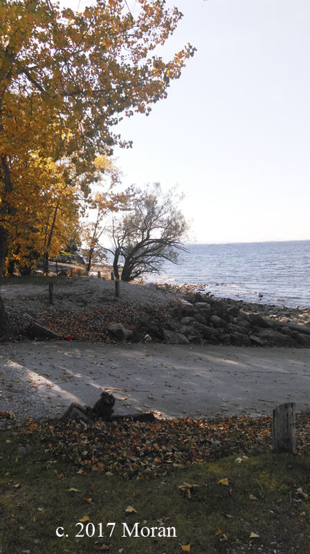
Some lighting contrast.
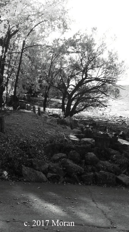
 I love it in black and white!
 Facing the bay, northwest. Light was not great, but I was playing.
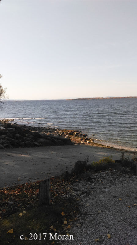
A gorgeous Vermont autumn day!
Photography and Packaging…Oh, My!
Vermont Open Studios, 2016
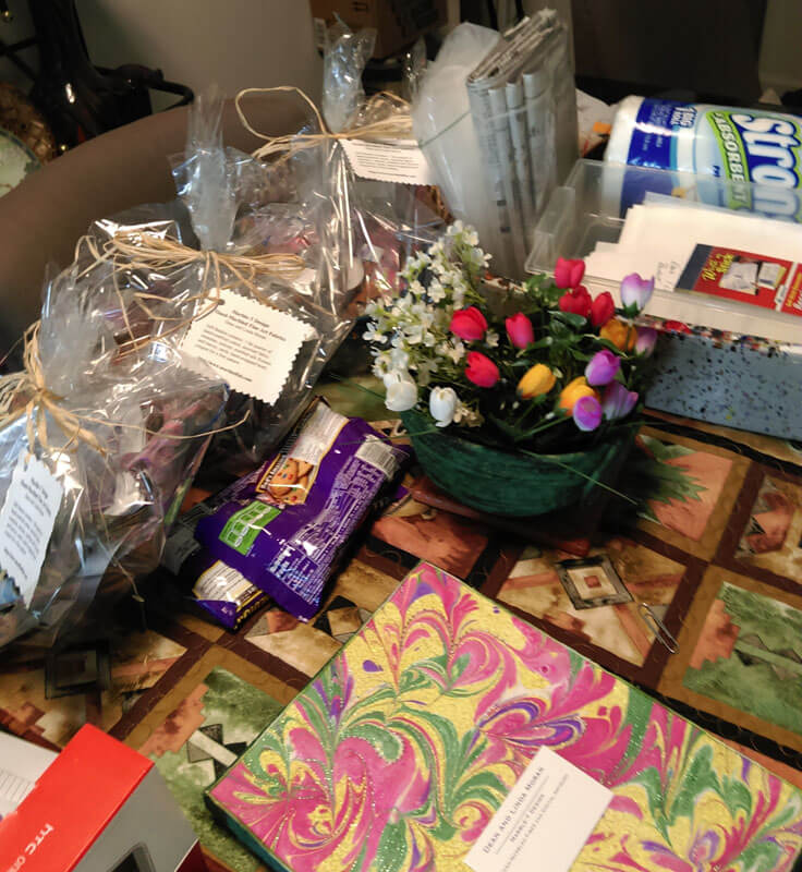
When we did Vermont Open Studios last May with artist Mary Hill, one of the great things about sharing the space was all the time we had to talk about our various art and marketing attempts. Mary had some GREAT ideas for us concerning packaging. We continue to process everything we thought about, with some definite changes in what we are doing. Thanks to Rachel of The Textile and Fiber Art List, we have also been improving photography – both how we shoot items and how we present the finished product.
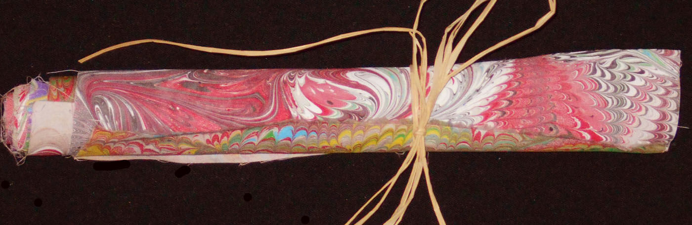
First, the photography. Our pictures have a “muddy” cast to them, and we are basically rephotographing everything we have. The place we are living now doesn’t allow for much flexibility for setting up good lighting. Hubby experimented with a lot of options – including moving to a rolled fabric presentation rather than each piece in a haphazard manner. Give an overall idea as opposed to every thing about each piece. In this manner we can still send the packages flat and save customers money (on international orders – domestic shipping is free). Some “before and after” ideas –
Getting the overall set-up of the product looking good –
Lighting and color still issues….but against the white background looking better. Also, we discovered that we needed to save pictures at a larger size in order to get more detail in the pictures. Next is better with a good cropping and some adjustments in Photoshop to correct the lighting.
Definitely getting there –
Uh-Huh…..
 Definitely brighter –
Close-up shot for the Twitter picture, which I am slowly getting back to using…..
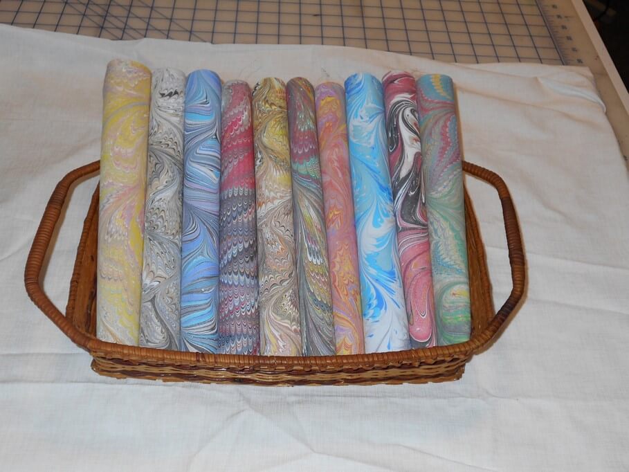
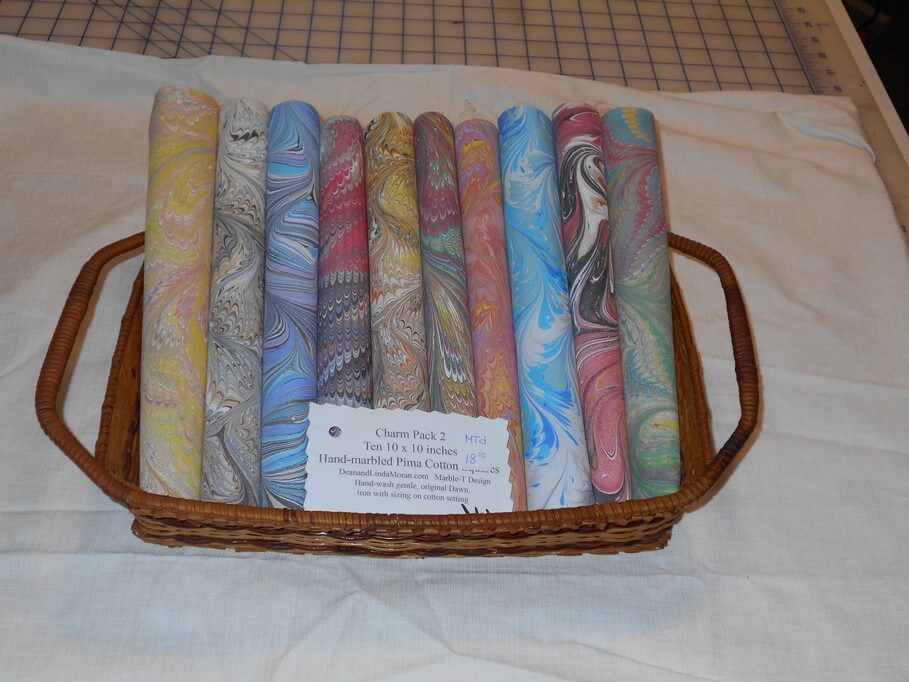
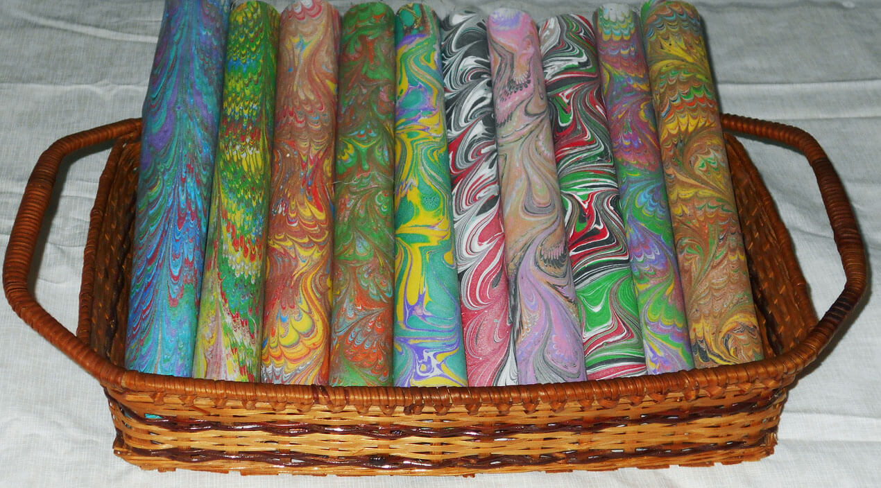
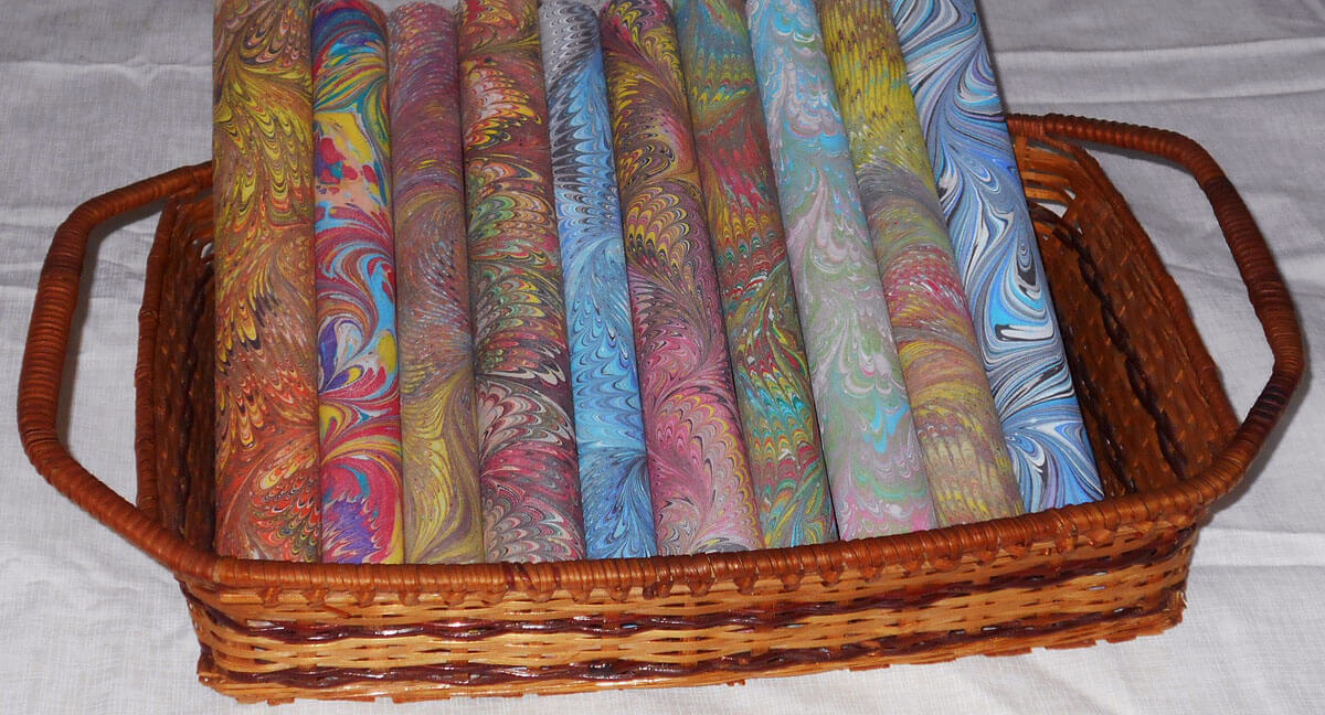
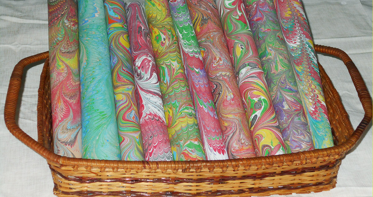
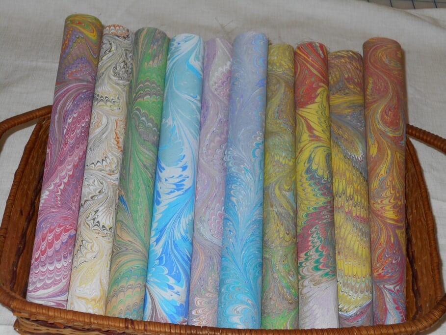
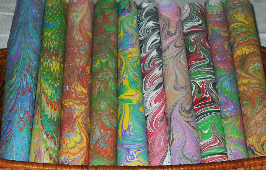
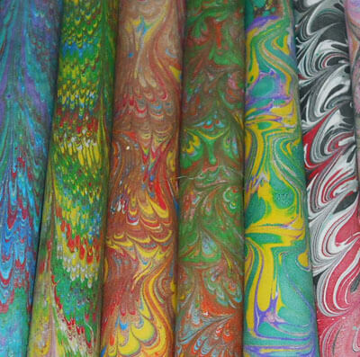 This is just for our Charm Pack 2 – ten pieces of hand-marbled pima cotton, assorted patterns and colors, 10 x 10 inches each. Slowly working on others. The pieces need to be appealing, hence all the work on presentation in the pictures. The mailing is easier than a rolled item, which costs more to ship and doesn’t give customers a good look at the fabrics.
This looks better in person when displaying for a show – but not for online sales.
 Much more ahead for us as we continue adding new items…let me know your thoughts and how you solved packaging problems.
8-0-1….801 Posts – Oh My!
 Wow. I have written 800 blog posts since I started some years ago…..January of 2007. I figured I’d keep the blog just for posting with the Photoshop class I was taking, but I’ve come to really enjoy writing and reflecting. Like a diary, which I could never seem to do when I was younger. But now I can look back, see how my art has grown, reflect on different pieces. It is amusing to see some of the very beginning Photoshop pieces:
 I was pretty thrilled with that first attempt….little did I know what I still needed to learn about layers!

This next taught me a lot about luminescence, even though I didn’t know it at the time!
 I really liked the examples I first posted some 6 years ago. I look at tyhem now and see that part of why I liked them was that they really showed some of the principles of design. I just didn’t know it at the time.
I’ve also been able to document a lot of our marbling through the web page, and I do need to do more of that, since we are building our audience significantly. That said, here’s a look at just one of the pieces we turned out on Tuesday this week.
Putting the layers of paint on the carrageenan size:

Starting the pattern with our personally-made “high tech” tools:

The nonpareil pattern – a very traditional pattern created after about four previous steps:

Looking at the pattern from the back side, after the fabric (on orange Kona cotton) had been laid on the size:

Here it is from the front:

It’s been a good week!
Trying to Learn Something About Value…..

…that could also read “something OF value,” but I want to focus in on the issue of value and color in design….something I know I am really weak on. I’m choosing a couple of pics that I really like for design composition and playing around with Photoshop filters to see what they tell me about the composition. This is different from how I usually approach working with Photoshop….play around until I get something that says Wow. This time I’m looking at the elements of the picture and trying to see how they change and why I like – or don’t like – the design.
Here’s my first photo, taken in Jericho, Vermont two summers ago, at the Old Mill, which houses much of the history of hubby’s family.

I love everything about this picture: the greens, the mill red, the flowing water, the fact that I’ve got it composed in thirds. And you can’t see that right behind me is very busy Route 15. So what did I learn from this exercise?
Primarily I am much more aware of the basic lines in the composition. The lines don’t change, but the focal point does, depending on the filter or effect I used. There is one example that I would consider making up in cloth, as I find it intriguing, and I’ve never tried anything like that. The others are just interesting to analyze. Here goes:

I love black and white. After three weeks in Seattle this spring, I developed a whole new appreciation for shades of gray (no, not the book……). I want to take this photo and play around with a few sections of rock to see what I might be able to sketch.

This is the “sponge” filter, and it’s one I really like. Shadows and subtle colors really come out in this filter. Once again I am amazed at all the shades of green there are. There’s more shading in the mill, as opposed to the original, but the movement of the water is lost.

This is the “find edges” filter. Interesting to see where basic pieces of fabric would be. I think I can also see the dark, medium, and light of the photo.

Accented edges filter. More of a pattern to follow if I wanted to recreate this. I did a small cropping that I could see in a 12 x 12 piece. I’m liking the shadows.


This is the “patchwork” filter, and I could see making this up as a larger wall quilt. The filter allows you to make the squares larger or smaller, but I am really curious to see how this would work up in piecing. I need to print this out larger and use my little red rectangle and look at the values closer.

Well, I have managed to lose my original with all the filters listed on it, so c***. What I like about this above photo is the additional shading that is present in the rocks, and in the red portion of the mill. Lots more texture, and I could see using some colored pencils to enhance the fabric pieces.

I believe this is a watercolor filter, and I like it. I can see looking for specific fabrics for this piece, rather than trying to do lots of little pieces togather. I could see just cutting pattern pieces and fusing them into place. I like the softness.

Palette knife, I think. I like the general clumps of color, and as I reflect on this, I could see making this into a small abstract. The image is still recognizable, and I like how you can see an actual pattern to follow in putting this together.

This is mosaic tiles, and I like the effect better than the patchwork photo above. I’d have to spend some time thinking about how to get the “grout” effect…..maybe a mottled gray color with texture in it as the background piece, and then the tiles cult at somewhat irregular edges so the grout shows through. I cropped a piece to see….


This is an inversion adjustment, and I like these because I always see something different when the colors are completely different. The yellow accents the shape of the edge of the mill in a way you don’t notice in the original photo. The rushing water doesn’t show up at all.

Forgot the adjustment, but the amount of purple really accents the amount of green in the original photo. And I like the way the shapes of the rocks are accented.

This is a red/yellow gradient, and I like playing around with gradients. Very other-worldly, but I don’t see taking this piece any further.

I saw some quilts a while back that were based on Joen Wolfrom’s color tool. People chose a color and then worked solely in the range of that color. Results were pretty dramatic. This is a color filter in a deep blue. I think I would print this out and take it fabric shopping and see just how well I could pick out various blues and other shades that have a blue cast to them.
That’s my first study, and I definitely need to do more of these. I feel like I have a better understanding of the composition of the original picture. Next up, my wrought iron photo….
Monday Marketing
![]()
This is one of those Mondays where you find yourself doing everything on the business but creating. I am slowly making progress in that area, including a new system for scheduling the actual creativity (to a point…) and getting hubby to pick up more of the business loose ends. Making progress…..
From Kate Harper’s blog comes 38 Amazing Apps for Designers: worth taking a look, as there might be something you can definitely use. Web Elements by Visual Lightbox looks intriguing – and might save me some time.

Also from Kate: Free Photoshop Brushes for Designers. Both links take you to the original pages, but it’s great to see all the goodies Kate posts. I’m thinking the Free Floral Brushes from Graphic Design Junction (now I have to figure out how to download…..advice??)
Bamboo Textures in Photoshop – these also look cool….
And….How to be Funny – excellent article on finding humor anywhere, especially if you are looking to write greeting cards.
Pinterest seems to be the rage, and I have been slowly checking out articles, as I am concerned about copyright. So from SewCAlGal comes Thoughts on Pinterest…..
 And…a new spot on line to check out: Tophatter, which is daily online auctions. I “sat in” on one, and it looks like something I want to try…but it’s kind of at the bottom of my list ot to-do’s right now, as there are a couple of commissions that need finishing. Handemadeology put up this buyers’ guide.
The latest I have found was off a link from a graduate student friend who found Pomodoro, which is a new organizing system (new to me, at least). I’m trying it this afternoon, and I’m pleased to report I am getting a lot down for these few hours. I downloaded a timer as an app for my iPad, and I’m liking how the whole system is helping. I downloaded their free e-book this morning (and multi-tasked by reading it and eating some fruit). You could get really in to it, but I like the overall approach, which is not very gimmick-y. If you do use it, let me know what you think.
 …and that’s the pomodoro……
A Life-Changing Few Months
 To say that it has been a while is an understatement. My last posts dealt with the Tucson shootings, and the aftermath for the community has been ongoing. Many in the community have been dealing with personal issues surrounding the events, from getting updates on Gabby Giffords and coping with the weird Arizona legislature to trying to understand our roles as humans working together.
For me, it has meant two months of a pretty severe depression, trying to cope with understanding so many of the historical aspects of this country coming in to play, trying to manage what the economy is doing to individuals, and getting ready to retire from a career of 40 years in education. I had to remove myself from almost everything extra in my life beyond the day-to-day coping within the classroom. I did a lot of sleeping and a lot of being sad. I didn’t even do a Fish Follies entry this year.
At Christmas we decided to move the retirement date to June of 2012. Hubby had some major health issues in January that will eventually lead to major surgery, and all I could think about was not having time together. His next CT scan will be in August, right when school starts again. That was probably the tipping point to look at retirement this May. I made the final decision the end of February to retire after working all the numbers with the retirement folks, and then a month ago applied for SSI.
Gotta tell ya, when I made the decision, it was like a weight had lifted. I started packing my classroom the next day – and it took the three months to get it all finished. Most of my math manipulatives, books, and supplies went to an organization called Treasures4Teachers – will be a nice tax deduction, and they were very grateful for all the goodies and posters.
In April, during spring break, we spent time with our friends up north who now have a place in Cornville, AZ, just south of Sedona right along Oak Creek. It is a gorgeous, restful spot. I was admiring all of my friend’s storage, and the conversation turned to the fact that maybe one of the problems getting back into the studio was the need to reorganize. Which got me thinking, and over the next month I started cleaning and organizing, and looking for new storage that would work. We’re about half-way through at this point, and the place looks great – and even better – feels great. Two more sets of shelves and we should be just about done. But I don’t think I’ll be waiting to get in there to sew.
So I’m recovering slowly from the depression, starting the rest of my life on my terms, planning on a nice run of happiness. And I’ll be back to blogging and creating and marbling and reading and writing and Photoshop and traveling and being with people and working for peace….
Photoshop Friday – Ginko Tree
![]()
I haven’t had a chance to do too much with playing around with the latest group of pictures from the Botanical Gardens, and there’s so much I need to plan out for these pictures. So today, after sorting through slides and doing some general organization, I decided to play.
We have one lone ginko tree at the Gardens, and it was nice and yellow when we were there over Thanksgiving weekend. I didn’t realize until I was looking at the photo that I had gotten some shafts of sunlight. Here’s the original, which I really like.
 I didn’t realize that there were some surprises in the upper right corner as a result of the sunlight.
 I love the shadows of the ground cover in the background. But you know me, I’m not content to just leave a picture alone, especially since I have plans down the road for some of these pictures. So….
 I don’t remember what the filter was, but it’s even more ethereal.
Now back to the whole shot….with a bunch of filters……I’m really partial to the sponge….
 …but then I went very abstract…..
 …again, very Asian in its simplicity, and I can see it in fabric……
Some other Photoshop Fridays you might like:
October – some of my favorites
Friday Photoshop – on Saturday….
 You might remember this zentangle from last week, and I said I was dying to try some Photoshop effects with it. Well, here’s one night’s work this week, in between grading linear graphs – this was MUCH more fun!
 I love them both – they are each so different. This week I have been roaming the net looking for zentangle patterns. I hadn’t realized that part of this art is set patterns that enable you to really “zen out,” as I put it, into the drawing mode. I’ll have some new zentangles up on Sunday for my week of Art Every Day Month, plus on Tuesday’s Top Ten I’ll list a bunch of the sites I’ve found.
This week also saw me playing with some of the new photos from the Tucson Botanical Gardens. Here’s the original of the one I started play with:
 This metal fountain is part of the Zen garden, and one of my favorite places to sit and be with nature. I was able to capture water movement in this one, which I really liked.
One of the things I have been doing in my attempt to create some collages is using my magic wand and capturing several sections of the photo, ragged edges and all – gives it more of a water color effect, which I do like. Here’s what I captured from this photo:

I love this just the way it is, but I kept going….Here’s the marbled fabric I chose to go in the background.
 I know what you’re thinking…but wait, there’s more……
 Same fabric photo, but with a gradient overlay that brings it closer to what I’m after with the fountain. Now I’m putting them all together….
 First blend – I like it….
 Second blend…hmmmmm……

This is the final, which I think I really like. I’m torn between the first one and this one. I’ll probably do prints of both! Weigh in – let me know which one you like the best!
Monday Marketing….So Many Outlets, So Little Time

This has been my latest project. Rachel of Rayela Art does an amazing job, having only started this in February. Members include working artists, textile businesses, galleries, suppliers and other fiber/textile people. All have an established web presence. Our common connection weaves us together: a love for textiles and fiber art. Getting this together was not an easy task…biographies, store links – there is a LOT of thought put into developing this, and the site is getting a lot of viewers.
I’ve been analyzing all the various areas where I have a presence – some stronger than others. There will be an Etsy group on the Textile and Fiber Art list, and I am looking forward to being mentored, as I need assistance in creating a good Etsy shop. My current shop has a dozen items (as of tomorrow night), and part of what I was stressing over was creating new work just for my Etsy store. Well, duh – it occurred to me that I could list some of the work from our website that gets admired, but no one thinks to buy. So we shall see……
Now along with this was getting the connections to Twitter and Facebook and the Facebook fan page…all of which require time. It’s a good thing I have some basic computer knowledge and can find my way around the web and individual sites. Some just aren’t as intuitive as they could be……But I think Facebook is now linked to my blog, my networked blog, my Etsy…..
I’ve just begun to look at ArtFire as another outlet, but I need to read about that more. I can’t add widgets for Cafe Press and Ebay because I am still using just the free listings for Cafe Press (limited items) and weekly auctions for Ebay. I know you have to spend money to make money, but a store on Cafe Press and Ebay costs additional….need to make good use of marketing dollars, as we still need to buy supplies to continue to make art to sell in these various outlets.
I did enjoy yesterday – spent the majority of the day at the computer, working with Photoshop on some new images, writing bios, and looking for a pic of hubby and moi for the TAFA site. Those of you who know me know it’s not really a current picture, but it is a good one!

Had a great time doing all this yesterday, and then it’s always coming down to reality when Monday morning hits and it’s back into the classroom. I also got the new newsletter out – special on Sampler Package 1 – 20% off….check it out – perfect for collage, mixed media, small quilt projects….
Didn’t get to read my blogs this weekend, and I miss knowing what people are up to. But I do have some good stuff for tomorrow’s post on the Top Ten on the web this week. Stay tuned for Wednesday with unveiling of two pieces that are either home from shows or aren’t traveling to any at this point.
Make art this week! Tell me what you’re working on!
Photoshop Friday – continued
I seem to be on a role with Photoshop and some of the ideas I want to try. Been playing around today with some more ideas, and I added a quote to the leaf. The original was taken at the Desert Botanical Gardens in Phoenix – it’s an amazingly HUGE leaf, with white veins and crinkly edges – really gorgeous to see. I hvae been taken with it, and after the success with yesterday’s, I decided to try “cutting” sections of the leaf and putting them on their own layers, then playing around with the layers. I am quite taken with the finished product.

A thistle leaf
When we were in Sedona over spring break, we took a Pink Jeep tour through the backcountry red rocks. We forded a stream, and stopped in the middle to take pictures of what the homestead probably looked like fifty years ago. I absolutely love the photos from the trip. Here’s the original, with a slight light correction for the tree trunks on the right.

This next is with a Smart Blur filter that lends a bit of water color to the picture.

Smart Blur filter
This last is with about five different adjustments, one on top of the other. I ended up cropping to just the right side of the photo because I fell in love with what was happening with the trees and the bank. I could definitely play around more with this image.

Brightness, curves, hue, and a few others
I’ve commented before as I have been learning Photoshop that one of the things I really enjoy is the ability to just “turn off” layers with what you thinnk are mistakes. To me it really frees up the creativity. But then every now and again you combine a coupe of layers and end up with something totally unexpected. An absolutely amazing program…
Photoshop Friday
Ah, back to my regularly scheduled posts! I have started working with all the images I have been taking of the desert spring this year – really a gorgeous one, with the additional rain, and the cactus have been amazing. I have wanted to do some collage work, but I haven’t known how to begin. I wnt things to seamlessly blend together, not have significant images stand out, so I guess it is just a case of experimenting. So I tried Tuesday night, and I was pleasantly surprised – and pleased. Here are the photos I started with, all taken from the Tucson Botanical Gardens:


Palo Verde in bloom

Thistle leaf
I wasn’t sure what was going to happen, but I did realize I needed to use separate layers and then adjust the opacity for each one. It occurred to me I could “cut” the flower itself. So here’s what happened with the mix:

Desert Bloom
I really liked how this worked – a little rotating of the flower, and the actual orange of the blossom is a perfect focal point. But – I decided to try individual layers on and off to see what happened….
 I probably will end up printing them both. I am thrilled, and I learned a few more things.
So yesterday I decided to try another one. Here’s the original photos, and I’m still not done…..have a few more ideas for the succulent.

Succulent - a type of aloe

A ground grate

Marbling pattern added
You need to click on this one to see the effect of the marbling pattern within the grate.

Desert Aloe
And…without the background. I’m not totally happy with this one, but there’s certainly a lot to work with….

Desert Aloe
All in all, a productive Photoshop time.
Additional Photoshop Friday posts:
Photoshop Friday – September
Sunday Sampler with Photoshop – August
Photoshop Friday – July
Photoshop Friday – stained glass
Adventures in Marbling

We spent yesterday setting up to marble (which always takes so long, with pretreating and actually setting up the liquid bath), but then today we got to play – marbled about 6 yards of fabrics, and once again everything went really well. It is so nice to be back in the large tray again – we actually feel like we are creating art again, not just little pieces to sell. Yet again today we were talking about how much of a void there was in our artistic lives when we couldn’t create large pieces of fabric. When you define your art this way for over 14 years, it really is distressing to lose the skills.
Especially nice is the fact that we are working with other fabrics. Tried some larger heavy-weight silk that worked wonderfully, as well as some faux suede pieces, and the velveteen also worked. I still need to treat the velveteen to soften it up, but overall extremely pleased. Still haven’t been able to do the chiffon again – those people who bought that two years ago certainly have one-of-a-kind pieces!
We want to marble more often now that things are working again. It is SO GOOD to be creating fabric again! We even are revisiting marketing and revving up the business end because we are turning out really great fabric. The disadvantage is that our bodies have changed enough that we can no longer go for six hours straight, not including clean-up. There was a time four years ago when we could do 60 fat quarters in a day. Can’t do that any more, and we also discovered we don’t like turning out fabric that way – we would just as soon do a smaller amount and have a chance to play on each of the pieces.
We are still looking for a particular fabric that we used for so many of our art pieces – we used a poly-satin that kind of worked, but not to the detail we would like. I found an old piece that we’ll use in checking around fabric stores. All the really great pieces are from bridal fabrics, so we just have to shop around for those.
This piece that I’ve scanned shows the incredible detail you can get on the poly fabrics.

Then I started playing with some of the new tools from the Photoshop lessons. This next is with the Shadows and Highlights adjustment. I particularly like the neon effect on the orange.

This next is playing around with the eye dropper tool and the white space. Each gives a different feel, which is why I have wanted to learn Photoshop for so long. I want to be able to take a really great piece of fabric and use it to create lots of other images, so the particular piece doesn’t have a short shelf life till someone buys it.

And finally – the joy of playing with filters in Photoshop! Take a look at what happens with the emboss filter with the same piece! Reminds me of maps of the Continental Shelf.

All in all, a great way to spend a day off from school (Rodeo days here in the Old Pueblo)!
Finally – Lesson 3 Redux
So I played some more today to try to come up with something that does more with linking and gradients. I must confess gradients are still a puzzlement – I keep getting weird colors. I am pleased, however, with the sky gradient in this piece. And I am having trouble with getting the grass brushes to be the greens I want instead of a series of mottled colors.
With this piece – Ocotillo – an abstract look at the almost dead-looking cactus that doesn’t bloom until rainy season – seems to be a cross with autumn. Oh well, it’s my vision! I linked the veins with the flowers – mostly. I had each flower (mostly) on a separate layer – except for the one falling, which got connected with one of the others. I do have a better sense of how this stuff works. I am enjoying just creating little pieces to work with the tools.
Reminder to me: LABEL LAYERS!!! Here goes –


Brushes again…..
I had fun last night playing again with the brushes and trying to create different layers and link them – still need to work on that – need to reread the linking stuff. I’m getting better at adding the layers each time I try something new.
I am drawn to geometric shapes – I think in the analysis it’s because they “always look like something,” so I can’t really mess them up. I do need to scan and play with one of my own sketches, to see what I can do with the brushes. But – here’s the new work:


More Brushes
I’m continuing to play around with more brushes as part of this week three lesson. For this portion we were to work on layers, and then move one of our objects. So here we go –


I would like to figure out how to make the shadows of the sun better, as well as crop the sun for the second one. But for a freehand, not too bad. I had watched Sewing With Nancy about landscape quilts, and part of what was included in that episode was tips on shading. So I wanted to do more with the window frame – but it needs to be larger – the scale seems all right for this, but not for more shading.
This just means I have to do more work…ahhh, too bad!