Archive for the ‘design’ Category
The Pot Quilt – 15 Years Later….
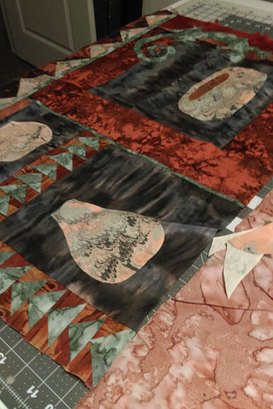
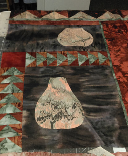
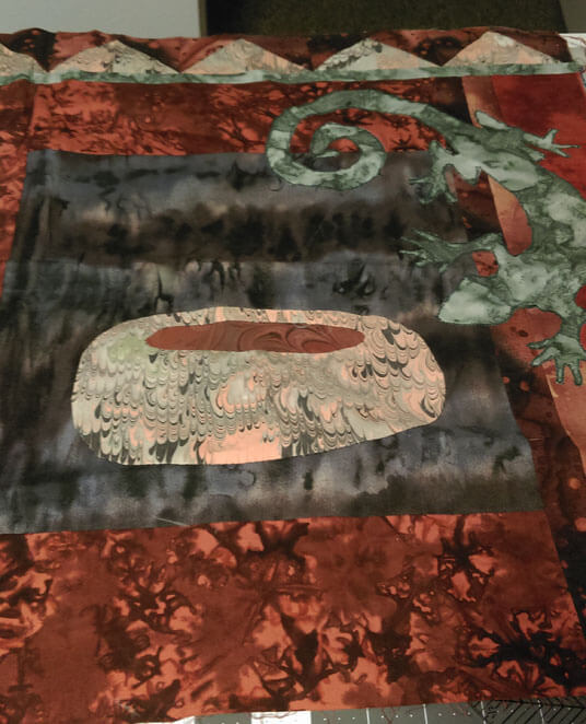
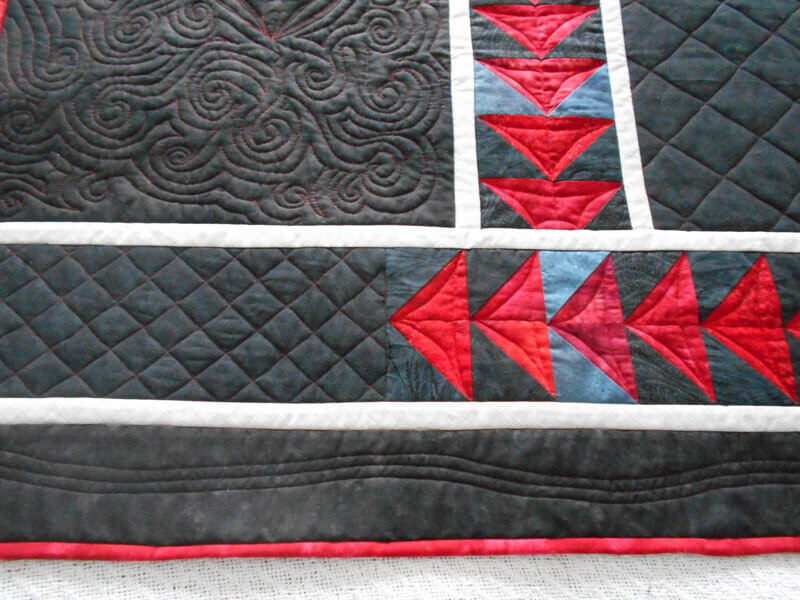
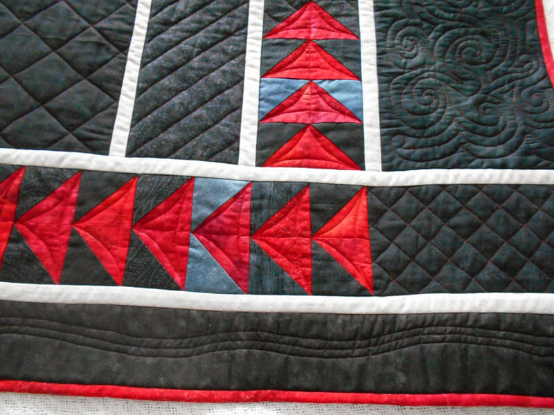
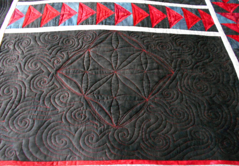
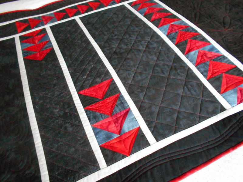
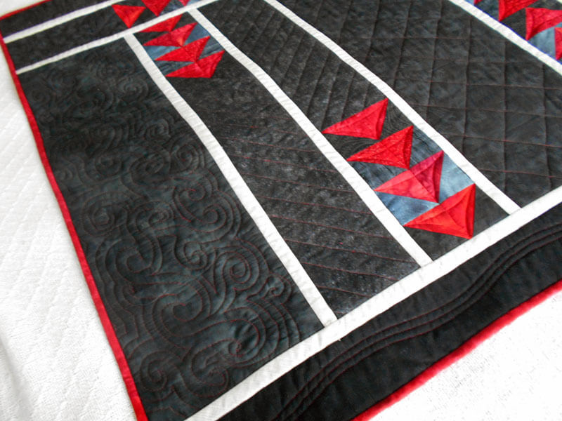
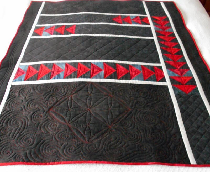
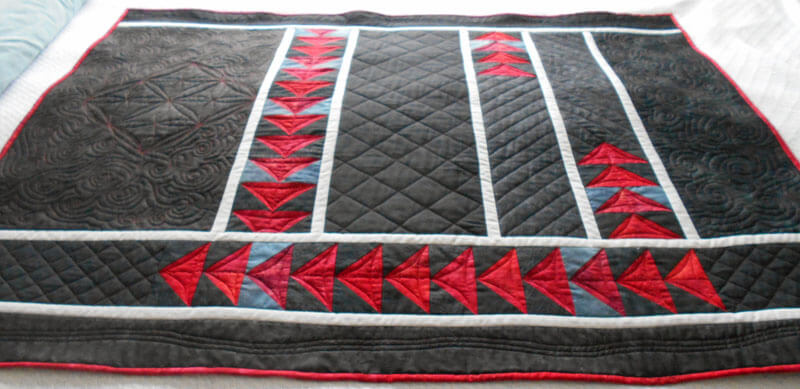
So after the weekend disaster, where I felt like a VERY beginning quilter, I unearthed one of the unfinished pieces – from 15 years ago. One thing struck me – I was doing some improvisational quilting in this piece before it was a “thing.” A lot of unusual fabrics, designs, geometry is somewhat skewed – it has a lot going for it. I decided to just add a few elements – a bottom border that somewhat mimics the top, and two narrow sides that will tie the triangles together. I’ve bought beads for this over the years we lived in the Southwest, so I am looking forward to embellishing.
But the quilting…I really can’t wait to get started on that. I have so many ideas I hope I can make happen. Here it is so far:
 Should be a very creative week!
Summer and Fall of “Enlightenment”
 Thoughts on NANOWRIMO – yes, it’s November…..been thinking about this for most of October and trying to decide what – and how – I will approach things. November 1 – I don’t have a lot of luck working through the month each day, as witnessed by the last two years of not accomplishing anything – or not even trying. So I think for this year I want to concentrate on writing my 1637 words each day – on rewrites, character studies, essays, blog posts – just getting back in the habit of writing regularly. I know two years ago I stopped on Book 2 because I had no idea where a lot of the plot was going, what the various story lines were….and then there is so much crap happening right now in the world that sometimes it seemed pointless…but my characters need some resolution, and I still have stories to tell.
So – things to write about –
* the books I have been reading since summer began
*conversations with God and the Joshua books
*science books
*where I seem to be evolving as a result of the changes in this country
*coping with changes in my life with illness with hubby
*writing concerning my art – especially blog posts – need to get regular again, as it does bring in more business, and a big show coming up
*newsletter for MTD
*pictures from this summer
*my own racism
It’s been a long while for writing a blog post, but not for doing art – a brief time off after the last baby quilt was done, and then back to a new baby quilt in September, and now three new pieces finished this week – feels good to be working again. The funny thing about the blog posts – for the last two years I have been 200 blog posts away from a 1000 posts – this year only 82. Should have been a snap, right? Well…..no. That just seems to be an impossible goal. Gonna be workin’ it this month….
We have so many shows coming up, starting with two small pieces tomorrow, two pieces for a January-April show, January/February for one of the community libraries, the US attorney’s office in Burlington, and a bunch more. While helping hubby recuperate in December from open heart surgery there will be a lot of time on the machine. I have some large pieces that need to be finished, and a major inventory to do of what goes to what show, without much repetition. Also, big art fest show in less than two weeks, and stuff to prepare for that – two patterns to write and put together, inventory for Square (and to figure that out), and the packing for the show.
There’s a l0t of good stuff going on art-wise. After all these years, we have finally found a decent way to package the fabrics – good for pictures, easy for people to see the various pieces, and we have some consistent sizes. Also, by mounting the finished pieces on canvas, we now have people thinking more about the fiber as wall art – a big jump in perception.
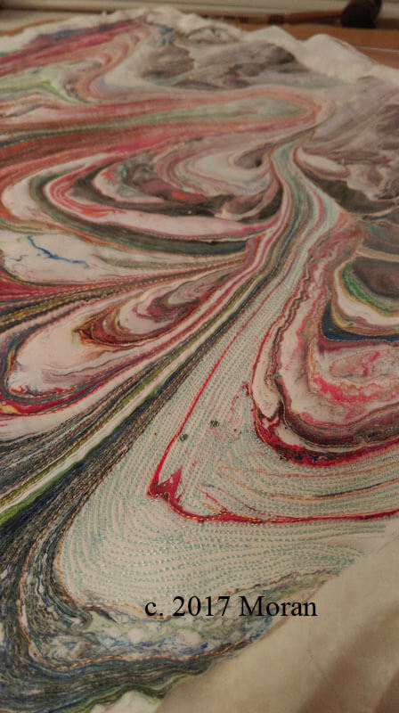
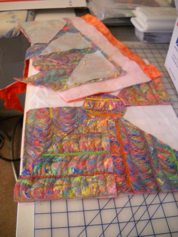
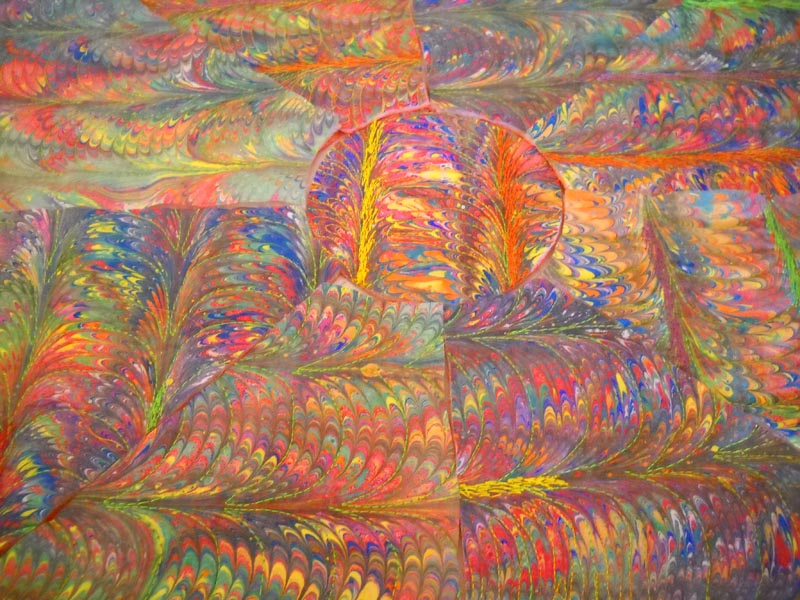
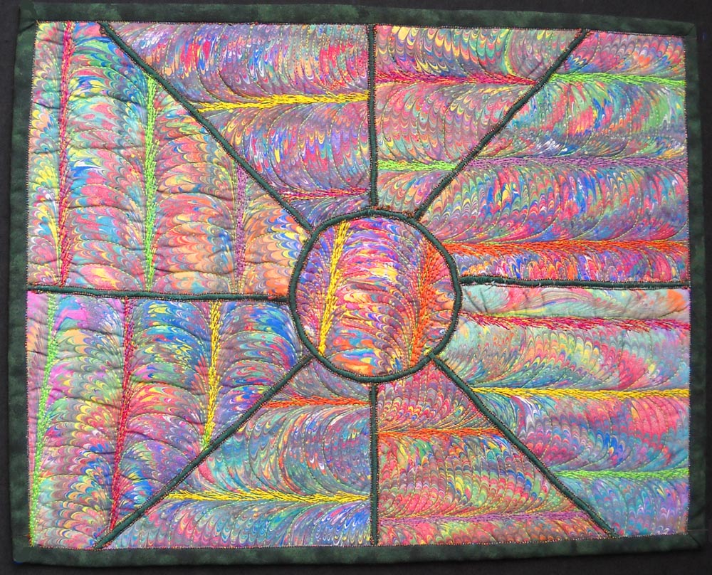
The three pieces from this past week – you can see in the upper portion what hasn’t been stitched. It is amazing just how much depth you get with the addition of batting and stitching. This is part of our “Leftover” series – paint left in the bottom of the tray when we clean it up. Once I add thread to it (and I used double batting for this one) it makes the piece come alive.
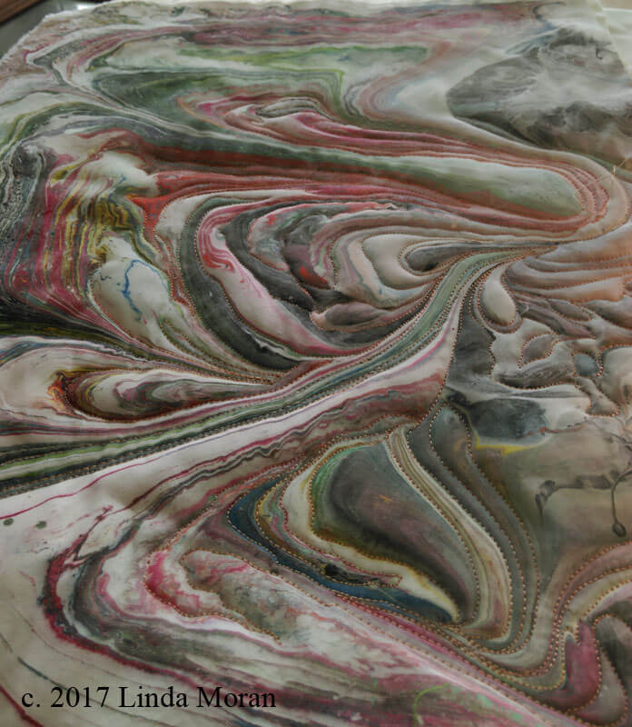
All the while doing this I was very aware of not having a focal point – I’ve been concentrating on that as I’m out taking pictures. It seemed like there was a consistent white stretch running from upper right to lower left – I saw it as a river, and as I used a light blue thread it started taking on some dimension, but ultimately I didn’t think the river was dark enough, and I wasn’t happy with other colors of blue that I had – so I used some of the India ink I’ve been suing for suminagashi and used a simple wash throughout the river – just the dimension I wanted.
This part for sizing/mounting canvas just didn’t seem to work. I assumed the canvas I had was an 11 x 14, and the piece was bigger than that. Hubby didn’t want to lose the lower left because of the effect, so we went and bought a 12 x 16. Turns out when we got home, that was already what I had…so it was back out for a 16 x 20. Great batik for the canvas covering, and between the binding and the extra border around the canvas, it looks like two mats for the frame. Happy with it!
Introducing: “A River Runs Through It.” $125.00 plus postage. 16 x 20 inches.

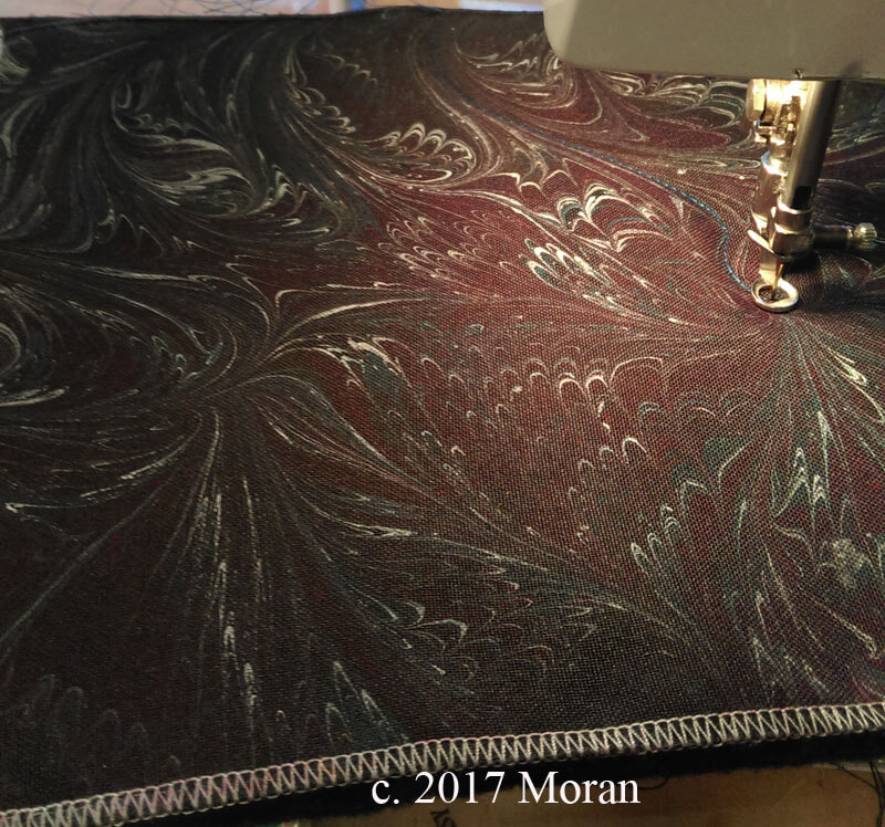
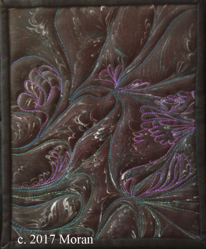
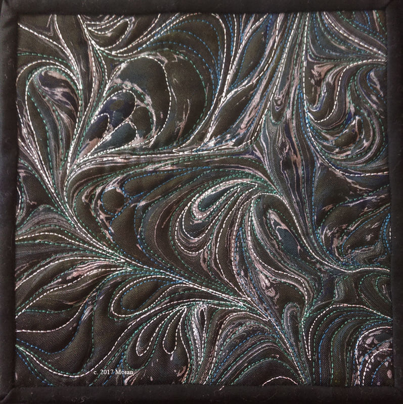
We have these wonderful polyester black linen pieces that marbne wonderfully, and I finished two of those – simple, easy to complete – not a great deal of stitching – just enough to emphasize what I want for a theme. Now they are part of a definite series – the “Moonlight” series Simple, easy to complete, and elegant.
Moonlit Garden, just starting the stitching. Finished size 8 x 10 inches.
Finished piece Moonlit Garden, $65.00 plus postage.
Finished Piece – Moonlit Winds, 8 x 8 inches. $65.00 plus postage.
Now to go through a lot of my works in progress – like the Iceberg piece – to get a couple of big pieces started/completed for show next year.
Personal Color Studies
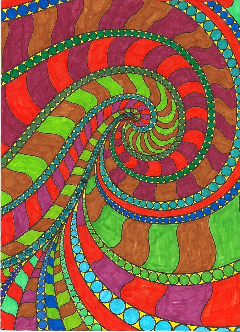 Been house-sitting/parent sitting for the past week, with no real access to projects, so I pulled out the markers and coloring books – which I haven’t touched in over a year – that craze passed quickly! It kept me occupied through a bunch of hours of the Hallmark Channel…a refreshing change, but after three movies I realized I’ve written those plots before.
The “have to be perfect” part of me was busy at work until I said “WAIT! These are color studies, you are just playing, yada yada yada….” I still can get stuck (very easily, it seems) in a rut of criticism. So the first of my efforts is on the left. Once again I realize how much I can appreciate white space (literally)…and I got smacked in the face with a focal point – usually my trouble spot. My eye in this one went right to the light blue when all was finished. I had done all the small circles first, and then accented around them with yellow. Overall I am pleased with the various color combinations – trying out some other colors for a change.
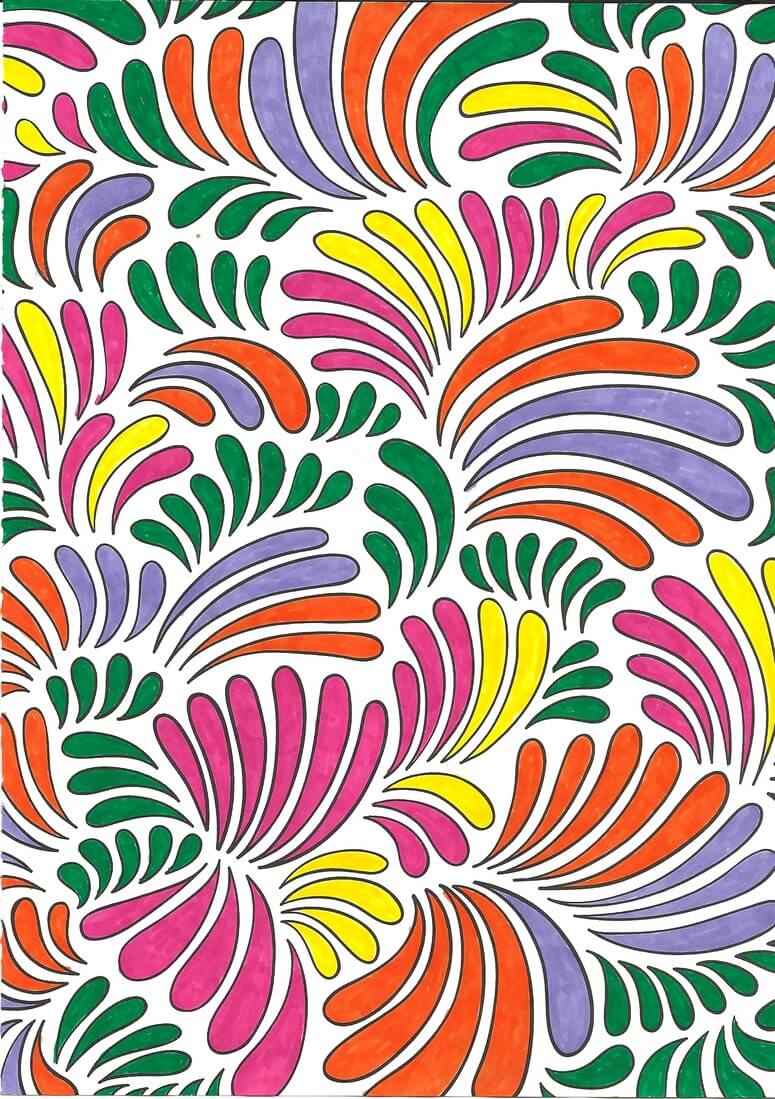
Number 2 – two colors, although I started with the intent to do blues and oranges – a favorite combo from a year ago when I was playing. As you can see, I only used two and then STOPPED – I do have trouble knowing when I am at the end….Very Cat in the Hat effect, I think. I do like it. It was hard to stop and not add some other color – but I do find this pleasing, and that’s what this exercise was about….right??? “Of course, right!” (Nod to “Fiddler…”)
I was also pleased with the white space on this next one. In other colors – more subdued browns and golds – it would remind me of William Morris. As it is, would be a nice wall paper border – too much for a full wall!
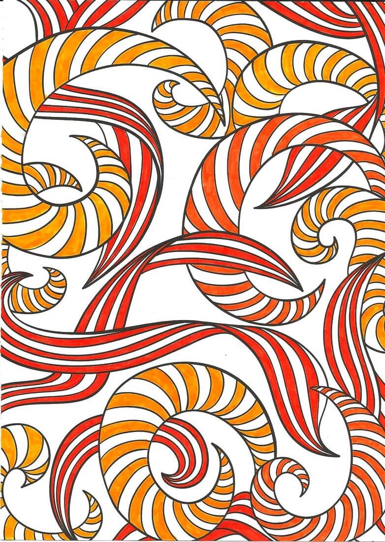
Interesting choice of colors on my part – I’m not really an orange/violet person, but I am really starting to like ORANGE – need more in my stash!!
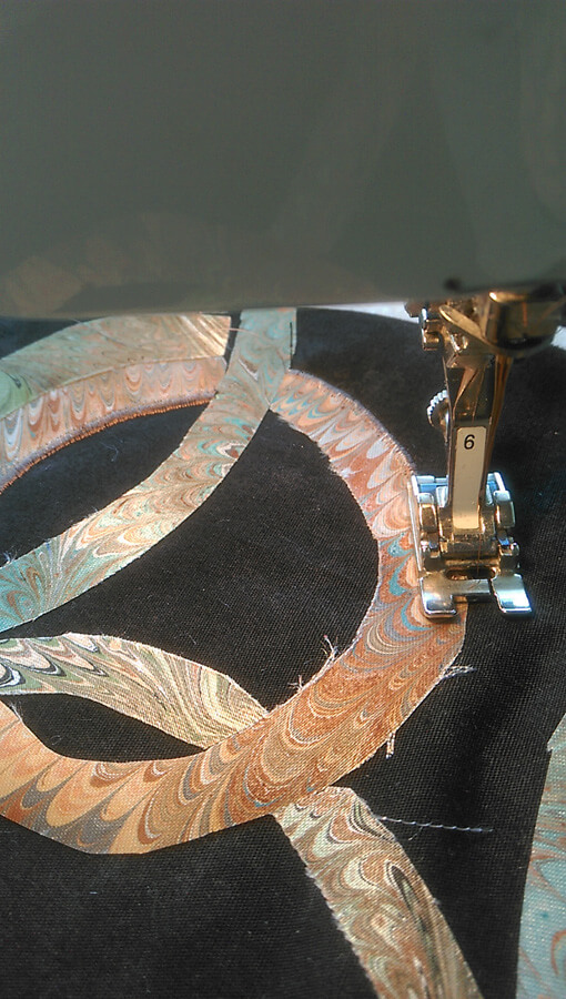
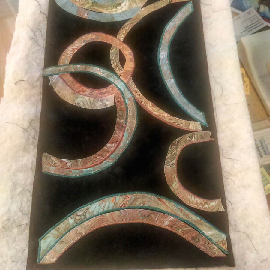
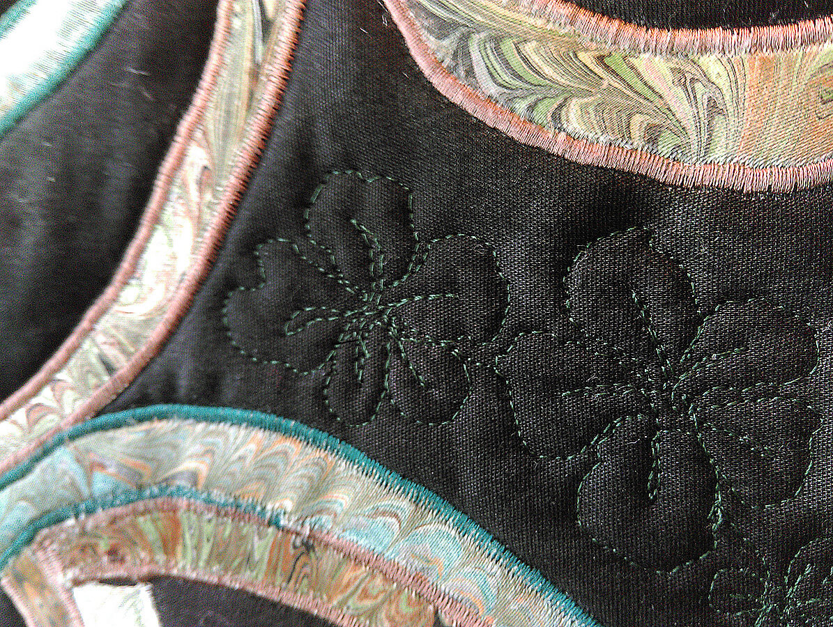
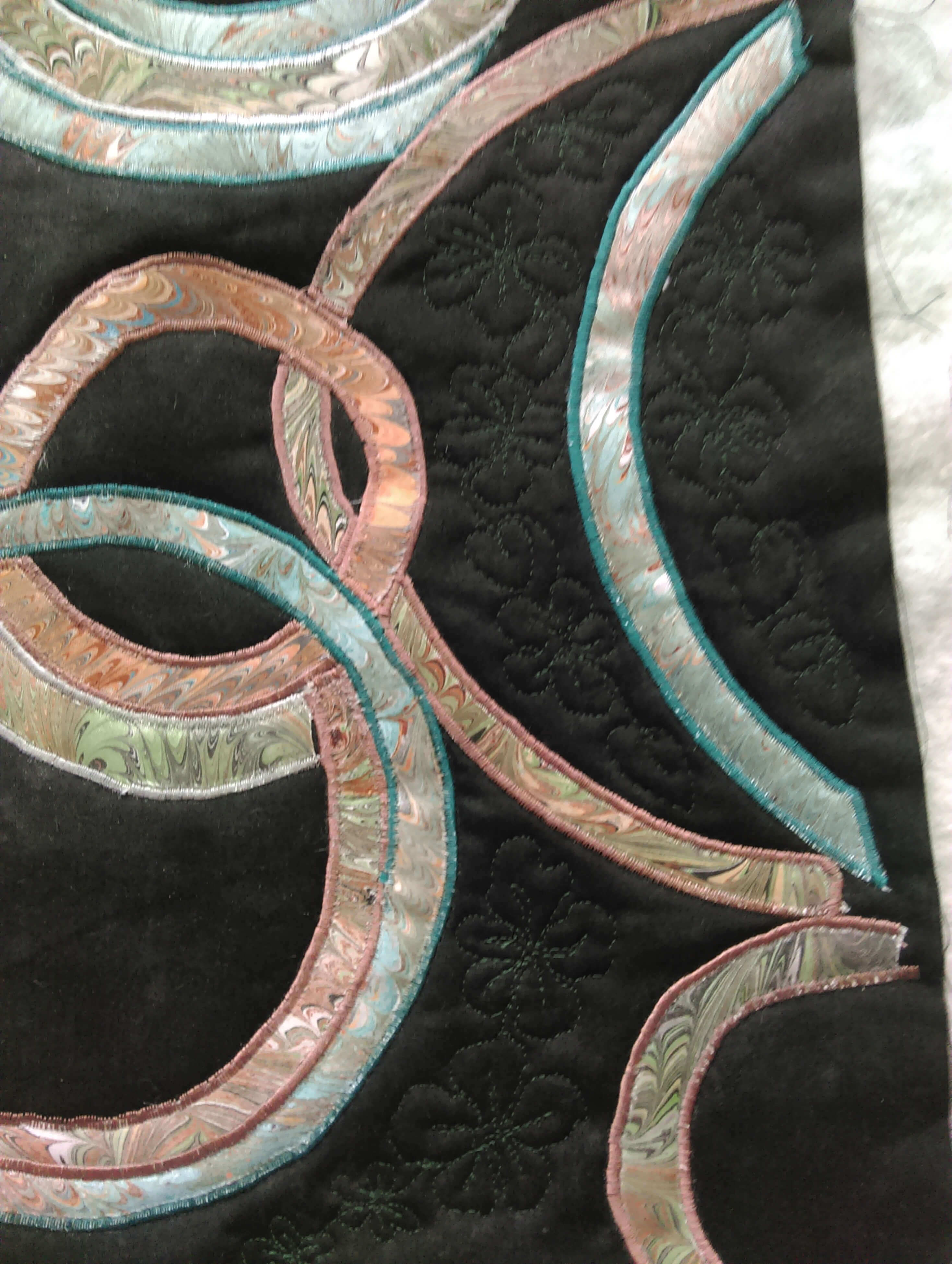
Last piece – not finished but happy with where it was going. Biggest issue….I keep wanting to fill in some of the white space in the little pockets between the ribbons. I get into the “If I don’t like it, I’ve ruined it” mode, which makes no sense, since this is an exercise…..ah, how that inner critic can be so busy!!
Till next time when I don’t have other projects – no more color studies….except winter is coming….lots of time for activities away from the sewing machine be=ut still inside……
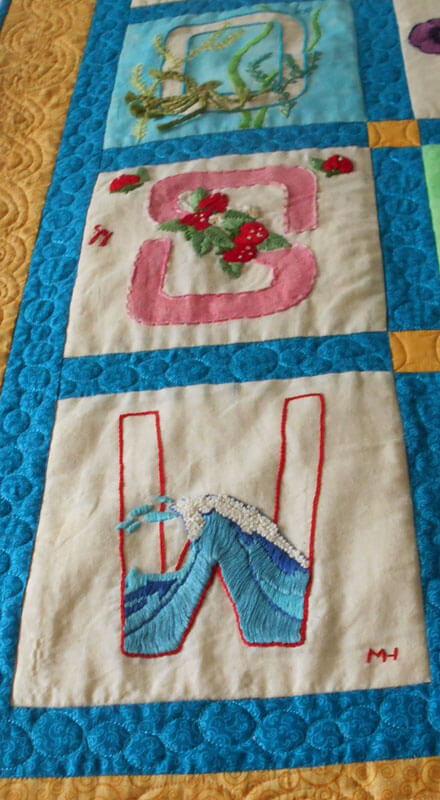
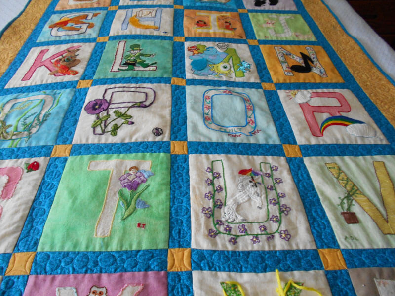
The Year (so far) for Baby Quilts
Two quilts for teachers at a school I used to teach at – I just did the quilting. The best quilt was the remake of a quilt given to my best friend of 43 years when she had her son some 35 years ago. He just became a daddy for the first time on July 1. The quilt was shipped June 30 – cutting it close! Kathy took her quilt apart from 35 years ago, repaired blocks, and completely changed the setting, sashing, and borders. It is really gorgeous and was quite a hit with the new parents. Visit a baby quilt here and here.
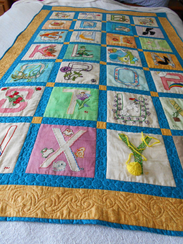
Two of the teachers who made the blocks above I taught with – so some nice connectivity.
Love doing this for folks! Welcome to the world, Miles! Congrats Jen and Tucker!
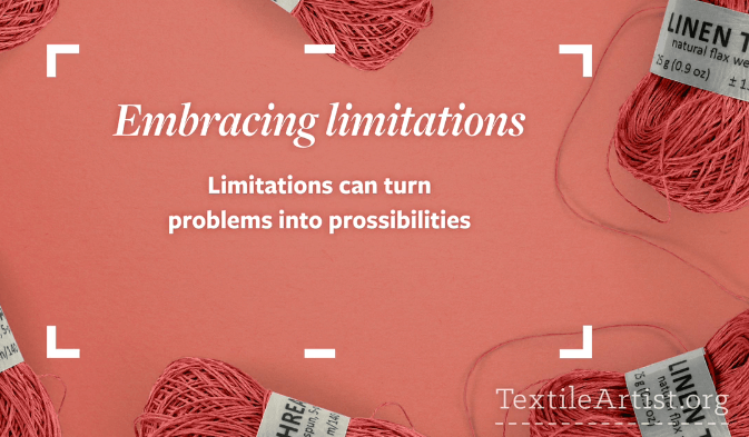
“Experimenting with Textiles”
I am currently (like right now) watching a video from the fellows who bring you textileartist.org. I’ve subscribed for several years, and they are introducing a series of videos on finding your voice with your textiles. So far, 11 minutes into the video, I can see the various paths I have taken and why I had problems with them.

First, early on in working with stitching on marbled fabrics, I felt intimidated by mo own machine quilting skills, and I felt like I needed to do a huge amount of practice on smaller pieces before I came to the bigger works I wanted to do. A cyber friend kindly said to me – do the work you want and the skills will follow….and so they did. I started weaving strips of marbled fabric after I machine-quilted them, and I didn’t look back.
Second, I’ve always experimented with lots of techniques – marbling happened to be the latest one (embroidery, knitting, crocheting, painting), but the marbling hooked and and hubby. Now I have a body of work that utilizes marbled fabric and new means of quilting and embellishing. I picked up bead work only in the sense it could add to the overall design.
Lots of ups and downs in learning and trying to determine a niche for ourselves, as well as work within limitations of what we could afford. I finally decided that what other marblers do is fine – so is our work in its own unique way. I didn’t want to marble paper – I wanted fabric – first limitation, and we made it work. We perfected our style on white fabric – very unforgiving – a second limitation.

How can I push the boundaries of the basics? Hubby and I laugh about what I have him end of trying to marble – “pushing” to do ribbon, silk flowers, canvas…all because I don’t want to waste paint in the marbling tray. Lots of additional projects opened up, mostly with embellishing what we were already creating. Any new techniques were pursued in how they could expand our marbled fiber art.
Making marbled art is expensive – a pound of carrageenan is about $50.00 now. So because of our extremely limited financial capabilities we had to work within a very tight budget – and we succeeded. Looking at a display of our work several months ago, both of us marveled at what we were able to create with so little resources.
Embracing what we can do on our limited budget led me to learn how to manipulate my 1008 Bernina workhorse sewing machine to do what I wanted it to do. Yes, I miss “needle down” and variable speed….but my skill with this basic machine has led me to teach very successful machine quilting classes to folks who think they can’t machine quilt unless they have a long-arm or other fancy sit-down machine.
In terms of skill level, I am completely self-taught, with only one marbling class from a master (Galen Berry). Everything else has been trial and error….no color theory of design, so I started with putting everything with black fabric. Hubby has the color sense, and I slowly came around to improving mine. Now I can put marbled fabrics with a range of other colors and designs. I attended a workshop with Tony Conner, water colorist extraordinaire, who talked us through a painting he created. It was like a design class with a master, listening to him talk through his decisions. I kept referring to pieces I was working on to see that I was naturally doing some of the design elements. I was trusting my “eye” and myself.
You owe it to yourself to watch the first of these videos – maybe you are new to the idea of limitations. We had natural limitations through finances imposed on us, and it led to who we are as artists now. Check out our web page to see our range of work. Find textileartist.org on Facebook and get your free video.
PS – no more pima cotton fabric, special order didn’t work because it was too light, so we “over-marbled”…and it’s good to go…..making due with a limitation……
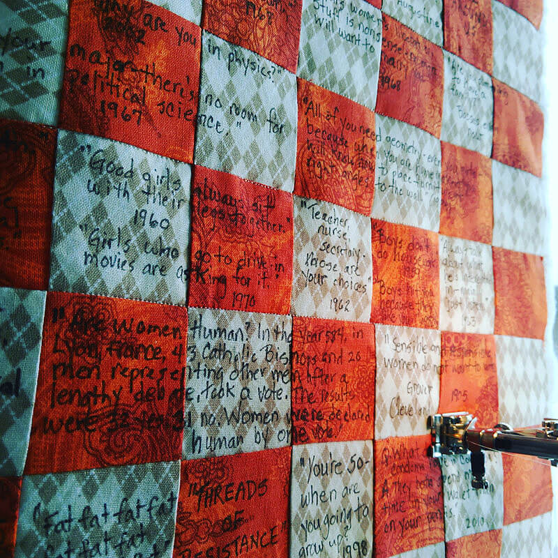
Threads of Resistance Entry Finished
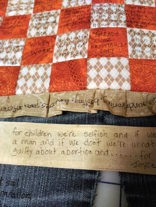
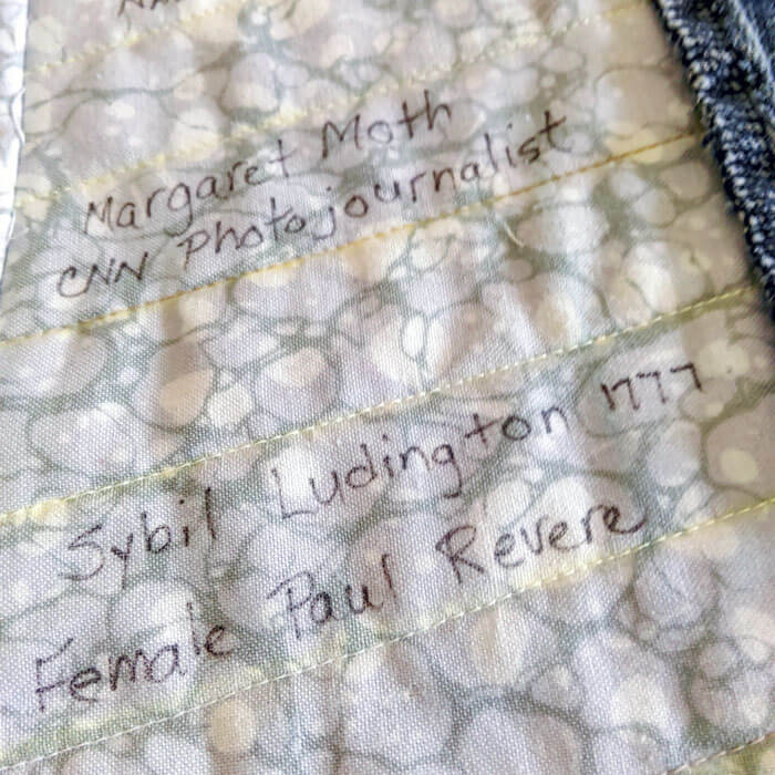
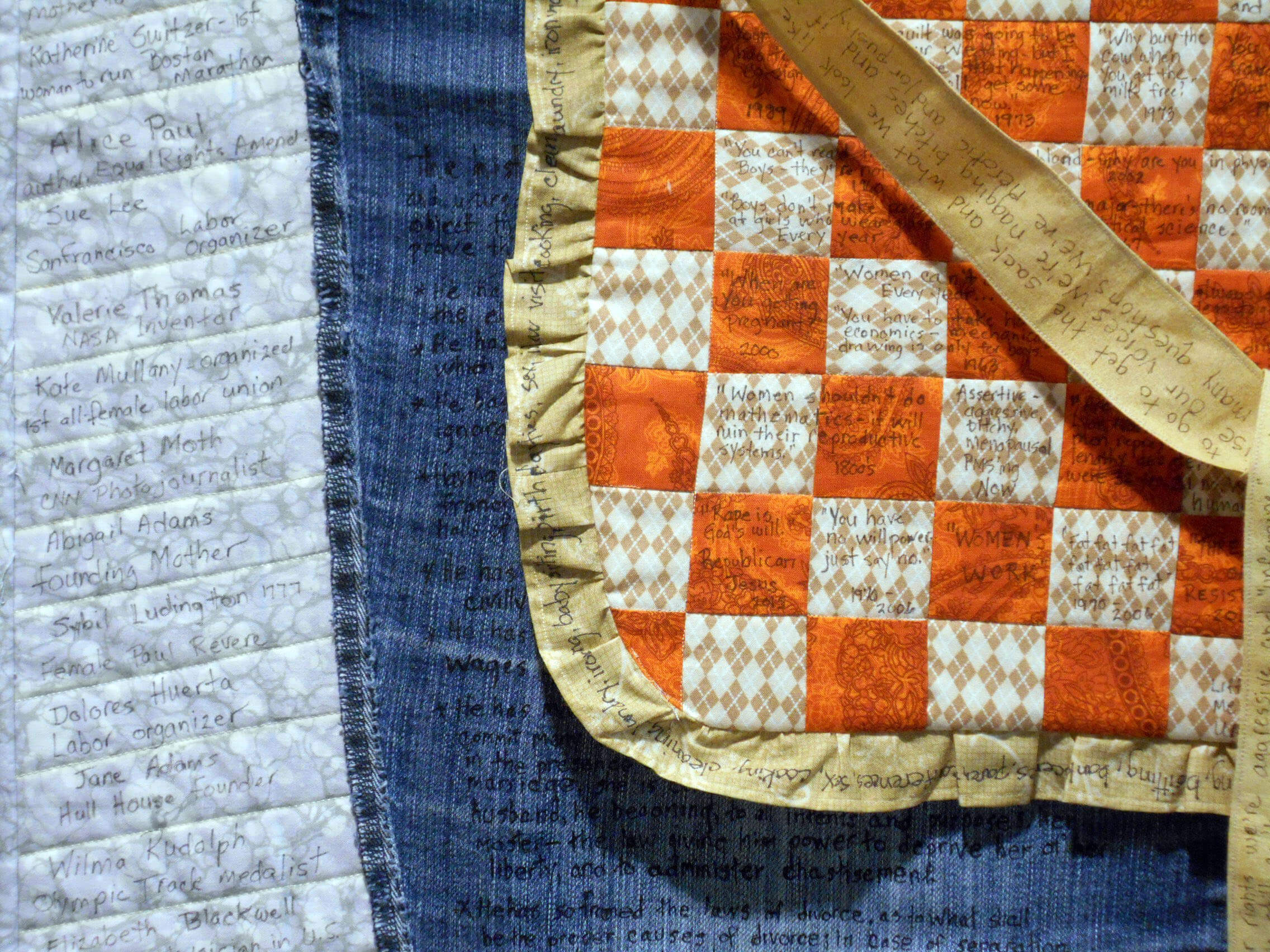
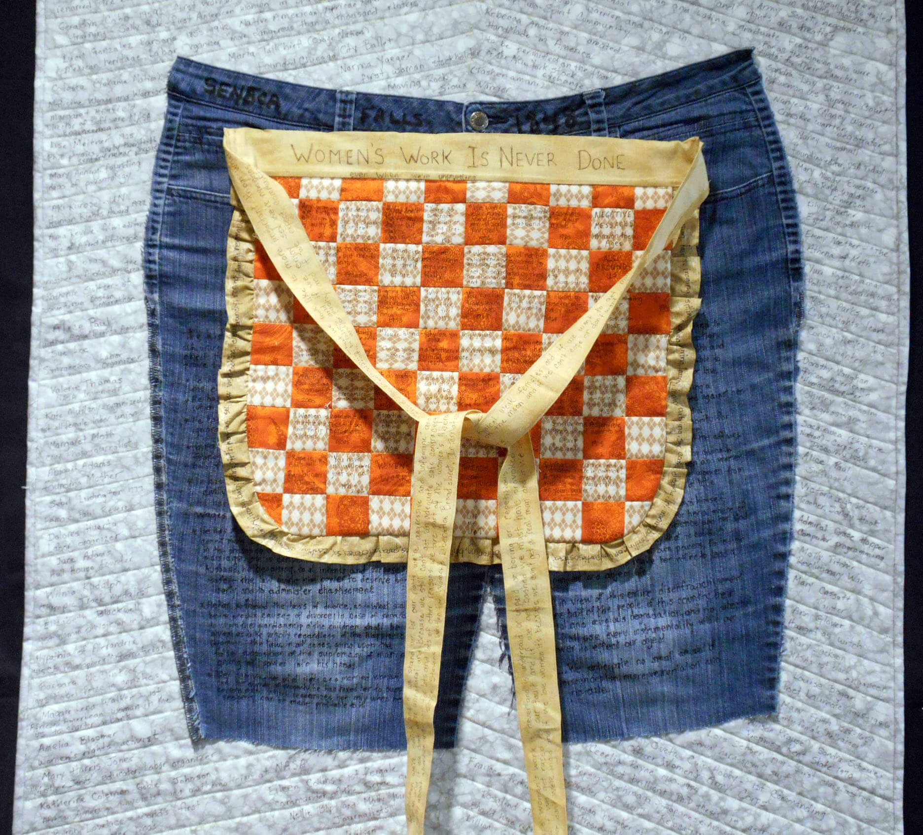
I spent a lot of time just coming up with an idea I felt would work, and then some of the time spent rehabbing my knee by walking the halls helped it come more into focus. Then once I started, ideas kept coming – what was a month’s project stretched out into two months, with a lot of time writing what would become the messages on the piece. Women’s Work s Never Done – the topic lef me in so many directions, starting with Susan B. Anthony and the Declaration of Sentiments in 1848 as a result of the women’s congress. The complete document can be found in the right-hand pocket of the jeans. Using a Sharpie, I started to painstakingly write in the GRIEVANCES woman had against men at that time…and as I was writing, I realized not a lot had changed. The best part of this piece was traveling back in time to read in full this document and realize how far we still have to march.
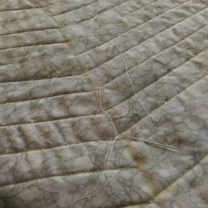
Here are the jeans about two-thirds complete with the writing – each letter gone over two-three times to ensure legibility.
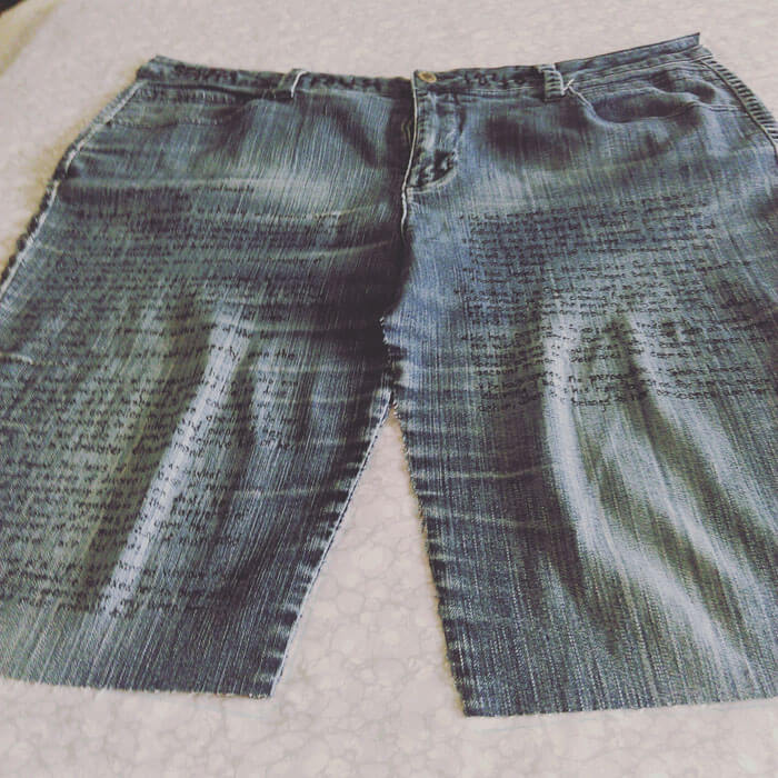
I worried about fading and having to re-do the writing – but isn’t that what we women have had to do through the ages? Prove ourselves again and again? Rewrite or own accomplishments so they aren’t forgotten? If the piece fades – any part of it – that’s the story of us as women.
Next came a woman’s required piece of clothing – the apron. I made it reversible – the front is traditional quilt design and somewhat traditional fabrics, and in each of the squares are messages to women – either from my own family or from society. I put a ruffled border on, and written on it is the litany of what women were expected to do: cooking, cleaning, babysitting, housework, laundry, cooking, etc. sex, birthday parties, planning dinners, sex, cooking…..you get the idea.
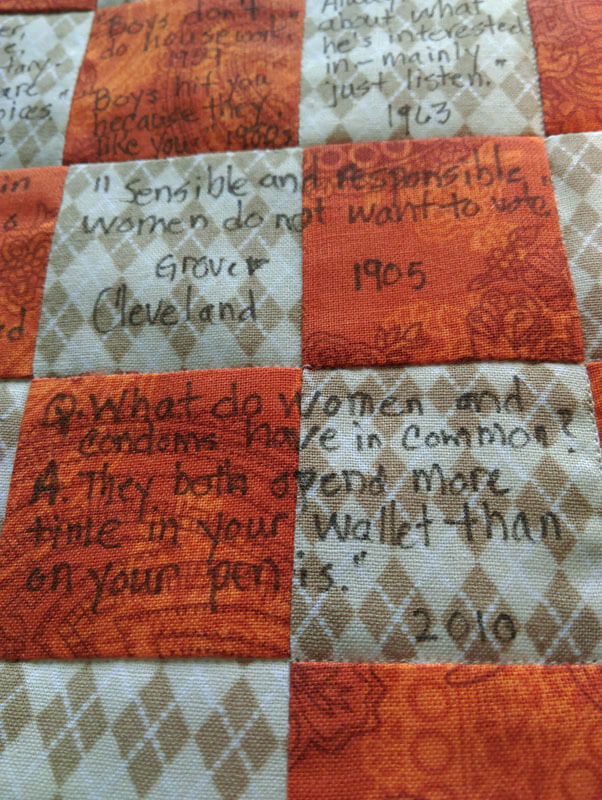
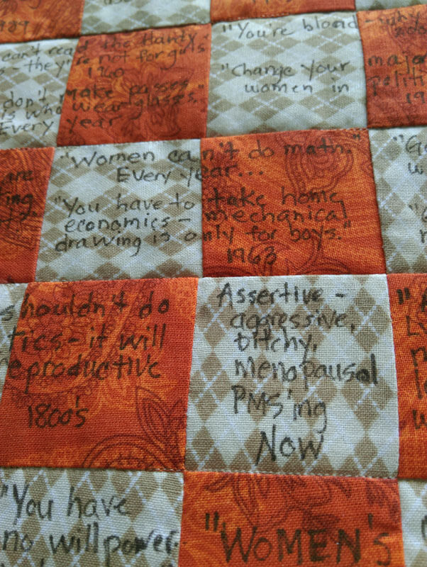
Click on the next picture – for some reason it isn’t clear….
Then came the apron strings. Not completely happy with how they worked out…but I love the message (original copy is in the left pocket of the jeans: a manifesto by Joyce Stevens from International Women’s Day in 1975.
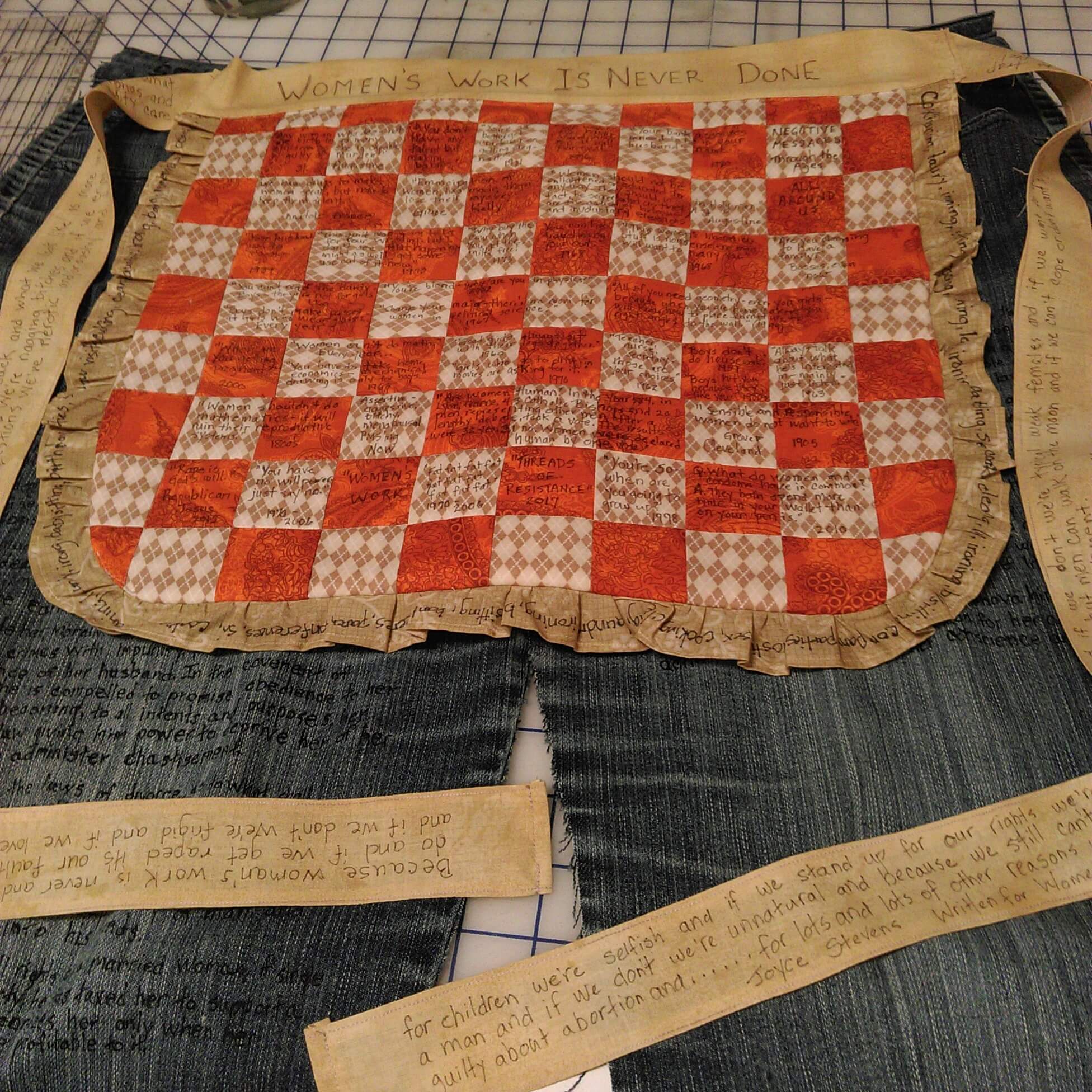
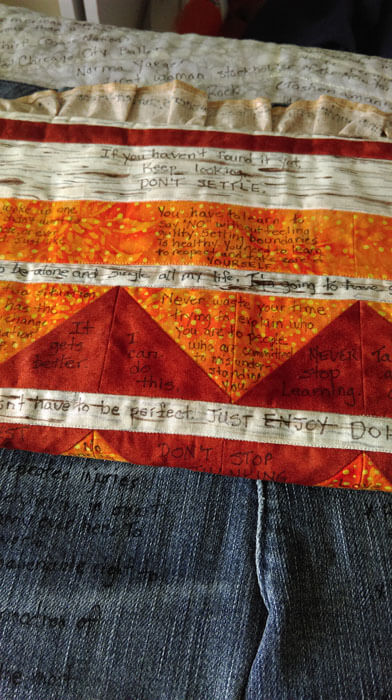
Now the reverse of the apron is more a modern design, with fabrics of the same hue but considerably brighter. On that is written positive messages I have given myself as a daughter of Women’s Liberation.
Next step was the background – actually background and backing – same fabric. I initially thought I would only quilt what would actually show before I began my writing on the front, but I realized why not continue on the back with more “hidden” women from history. So I ended up quilting the whole background. Then came the burying threads – which I don’t normally do, but since the back suddenly became important, I went and did it…..there were a lot…….
I spent a lot of time online looking for missing/unknown/hidden women and I found amazing stories – most I didn’t know – even as a history major. I started out writing every other line, from the middle to top and bottom so everything would remain even.
 Then I filled in everything and started on the back.
 I am very pleased that it came together as I had envisioned – learned a lot (I usually do…), but very pleased.
Comments? I’m taking names to continue the back of the quilt with other “hidden” women – send ’em along!
Busy Busy Busy…….Two of Seven…..
So it’s a crazy time in the studio right now – 7 projects, five of which are big ones. Two deadlines coming up this next Monday for photography…see, Kathy Nida – I’m calling the photographer ahead of time to get myself to the deadline!
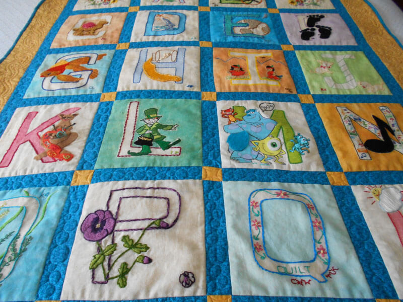
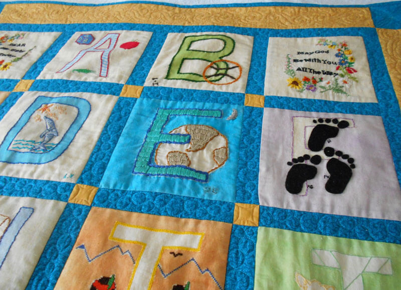
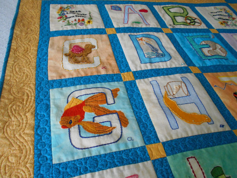
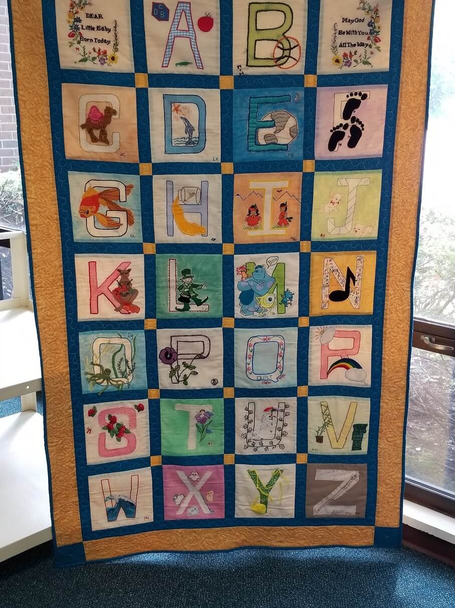
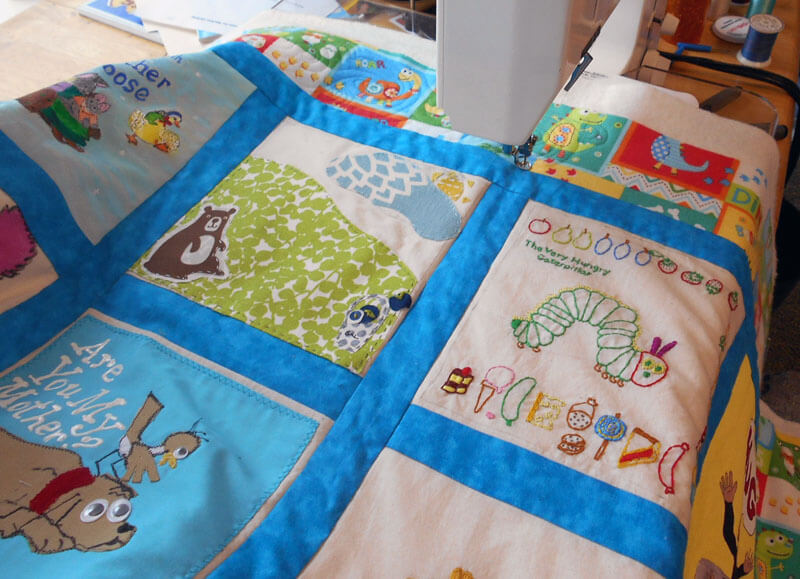
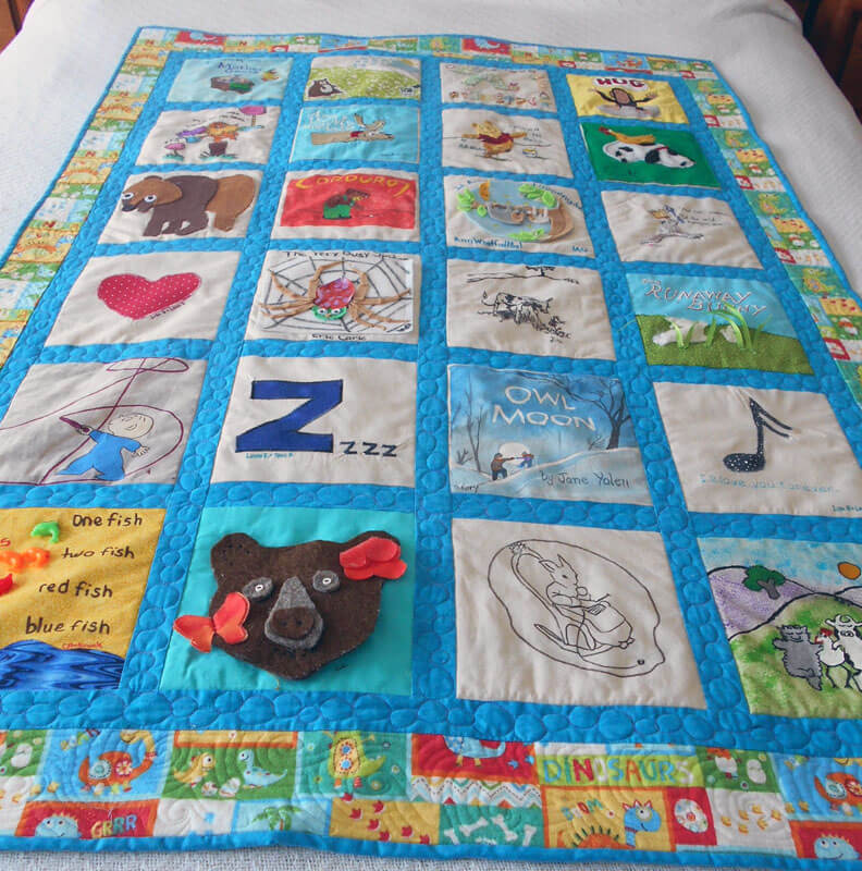
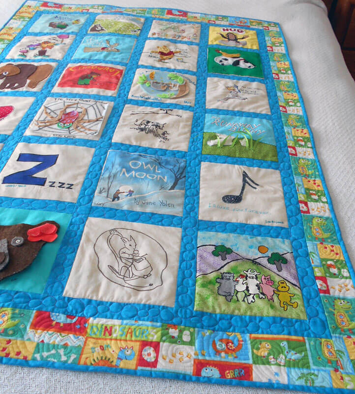
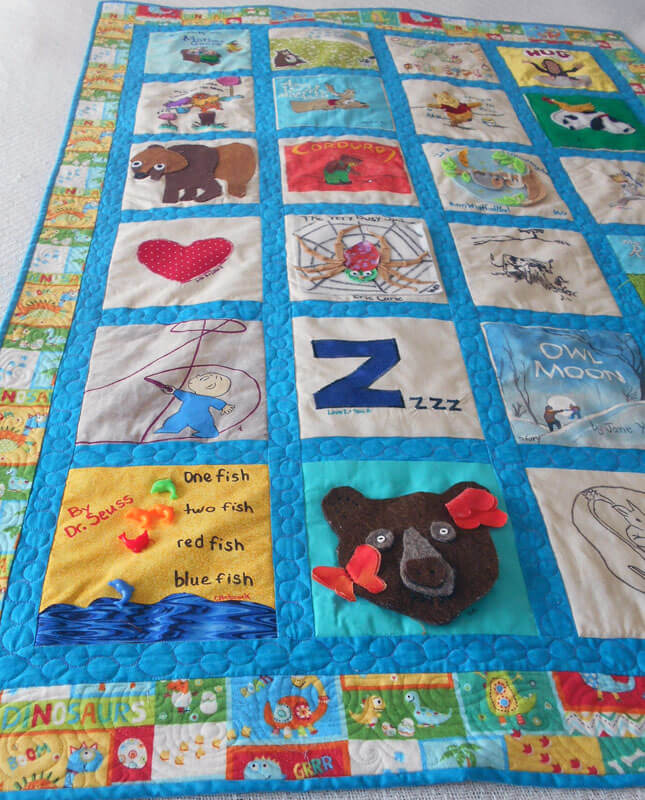
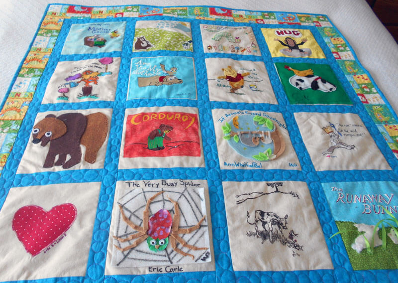
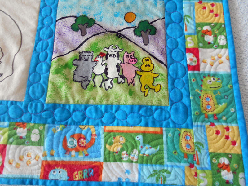
Here are the first two of the seven….I’ve been quilting baby quilts for a friend who works at the middle school we both did, me back in the mid-seventies. You can see the last baby quilt (before all the deadlines hit) here. I enjoy doing them, we usually get a free lunch together, and it gives me a chance to practice my free-motion skills – kind of like practicing free throws before you need them for the big game. You can see the children’s literature theme – the books usually stay the same, and the colors change to the new mom’s preference. ALL pictures copyright 2017, Linda A. Moran. PS – thank you, Superior Threads!
 ALL pictures copyright 2017, Linda A. Moran.
 ALL pictures copyright 2017, Linda A. Moran.
Now for the next project – I decided to make quilts for my great-nieces and great-nephews when they turned 13. You can see Gracie Mae’s quilt from two years ago here. Now it’s Gavin’s turn, and I did another “modern” quilt with the colors he wanted. Again, a great chance to practice design and free motion quilting. In looking at the one two years ago, I can see the improvement in my skills. In two years I owe two new birthday quilts.
 Love the backing – perfect for an adolescent boy!
 ALL pictures copyright 2017, Linda A. Moran.
 ALL pictures copyright 2017, Linda A. Moran.
 ALL pictures copyright 2017, Linda A. Moran.
 ALL pictures copyright 2017, Linda A. Moran.
 ALL pictures copyright 2017, Linda A. Moran.
I really wanna learn to use rulers like Judy Madsen…..
On to “Eruption” and the “Threads of Resistance” quilts…….
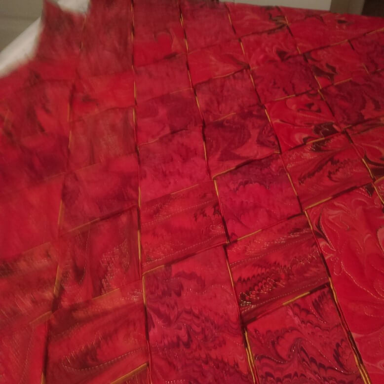
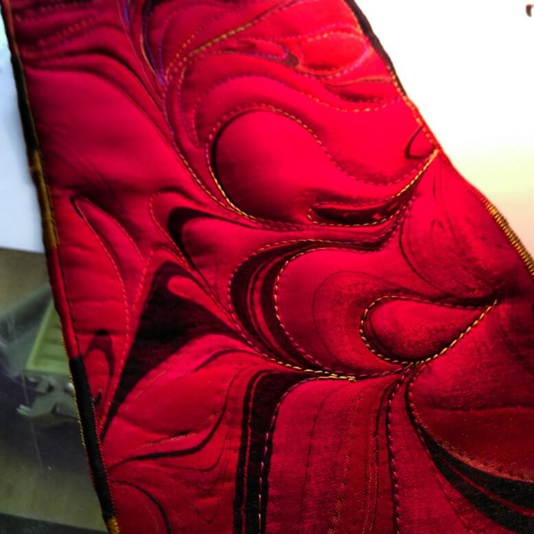
Deconstructing and Redesigning
Photograph by Stephen DeVol, Sedona, AZ
For over 13 years this piece has been known privately as “Ode to the Fire Goddess Pele” as a result of my time in Hawaii. It’s official title is Gaia 2: Beginnings. Our biggest problem has been that it was meant to hang on it’s own, but we were unable to figure out a simple – and not intrusive – hanging system. So for the last year, since we have been showing our work in Vermont, we’ve talked about mounting the piece – somehow. Here’s the story of the creation of the original piece.
That led to me deciding to completely redo the piece – ev.er.y.thing. It took two weeks of night time by the television to get all the machine quilting pulled out. In the 13 years since this was finished my machine quilting skills are SO much better. I will say that my original tension was so bad that in many places all I had to do was pull a thread and I had many many inches come right out.
My new plan is to requilt it, change the edging, mount it on a large piece of black fabric, quilt the black fabric, and then add a sleeve. I need to have all this accomplished by May, as I plan to enter it into the “Abstraction” show in Saranac Lake this summer.
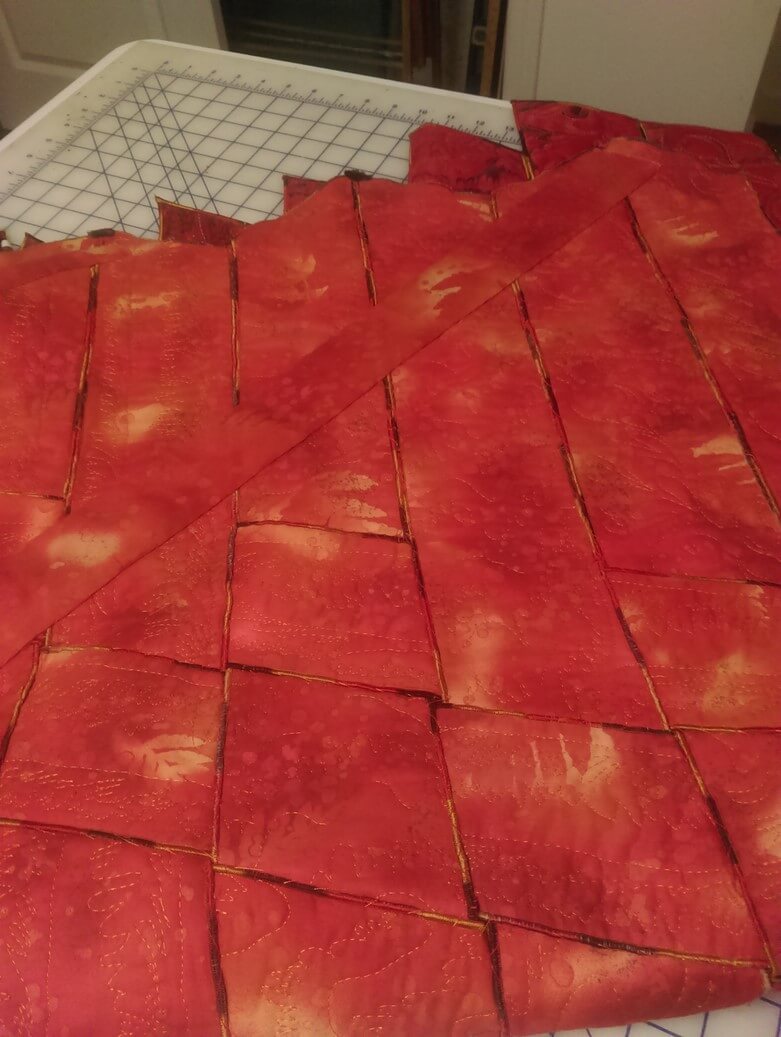
Right now I have 12 strips still with serged edges. I found a FABULOUS piece of red and gold fabric in my stash, and (hoping I have enough) I will put the binding on over the serged edges. It looks really good so far.
A close-up of the original weaving with the serged edges.
 A close-up of the back with all the hand-stitching to hold all the pieces tight and together (oy, did that take a while….)
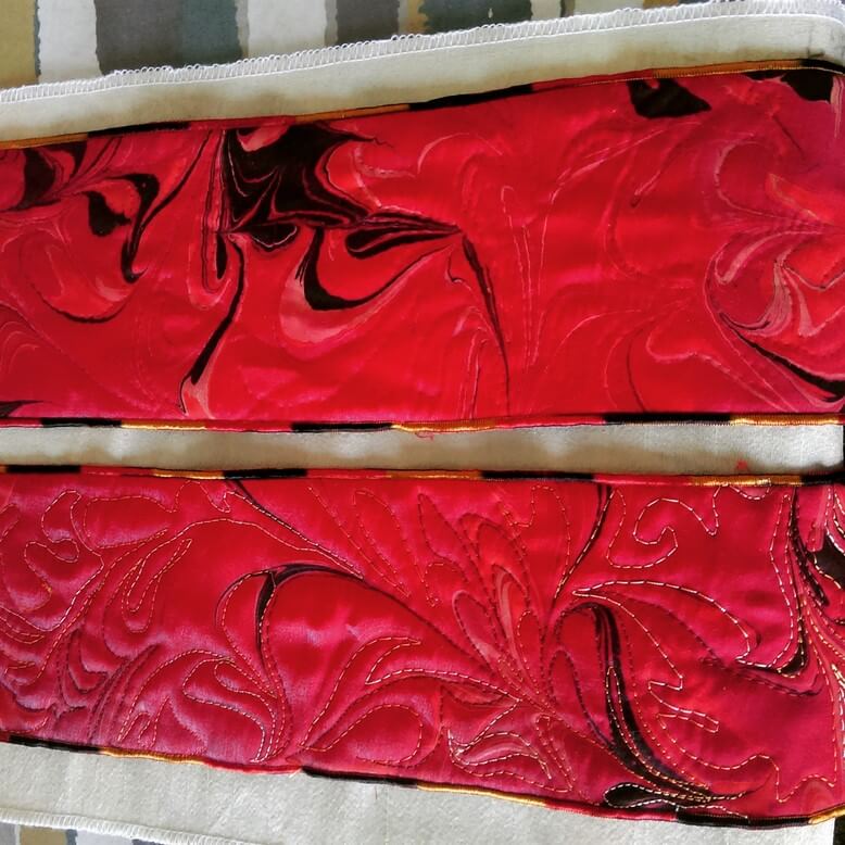 Before and after – original stitching, and after the frog stitch….
 More before and after….
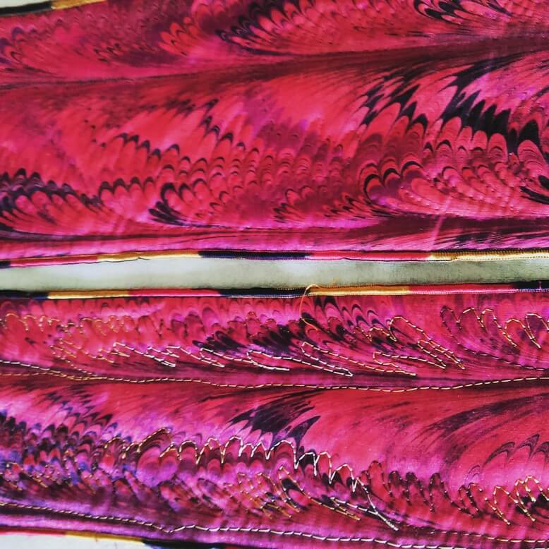
 The beginning of new free motion quilting….
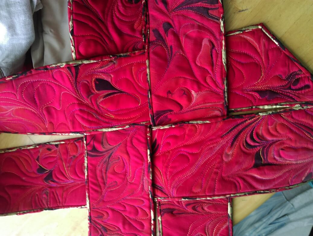 A look at the new binding and how it will work with the weavings.
This piece will also have a new name: Revolution. More on that as I get further along in the quilt.
Art in 2016 – Part 2 Review – Small Works
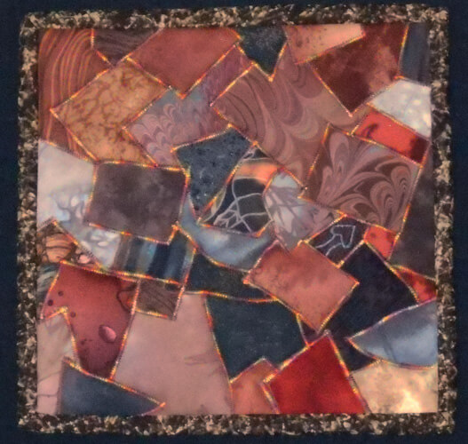
A lot of smaller work was started, finished, and revised this year – part of the need to create more pieces, and part to experiment with new ideas. We also tried more framing (pretty successful) and mounting on canvas (very successful, and not that all expensive). The biggest issue seemed to be people didn’t know what to do with small wall hangings or table-toppers. By framing them we are leading our customers to see the piece on a wall, looking like artwork. This is also working well for galleries and stores with small spaces.
The “Chocolate Box” piece on the left was done some 18 years ago as part of a challenge on the QuiltArt list to create an 8 x 8 piece with the theme of “brown.” I pulled all kinds of browns from my stash, including some marbled fabrics, and then I zigzagged them together with the idea of creating a “Whitman’s Sampler.” I have always thought it looked very cute. I rediscovered it this summer, adding batting and backing, variegated thread in a more prominent zigzag, put on a binding, and mounted it on fabric. Lots of good feedback on the piece.
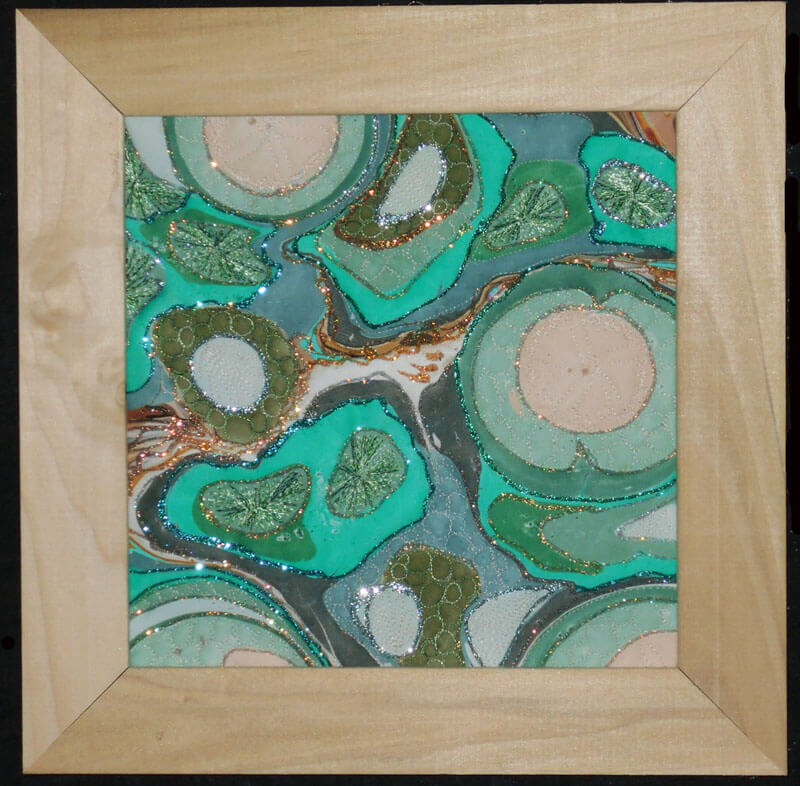
Another piece that saw framing was a small piece of marbled poly-satin that a friend (Suzan Drury of Saltwater Systems) added glitter to at least 10 years ago. Loved it, but it didn’t translate into something someone would want to buy – so on a whim I added batting and backing and then quilted it – thus “Pond 3” – a favorite topic. I learned to do sand dollars as part of a tutorial from Lori Kennedy (theinboxjaunt.com), so you will see clam shells, sea urchins, and sand dollars throughout the small piece. It looks quite striking. One thing I learned in the framing process was to move to lighter-colored frames to keep a piece from feeling constrained.
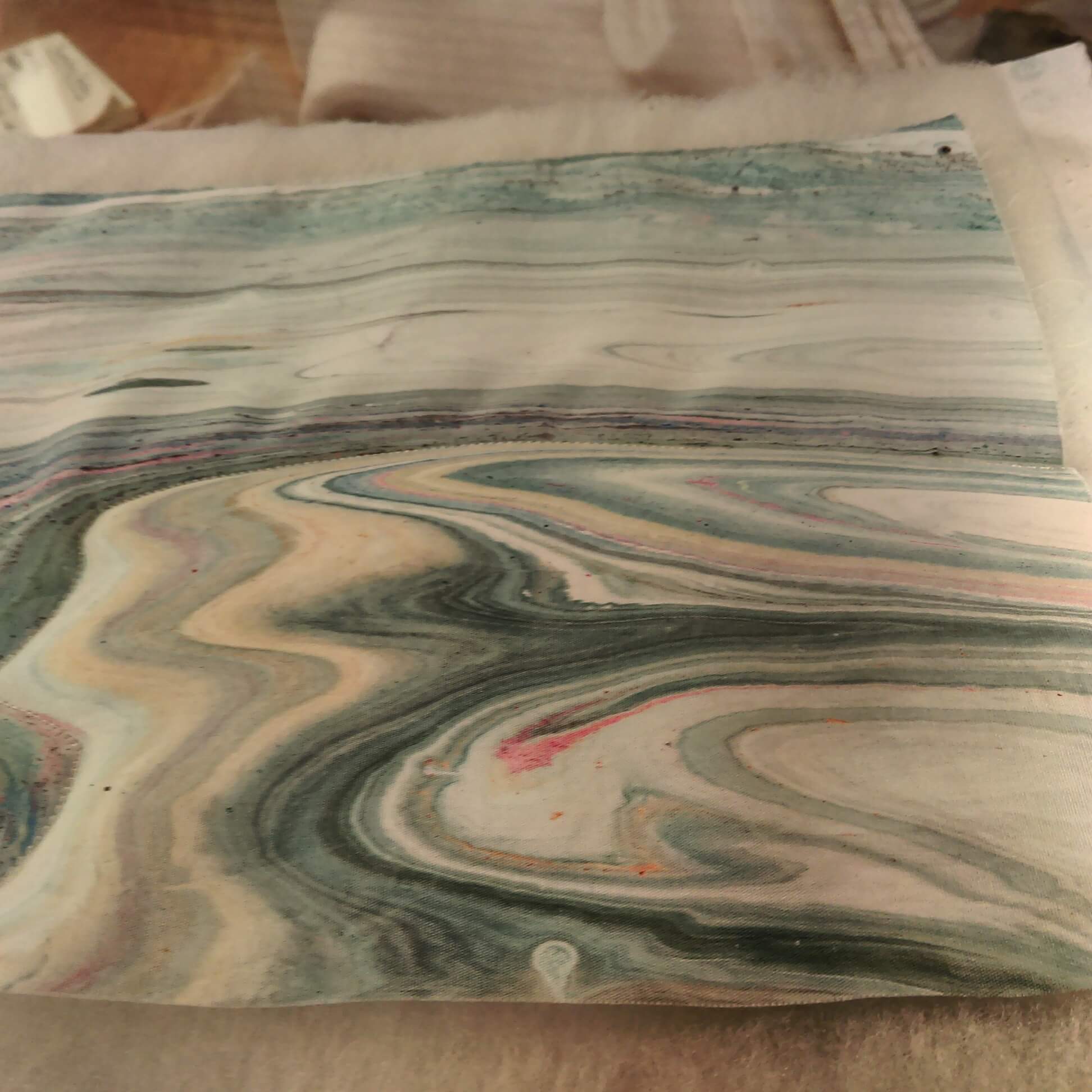
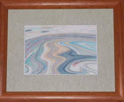
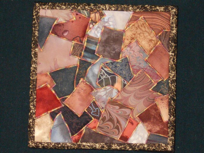
this year saw the debut of a new series – “Leftovers.” The idea for this came about when we would clean the marbling tray after a session. There were wonderful designs of leftover paint as we emptied the carrageenan. We started saving some small pieces to capture to designs – all of which are very organic and “earth strata.” Two pieces made their debut at Phoenix Books in Essex as part of a rotating display of work by the Essex Art League. There are LOTS more to come – all of which need me to stare at a piece for a while to determine how it wants to be stitched. They are all simply framed and look almost like photographs.
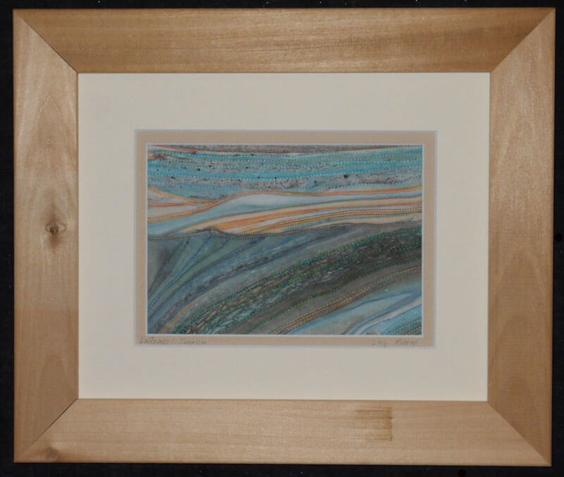
Leftovers 1: Sunrise
Before stitching on From Above:
Ultrasuede marbles wonderfully. Over the past couple of years we have been doing yards of this for Bead My Love to sell at the various bead and gem shows. We get to keep a few pieces for ourselves, and this year I finally attacked quilting one – with some interesting lessons….the fabric feels like suede, but it doesn’t translate to a puffiness when quilting (note to self: use extra batting for the next piece). Also, the various colors didn’t show well, which is why I went with Superior Threads New Brytes yellow – a thicker thread. this is a 12 x 12 piece of ultrasuede. Introducing “Partly Sunny, Chance of Storms.”
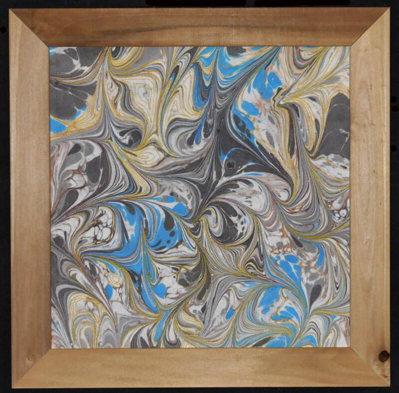
Partly Sunny, Chance of Storms
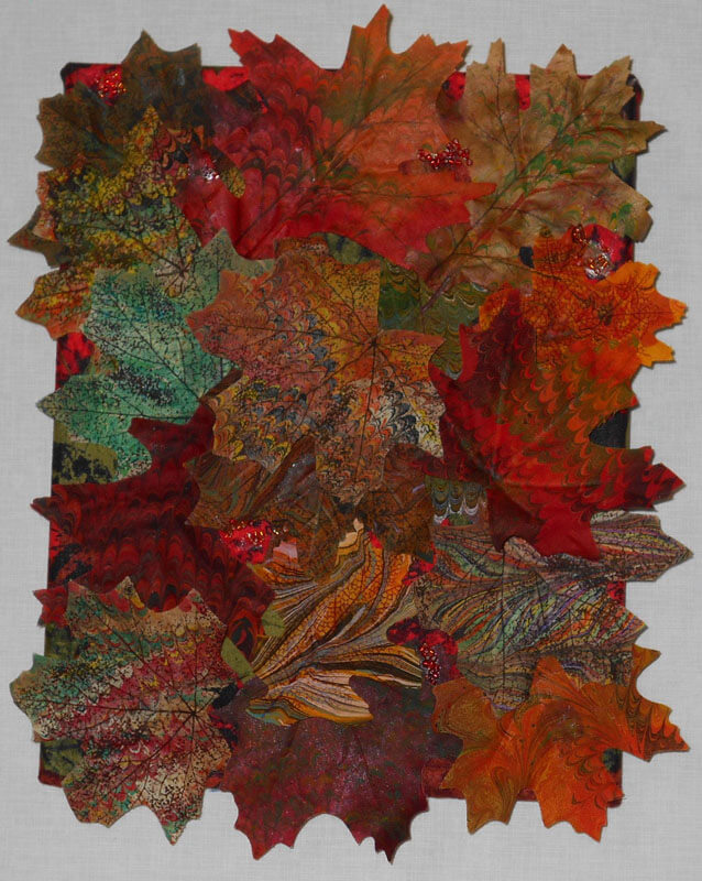
One more piece – we also started marbling flowers and leaves from the silk flower sections of the craft stores – another way to use up left-over paint in the marbling tray. Here’s “Autumn,” a collage of some marbled silk leaves. Covered canvas, 8 x 10 inches.
More next time as I continue to review the year. Comments welcome!
Art in 2016 – Part 1 Review
It has been a banner year for art – especially in the making of art. When I stopped to reflect, I realized we created more this year than any other year – some big, many small, and all taught us something! I’m doing several blog posts, since I don’t have pics for a bunch of gifts – awaiting the jpgs in the email….
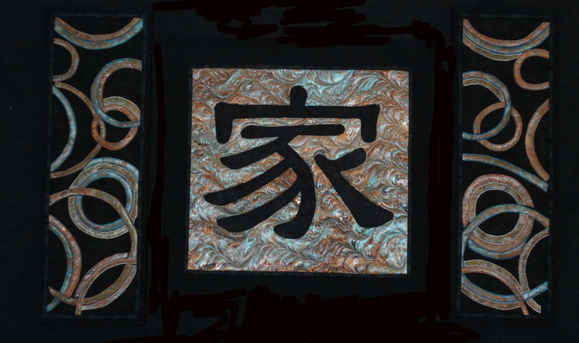
Yesterday was the presentation of a commission for dear friends of ours. It was supposed to be for their anniversary in September, but just didn’t happen….Once knee surgery was over and I could move around fairly easily, I set to work. The marbled fabric had been done since April, and I had been mulling designs since then. It was time….
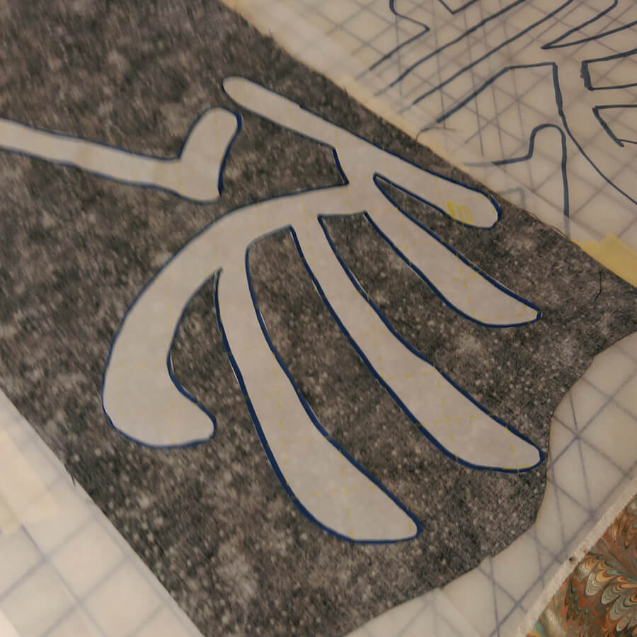
I started working with the Chinese symbol for “family,” and after just this first littyle bit, I have even more appreciation for the art quilts of Kathy Nida. This involved tracing the symbol, determining which side would be “up” when ironing onto the front of the fabric, adding WonderUnder, and then making sure it actually worked – especially since I had a limited amount of the fabric choice for the symbol. First success.
Next was creating the pattern for the side panels, loosely based on a table runner by Lonnie Rossi and definitely made my own. Same issues with being sure of right and wrong side, since there would be two panels, and the designs would mirror each other. Much angst – especially on the choice of the background – I had a peach silk that worked with the overall colors, but looked terrible with the small pieces actually on it. The fabrics were extra marbled fat quarters that didn’t make the cut in terms of main color, but they were all complementary.
I put off for the longest time doing the zigzag satin stitch and then discovered that the fabric frayed very easily. A lot of adjustment, sharp pointy scissors, and FrayCheck got me through this section.
The satin stitch….forever…..
I had one panel completed and then started on the second panel. It probably would have been easier doing them both at the same time, but I wanted to be sure the idea could be executed before I was completely committer.
The request was for some apple blossoms quilted into the design – originally to be on the border….but it worked out differently. I Googled images of apple blossoms and determined a free motion pattern, and then began. As long as the petals had ragged edges, the pattern worked.
Starting the apple blossoms
Lots of flowers over both panels – really liked how subtle the patterns are.
Checking to see if the three panels really do work together….
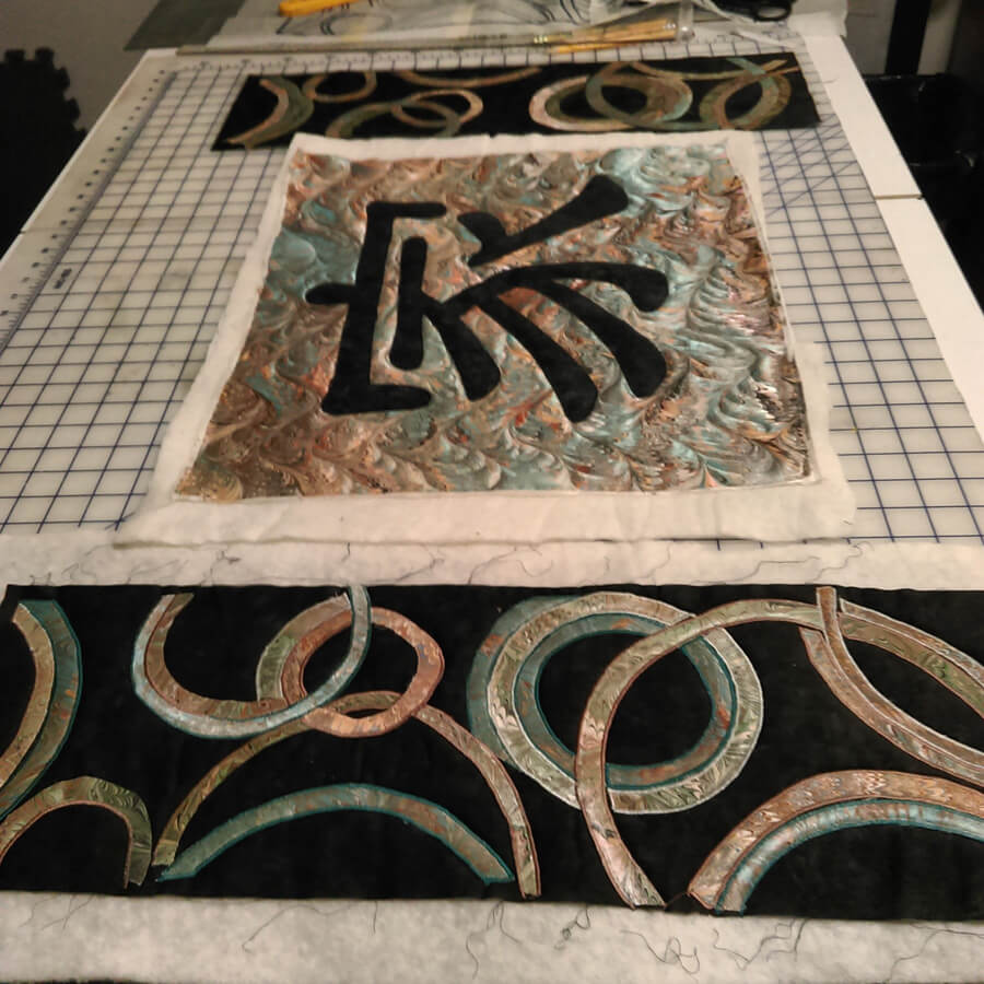
Time to square off and do the binding – the side panels had a LOT of ironing as they were becoming distorted. Note to self – allow more edging next time around…..
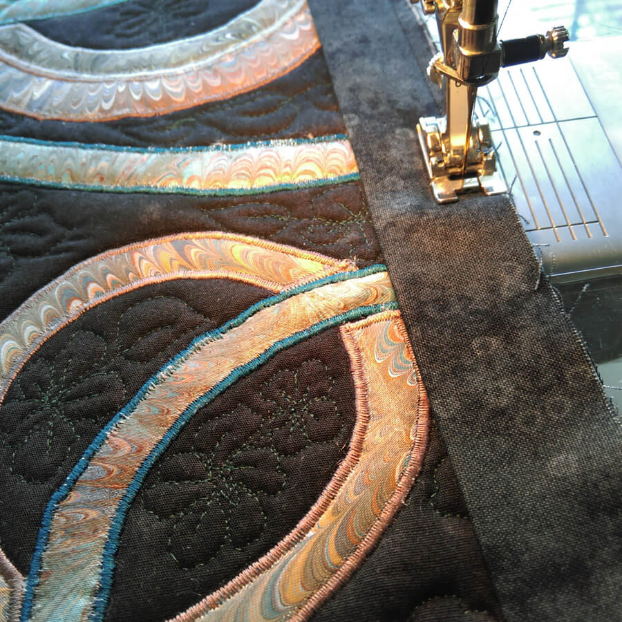
Preparing the canvas for mounting the panels. We have started mounting much of our work on canvas frames covered with a complementary fabric. Much sturdier, easier to hang, and people seem to view them more as “art.”
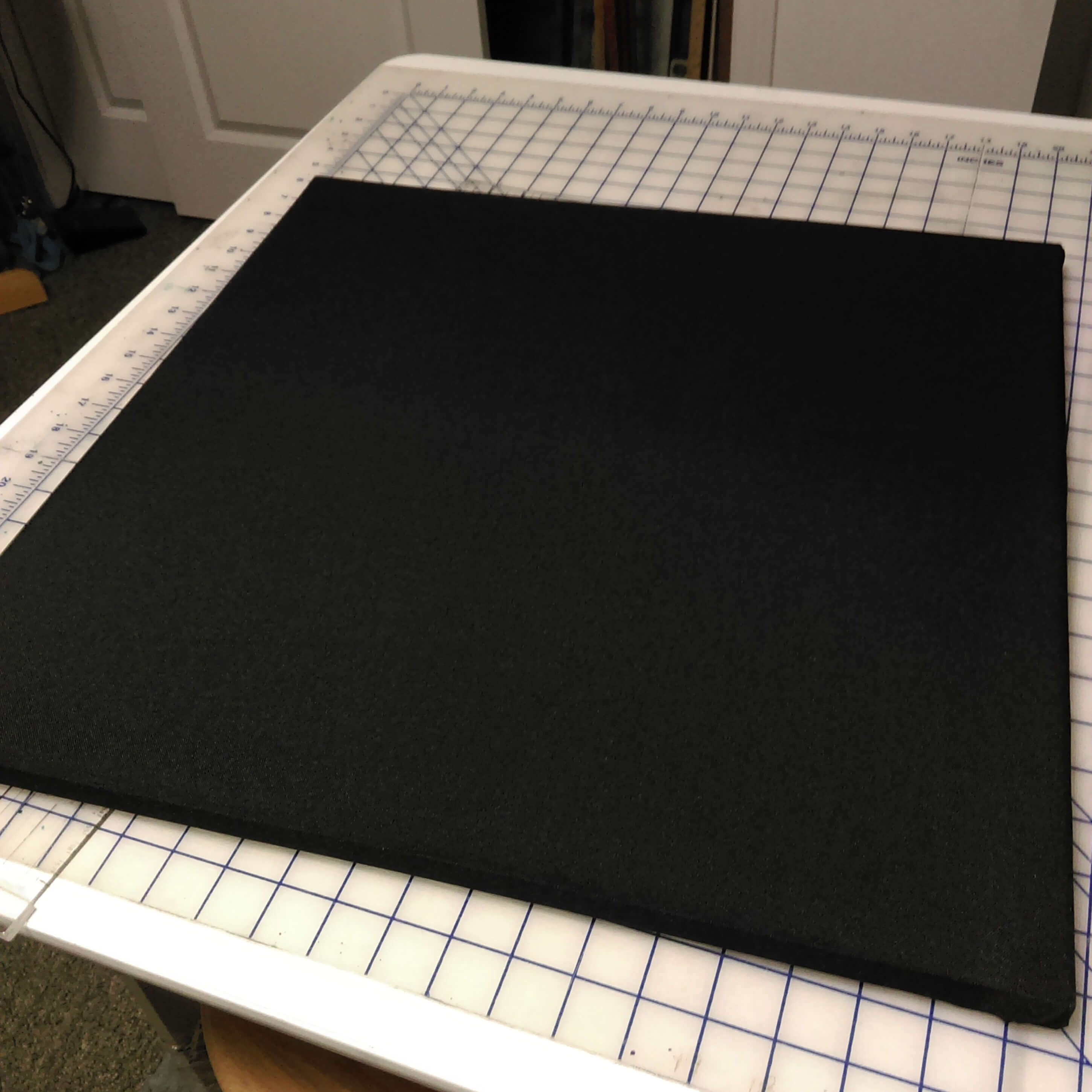
20-inch square canvas covered in poly-linen.
Thinking it’s going to work…….each side panel is three 8 x 8-inch canvases, mounted together and covered.
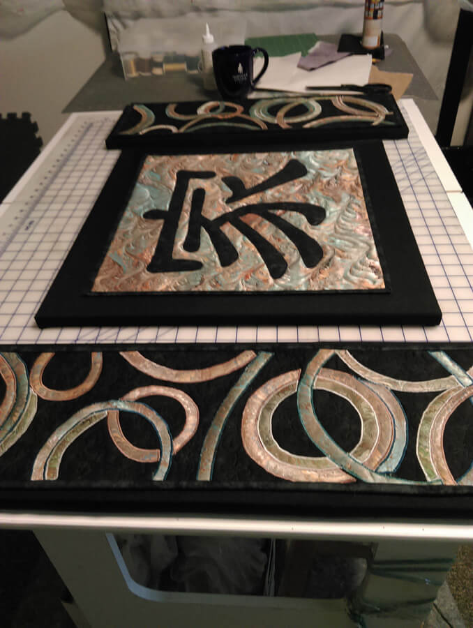
The final product – “Family.”
Playing Catch-Up…..
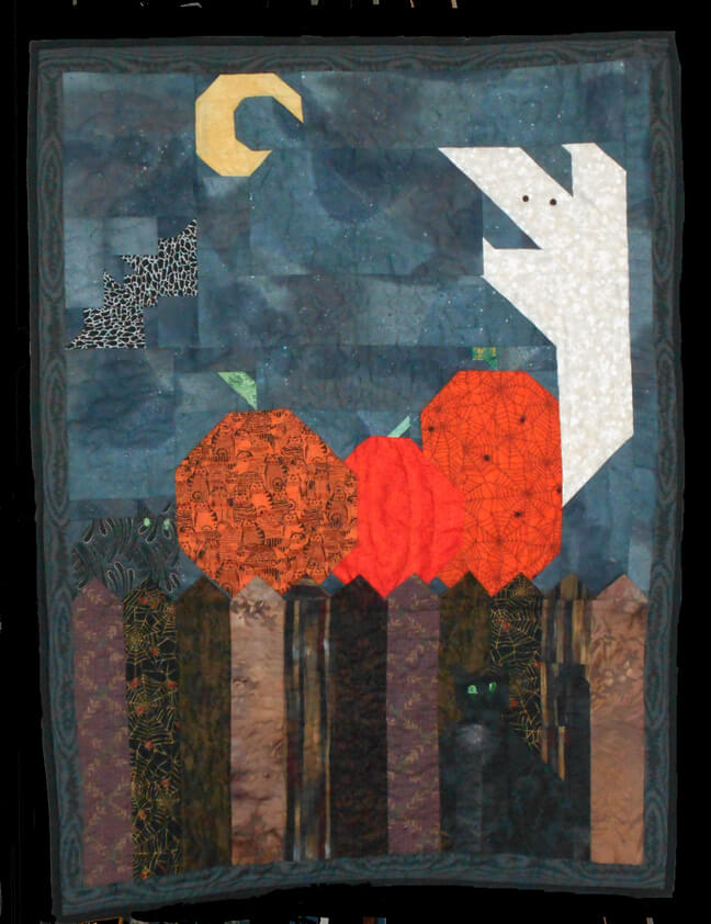 A piece I started about 15 years ago and finally finished this summer – will be adding loops to the back to hang on our door for Halloween. I still have plenty more to work on, and slowly,over the winter during knee recovery I plan to work on them – plus lots of new ones.
Speaking of new ones, in organizing Bridge yesterday (some 7000 photos and a lot of saved duplicates, I think I can make sense of some of the new process pictures. This first piece, Chocolate Box, was done YEARS ago, as part of an 8 x 8 challenge from the old QuiltArt list. I think the theme was “brown,” but who knows? Originally I just sewed pieces with a zigzag stitch – and then I realized I needed stabilizer on the back – like I said, a long time ago. This summer I came across it, added backing, re-quilted it in a variegated thread, and added a border. Still love the piece!
Chocolate Box
This piece was done for us years ago as part of a challenge to use marbled fabric in a traditional pattern. I made a sandwich, added waves to the bottom of each boat, and quilted semi-circles around the sails to represent the sun. If you made this for us, please let me know so I can credit you.
This next was also part of a challenge, and I use it as a sampler for using free motion quilting on a traditional block. One of the sections is plain, the others have a variety of patterns, some following the the pattern, and some walking around. I love how the marbled fabric quilts up.
Pinwheel
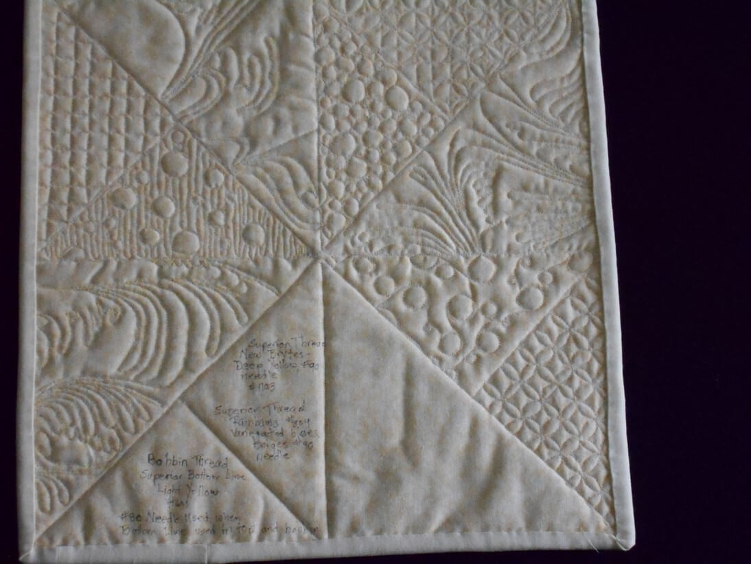
I like to use my backs to show errors- and then in the blank area I added details about threads and needles.
So I continue with cleaning and organizing, and hubby is busy marbling every fabric we seem to have in the house. He’s having a ball!
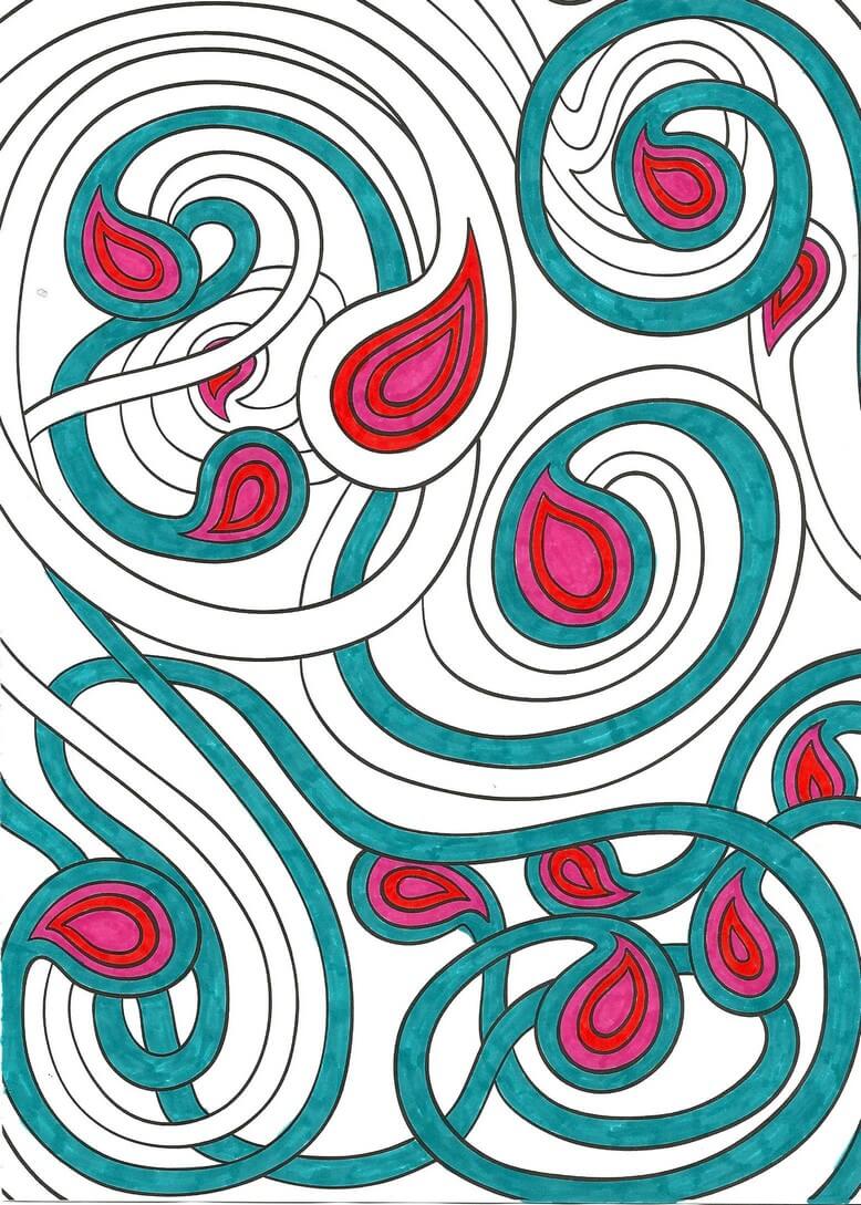
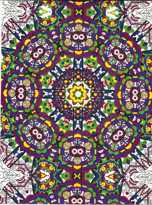
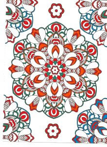
More Lessons from the Coloring Books – Part 1
Throughout all the stress of medical issues this winter and early spring, I resorted a lot to coloring at night – one BIG take-away from the coloring is that it controls my appetite….no small thing. But I’m learning something almost every piece I do. You can catch up with what I learned so far here.
So here are some pics – and lessons learned.
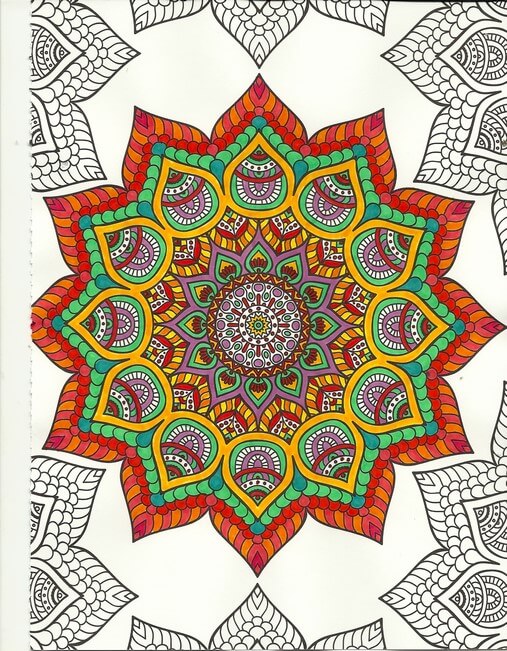
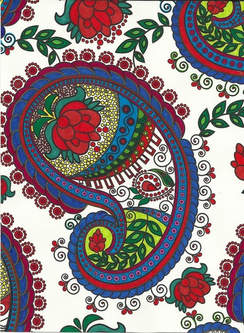
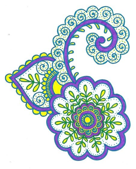
One of the things I’ve been playing with is amount of white space. You can see in the above that not everything is colored. Pus, I was trying to play around with oranges and color combinations, like mixing colors that are close together. I love the way the turquoise is accented. No point in doing the edges – I was concentrating on the center – which is an interesting move for me – to just let things “be” without having to “finish” everything.
Again with the reds, oranges, purples, but I decided to add an unexpected color – my fiber work tends to lack strong focal points – so I added the blue – makes the piece. I also rotated the scan because the “bottom” was too heavy when on the “top.”
Here’s where I figured I really need to spend some time with colored pencils, especially when I can do shading – which I love doing with regular pencil. And again the oranges and reds.
I left white space with this, and I discontinued finishing the design – it was getting too busy. Here’s where I kept hearing Tim Gunn’s voice to “edit.” The yellow in here really glows.
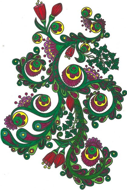
 This was playing around with oranges and blues – a combination I am starting to like a lot. Lots of white space, and I used the designs on the edges to play with color combinations. The lower right looked too much like a super-hero costume for me……
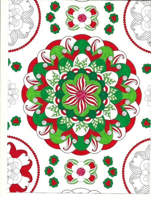
Christmas colors – meh. These were better than some I tried. The colors – for me – need to be true, but I am happier with mottled shades of reds and greens.
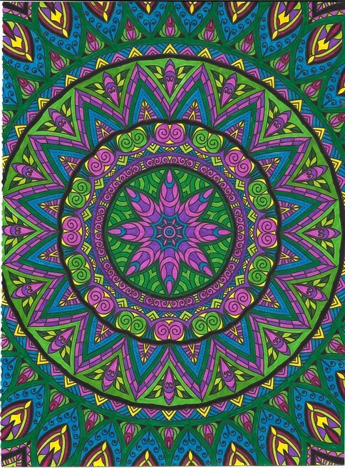
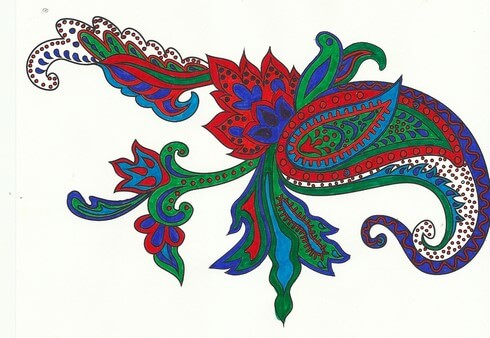
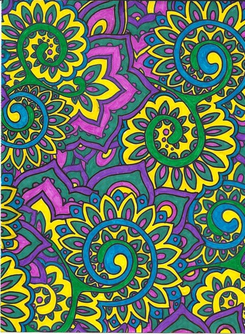
Interesting as I was working with what colors glowed – the yellows, but especially the purples in the center. I also discovered differences in black – flat and shiny, which I should know because of all the black fabrics out there. Overall a fun design, but it bugs me that the books consistently cut off complete designs.
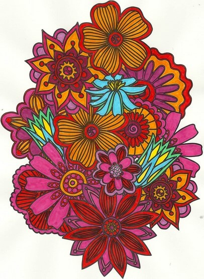
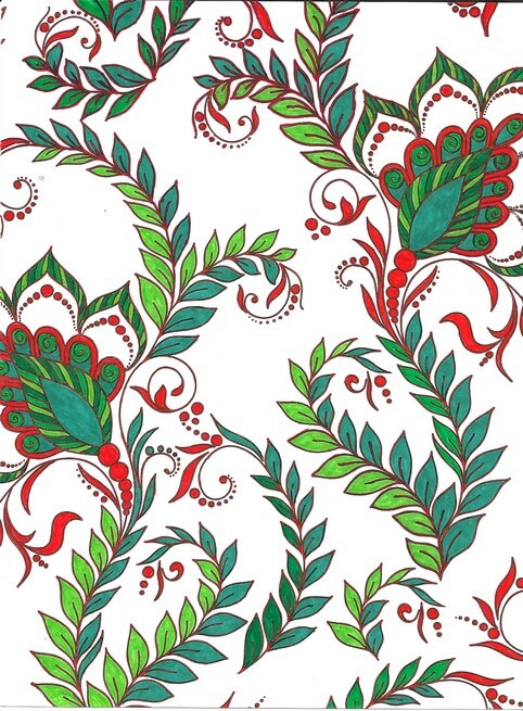
Blues, reds, greens and white space. I am finding not everything needs to be colored. I find this quite pleasing.
Love the delicacy of this one. Even though the design is completely filled in, there is an airiness to it.
Same for this design – and I really like the colors – very vibrant.
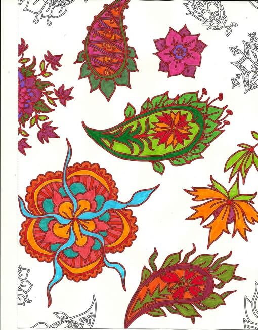
Again oranges and greens – would make a great wall paper.
Nice and lacy – I like incorporating some of the zentangle motifs when I feel there is too much white space.
The original dominant color here was going to be the pink-purple, but yellow won out. Interesting to me how that happens.
Really need to spend some time with colored pencils, but I SO like the intense color of markers. Like I said before, surprising for me, since they are so unforgiving.
I definitely can see some of the effects of the coloring in the most recent fiber work – more on that to follow.
Suggestions Needed
So I have unearthed a bunch of UFOs in going through one of the containers in the studio. One is up on Facebook, free to a good home for the cost of postage. A couple of them, I need suggestions for what I can do for the quilting. Plus, if you recognize that you made the item, please let me know so I can credit you – it’s been a long time since they were sent to us.
Here’s the first.
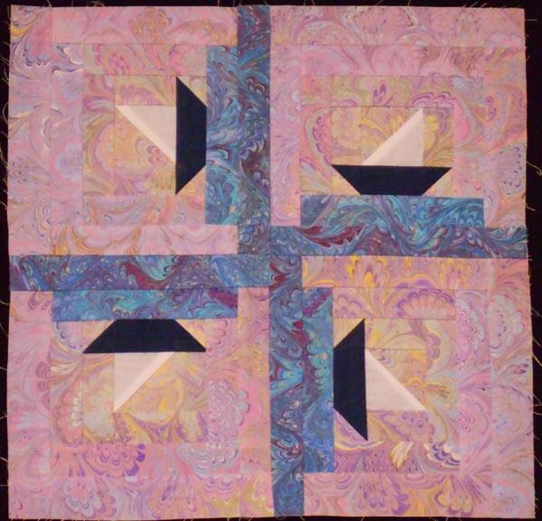
Log Cabin Sampler
This was done for us as a way to use marbled fabric in a traditional block. Now I need suggestions on the quilting. I want to use it as a sampler in my fmq classes. I was thinking of outlining the blue marbling for the waves and then doing something with partial circles around the sunrise/sunset….Ideas?
Here’s number two.
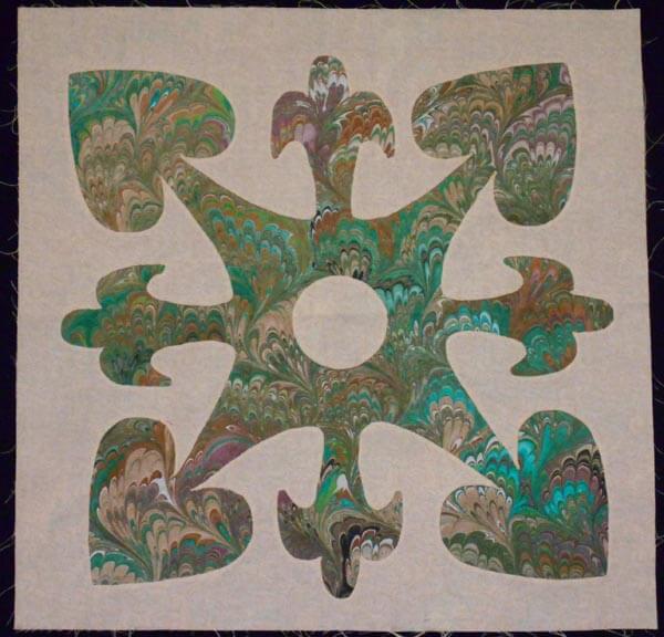
Reverse Applique
This is reverse applique, and I can treat it as a Hawaiian block with outlining, but I’m wondering if there is something else. All suggestions welcome!!
Thoughts of NOLA – for Cousin Barb, Victoria, and Anne
This is my blog post for the “carnival” theme for Art Quilts Around the World.
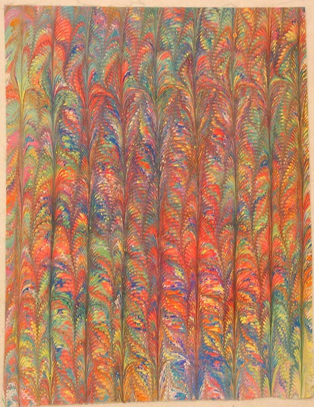
I spent a lot of time thinking about this piece. I made the fabric the beginning of January, and so it sat until two weeks ago. I had an idea of what I wanted to do – free motion along the design. Here’s the initial fabric.
In the past when I have quilted through the design on the marbled fabric, I always have been really pleased with the results. This time not so much. I evidently have learned a huge amount about focal points and movement within a piece. I did two quilting motifs; the first one was a basic outline to enhance the flow of the marbled pattern.
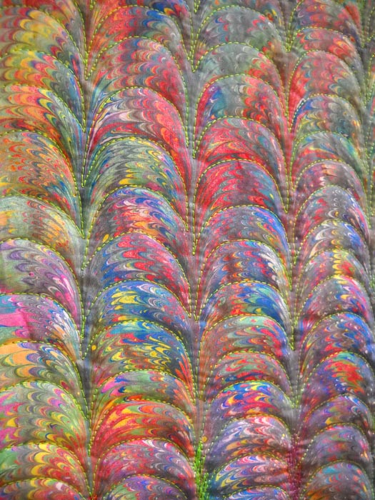
I liked this, bit I realized it needed more definition. It seemed boring. So I tried increasing the quilting around the nonpareil portion of the pattern.
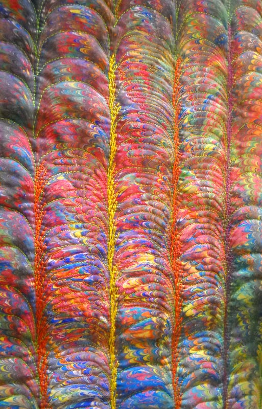
Once that was completed, I was even more dissatisfied, so I tried a bit of a free motion “feather” along side each part of the pattern. DID. NOT. LIKE. IT.
So it sat for a week while I pondered, talked it over with hubby, and tried to think it through. I guess that’s why it’s called a challenge, which I definitely need to push me further. So I decided I would need to cut it up…………..which I’ve never done before…………………….
It automatically started looking a lot more interesting. I finished the pattern pieces and liked the finished result.
I then had to think about how it was going to go together. I had all these separate pieces and had to think how to best connect them and make it an element of the overall design. At this point it seems kind of like a stained glass window, so I auditioned thin fabric strips for the leading. I figured I could use fusible on the back of the strips. Not a single color worked. Every strip looked like it had just been stuck there and wasn’t an integrated part of the design.
I have always liked the effect of satin stitch, so I tried a bit on a piece of left-over quilting. Dark green Superior Brites gave it just what I needed. Fitting the pieces together was a bit of a challenge, but…..all those years of watching This Old House made me realize I could scribe the pieces to get the circle measurement for the center. I outlined all the sating stitch and border with some Superior Razzle Dazzle, trying out some bobbin work for the first time. It definitely sparkles in the sun.
And – best part – the piece now had a story to it. I have always imagined that Mardi Gras was one long assault on color, looking out a hotel window at all the revelers. I thought of my Cousin Barbara Jean, who as a first responder was taking care of others during Katrina and had to start over herself. Two of my cyber friends, Victoria and Anne, have very fond memories of New Orleans, and I thought of them as I finished this off. From these three folks, I hope I have some idea of the carnival aspect of Mardi Gras. Cousin Barb, this is for you.
Thoughts of NOLA – for Cousin Barb, Victoria, and Anne
TAFA Eye Candy – Part 5
![]() I have so enjoyed doing these posts each week. I get so inspired by color and design from the over 450 artists on the TAFA list…..and I’ve only been through 20 artists! And now, Rachel, our list mom and guiding light, has taken photos from us and set up a TAFA gift store on Zazzle. Gorgeous stuff!! More items going up all the time.
I have so enjoyed doing these posts each week. I get so inspired by color and design from the over 450 artists on the TAFA list…..and I’ve only been through 20 artists! And now, Rachel, our list mom and guiding light, has taken photos from us and set up a TAFA gift store on Zazzle. Gorgeous stuff!! More items going up all the time.

And now some more artists…..
 “The mission of Zeni Design Studios is to create simple designs using luxurious and sometimes unexpected combinations of textiles that my customer will enjoy for many years to come. As a result, all of my designs have the customer in mind throughout the design and fabrication process. Environmental Commitment – In an ongoing desire to respect the environment, when available, organic, up-cycled, environmentally friendly and socially responsible materials are used. ” Zeni Design Studios
 “The Yeiser Art Center, founded 1957, is a non-profit visual arts gallery located in the historic Market House in downtown Paducah, Kentucky. Exhibitions and events organized by the Yeiser are designed to serve citizens of and visitors to our region and feature quality works by established and emerging artists. Our permanent collection, exhibited periodically, is at the core of our educational mission to provide a variety of visual arts experiences to students of all ages.” Yeiser Art Center This is a must-visit for our trip east next summer!
 “I’ve been tatting over 30 years, and designing and selling tatted jewelry since 2004. Magazine articles featuring my tatted jewelry have appeared in Bead&Button (April 2012) and Belle Armoire Jewelry (Winter 2009). I am the author of the book Tatted Jewelry published 2011 by Annie’s Attic, as well as 2 self-published books: Up and Tat ‘Em (2010) and Boutique Tatting (2008). I teach an online Shuttle Tatting course at http://www.craftsy.com/shuttletatting and hope to help many people learn to tat. ” Yarn Player
 “Inese Liepina graduated from the School of the Art Institute of Chicago with a Bachelor of Fine Arts degree in 1980. Inese relished her years at SAIC and attempted to learn techniques in as many disciplines as possible. Majors were in fiber/fabrics and ceramic sculpture. Inese has explored glass blowing since 1991 while working as a fashion, textile, and interior designer. In the late 70’s SAIC emphasized originality along with an mentality of “breaking the rules” in art. This influence follows Inese in all her work, and she studied glassblowing technique only to learn how the rules can be broken to fit her ideas. ” Wrapture by Inese
 “Like so many others, I was brave and comfortable with my creativity when I was younger, but misplaced that understanding as I became an adult. A diagnosis of cancer re-ignited my passion through a wonderful program called Art as Medicine, offered by the Cross Cancer Institute to patients, health care professionals, and their supporting friends and family. I once was a professional musician, and have re-discovered my love of singing through the vocal music program, but also my love of creating things with my hands. I am very involved now in building a cancer wellness and support facility called Wellspring Edmonton that will supplement our overburdened cancer care system, and where I hope to help others touched by cancer to express their feelings through arts-based programs. ” Wooly Boulevard
Enjoy! More next week……