Posts Tagged ‘design’
“Experimenting with Textiles”
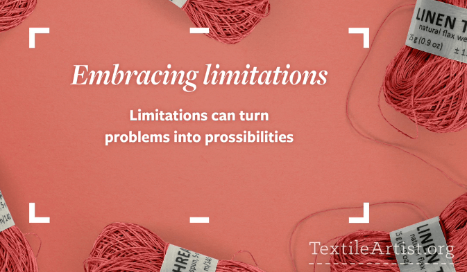
I am currently (like right now) watching a video from the fellows who bring you textileartist.org. I’ve subscribed for several years, and they are introducing a series of videos on finding your voice with your textiles. So far, 11 minutes into the video, I can see the various paths I have taken and why I had problems with them.

First, early on in working with stitching on marbled fabrics, I felt intimidated by mo own machine quilting skills, and I felt like I needed to do a huge amount of practice on smaller pieces before I came to the bigger works I wanted to do. A cyber friend kindly said to me – do the work you want and the skills will follow….and so they did. I started weaving strips of marbled fabric after I machine-quilted them, and I didn’t look back.
Second, I’ve always experimented with lots of techniques – marbling happened to be the latest one (embroidery, knitting, crocheting, painting), but the marbling hooked and and hubby. Now I have a body of work that utilizes marbled fabric and new means of quilting and embellishing. I picked up bead work only in the sense it could add to the overall design.
Lots of ups and downs in learning and trying to determine a niche for ourselves, as well as work within limitations of what we could afford. I finally decided that what other marblers do is fine – so is our work in its own unique way. I didn’t want to marble paper – I wanted fabric – first limitation, and we made it work. We perfected our style on white fabric – very unforgiving – a second limitation.

How can I push the boundaries of the basics? Hubby and I laugh about what I have him end of trying to marble – “pushing” to do ribbon, silk flowers, canvas…all because I don’t want to waste paint in the marbling tray. Lots of additional projects opened up, mostly with embellishing what we were already creating. Any new techniques were pursued in how they could expand our marbled fiber art.
Making marbled art is expensive – a pound of carrageenan is about $50.00 now. So because of our extremely limited financial capabilities we had to work within a very tight budget – and we succeeded. Looking at a display of our work several months ago, both of us marveled at what we were able to create with so little resources.
Embracing what we can do on our limited budget led me to learn how to manipulate my 1008 Bernina workhorse sewing machine to do what I wanted it to do. Yes, I miss “needle down” and variable speed….but my skill with this basic machine has led me to teach very successful machine quilting classes to folks who think they can’t machine quilt unless they have a long-arm or other fancy sit-down machine.
In terms of skill level, I am completely self-taught, with only one marbling class from a master (Galen Berry). Everything else has been trial and error….no color theory of design, so I started with putting everything with black fabric. Hubby has the color sense, and I slowly came around to improving mine. Now I can put marbled fabrics with a range of other colors and designs. I attended a workshop with Tony Conner, water colorist extraordinaire, who talked us through a painting he created. It was like a design class with a master, listening to him talk through his decisions. I kept referring to pieces I was working on to see that I was naturally doing some of the design elements. I was trusting my “eye” and myself.
You owe it to yourself to watch the first of these videos – maybe you are new to the idea of limitations. We had natural limitations through finances imposed on us, and it led to who we are as artists now. Check out our web page to see our range of work. Find textileartist.org on Facebook and get your free video.
PS – no more pima cotton fabric, special order didn’t work because it was too light, so we “over-marbled”…and it’s good to go…..making due with a limitation……
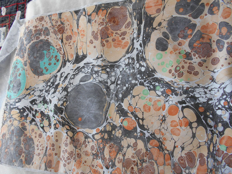
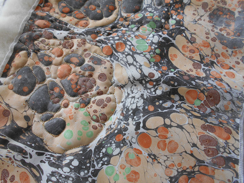
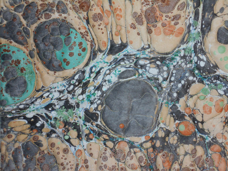
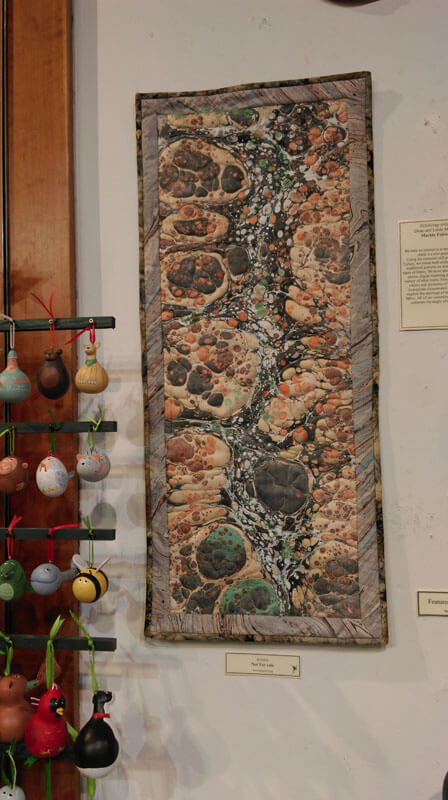
Art in 2016 – Part 6 in Review – More Small Works
 There were a lot of other small items completed – some UFO’s and some brand new. The small piece at the left (24 0nches square) was an OLD top from many years ago – part of a pattern kit for customers using marbled fabrics. The quilt top had some serious rolls of fabric where the iron (and the user…) had pressed wrong. So I to0k out all the stitches, fixed it, made the sandwich, and then requilted it with my practiced free motion skills. A lot of new patterns from Lori Kennedy’s The Inbox Jaunt – she has amazing tutorials.
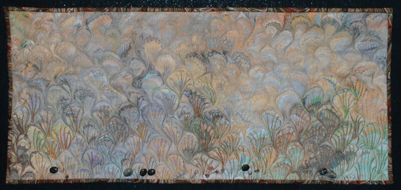
Then there were pieces where I looked through pieces of marbled fabric we had saved and waited for one to speak to me. A lot of them did in the course of the year. “Sonoran Desert” was one of those. this was done on white denim, and it was a pattern I’ve not quilted before – but it spoke to me of the saguaros of the Sonoran Desert.
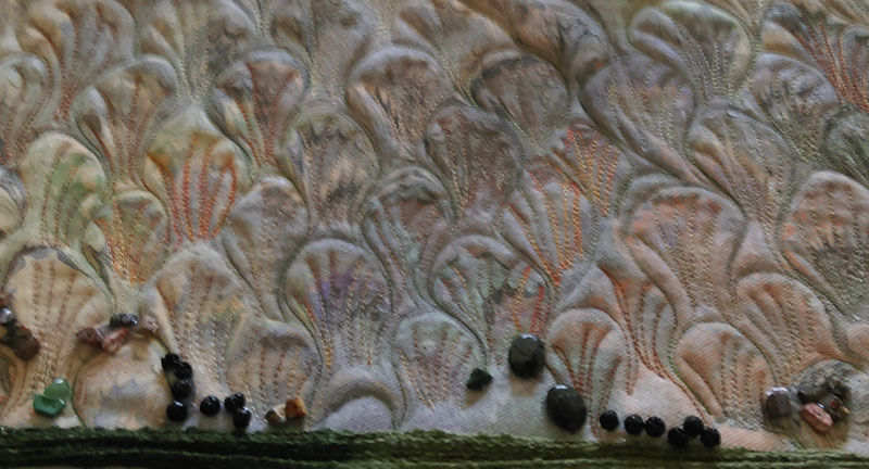 Didn’t like this binding – too sloppy to control, so did a regular fabric binding. It hung in our library show and now has a new home with a woman who lived in Tucson for a number of years. Added a few semi-precious pieces of turquoise, agates and lava.
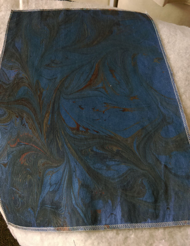
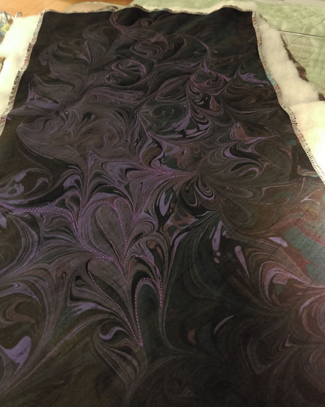
A friend keeps us supplied with all sorts of remnants of cottons, polys and silks. We used a couple to see if they would marble – and they did – spectacularly. One of them went immediately to our son in Seattle – he loved the dark colors – said they were “sexy.” The one he received was “Sliver of Moonlight.” First pic is of the plain marbled fabric, second is seeing the stitching. Unfortunely no final pic of it mounted.
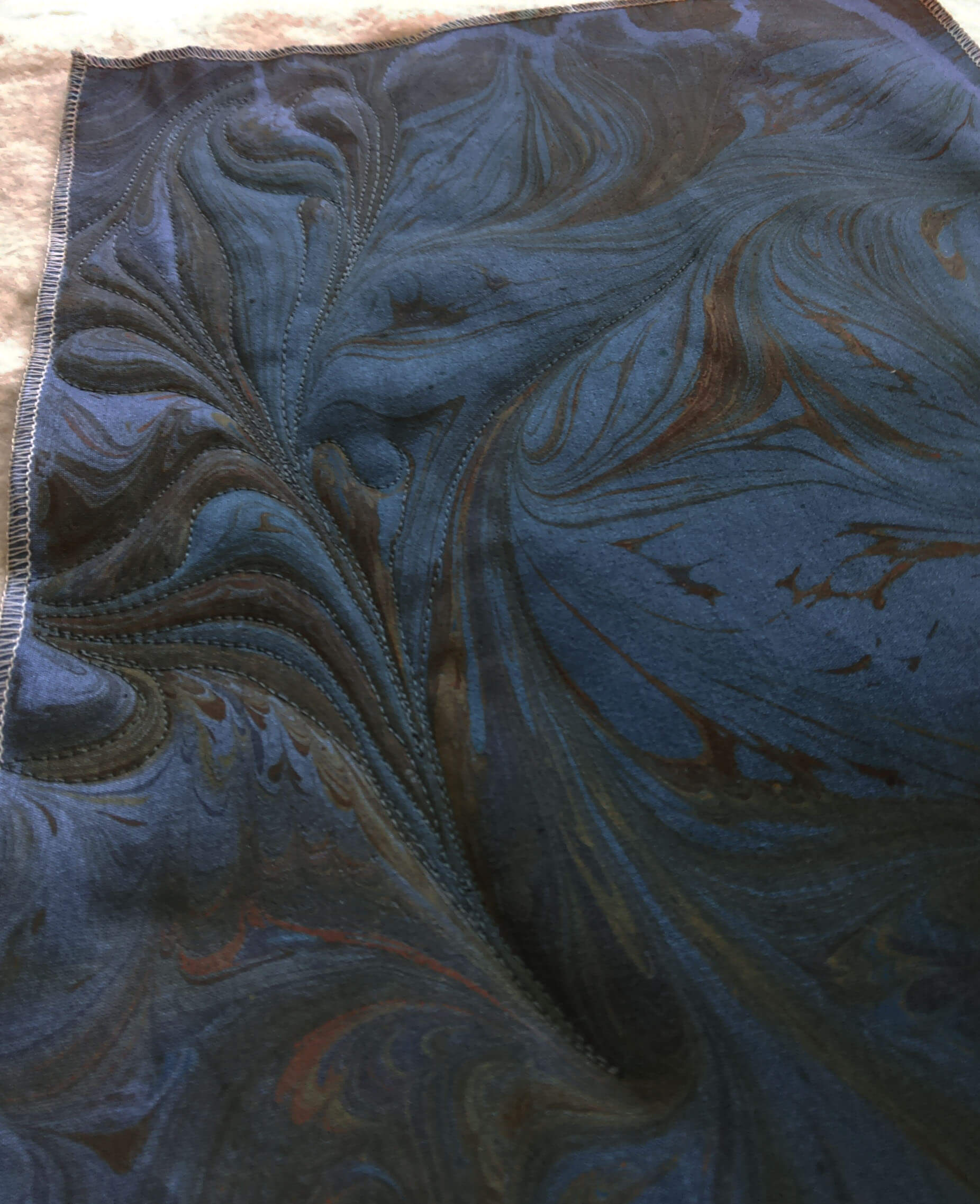
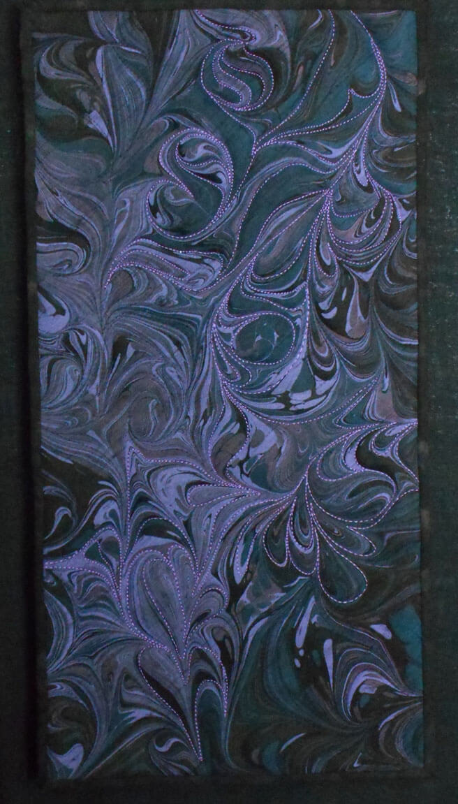
This one is same fabric – black poly-silk, and is called “Whispers in the Moonlight.”
 The finished piece is mounted on a canvas frame covered in black linen, and it “floats” about the frame.
There are more pieces, but I need to move on to new projects…..more on an upcoming sale we are having – next blog post!
hitting 1000 b logposts……
Art in 2016 – Part 4 Review – Classes and Shows…and a Book!
This was a big year for showing our work – many more options and acceptances than most of our time in Arizona. We taught a beginning marbling class at BluSeed Studios in Saranac Lake, NY, and in the process of chatting, we became part of their arts curriculum grant project. I’m really looking forward to this activity; I miss the days of working with The Kennedy Center to bring integrated arts into the classrooms in the Chittenden East School District in Vermont.A lot of great memories from the conferences, and then great memories from arts work within the district (need to do a blog post and reflect on the work we did….)

A couple of pictures from our Saranac Lake class, followed by an individual machine quilting class I did for a fellow artist who wanted to expand her techniques. Mary Hill is a mixed media artist, with vibrant work.

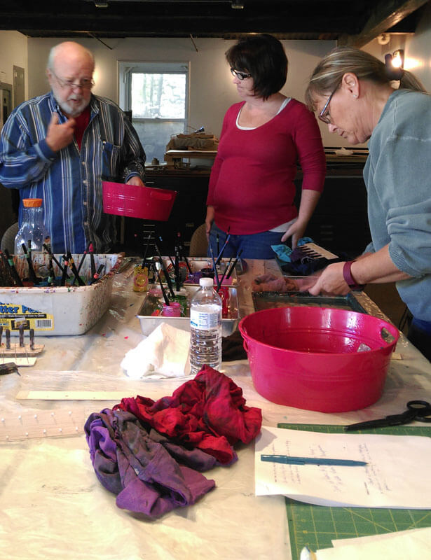

We spent Vermont Open Studios sharing space with Mary over Memorial Day Weekend. LOTSSof great discussions on marketing!!
It was a challenge to plan for what could take Mary’s already wonderful art to the next level.
 Mary Hill’s “experimenting as a result of our machine quilting class:
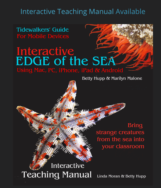
Plus, since May I have been working on an interactive teaching manual for the ebook Interactive Edge of the Sea. This takes all I have worked on in curriculum in 40 years of teaching and brings it together for teachers, with a modern update on using all forms of new assessment and social media within the classroom. My hope is that this manual becomes a template for other disciplines, as there are a lot of useful interactive teaching techniques – and everything is correlated to current educational standards. A labor of love with my second mom, Betty Hupp. Here’s the cover:
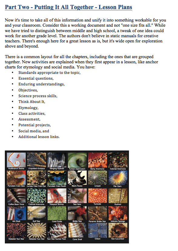
 A snippet of the lesson plan section….
We are just about done with final edits, and after the first of the year it heads off to coding. I have a lot of links to check to be sure they all work!
Bunches of shows…..here are pictures of our small pieces at Sweet Grass Gallery in Williston, VT for the month of November.
There’s still more…..stay tuned!
Art in 2016 – Part 3 Review – A Few Other Commissions
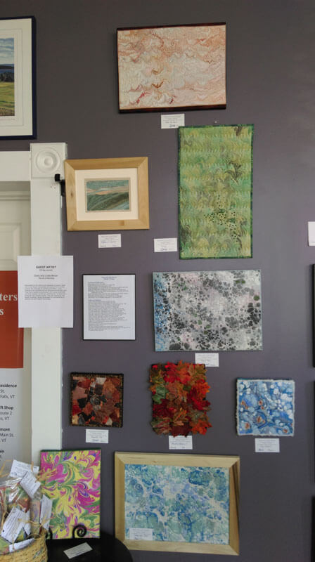
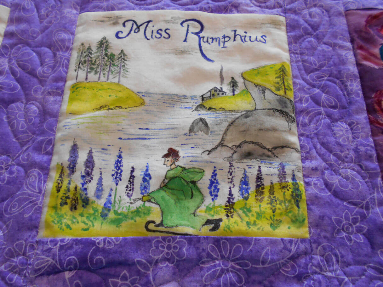
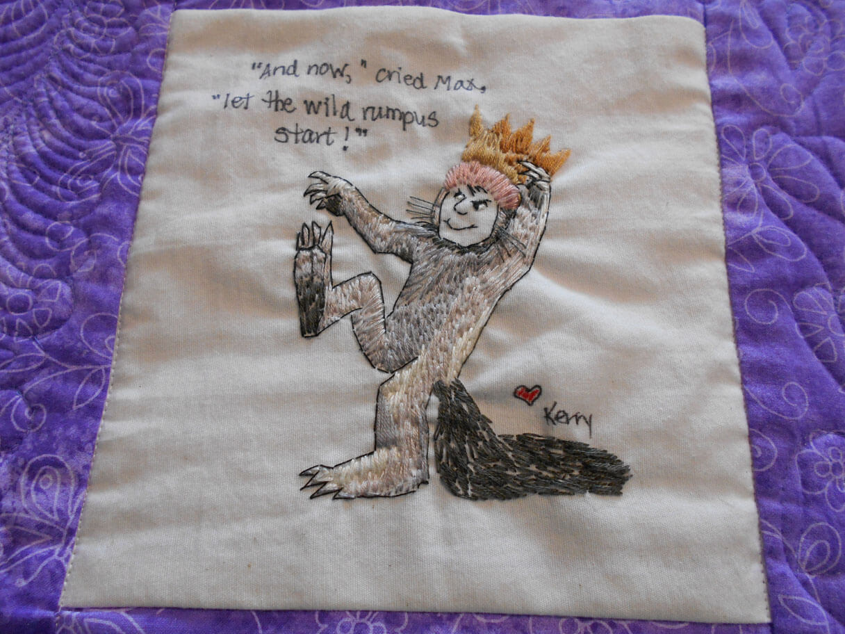
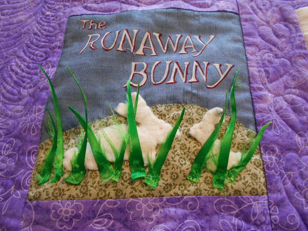
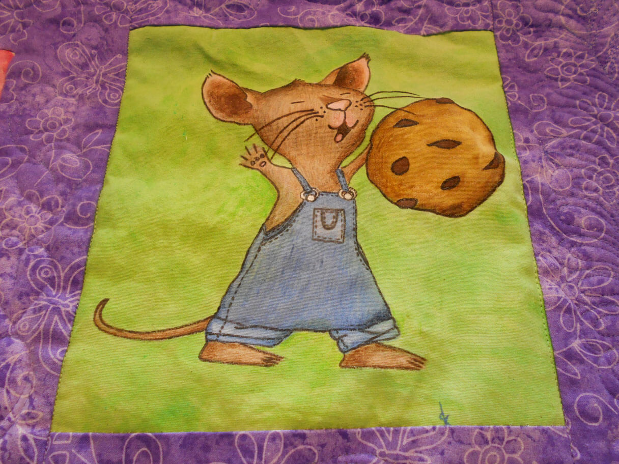
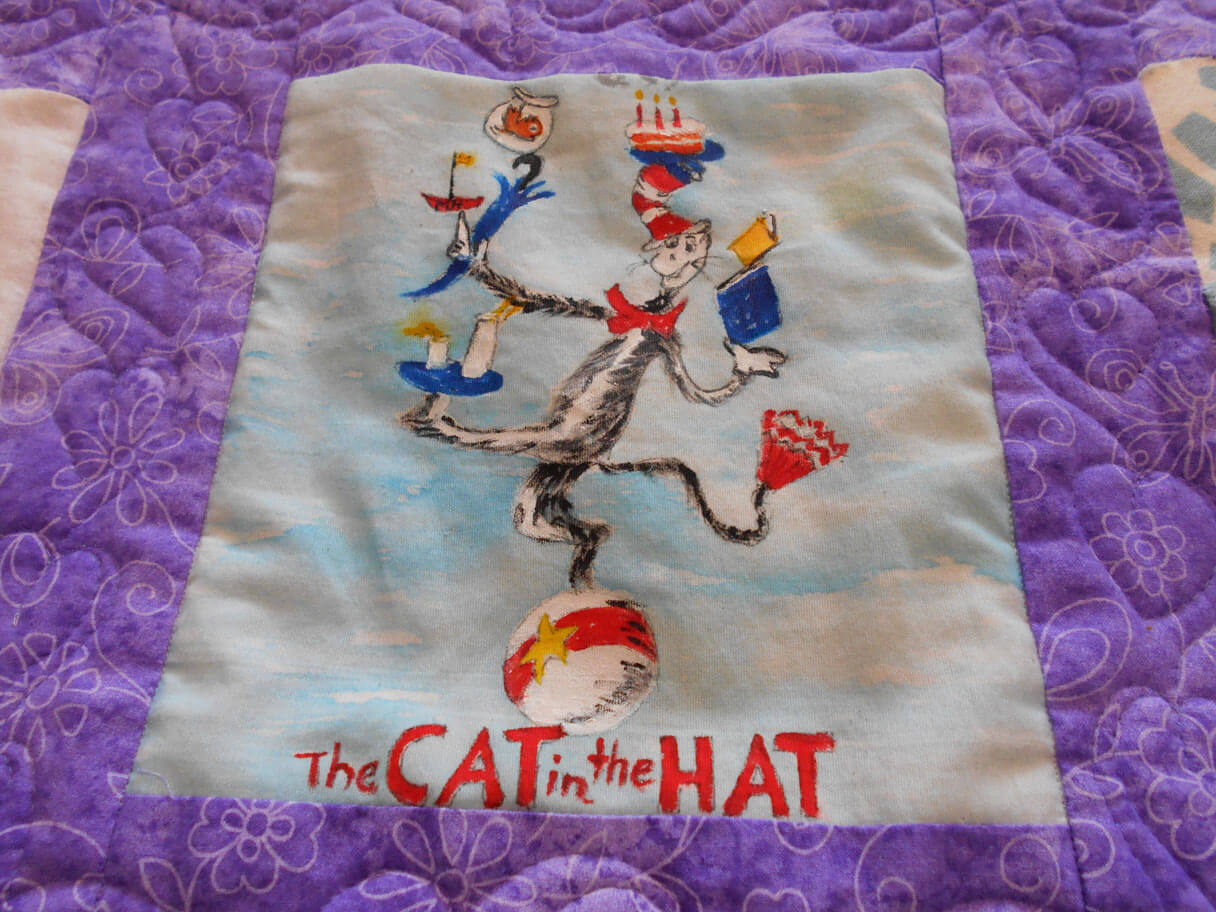
I was very involved this year in helping others create some wonderful fiber art. First up was a baby quilt for a teacher at a former school of mine. The teachers all created blocks based on children’s books, and then along with the baby quilt, gave the books to the new mom. It came out so cute!
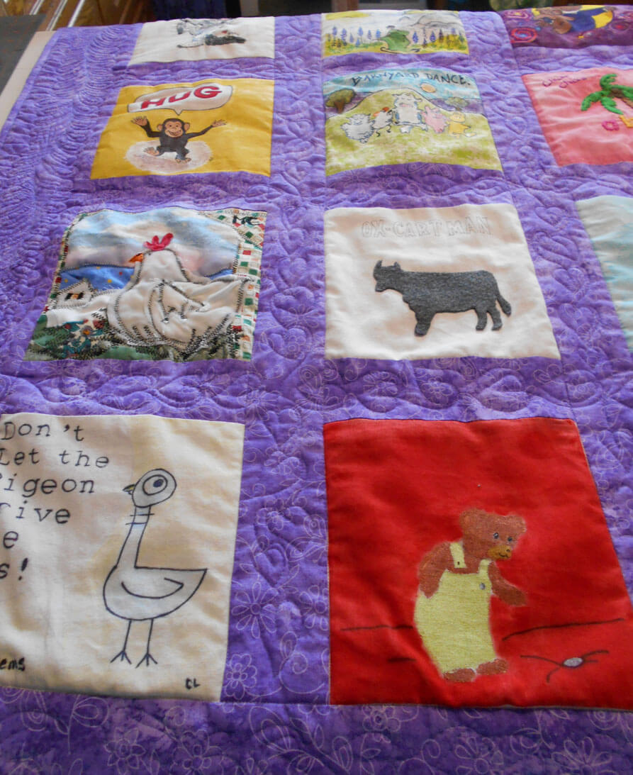
Children’s Book Baby Quilt
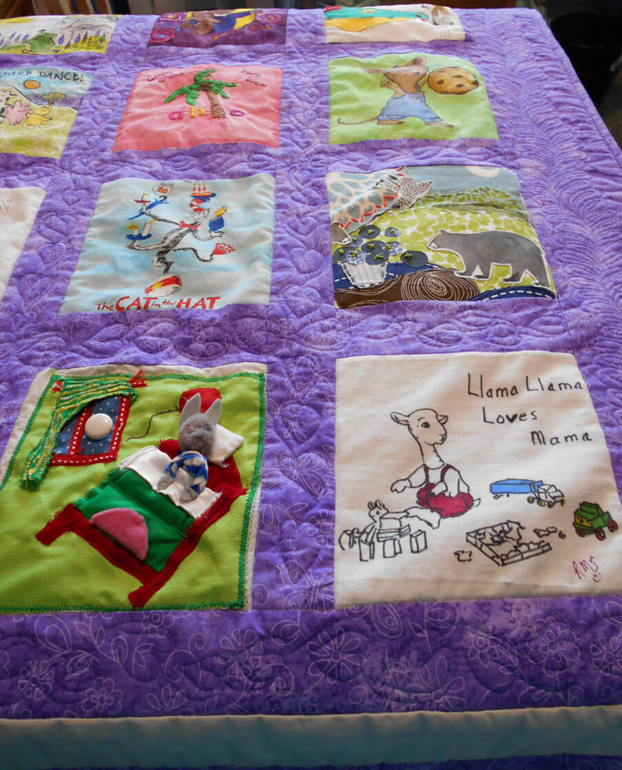
You can see the machine quilting – “leaves” for the pages of books – the leave of a book……a lot of fun to quilt. Next time….stabilize the pieces before they are sewn into blocks….
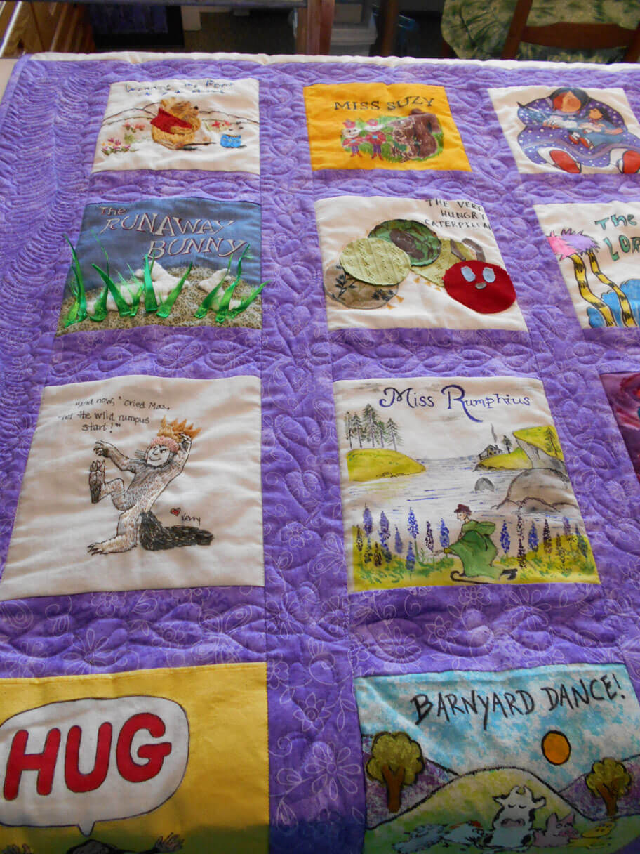
How many books can you identify?
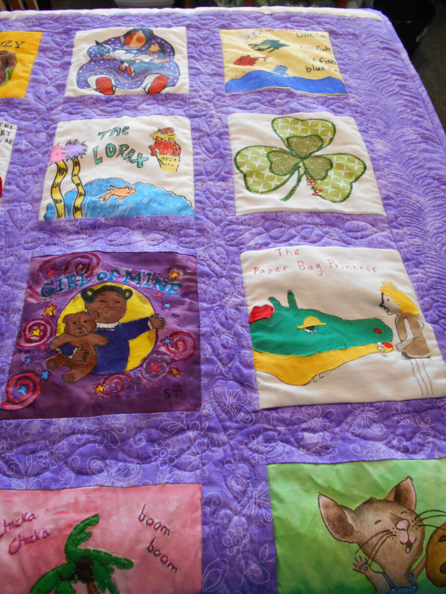
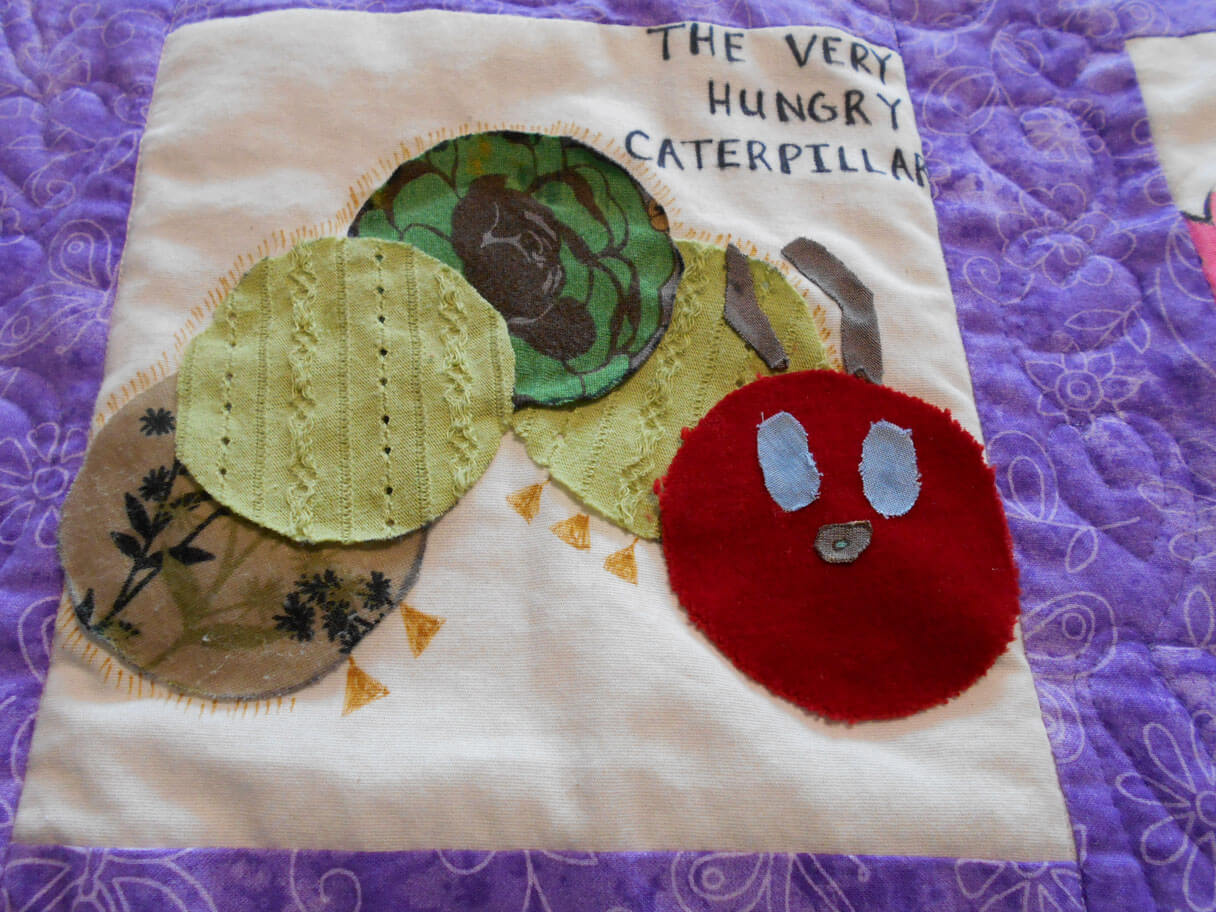
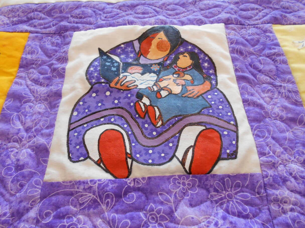
LOVE Patricia Pallaco!
Two more baby quilts scheduled for the new year….prolific bunch at Camels Hump Middle School!
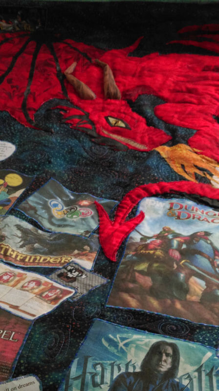
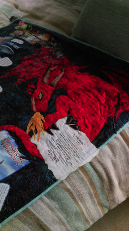
A good friend made a “science fiction” quilt for her son – a gamer, doctoral student, and avid reader. It was SO MUCH fun helping in the process, from using spray basting, to zigzagging quotes, to creating the dragon (a “must-have in this quilt). It hangs from a curtain rod that is very “Lord of the Rings” in design. I was responsible for the machine quilting of dozens of galaxies within the quilt. The dragon has a lot of marbled fabric within it, and it works so well! Kathy did an amazing job. Teeth, flame, wings, and horns all crafted from marbled fabrics. Hubby Dave did the design for the pattern, Kathy did the contruction with vinyl and a few other fabrics.
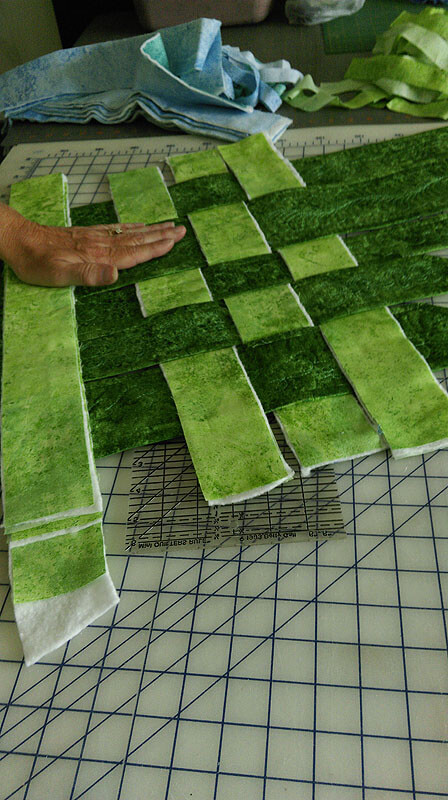
 The last heavy sewing/quilting happened when my friend Kathy wanted to recreate a marbled wall hanging of ours that one of her daughters loved. Sure…..to find she wanted it reversible…and a few other changes….
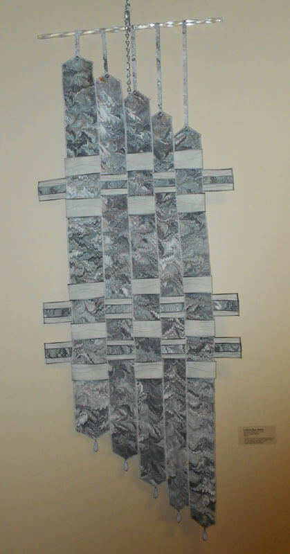


 The story of the original piece is here.
I don’t have any finished pics at this point – just an in-progress. Oh, did I forget to mention she wanted one for each daughter? Different colors for reversible? Different quilting patterns? It really was a lot of fun, and it challenged me to revisit a reversible binding….but I made Kathy do all the hand-stitching……
A close-up of in-progress……
 Can’t wait for pictures of both the blues and the greens!
The year started with this commission: The Arroyo –
Starting stitching
Embellinging
On the wall at Frog Hollow Gallery
…and we’re not done for the year!!
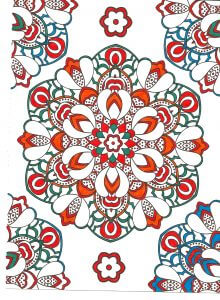
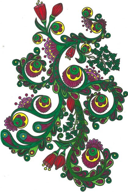
More Lessons from the Coloring Books – Part 1
Throughout all the stress of medical issues this winter and early spring, I resorted a lot to coloring at night – one BIG take-away from the coloring is that it controls my appetite….no small thing. But I’m learning something almost every piece I do. You can catch up with what I learned so far here.
So here are some pics – and lessons learned.
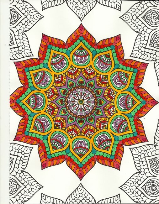
One of the things I’ve been playing with is amount of white space. You can see in the above that not everything is colored. Pus, I was trying to play around with oranges and color combinations, like mixing colors that are close together. I love the way the turquoise is accented. No point in doing the edges – I was concentrating on the center – which is an interesting move for me – to just let things “be” without having to “finish” everything.
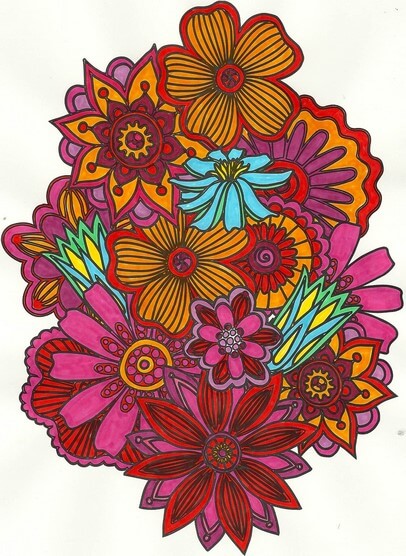
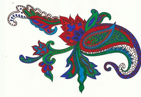
Again with the reds, oranges, purples, but I decided to add an unexpected color – my fiber work tends to lack strong focal points – so I added the blue – makes the piece. I also rotated the scan because the “bottom” was too heavy when on the “top.”
Here’s where I figured I really need to spend some time with colored pencils, especially when I can do shading – which I love doing with regular pencil. And again the oranges and reds.
I left white space with this, and I discontinued finishing the design – it was getting too busy. Here’s where I kept hearing Tim Gunn’s voice to “edit.” The yellow in here really glows.
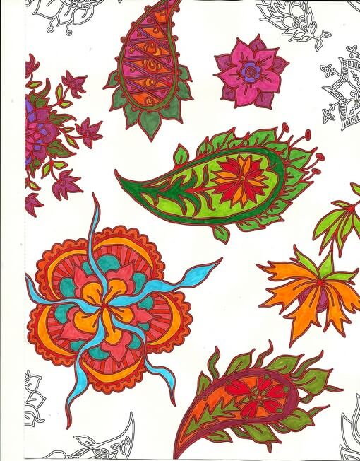
 This was playing around with oranges and blues – a combination I am starting to like a lot. Lots of white space, and I used the designs on the edges to play with color combinations. The lower right looked too much like a super-hero costume for me……
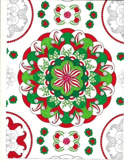
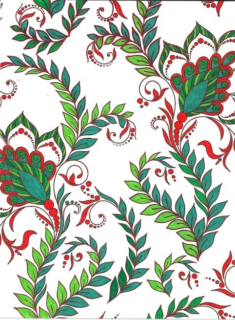
Christmas colors – meh. These were better than some I tried. The colors – for me – need to be true, but I am happier with mottled shades of reds and greens.
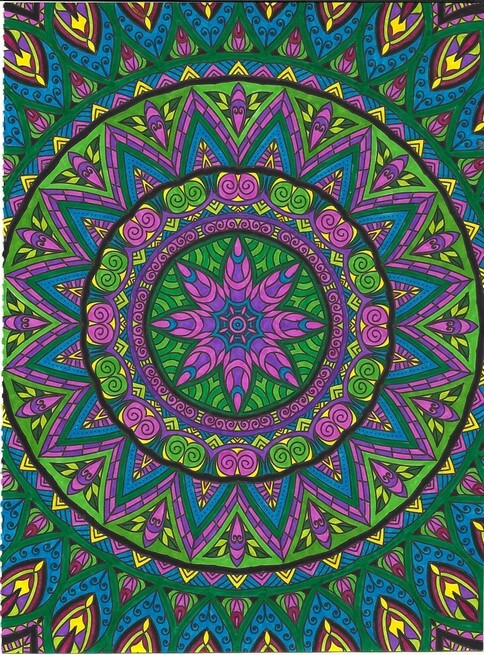
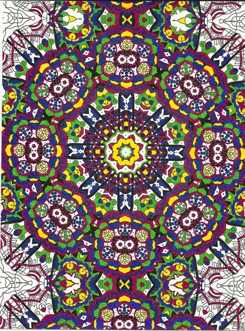
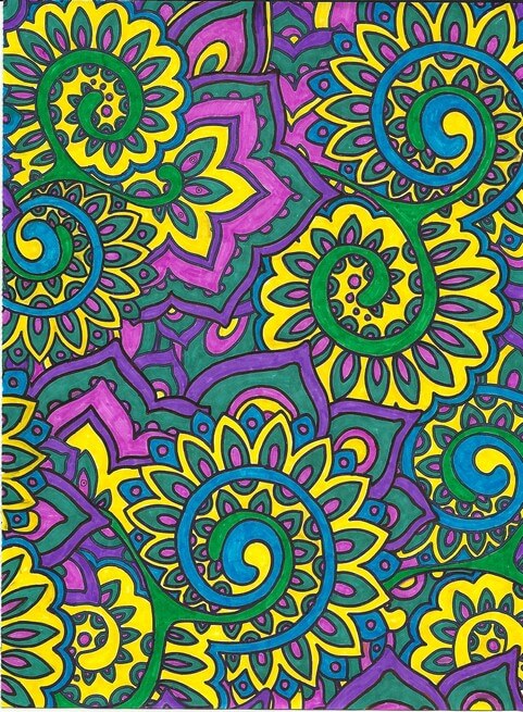
Interesting as I was working with what colors glowed – the yellows, but especially the purples in the center. I also discovered differences in black – flat and shiny, which I should know because of all the black fabrics out there. Overall a fun design, but it bugs me that the books consistently cut off complete designs.
Blues, reds, greens and white space. I am finding not everything needs to be colored. I find this quite pleasing.
Love the delicacy of this one. Even though the design is completely filled in, there is an airiness to it.
Same for this design – and I really like the colors – very vibrant.
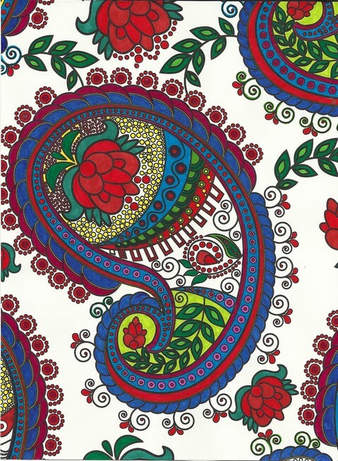
Again oranges and greens – would make a great wall paper.

Nice and lacy – I like incorporating some of the zentangle motifs when I feel there is too much white space.
The original dominant color here was going to be the pink-purple, but yellow won out. Interesting to me how that happens.
Really need to spend some time with colored pencils, but I SO like the intense color of markers. Like I said before, surprising for me, since they are so unforgiving.
I definitely can see some of the effects of the coloring in the most recent fiber work – more on that to follow.
Suggestions Needed

So I have unearthed a bunch of UFOs in going through one of the containers in the studio. One is up on Facebook, free to a good home for the cost of postage. A couple of them, I need suggestions for what I can do for the quilting. Plus, if you recognize that you made the item, please let me know so I can credit you – it’s been a long time since they were sent to us.
Here’s the first.
Log Cabin Sampler
This was done for us as a way to use marbled fabric in a traditional block. Now I need suggestions on the quilting. I want to use it as a sampler in my fmq classes. I was thinking of outlining the blue marbling for the waves and then doing something with partial circles around the sunrise/sunset….Ideas?
Here’s number two.
Reverse Applique
This is reverse applique, and I can treat it as a Hawaiian block with outlining, but I’m wondering if there is something else. All suggestions welcome!!
Top Ten Tuesday
![]()
Back again! I do love reading Letters of Note, and this is a gem from Mae West to the RAF, during WWII.

From the TED Blog comes this interesting explanation of how we get plugged in to the internet worldwide. Pictures show what it means to lay cable across oceans.

This next bothers me tremendously. From Scheiss Weekly, Mamacita talks about education in words and thoughts that I really love. Here’s her take on textbook publishers who have sanitized Anne Frank: The Diary of a Young Girl. Did you know that Prentice-Hall got actual permission from Anne herself to change her diary entries?

These are some amazing nature photos! Not all have attributions, but I love what the author of the page says – nothing better than nature porn….

I am finding some amazing nature shots and video through StumbleUpon. This one is A.MA.ZING. The Aurora…. I’m just including the link because it automatically plays the sound….
Here’s a great time-waster – and lots of design possibilities. First design when you go to the page….
 …and from there…..endless…..

Weave Silk – an integrative, magical silk artwork. Another time waster that is absolutely fascinating.

From Designer Daily comes “20 Awesome Examples of Street Art.”

From Alternative Reel – a great list of Top Ten categories for movies…..interesting browsing! Just a few of the categories…..

And finally...Rainbow Origami Street Art. Just cool.

I have just discovered the joys of StumbleUpon….check it out and sign up. Lots of amazing stuff! Till next week – send me links to really cool stuff on line!
Design Class Continued……
 I’ve fallen a bit behind in my class through Quilt University, but I got myself somewhat back on track these past two nights, and I am learning some fascinating things through these exercises. First, I would never have attempted going beyond a basic picture or design like this on my own. It’s a case of “I don’t know what I don’t know.” These exercises are really stretching me, and what’s coming out is definitely intriguing.
So here are the three basic pictures/sketches I have been working with and what has happened with them.


For this week I needed to take a basic design element and create a pattern with it on a grid. I chose a triangle for a sail, with a longer rectangle for a type of mast. As I was adding the pattern to the grid, I decided to flip the pattern, make some of different sizes, and make some small ones for depth in the distance.

It may not seem like much, but it was quite the departure from how I work, and I can definitely see possibilities with this sketch. From this point, we took a basic shape (again the triangle) and just worked on creating triangles. At one point I decided to fill in one of the triangles with a favorite zentangle, Paradox. It looked so cool, I decided to see what the sail pattern would look like. Again, definite possibilities.


I think there’s huge potential here.
Now here’s the second picture and sketch, a tree from Spanish Landing Park in San Diego.

 I worked with three different weights of pencils, and I really like this, plus as I work more with it, it is giving me some ideas for the driftwood piece. From here I sliced the piece in to strips and then wove them back into a new design. Very interesting activity.

I didn’t really care for this one, as I felt there was too much negative space.

This seemed better, and while I know I am supposed to concentrate just on creating designs, I find myself thinking about moving into fabric, and I have a hard time imagining how this would happen with this design.
Here;s the sketch and the picture for the third one.

 This time I tried a different technique: I sliced the sketch and then put it back together, with each slice up or down of the other pieces.


With this one I could definitely see the idea of reflecting water.
There is a lot more to this lesson, and I think tomorrow I am going to look at more of the photos I shot in San Diego and evaluate them according to the principles of art. Then maybe I will feel like I have a better idea of the terminology and can try some new sketches.
Continuing Lesson 1
 I have been ruminating on finishing this first lesson in my Quilt University class, especially since I am now a week behind due to our vacation in San Diego. But it was not wasted time, even though I never opened the sketch book. The exercises I had done at the beginning caused me to start looking at my surroundings in terms of line and shape, focal points, unusual camera angles, and textures. I ended up with a lot of unusual shots, just to remind myself of what caught my eye.
Last night I sat down with my selected pictures, tracing paper, and my sketchbook to see just what I could come up with. First, here’s the original picture, from sitting in Spanish Landing Park and admiring all the boats, and masts, and straight lines….and triangles……

I cropped the picture and then used tracing paper to get basic outlines. I am not comfortable sketching freehand with this activity – it kind of intimidated me at first.

What I liked about this was that I could definitely see the trapezoids, triangles, and straight lines. From here I tried a grid to repeat some design elements.

Not happy with this – not at all pleasing to me. Probably because the exercise itself is so new. So worried – like always in the past – about what this was going to look like. Then I went to my triangles and straight lines:
 This has got possibilities, but it would seriously need reworking. I might pick up tree color in the sails. Once again, I can see just how linear I am in the design….
From here I went to the photo of what hubby and I called “our tree” at Spanish Landing Park, since we sat next to it for three days. Here’s the original:

I ended up turning this on its side for the outline – something I NEVER do with a picture…..and I liked it!

I already could see some possibilities in this, and at this point I was kind of amazed at how my thinking was changing. In the past I had always looked at trying to work with the whole composition, instead of just pieces of it.
 Here’s the close-up, and as I was trying to add some texture, it occurred to me that all the lines were pretty much ovals…..the beginning of inspiration and a real change in my thinking, which led to this…..

I LOVE this! The linear part of me was going to do all the ovals equidistant apart, but I had trouble with that in the second line and I realized the wonkiness of the “in and out” of the line gave me even more texture. Then when I changed pencil hardness I was really hooked……which led to “Oh, my, I need more thread and yarns….” I think I’m on to something. Plus, this was so freeing. This process really works, and I can see working this activity much more.
So then I went to another photo:

This was taken in Balboa Park, the reflecting pools near the Botanical Gardens. LOVE these lily pads, especially the variegated leaves. Here’s the outline.

And here’s the close-up:
 I really like the shape of the lily pad, so I decided to use not-quite-regular circles. I ended up with this, and again, really happy with it. I already know what stitches I would use….and again, I need more thread…..

I have a couple of additional photos I want to do this exercise with, and I can see myself using it a lot. I had ideas come out that I wouldn’t have seen otherwise. Definite progress.
Second Design Photo Analysis
![]()
I worked with another photo last night, and I didn’t have nearly the success with adjustments and filters as I did with the first photo. Now I need to think through why that is so. Here’s the new photo – driftwood from Vashon Island in Puget Sound.

Well, crap….seems like I did it again in saving…or not saving. I need to remember to save everything as a psd file first to preserve the layers, and then save each piece individually. Okay, bottom line, nothing really spoke to me with the different adjustments, so I need to think through why that is so.
Is it because this is a fairly abstract image to begin with, mostly line and color? Perhaps that is why I am so fascinated with tree bark to begin with. The lines, shadows, differing colors to create the texture. And this picture, knowing it is driftwood, also reeks of a hidden history after being tossed in the water and then left high and dry. But how would I create some of that mystery?
What initially prompted me to take a picture of this? Probably all the smooth curved lines and the knot.

Looks like all kinds of interesting lichen within all those folds. The colors are so subtle, but at the same time I see a nice interplay of line and shadow.

I look at that knot and see a captured sea spirit. The more I look at this one, the more I am intrigued by it. The curves are so soft amidst all that hardness.
Now that I look at a couple of additional questions, I am stumped. Main idea? I like the thought of a captured sea spirit. Areas worth keeping? I can see leaving out everything else from these two crops. Other elements to add? No clue. But as I ponder, the first thought that comes to mind is to carry the lichen out into a border, and maybe the overall piece doesn’t need to be square or rectangular, maybe more oval so that the spirit seems encased and surrounded but is really still there. Don’t know if that is making sense….
How and where can more pizazz be added? Again, no clue. But…perhaps a lot of thread painting would be needed for surface texture.
I can see this going to sketches as the next step and seeing what develops from there. Comments?
Trying to Learn Something About Value…..

…that could also read “something OF value,” but I want to focus in on the issue of value and color in design….something I know I am really weak on. I’m choosing a couple of pics that I really like for design composition and playing around with Photoshop filters to see what they tell me about the composition. This is different from how I usually approach working with Photoshop….play around until I get something that says Wow. This time I’m looking at the elements of the picture and trying to see how they change and why I like – or don’t like – the design.
Here’s my first photo, taken in Jericho, Vermont two summers ago, at the Old Mill, which houses much of the history of hubby’s family.

I love everything about this picture: the greens, the mill red, the flowing water, the fact that I’ve got it composed in thirds. And you can’t see that right behind me is very busy Route 15. So what did I learn from this exercise?
Primarily I am much more aware of the basic lines in the composition. The lines don’t change, but the focal point does, depending on the filter or effect I used. There is one example that I would consider making up in cloth, as I find it intriguing, and I’ve never tried anything like that. The others are just interesting to analyze. Here goes:

I love black and white. After three weeks in Seattle this spring, I developed a whole new appreciation for shades of gray (no, not the book……). I want to take this photo and play around with a few sections of rock to see what I might be able to sketch.

This is the “sponge” filter, and it’s one I really like. Shadows and subtle colors really come out in this filter. Once again I am amazed at all the shades of green there are. There’s more shading in the mill, as opposed to the original, but the movement of the water is lost.

This is the “find edges” filter. Interesting to see where basic pieces of fabric would be. I think I can also see the dark, medium, and light of the photo.

Accented edges filter. More of a pattern to follow if I wanted to recreate this. I did a small cropping that I could see in a 12 x 12 piece. I’m liking the shadows.


This is the “patchwork” filter, and I could see making this up as a larger wall quilt. The filter allows you to make the squares larger or smaller, but I am really curious to see how this would work up in piecing. I need to print this out larger and use my little red rectangle and look at the values closer.

Well, I have managed to lose my original with all the filters listed on it, so c***. What I like about this above photo is the additional shading that is present in the rocks, and in the red portion of the mill. Lots more texture, and I could see using some colored pencils to enhance the fabric pieces.

I believe this is a watercolor filter, and I like it. I can see looking for specific fabrics for this piece, rather than trying to do lots of little pieces togather. I could see just cutting pattern pieces and fusing them into place. I like the softness.

Palette knife, I think. I like the general clumps of color, and as I reflect on this, I could see making this into a small abstract. The image is still recognizable, and I like how you can see an actual pattern to follow in putting this together.

This is mosaic tiles, and I like the effect better than the patchwork photo above. I’d have to spend some time thinking about how to get the “grout” effect…..maybe a mottled gray color with texture in it as the background piece, and then the tiles cult at somewhat irregular edges so the grout shows through. I cropped a piece to see….


This is an inversion adjustment, and I like these because I always see something different when the colors are completely different. The yellow accents the shape of the edge of the mill in a way you don’t notice in the original photo. The rushing water doesn’t show up at all.

Forgot the adjustment, but the amount of purple really accents the amount of green in the original photo. And I like the way the shapes of the rocks are accented.

This is a red/yellow gradient, and I like playing around with gradients. Very other-worldly, but I don’t see taking this piece any further.

I saw some quilts a while back that were based on Joen Wolfrom’s color tool. People chose a color and then worked solely in the range of that color. Results were pretty dramatic. This is a color filter in a deep blue. I think I would print this out and take it fabric shopping and see just how well I could pick out various blues and other shades that have a blue cast to them.
That’s my first study, and I definitely need to do more of these. I feel like I have a better understanding of the composition of the original picture. Next up, my wrought iron photo….
Monday Marketing – Creating a Schedule

It’s Monday again….and it seems like all I did was read, look at emails, and set up buttons and the like. This is the “time-sucker.” So my goal for this blog post is to try and identify what needs to be done each week for marketing and set up a kind of calendar to work with.
This is what I’m dealing with: Ebay, Etsy, LinkedIn, Facebook, Twitter, Cafe Press, Zazzle, newsletters, a website, lynda.com, flickr, and a blog. I am trying to avoid doing all of this every day, because nothing else seems to get done. I’m brainstorming as I write, with the hope that by the time this post is done, I will have a plan.
Ebay: hubby handles almost all of this, including postal trips. But…if we are going to increase sales, we need more product, and I would like to help with the actual marbling. So…..marbling weekly. I do need to update the About Me page…..
Etsy: the bulk of the organization is done. But…I need to be adding product on a regular basis, which means I need to keep making things. It would be nice to have one new product up each week, if not more often. One of the goals this week is to add some of the major artwork (even though I don’t expect to sell it on Etsy, it is more exposure) on the site, as the pictures are redone. I want to continue with the circles marketing, which, if I have enough products, could be done every day – 15 minutes for this. Plus, I need to keep working…….
LinkedIn: profile is done, and I have registered for several groups for business. I have found already difficulty in keeping up with reading emails each day from the groups and have already deleted one group. This week I will determine which groups look to be the most advantageous. I also need to complete the setting up of a profile of artwork.
Facebook: I read this several times a day. I have a fan page which needs serious work, as well as Art From The Heart, which is to support healing art after the Tucson shootings in January. I have added FB buttons to my blog and this week to my website. I have read the Terms and looked at all the privacy settings. I also went through the photo stream stuff for FB and fixed photos for both the personal and fan page. I need to really think through what is going to happen with the Fan Page.
Twitter: I am finishing a class from lynda.com on using Facebook and Twitter for business, and I highly recommend the site. For #25 you can choose different trainings all available for a month at your schedule. I picked up all kinds of little tips, most of which have already been implemented. But….and this is a BIG but….the time for tweets and what to tweet. By syncing a lot of the programs, my blog appears on Twitter, FB, LinkedIn, my tweets appear in a couple of places. I don’t think I can go further with this – the tweet button is on the blog and soon to be on the website. This is one area that needs some serious scheduling. Since I use TweetDeck (which is free…), I can schedule and keep track of who’s following and what is getting retweeted. So…I’m going to use Sundays for scheduling business tweets for the week, and I will look through the twitter feed once a day to see if there’s some good stuff to retweet.
Cafe Press: I have a site, a free one, so I am limited as to the number of products I can put up. I haven’t looked at this in several months and it needs serious work. To have a store isn’t much money each month, and I could have a lot more products available, but the issue is marketing and driving people to the site. I have some great digital stuff already to go, and I need to start planning around the holidays, reading about marketing through Cafe Press, and so on.
Zazzle: Ditto for Cafe Press……both are not a high priority right now.
Newsletters: oy, it’s been months since a newsletter went out, and I have all these contacts where nothing is happening. I used Constant Contact last year for a few months, until I couldn’t keep up with the demands and school at the same time. I was happy with it, but disappointed that not many people actually read it. I need to go back to a newsletter and offerings at least once every three weeks, and more during the holiday seasons. I need to check out Mail Chimp, which is free, and I have heard people have good luck with it. I’ll try and make this a priority this week.
Website: Most of the changes to the website have been made by my wonderful web lady Suzan. I need to get a couple of buttons set up, and then do something about newsletters and contacts. I also have some pages to add on Digital Marbling (TN), and I need to evaluate “print on demand” for artwork. This is a “need to think about” topic…..
lynda.com: I have until Friday to finish my month of training. I still need to finish Twitter, and I want to get the html newsletter course done. I am not going to continue with Dreamweaver because it isn’t a priority.
Flickr: I have photos up, not all of them with copyrights, and there is a class on lynda.com if I have time. I’m not really sure what I want to do here….
And finally, my blog, Marbled Musings. I went a bunch of months with no new writing, and I’m at maybe three times a week. I need to get back to at least four times a week, and eventually every day. I have plenty to write about…and I need to stay up with my Google reader – as well as comment more on some of the posts. This is probably the biggest area for marketing that I have to schedule.
Weekly:
* Marbling fabric
* Work on Etsy products
* Sewing and other design
Mondays:
* Add Etsy product
* Add Etsy circle information
* Read newsletters from LinkedIn groups
* Read Twitter feed
* Blog post Monday Marketing
* Google reader and at least three comments
Tuesdays:
* Add Etsy circle information
* Read Twitter feed
* Blog post Top Ten Tuesday
* Google reader and at least three comments
Wednesdays:
* Add Etsy circle information
* Read newsletters from LinkedIn groups
* Read Twitter feed
* Blog Work in progress Wednesday
* Google reader and at least three comments
Thursday:
* Add Etsy circle information
* Read Twitter feed
* Blog – Thursday Thoughts
* Google reader and at least three comments
Fridays:
* Add Etsy circle information
* Read newsletters from LinkedIn groups
* Read Twitter feed
* Blog Photoshop Friday
* Google reader and at least three comments
Saturdays:
* Read Twitter feed
* Blog posting on Specials
* Google reader and at least three comments
Sundays:
* Read Twitter feed
* Schedule Tweets for the week (i.e. Etsy, Ebay…)
* Blog Sunday Stories
* Google reader and at least three comments
Goals for next week:
* FINISH LYNDA.COM
*Update “About Me” page on Ebay
* Update Etsy products, especially note cards
* Evaluate how calendar is working
* See if buttons are added to the website
* Decisions on what will happen with the Facebook Fan page
* Long-term thoughts – what to do with CafePress and Zazzle
* Read and decide about Mail Chimp for a newsletter
* Spend some time thinking about what the website still needs….
Okay, I think I have a handle on this…we’ll see next week as I evaluate how the week goes. And…I’m taking some online classes!
Thoughts??
Work in Progress Wednesday

It has been a productive week, and I have two new projects on the agenda, but first – my finished quilt from last week. This is waaayyyy better! It was originally done many moons ago as a marbled BOM, and I wanted the quilt, which I have always liked, to reflect the new skills I have. It’s from a block pattern from Judy Martin’s Around the Block.
 I’m calling it Monet’s Marbles, based on the mottled green fabric, which I bought years ago because it reminded me of Monet. I didn’t quilt anything in the stars, because I wanted them to stand out from the rest of the quilt. Here’s a close-up:
 This is one of the blocks from Judy Martin – the quilt has four and uses two different marbled fabrics.
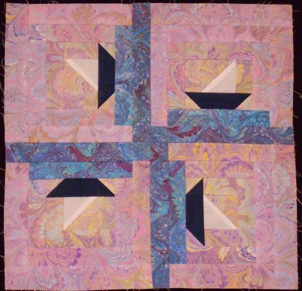
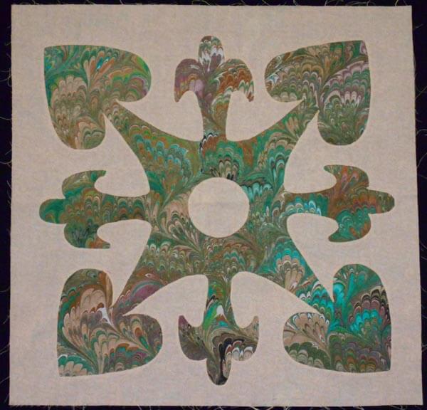
The next project is to finish up some small wall hangings for my second mom. She spent one winter in Vermont cutting out Hawaiian designs for a potential quilt – they never made it into a quilt, and I am trying to put them into something that Momcat can use. There is one major problem….these amazing blocks are all cut out of a heavy white polyester fabric…that ravels…………so I am using a lot of satin stitch, which also adds a slight bit of color to the blocks.
We decided on a black background to emphasize these wonderful patterns. I am hoping for one of the small wall hangings to be done for next Wednesday….we shall see…..


Many of these are original designs , and they are certainly a challenge in corners, heavy polyester, and satin stitch….but they will be gorgeous!
Brushes again…..
I had fun last night playing again with the brushes and trying to create different layers and link them – still need to work on that – need to reread the linking stuff. I’m getting better at adding the layers each time I try something new.
I am drawn to geometric shapes – I think in the analysis it’s because they “always look like something,” so I can’t really mess them up. I do need to scan and play with one of my own sketches, to see what I can do with the brushes. But – here’s the new work:

