Archive for the ‘Quilt University’ Category
In Retrospect – Year 2 of Retirement
I’ve been retired now for two years. Last year on the one-year anniversary I took a look at what I accomplished for the year. I was afraid of looking back on retirement and not seeing anything to show for it. So I tracked everything this year. The last four months have been pretty fallow, as I struggled with some personal issues, but I feel like I am finally reclaiming myself. All in all, I had a pretty productive year.
SAQA quilt submitted to major show
SAQA auction quilt submission
continued blogging
Tried out Tophatter, gave it up after some really obnoxious feedback from an a-hole, who actually burned my quilt
Newsletters for 10 out of 12 months
Wrote a dozen blogs for Handmadeology
Remade hubby’s blue quilt
Participated in the free motion quilting challenge through the end of the year
Yoga instruction throughout the year, including pretty regular daily practice
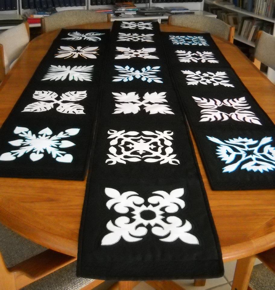
Completed two more table runners for Momma Betty
Completed Stepping Stones table runner
Completed “Clammin’,” a small art quilt up on Etsy
Completed pattern and two samples for the table runner pattern
Sold “DesertScapes”
Machine-quilted the Forest quilt
Machine-quilted two bed-stand table-toppers and one dresser scarf
Worked at stocking and marketing the Etsy store
Took a Quilt University class with Elizabeth Barton
Finished Spring Wall Hanging
Guest post on Craft Gossip
Finished makeover of small Christmas quilt
Pictures in Martha Stewart Weddings, Spring issue
Quilted Ali’s green picture
Participated in three challenges for Art Quilts Around the World
Took two Craftsy classes
Joined Galleribba online gallery
Potentialgallery representation starting fall 2013 in Tubac
Participated in StashFest again this year for the La Conner Quilt Museum
Submissions for three books, one accepted, the other as an ebook
Green and purple whole cloth quilts completed
Started commission of 7 quilted chakras, finished Root chakra
Completed two bed-stand table toppers and one long dresses scarf
Accepted into the juried Faculty/Staff art show for The Art Institute of Tucson
There are probably a couple more, but the mind has been kind of blank. It’s nice to have this list, so I know I accomplished a lot! Now I have to start the new one for year three.
Free Motion Quilting – a New Design
 Oh my, have I learned some new stuff! The Free Motion Quilting challenge, hosted by SewCalGal, had a bonus tutorial by Susan Brubaker Knapp that piqued my interest. Basically you can create your own quilting design from your pictures. Well, I kinda figured you could, but once I read through this, I knew exactly how to do it. Bingo! I had loads of pictures that I would be able to use. I was having trouble with the drawing of the pattern for the August challenge; I planned to use that design on one of our bed stand runners. Now I had a new idea.
Concurrently, I am working on my Quilt University class, Inspired to Design, with Elizabeth Barton. I was looking at one of the photos I had morphed into a new design and suddenly realized I had a free motion quilting pattern right in front of me. Here’s the original picture:

Here’s the design element I developed a little further:

I added more pads to the design, made my pattern, and traced parts of it to the cotton. I realized, after my arms started to ache from tracing, that this was very free-flowing, so I really didn’t need to trace any more. I went with a brighter green for the outlines of the pads. Sometime in July I watched The Quilt Show episode on Stupendous Stitches, and after that I took a serious look at the other stitches on my Bernina workhorse 1008. Not many to work with, but I had one that I thought would work to give the idea of a ragged edge to the lily pad. Then I used a variegated green to do the stitching in each pad. I used a monofilament to create water waves on the rest of the background. Here it is:

Lessons Learned:
The background fabric actually worked pretty well, as did the thread colors. I wouldn’t stack the lily pads as much the next time. The most important lesson for me was going back and studying the original photo and realizing I could do much more with the interior lines. I became much more aware of that element in the original picture. I also did my binding a little differently, since I managed to cut it a half inch too thin. I used one of the stitches of a wave on the machine and made it very small. I tacked the binding down by maching, and you can’t really tell unless you’re looking at it close up.
And speaking of close-ups, here is one of the pads:

For the purposes of the table runner and the learning, I’m done. Next time I would use more color within the pads, spread the pads out more, and probably add stems. Overall, I love it! Thank you, Susan and SewCalGal!!
Analyzing an Artist – Jacob Lawrence
 Part of Lesson 2 is to look at designs in terms of basic elements of art. I chose Jacob Lawrence, as I have always been drawn to his paintings, both for story and simplicity. I saw a retrospective of his work at the Museum of Art in Houston the year I went to Quilt Market. All of his WWII paintings were grouped together, so you really got the narrative of that work.
I am very much a novice at doing this kind of critique – I always feel hampered by the lack of any formal art training, but I am curious to know why something appeals to me. So here goes. These paintings are a selection from a blog post on The Ragged Cloth Cafe, by Jane Davila.

Jacob Lawrence, Ironing
Such a simple task and so lovely in composition. The vertical lines of the figures unify the painting, as do the irons. The lines of the irons are different, indicating the various stages of pressing. You can see the tension in each woman as she goes about her task, possibly as a result of the angles of the irons and the bent/angled heads in concentration. Balance and proportion: the irons seem very large, but they may be because I am looking at them from a modern perspective. I’ve never had to use heavy irons, and perhaps they were that big. The women dominate the painting, but I like that. This is “women’s work,” and that domination shows that. There is a lot of repetition in the postures, as well as in the background. I can almost get a “sweatshop” feel, and I get an image of the women from the movie The Help working and talking together. Perhaps the repetition helps to show community. Economy: again a simple task and a simple composition, but the focus is on the main idea. I can see the blue of the upper right pulling the eye to two of the ironed pieces; same for the orange and red in the upper left. The women themselves are dressed similarly, perhaps to indicate the uniform of the job. The more I look at this the more I see the strength and movement in the women, in their arms, the irons, their heads.
Now this next painting is one that doesn’t particularly appeal to me.

Jacob Lawrence, Barber
I find the colors very jarring, not at all harmonious. So many diagonals that my eye doesn’t want to rest at all. Again, a simple task at the barber shop, but there doesn’t seem to be the rhythm to the task as in the above painting. Unity/harmony: seems to be only in the main idea, that of a busy barbershop. Skin color is a unifying element. The faces seem to be the last thing you notice, just a few lighter lines. Interesting, in that may be a comment on the invisibility of the black community or the black man. Please note I am making that comment strictly from a white historical perspective. In terms of variety/tension, there certainly is a lot going on in this painting, indicating to me a very busy barber shop, and yet, now that I’ve noticed it, one man is smoking – that little bit of white draws your eye to the center of the painting. Balance/proportion: the piece seems very heavy on the bottom, big heavy dark triangles. The shampoo capes (for lack of a better term) are too many colors for my taste, and I think that’s what throws everything off for me.
Interesting exercise. I like having a selection of terms to work with, and I found I saw more in the painting the more I looked at it. But nothing beats seeing the work in person! What else can you add to the analyses? Comments welcome!
Design Class Continued……
 I’ve fallen a bit behind in my class through Quilt University, but I got myself somewhat back on track these past two nights, and I am learning some fascinating things through these exercises. First, I would never have attempted going beyond a basic picture or design like this on my own. It’s a case of “I don’t know what I don’t know.” These exercises are really stretching me, and what’s coming out is definitely intriguing.
So here are the three basic pictures/sketches I have been working with and what has happened with them.


For this week I needed to take a basic design element and create a pattern with it on a grid. I chose a triangle for a sail, with a longer rectangle for a type of mast. As I was adding the pattern to the grid, I decided to flip the pattern, make some of different sizes, and make some small ones for depth in the distance.

It may not seem like much, but it was quite the departure from how I work, and I can definitely see possibilities with this sketch. From this point, we took a basic shape (again the triangle) and just worked on creating triangles. At one point I decided to fill in one of the triangles with a favorite zentangle, Paradox. It looked so cool, I decided to see what the sail pattern would look like. Again, definite possibilities.


I think there’s huge potential here.
Now here’s the second picture and sketch, a tree from Spanish Landing Park in San Diego.

 I worked with three different weights of pencils, and I really like this, plus as I work more with it, it is giving me some ideas for the driftwood piece. From here I sliced the piece in to strips and then wove them back into a new design. Very interesting activity.

I didn’t really care for this one, as I felt there was too much negative space.

This seemed better, and while I know I am supposed to concentrate just on creating designs, I find myself thinking about moving into fabric, and I have a hard time imagining how this would happen with this design.
Here;s the sketch and the picture for the third one.

 This time I tried a different technique: I sliced the sketch and then put it back together, with each slice up or down of the other pieces.


With this one I could definitely see the idea of reflecting water.
There is a lot more to this lesson, and I think tomorrow I am going to look at more of the photos I shot in San Diego and evaluate them according to the principles of art. Then maybe I will feel like I have a better idea of the terminology and can try some new sketches.
Top Ten Tuesday
![]()
Slowly getting caught up on blogs, as well as working on a class at Quilt University. If you are interested in online learning in quilting and other fiber art techniques, check out QU. This is my 5th class with them, and I have been very pleased with every single class. I mostly focus on the design classes, and right now I’m doing a class on design with Elizabeth Barton, whose work I really like. Pretty great stats, wouldn’t you say?

I discovered a new photography blog, Sun Gazing. Great list of resources. Actually this is more a New Age site, and a lot of Buddha images, but the photography is amazing.

Look at this amazing photo!

Once again from the 365 Project, some glorious photography.

Oh My God, It’s Full of Stars by Alexis Birkell
I’ve just discovered Alison Schwabe’s blog, and this post on making samples was very good. One other blog has talked about stitching things out ahead in samples, and I think I’m looking at a new piece of my process. Should at least keep me from pulling out several inches of thread……

Readers of this blog know I love TED talks, and on the TED blog today is a list of the top 20 TED talks. There are a bunch here I haven’t seen, so I have some fun stuff to watch this week!
![]()
Discovered a new quilting blog this morning, with examples of some of the motifs being used for the 2014 Olympics in Sochi, Russia. Inspired patchwork! The blog is With Heart and Hands by Michele Bilyeu.

Animals Talking All in Caps is exactly what it says. Folks send in a picture with animals in it, and our moderator does a caption. Some are hysterical – well, most of them are. And some are very poignant.

I’M SORRY I KICKED DARREN IN THE FACE FOR CHEATING ON YOU.
I’m sorry I yelled at you for doing it. I was just startled.
HOOF TO GOD, I THINK HE DESERVED IT. YOU’RE A PRINCESS.
I love you, Shelly.
I LOVE YOU TOO.
Not every parent appreciates the pursuing of a liberal arts education, especially if it involves the classics. From Letters of Note is this letter to Ted Turner from his father, questioning his stupid quest to study Greek.

I love Vi Hart. She’s a recreational mathematician, and she teaches you stuff about math that is fun, simply through doodling. Here’s her latest video….warning – you need to concentrate!
And we’ll end with an interesting tidbit of history: Who Stole Helen Keller? How has history rewritten her story?
“Helen Keller worked throughout her long life to achieve social justice; she was an integral part of many social movements in the 20th century. Yet today, she is remembered chiefly as a child who overcame the obstacles of being deaf and blind largely through the efforts of her teacher, Annie Sullivan. While she may be hailed as a “hero” in lesson plans for today’s children, the books recount only a fraction of what makes Helen Keller heroic.”
Have a great week – let me know what you find on line that’s interesting!
Continuing Lesson 1
 I have been ruminating on finishing this first lesson in my Quilt University class, especially since I am now a week behind due to our vacation in San Diego. But it was not wasted time, even though I never opened the sketch book. The exercises I had done at the beginning caused me to start looking at my surroundings in terms of line and shape, focal points, unusual camera angles, and textures. I ended up with a lot of unusual shots, just to remind myself of what caught my eye.
Last night I sat down with my selected pictures, tracing paper, and my sketchbook to see just what I could come up with. First, here’s the original picture, from sitting in Spanish Landing Park and admiring all the boats, and masts, and straight lines….and triangles……

I cropped the picture and then used tracing paper to get basic outlines. I am not comfortable sketching freehand with this activity – it kind of intimidated me at first.

What I liked about this was that I could definitely see the trapezoids, triangles, and straight lines. From here I tried a grid to repeat some design elements.

Not happy with this – not at all pleasing to me. Probably because the exercise itself is so new. So worried – like always in the past – about what this was going to look like. Then I went to my triangles and straight lines:
 This has got possibilities, but it would seriously need reworking. I might pick up tree color in the sails. Once again, I can see just how linear I am in the design….
From here I went to the photo of what hubby and I called “our tree” at Spanish Landing Park, since we sat next to it for three days. Here’s the original:

I ended up turning this on its side for the outline – something I NEVER do with a picture…..and I liked it!

I already could see some possibilities in this, and at this point I was kind of amazed at how my thinking was changing. In the past I had always looked at trying to work with the whole composition, instead of just pieces of it.
 Here’s the close-up, and as I was trying to add some texture, it occurred to me that all the lines were pretty much ovals…..the beginning of inspiration and a real change in my thinking, which led to this…..

I LOVE this! The linear part of me was going to do all the ovals equidistant apart, but I had trouble with that in the second line and I realized the wonkiness of the “in and out” of the line gave me even more texture. Then when I changed pencil hardness I was really hooked……which led to “Oh, my, I need more thread and yarns….” I think I’m on to something. Plus, this was so freeing. This process really works, and I can see working this activity much more.
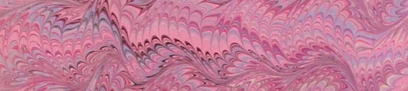
So then I went to another photo:

This was taken in Balboa Park, the reflecting pools near the Botanical Gardens. LOVE these lily pads, especially the variegated leaves. Here’s the outline.

And here’s the close-up:
 I really like the shape of the lily pad, so I decided to use not-quite-regular circles. I ended up with this, and again, really happy with it. I already know what stitches I would use….and again, I need more thread…..

I have a couple of additional photos I want to do this exercise with, and I can see myself using it a lot. I had ideas come out that I wouldn’t have seen otherwise. Definite progress.