Posts Tagged ‘adult coloring books’
Personal Color Studies
 Been house-sitting/parent sitting for the past week, with no real access to projects, so I pulled out the markers and coloring books – which I haven’t touched in over a year – that craze passed quickly! It kept me occupied through a bunch of hours of the Hallmark Channel…a refreshing change, but after three movies I realized I’ve written those plots before.
The “have to be perfect” part of me was busy at work until I said “WAIT! These are color studies, you are just playing, yada yada yada….” I still can get stuck (very easily, it seems) in a rut of criticism. So the first of my efforts is on the left. Once again I realize how much I can appreciate white space (literally)…and I got smacked in the face with a focal point – usually my trouble spot. My eye in this one went right to the light blue when all was finished. I had done all the small circles first, and then accented around them with yellow. Overall I am pleased with the various color combinations – trying out some other colors for a change.
Number 2 – two colors, although I started with the intent to do blues and oranges – a favorite combo from a year ago when I was playing. As you can see, I only used two and then STOPPED – I do have trouble knowing when I am at the end….Very Cat in the Hat effect, I think. I do like it. It was hard to stop and not add some other color – but I do find this pleasing, and that’s what this exercise was about….right??? “Of course, right!” (Nod to “Fiddler…”)
I was also pleased with the white space on this next one. In other colors – more subdued browns and golds – it would remind me of William Morris. As it is, would be a nice wall paper border – too much for a full wall!
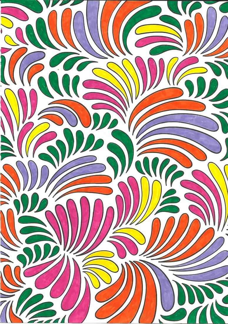
Interesting choice of colors on my part – I’m not really an orange/violet person, but I am really starting to like ORANGE – need more in my stash!!
Last piece – not finished but happy with where it was going. Biggest issue….I keep wanting to fill in some of the white space in the little pockets between the ribbons. I get into the “If I don’t like it, I’ve ruined it” mode, which makes no sense, since this is an exercise…..ah, how that inner critic can be so busy!!
Till next time when I don’t have other projects – no more color studies….except winter is coming….lots of time for activities away from the sewing machine be=ut still inside……
More Lessons from the Coloring Books – Part 1
Throughout all the stress of medical issues this winter and early spring, I resorted a lot to coloring at night – one BIG take-away from the coloring is that it controls my appetite….no small thing. But I’m learning something almost every piece I do. You can catch up with what I learned so far here.
So here are some pics – and lessons learned.
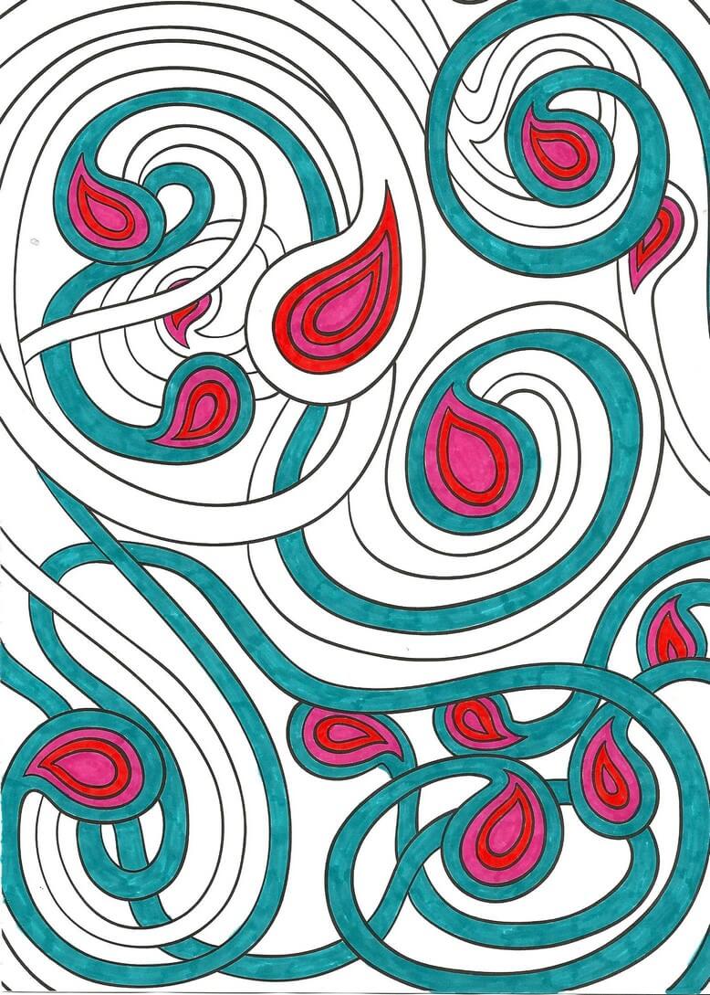
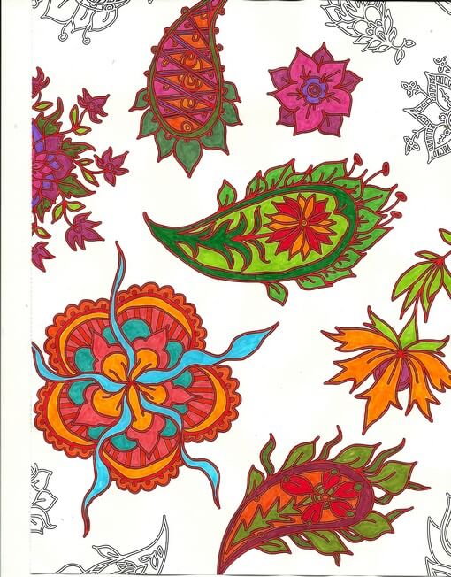
One of the things I’ve been playing with is amount of white space. You can see in the above that not everything is colored. Pus, I was trying to play around with oranges and color combinations, like mixing colors that are close together. I love the way the turquoise is accented. No point in doing the edges – I was concentrating on the center – which is an interesting move for me – to just let things “be” without having to “finish” everything.
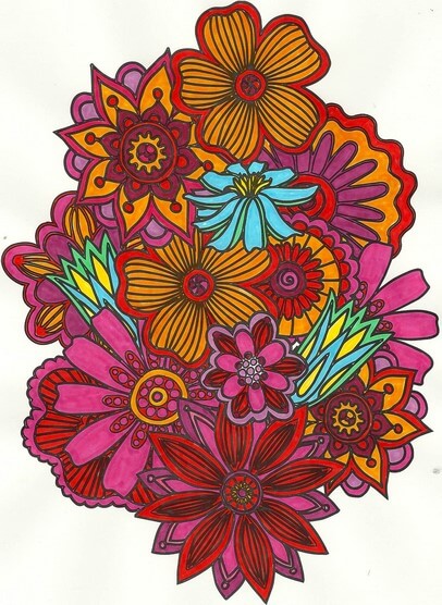
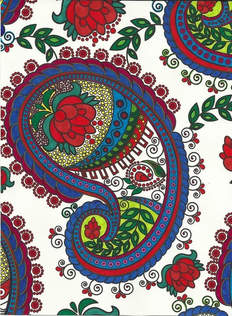
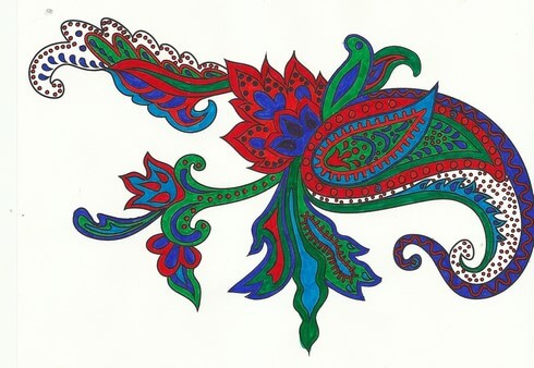
Again with the reds, oranges, purples, but I decided to add an unexpected color – my fiber work tends to lack strong focal points – so I added the blue – makes the piece. I also rotated the scan because the “bottom” was too heavy when on the “top.”
Here’s where I figured I really need to spend some time with colored pencils, especially when I can do shading – which I love doing with regular pencil. And again the oranges and reds.
I left white space with this, and I discontinued finishing the design – it was getting too busy. Here’s where I kept hearing Tim Gunn’s voice to “edit.” The yellow in here really glows.
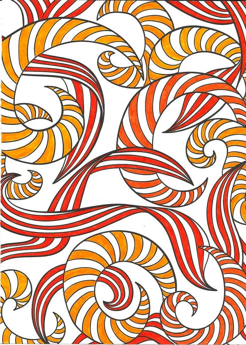
 This was playing around with oranges and blues – a combination I am starting to like a lot. Lots of white space, and I used the designs on the edges to play with color combinations. The lower right looked too much like a super-hero costume for me……
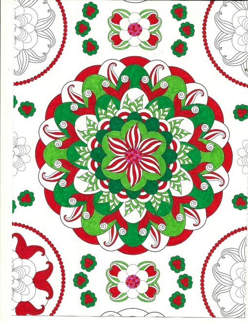
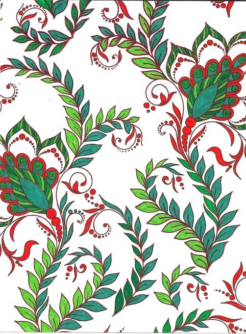
Christmas colors – meh. These were better than some I tried. The colors – for me – need to be true, but I am happier with mottled shades of reds and greens.
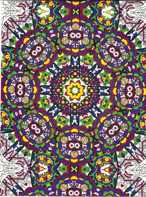
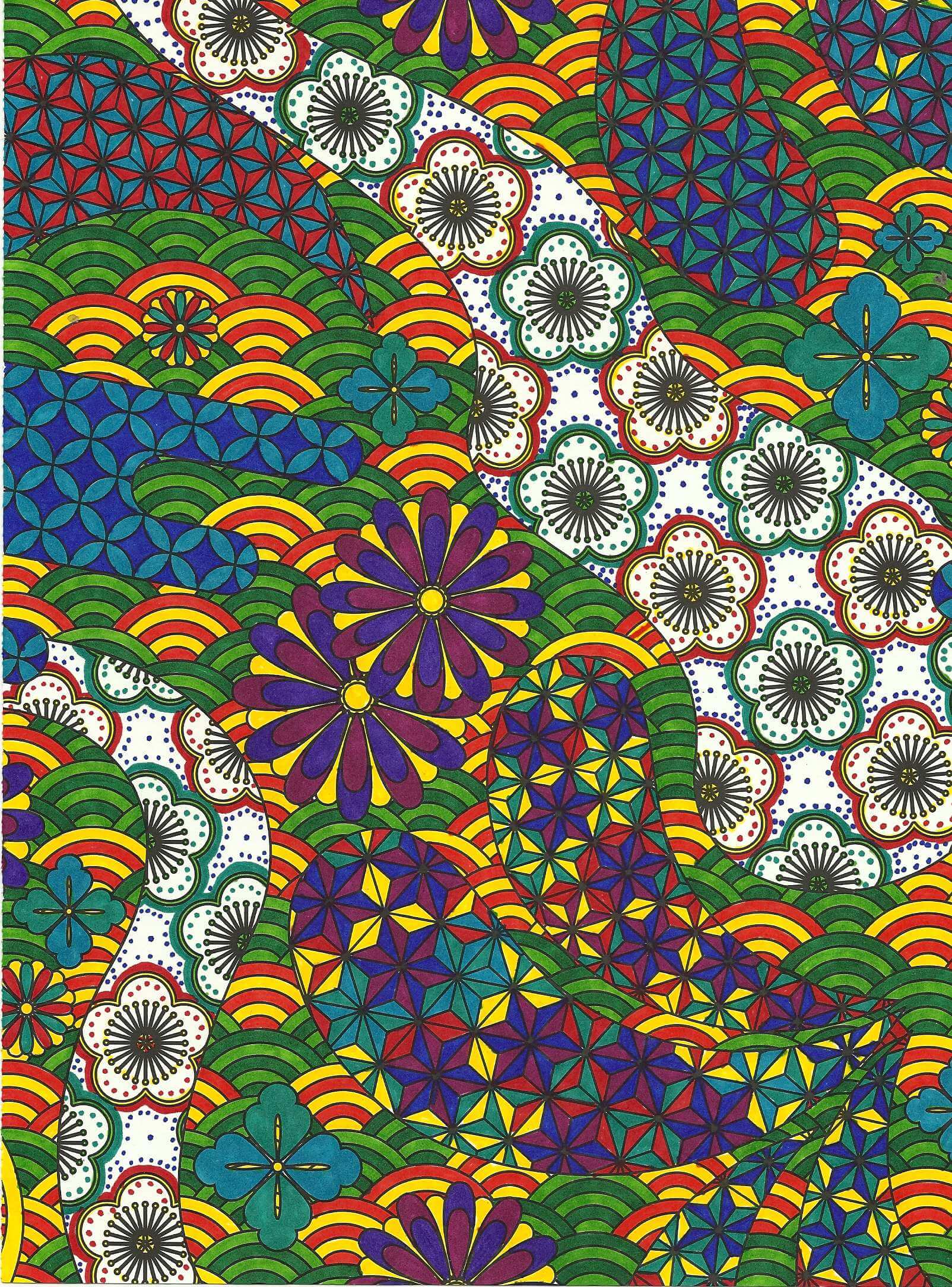
Interesting as I was working with what colors glowed – the yellows, but especially the purples in the center. I also discovered differences in black – flat and shiny, which I should know because of all the black fabrics out there. Overall a fun design, but it bugs me that the books consistently cut off complete designs.
Blues, reds, greens and white space. I am finding not everything needs to be colored. I find this quite pleasing.
Love the delicacy of this one. Even though the design is completely filled in, there is an airiness to it.
Same for this design – and I really like the colors – very vibrant.
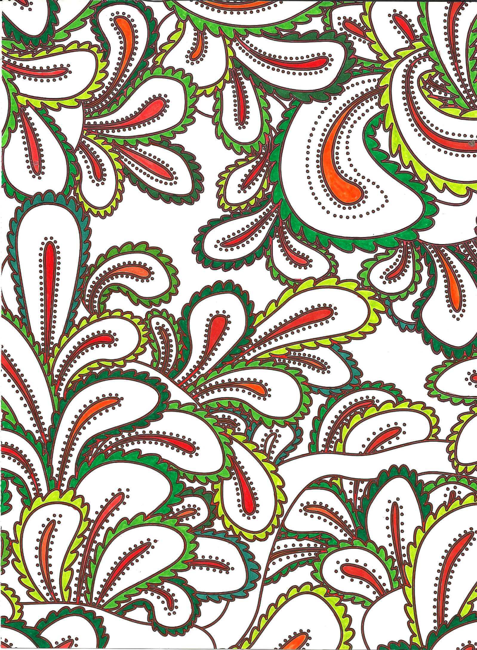
Again oranges and greens – would make a great wall paper.
Nice and lacy – I like incorporating some of the zentangle motifs when I feel there is too much white space.
The original dominant color here was going to be the pink-purple, but yellow won out. Interesting to me how that happens.
Really need to spend some time with colored pencils, but I SO like the intense color of markers. Like I said before, surprising for me, since they are so unforgiving.
I definitely can see some of the effects of the coloring in the most recent fiber work – more on that to follow.
Lessons from the Coloring Books
I received two “adult” coloring books for Christmas and have been enjoying myself immensely. Once I got past the old bugaboo about what this would be, I realized I could learn a lot about color theory from these pieces. And learn I did….
First, I discovered why I thought coloring was boring when I was younger. Sheesh, crayons and a picture. No challenge there. Just like I found Barbies incredibly boring. Plus I didn’t have great crayons – I lusted after big boxes – and I do have many colors of sharp pointed crayons now.
Second, I love symmetry and working with color within the symmetry. These pics have been perfect for that. I’m using markers – very unforgiving as a medium, but then so much of my earler work was pen and ink – even more unforgiving.
Third, I learned a lot about color. I like color. I like bright color. I need me my white space – a challenge on some of these designs. I need a variety of color items. Marker – yes, bought a bunch more. Also, love me my Pigma pens from my zentangle work.
Here are my discoveries – love being self-taught! The odd-numbered ones are from a book on zen coloring. The even-numbered ones from a book called Mendhi – very different in approach. I do them alternately – learning from each type and applying lessons learned from the one before it.
Coloring Book 1
The amount of white space really through me. The colors are very saturated and I opted to leave nothing blank…but the two paths going through the design were way too white and off balance. So I took a few ideas from my zentangle work – aura and echoing, along with dots. Really like how it came out.
Coloring Book 2
I opted to keep some spaces white for balance. I happened to see samples of the designs in the front of the book but didn’t use any of the examples. I’m enjoying making my own decisions, which in most cases work out for the end result. You’ll notice the same color families appearing in the designs. Added the dots to frame the design.
Coloring Book 3
Left a lot of white space on this one. I have some solid sections separating the main designs, and this kind of threw me. I used a brown that was much darker than the surrounding colors, and it drew my eye immediately to it. Did not like that, and part could be my bias as the designer. So I attempted to spread out the brown throughout the whole design. Much happier with the overall effect.
Coloring Book 4
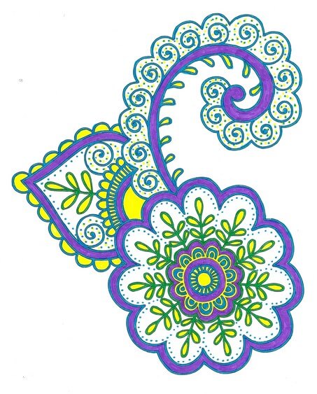
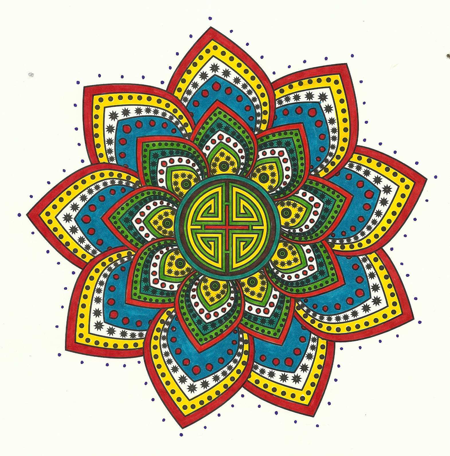
Love this one! There were a lot of very skinny outlines throughout this, so I went for my black Pigma pen, which I discovered made everything very crisp. Yellow, purple, green, but I think the orange works well on the outside. Really like how this one developed.
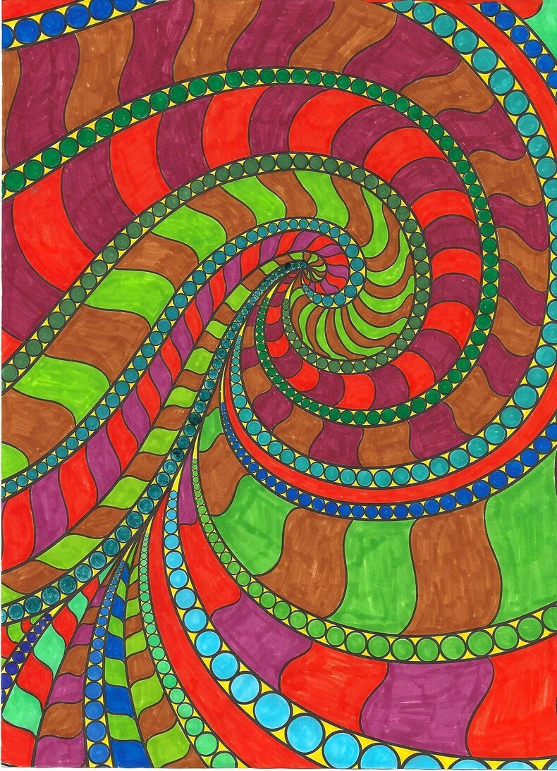
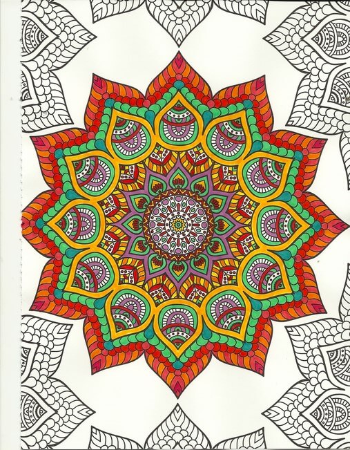
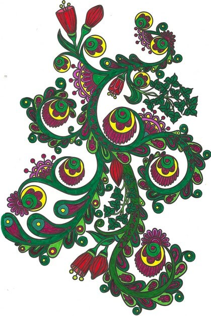
Coloring Book 5
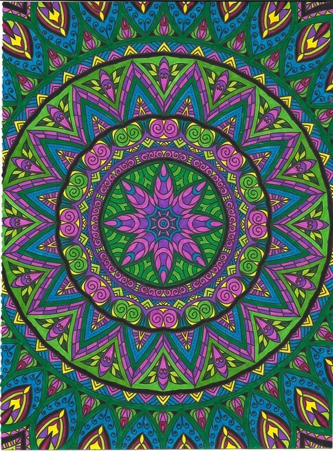
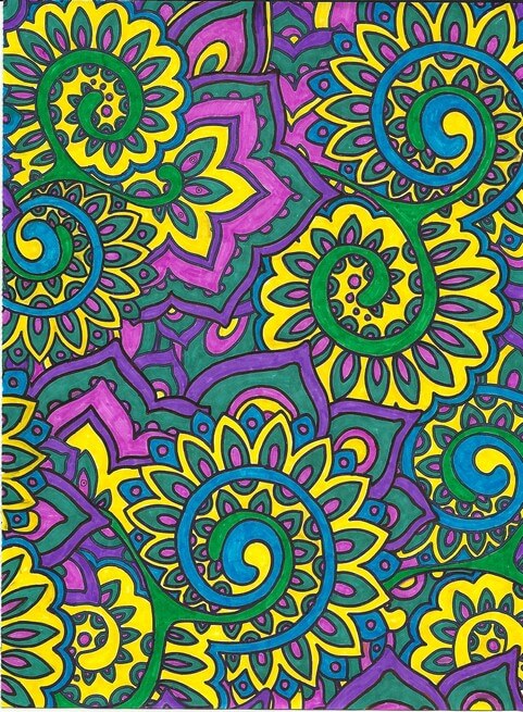
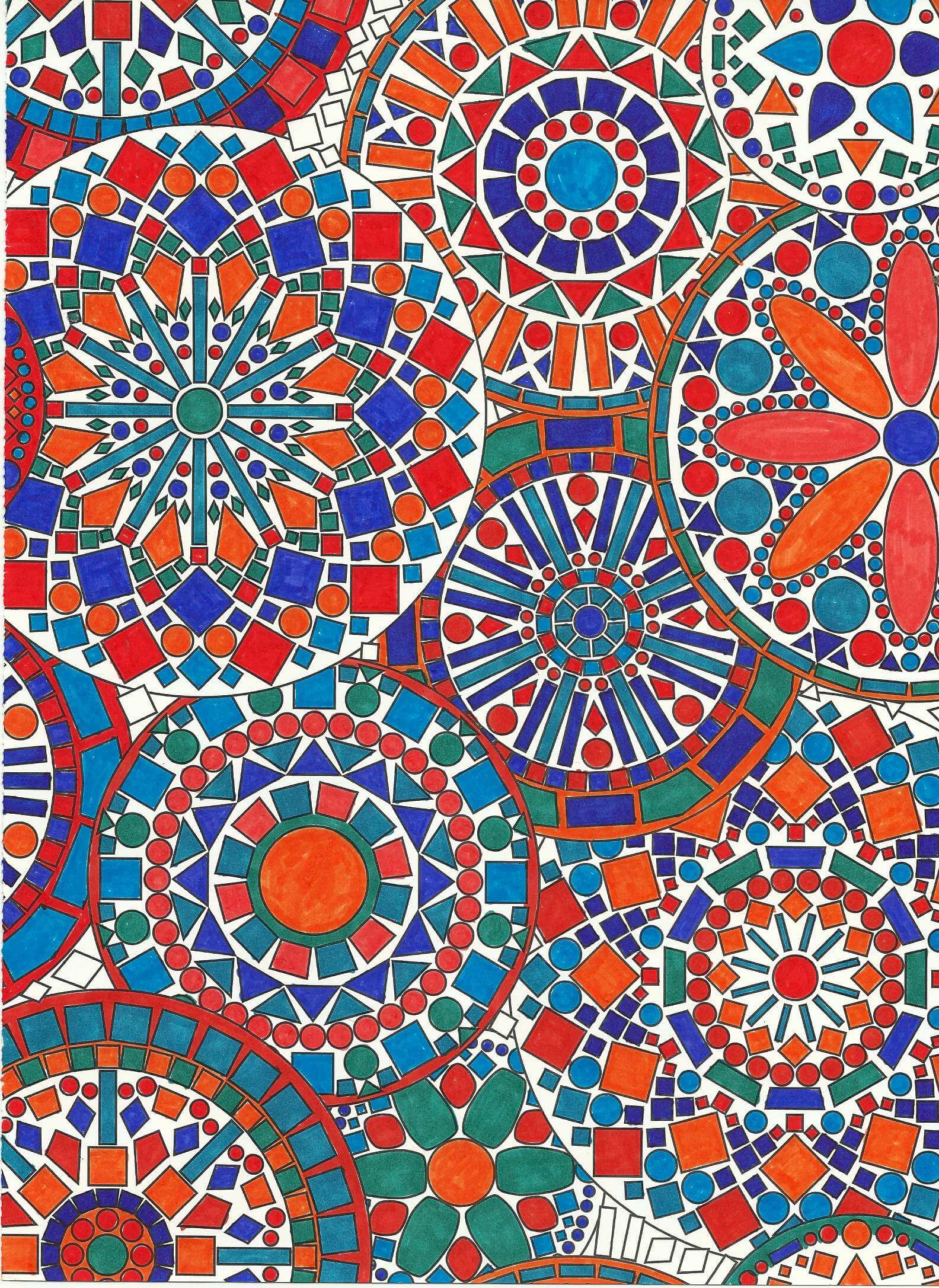
Blues and oranges – shades of them. Have never really worked in this color family before and I like it. Depending on color placement, some of the oranges look red – interesting to me, although it shouldn’t be because we deal with that all the time in marbling. Some of the blues looked green. Overall, I am planning on doing a mandala quilt using some of these designs, as I really like how it all worked out. Great balance, and I LOVE the geometry of it all.
Coloring Book 6
A lot of red Pigma pen outlining – nicely enhances the design. Greens and oranges, and even with the red, doesn’t look too holiday for me.
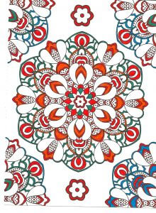
Coloring Book 7
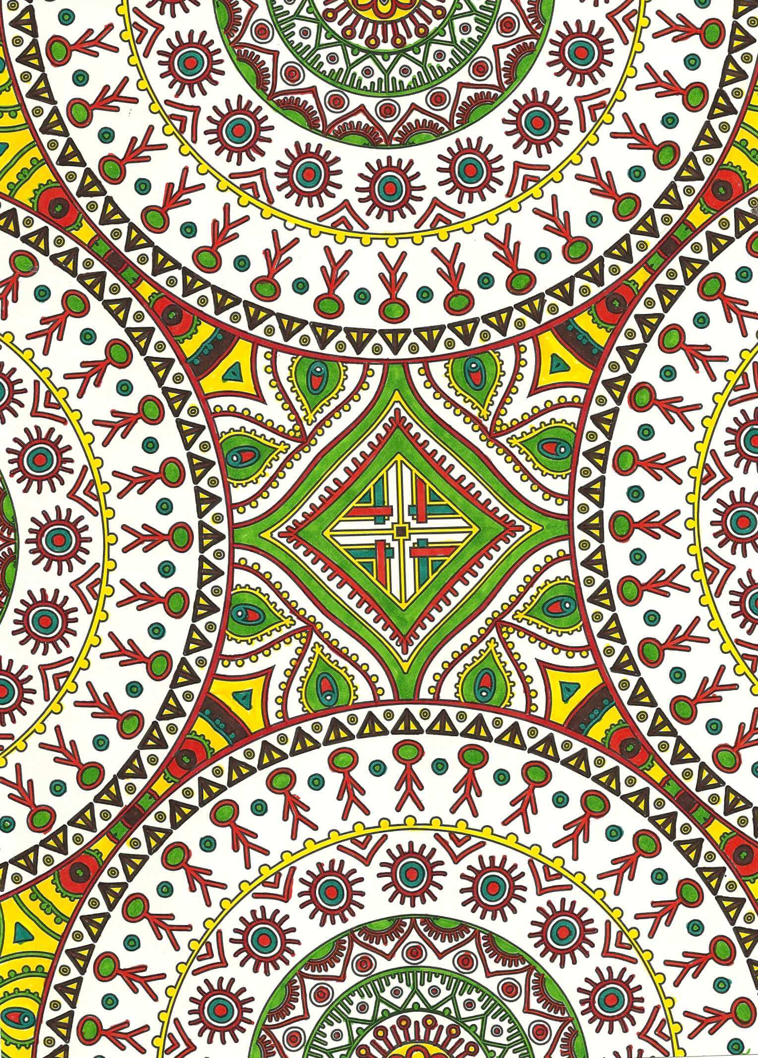
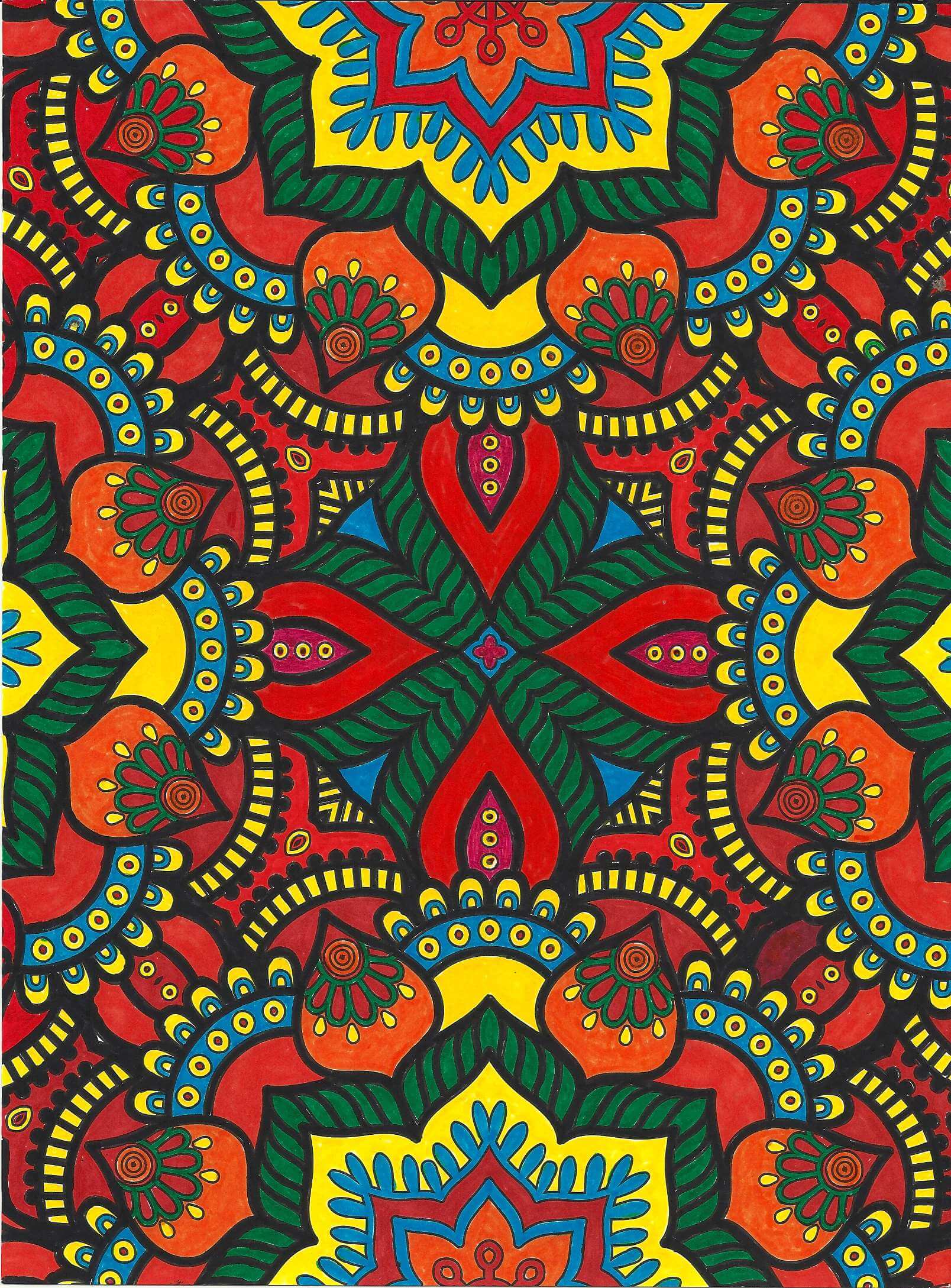
Again very saturated, primarily reds, yellows, and oranges. I didn’t want to leave the white space of the outlining – wasn’t sure I would like it. So I opted to go with a mosaic look, using black. I completed the center first and really thought I had made a mistake with that amount of black, but I am learning to make decisions as I go along and not worry about it partially done. I am very pleased with how it all came together.
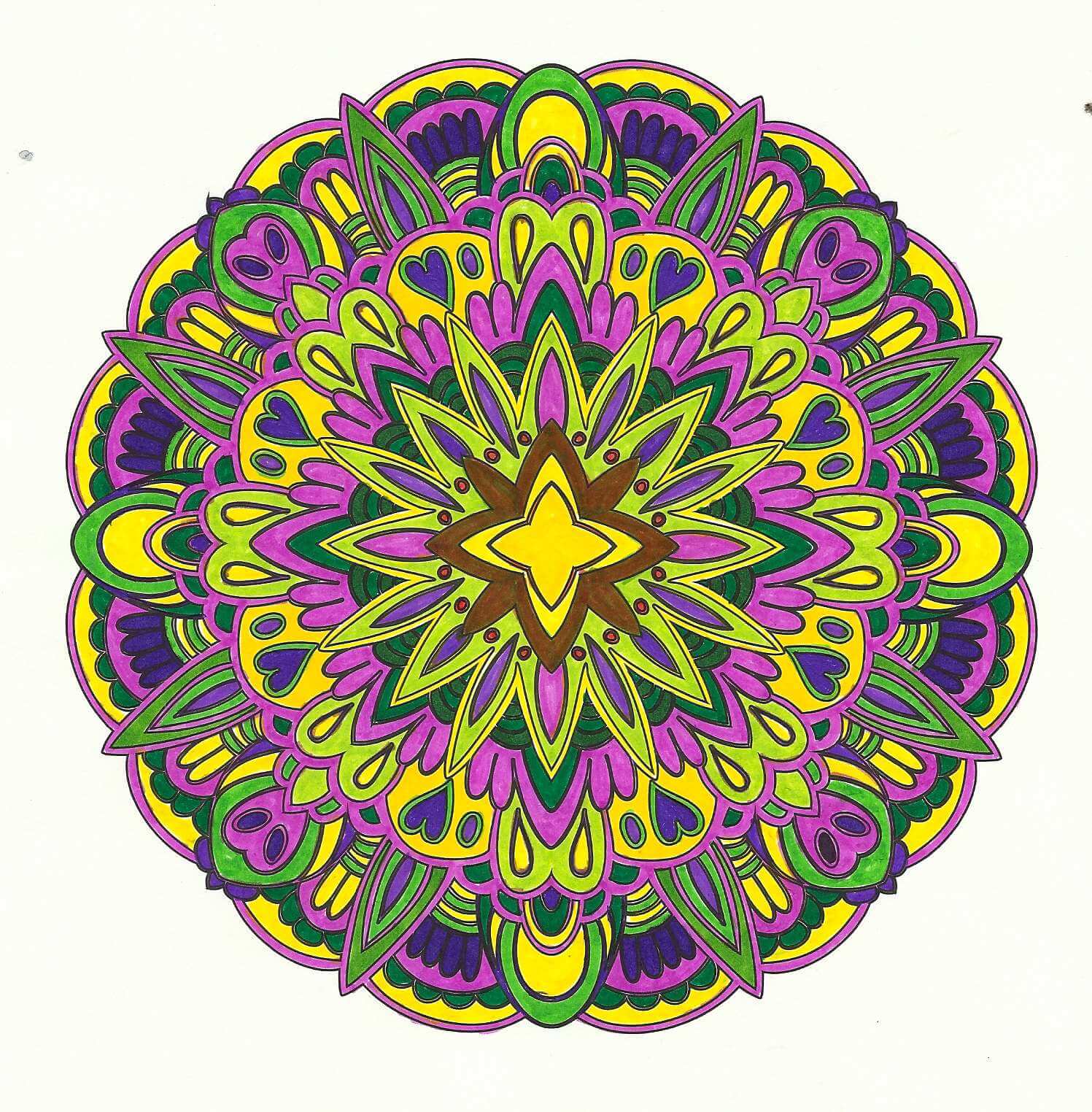
Coloring Book 8
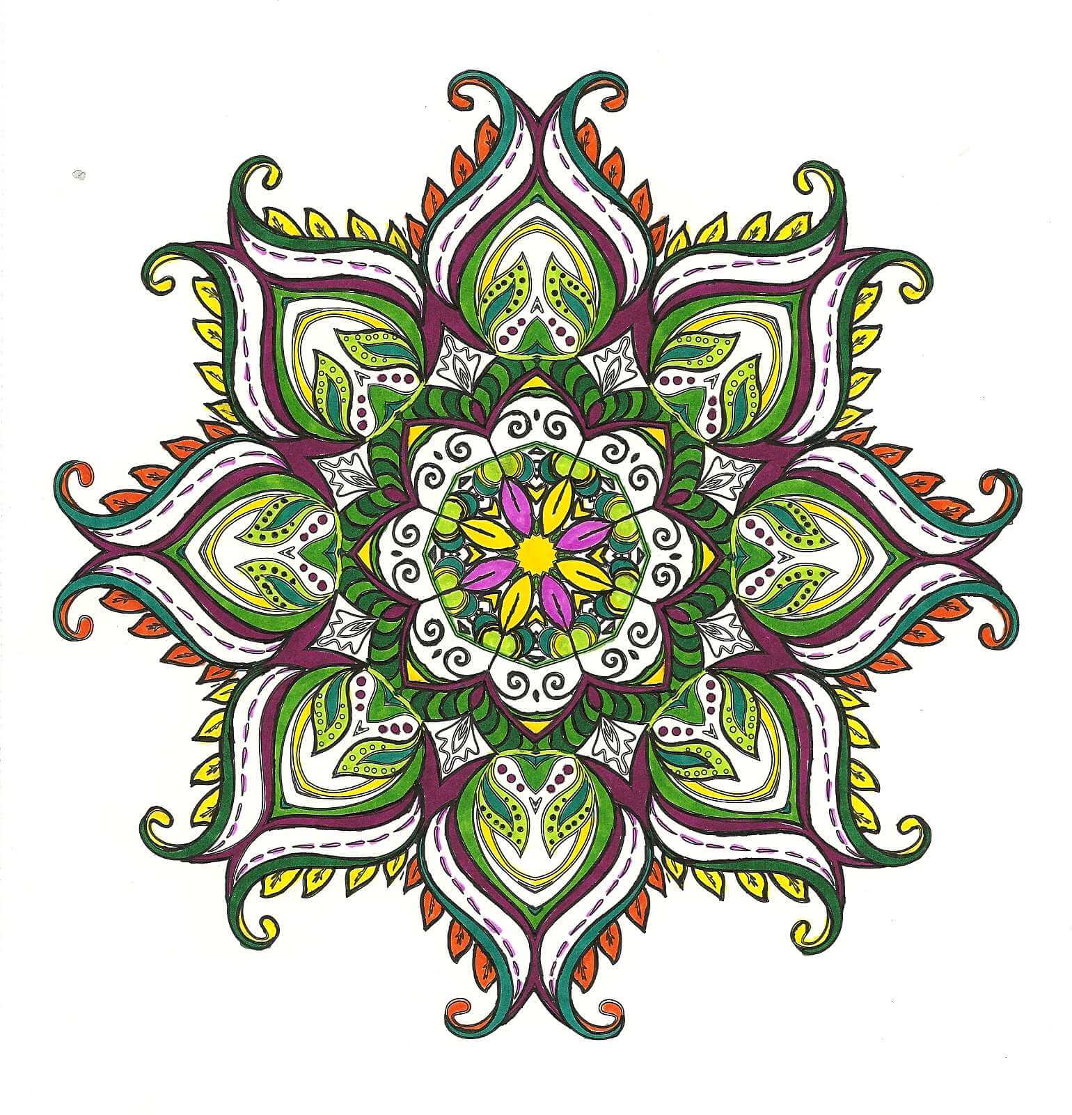
Purples, yellows, and greens. Glad I had a variety of markers. I originally put an orange around the yellow center, and my eye kept getting drawn to it. Didn’t like that, so I thought I would see if I could add green over it – turned brown, and I wasn’t happy. However, the brown fades into the background and throws the eye outward in the design. Interesting lesson learned there.
Lots of new skills,lessons learned, and enjoyable hours – there are more coloring books in my future!