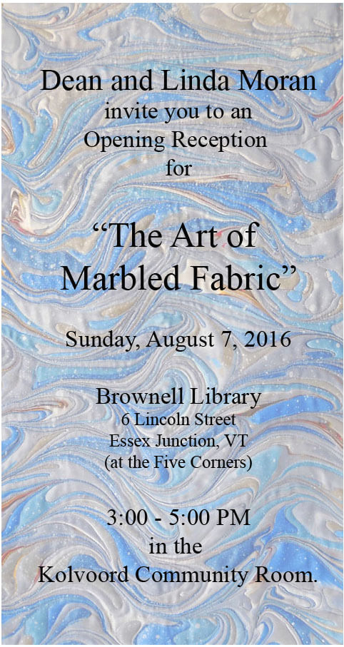
Archive for the ‘creativity’ Category
Deconstructing and Redesigning
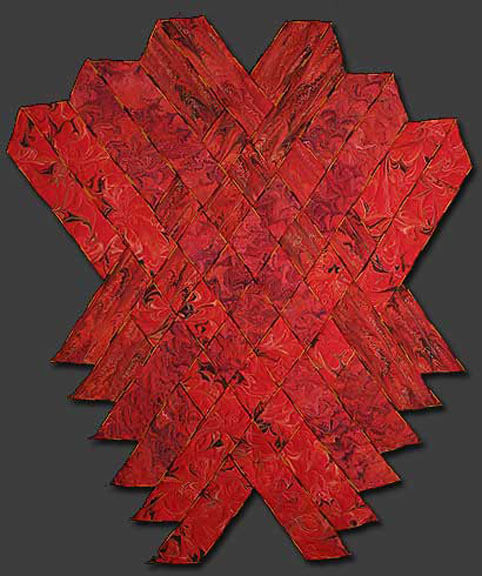
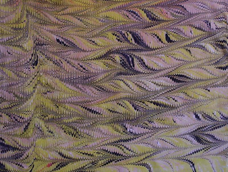
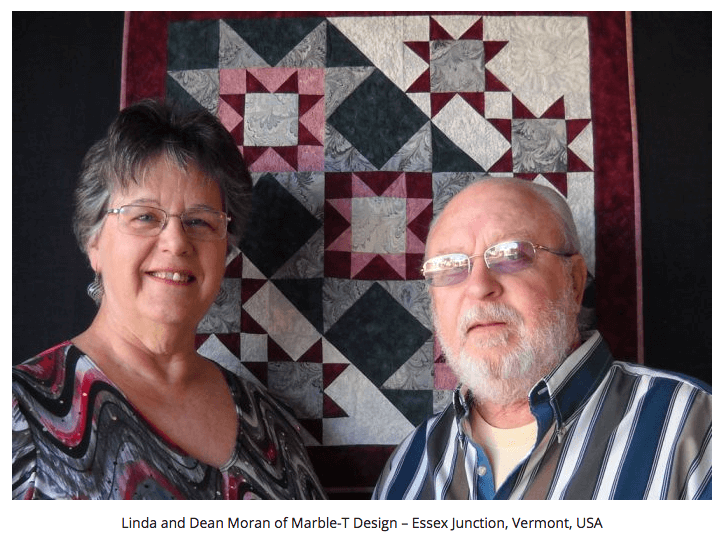
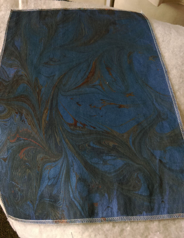
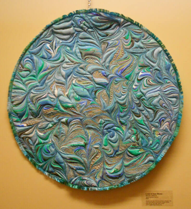
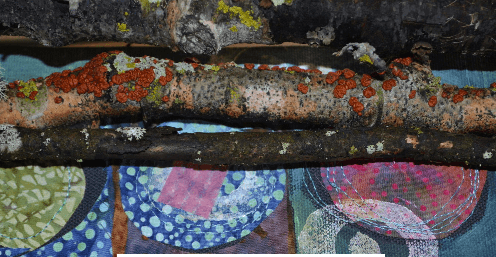
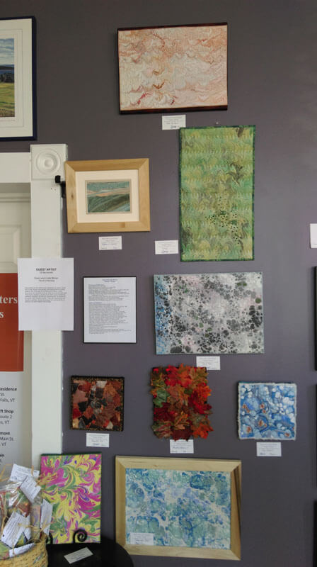
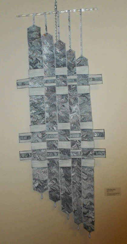
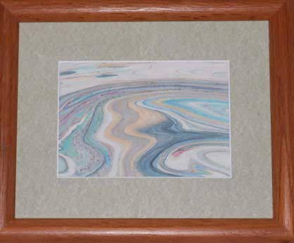
Photograph by Stephen DeVol, Sedona, AZ
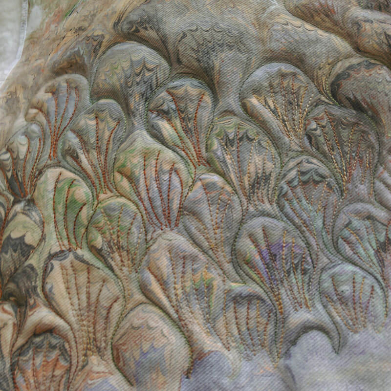
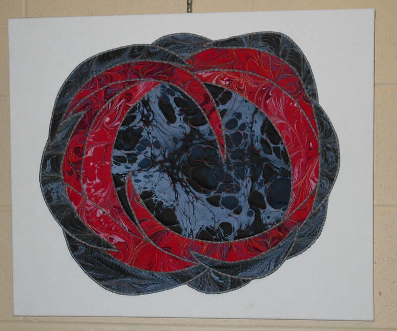
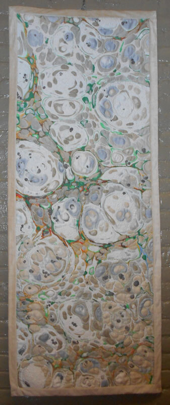
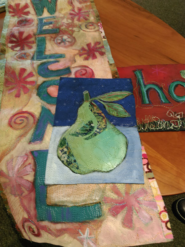
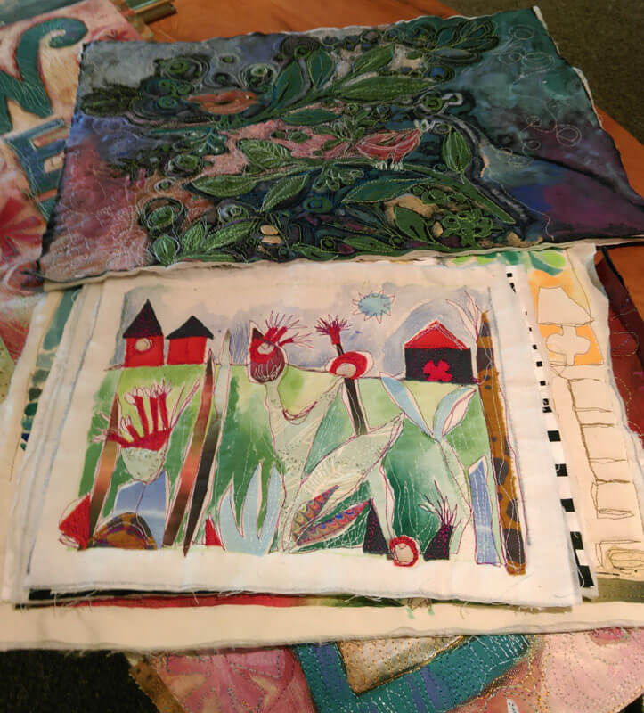
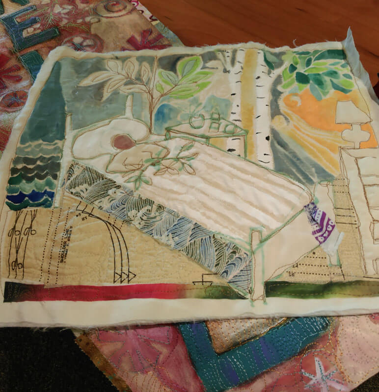
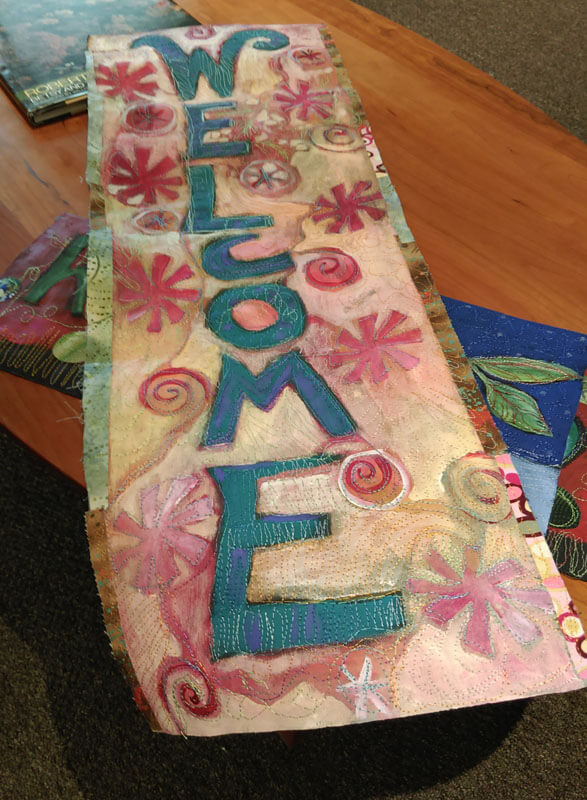
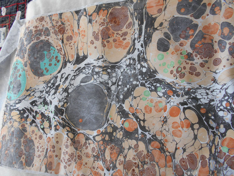
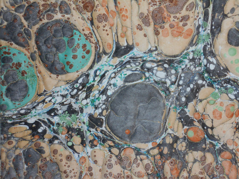
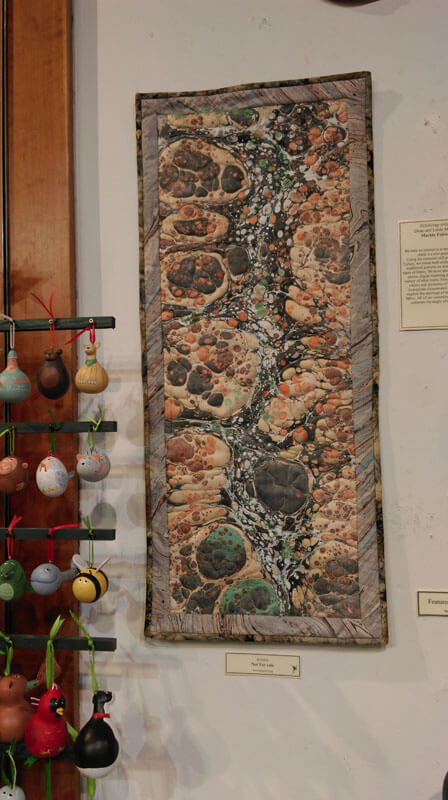
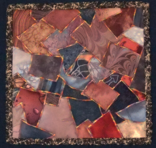
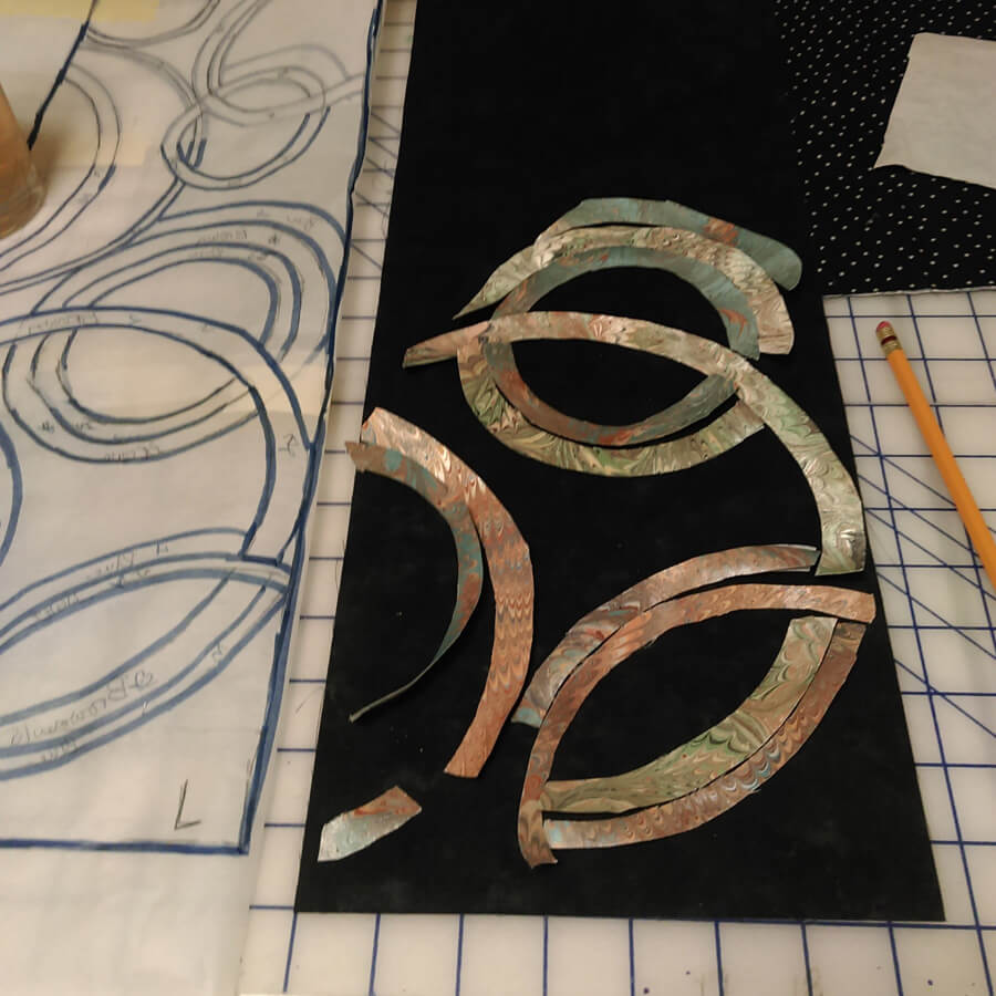
For over 13 years this piece has been known privately as “Ode to the Fire Goddess Pele” as a result of my time in Hawaii. It’s official title is Gaia 2: Beginnings. Our biggest problem has been that it was meant to hang on it’s own, but we were unable to figure out a simple – and not intrusive – hanging system. So for the last year, since we have been showing our work in Vermont, we’ve talked about mounting the piece – somehow. Here’s the story of the creation of the original piece.
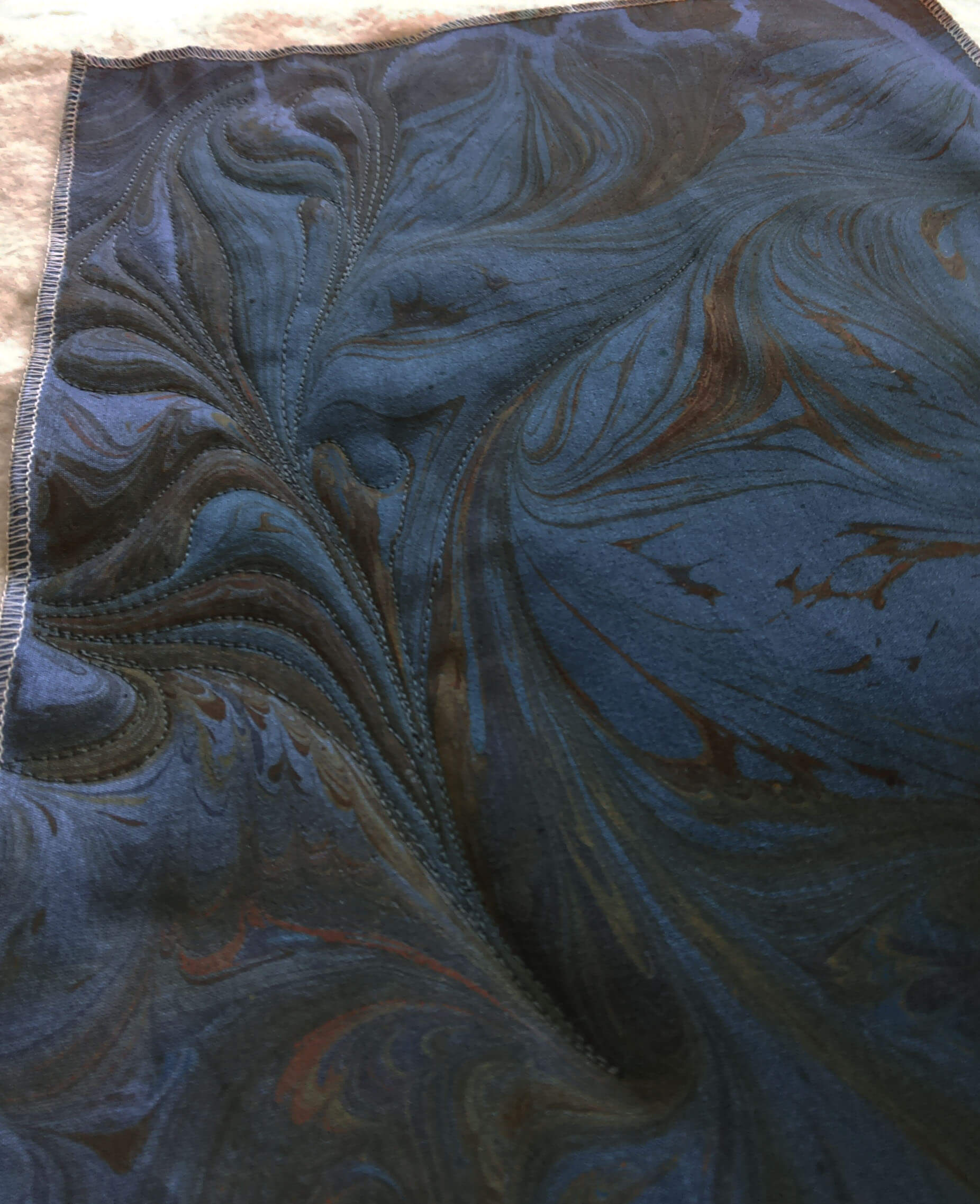
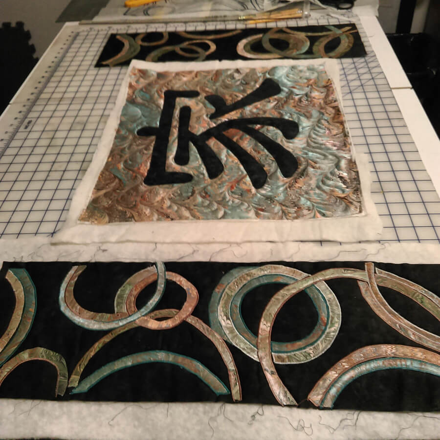
That led to me deciding to completely redo the piece – ev.er.y.thing. It took two weeks of night time by the television to get all the machine quilting pulled out. In the 13 years since this was finished my machine quilting skills are SO much better. I will say that my original tension was so bad that in many places all I had to do was pull a thread and I had many many inches come right out.
My new plan is to requilt it, change the edging, mount it on a large piece of black fabric, quilt the black fabric, and then add a sleeve. I need to have all this accomplished by May, as I plan to enter it into the “Abstraction” show in Saranac Lake this summer.
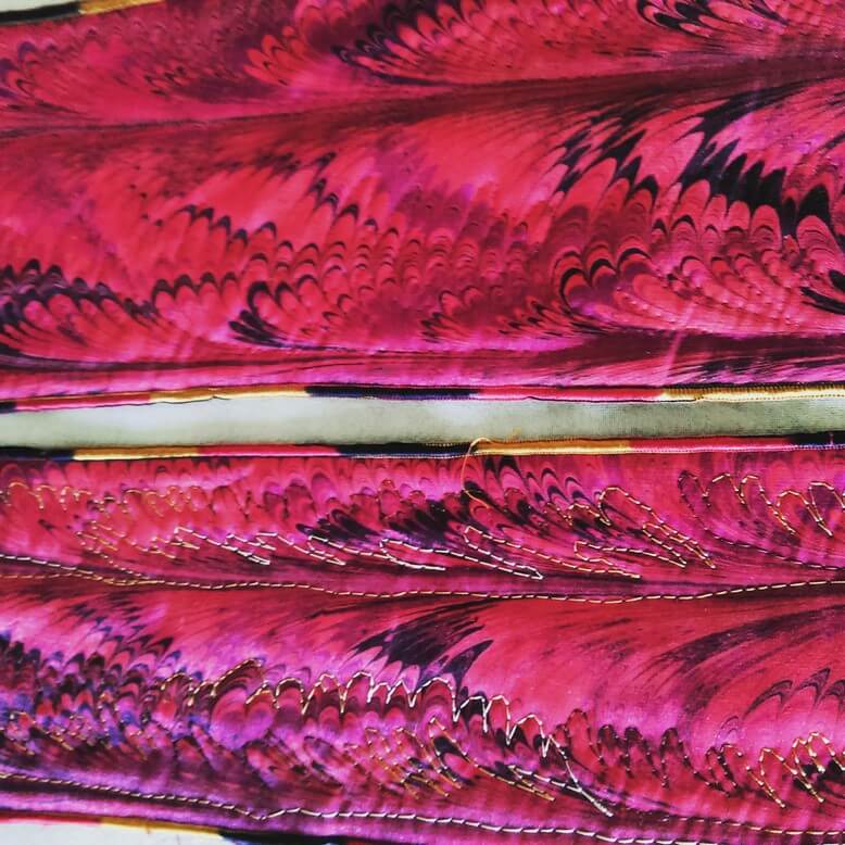
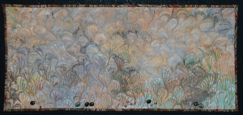
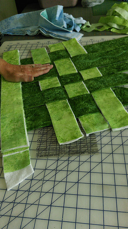
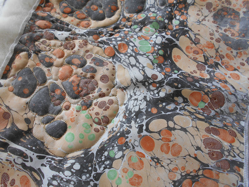
Right now I have 12 strips still with serged edges. I found a FABULOUS piece of red and gold fabric in my stash, and (hoping I have enough) I will put the binding on over the serged edges. It looks really good so far.
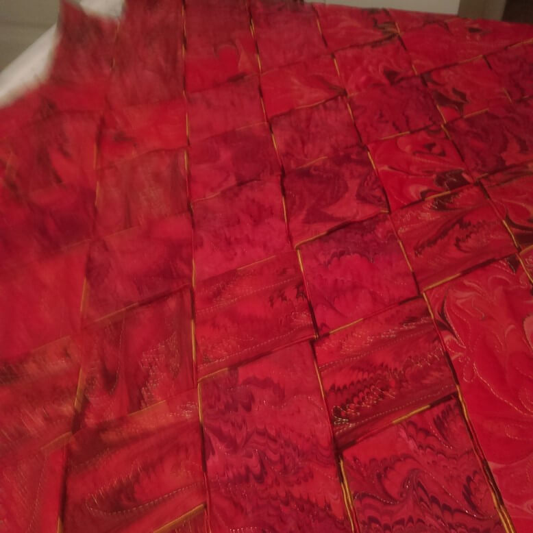
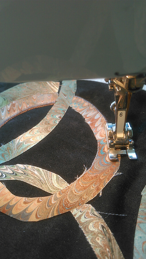
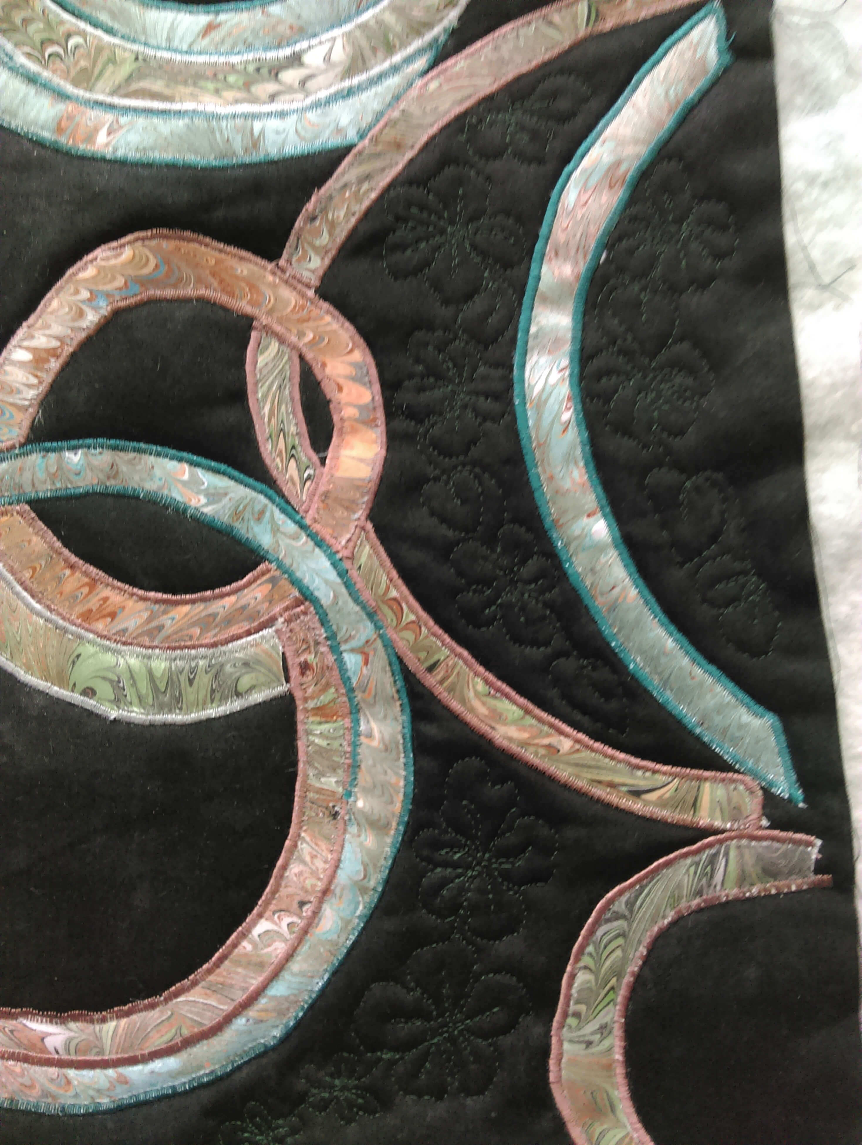
A close-up of the original weaving with the serged edges.
 A close-up of the back with all the hand-stitching to hold all the pieces tight and together (oy, did that take a while….)
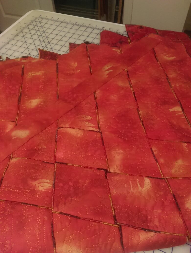
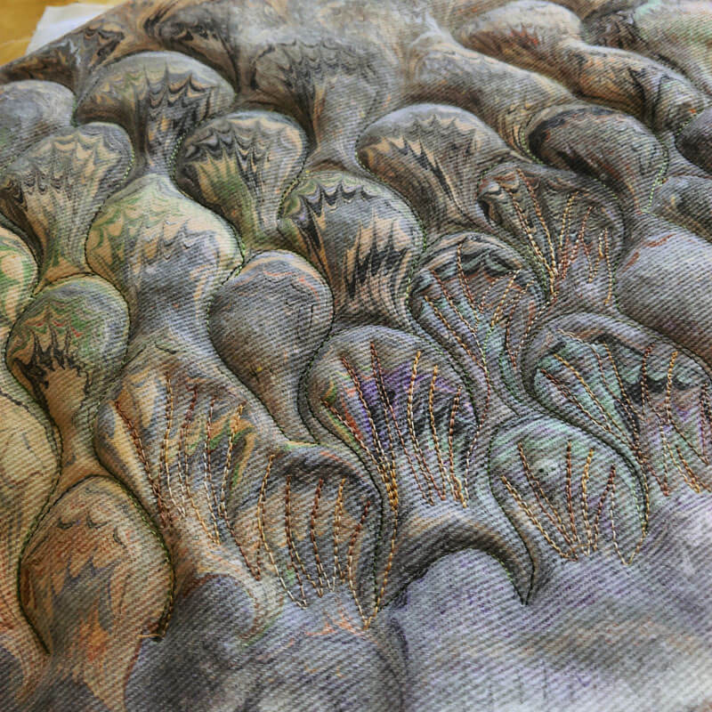
 Before and after – original stitching, and after the frog stitch….
 More before and after….
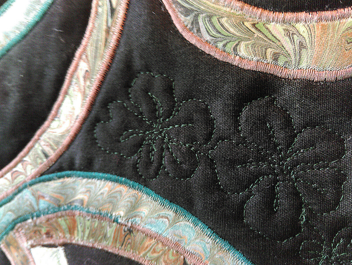
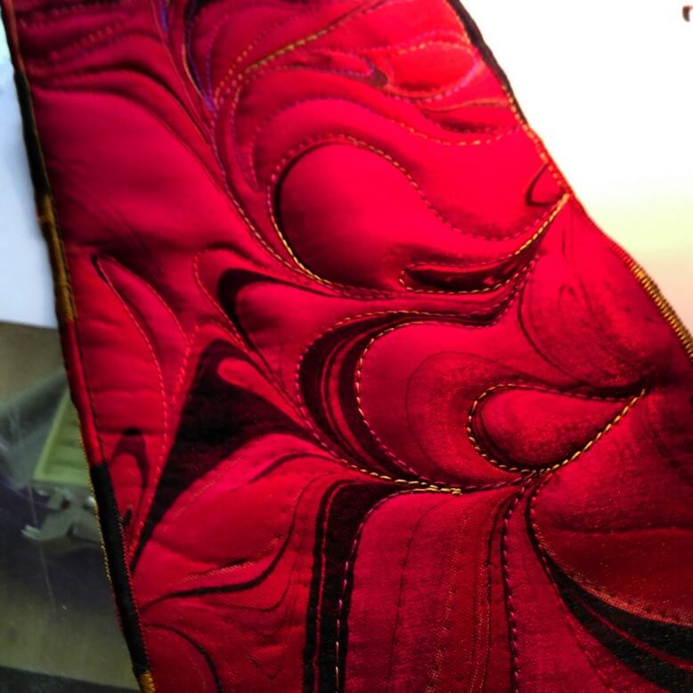 The beginning of new free motion quilting….
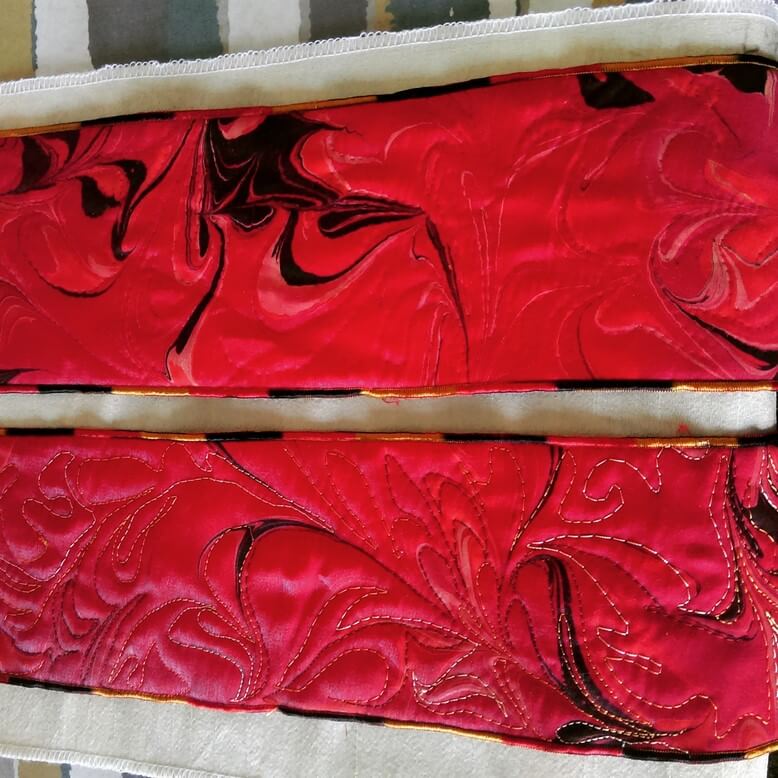
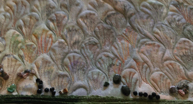
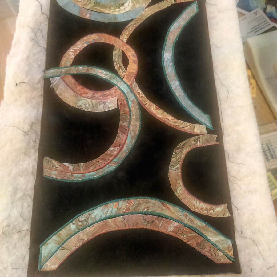
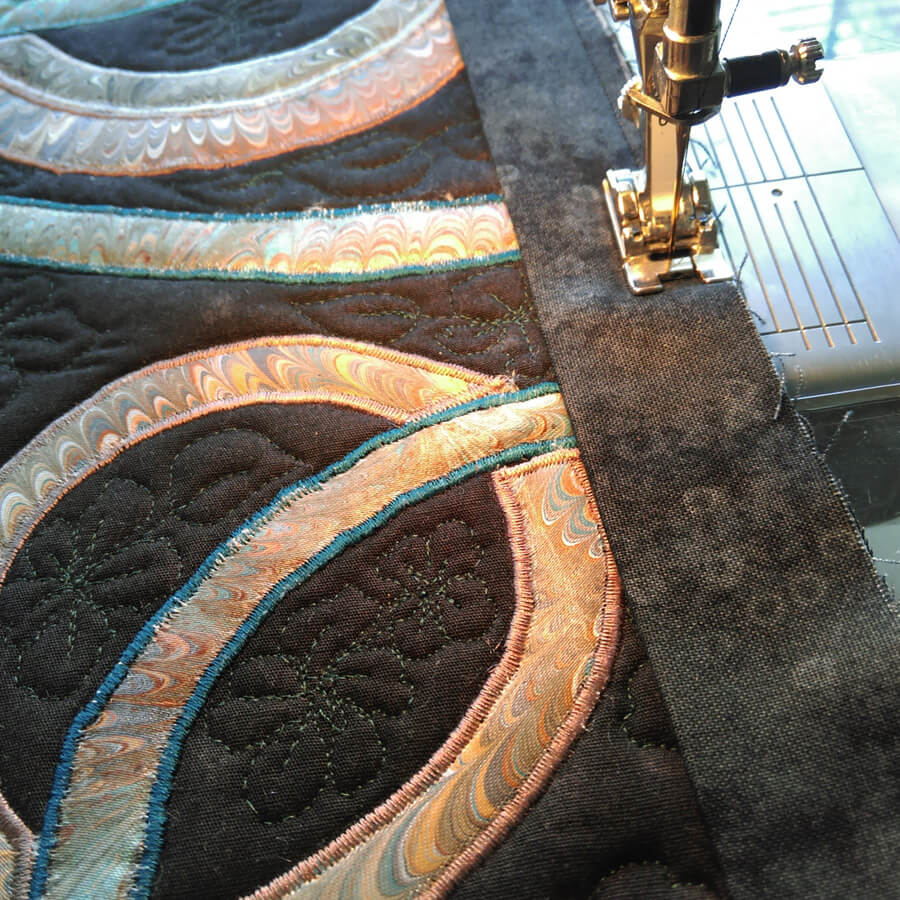
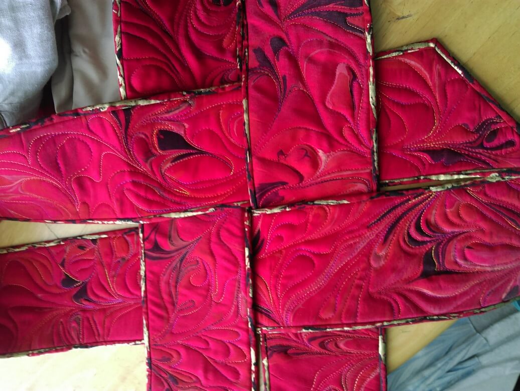 A look at the new binding and how it will work with the weavings.
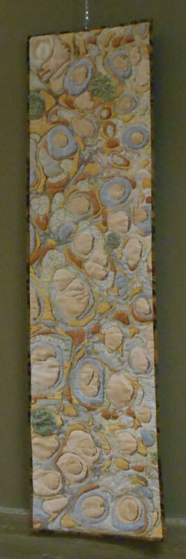
This piece will also have a new name: Revolution. More on that as I get further along in the quilt.
Beginning Free Motion Quilting
Beginning Free Motion Quilting – Yes, You Can!
4 hours, $40.00 (plus 1/2 hour working lunch) 10:00 – 2:30,
February 11, Saturday
Quilting With Color, Williston, Vermont 802-876-7135
Now what? Your quilt top is done…send it out or quilt it yourself? You can free-motion your own quilt top, no fancy domestic or long-arm machine needed! YOU CAN do it all yourself – it just takes practice! From thread choice, basic supplies, setting up your machine, to learning basic FMQ patterns to build other designs on, you will learn the happy sounds of your machine as you practice six basic patterns on fat-quarter sandwiches: straight lines (without a ruler or walking foot), various size stipples, pebbles, basic feather, grid work, and a leaf/vine shape.
You supply:
* sewing machine in working order, ability to lower feed dogs, instruction manual (I can’t stress enough how you need familiarity with your machine and lowering the feed dogs)
* free motion (or darning) foot; NEW #80 0r #90 machine needles (#90 might be easier for you if you want to use fancy threads)
* a selection of threads, from “old and cheap” to “fancy and expensive” (cotton and poly are welcome)
* low-loft cotton (or 80/20 cotton) batting in fat quarter size for two quilt sandwiches
* 4 fat quarters (18 x 22 inches), one for the top and one for the bottom of two quilt sandwiches (not fancy fabrics, just for practice, and muslin is fine – tone-on-tone or solid color is best for getting started
* scrap paper and pen or pencil
* scissors
* marking tools (fabric marker or chalk
* ruler for marking grid lines on the fat quarters
OPTIONAL: small white board and marker for practicing designs; a machine extension table (you will be happier with one…), Machingers quilting gloves.
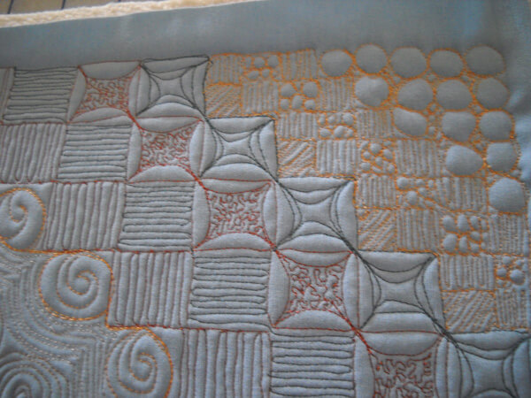
One of many samples looking at how you can add free motion quilting to your work….
COME JOIN US!!
Top Ten Tuesday (well, actually 28……)
Been a while for this series, and today is slightly different – a great infographic to study – and lots of saved bookmarks in the queue for future blogs.

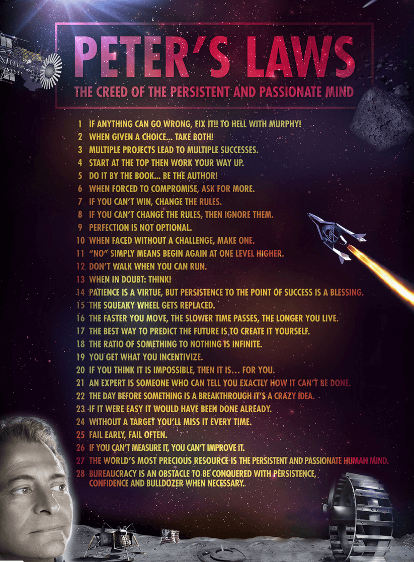 Which ones resonate with you?
A New Video!!
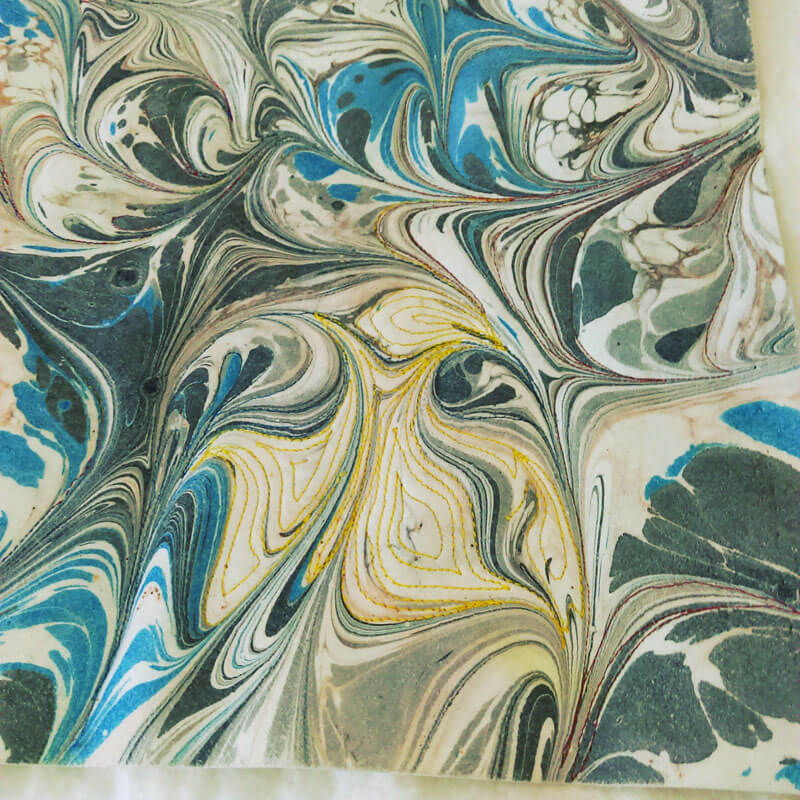
We have decided to do our own videos and set up a YouTube channel with them. We want to show the creation of the various marbling patterns. The first video was more an overview of creating a design…and gave me a chance to play around with iMovie. The second one looks just at the very beginning pattern – the stone. Every piece of marbling starts with this pattern. I am using royalty-free music under Creative Commons. It’s fun, labor-intensive, and when you have weeks between videos you forget all the things you figured out before…like getting the music to play. Plus, this time I cut out pauses where hubby was getting paint, so I learned to delete frames and add a connector. Now it’s learning to use titles and such for additional information.
Here we go!
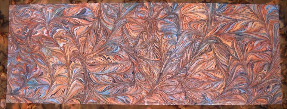
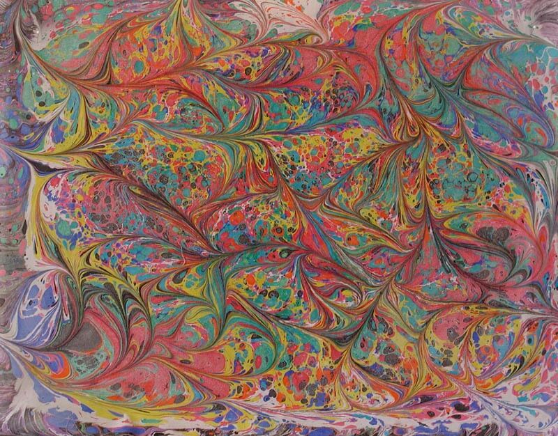
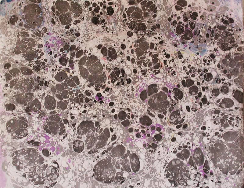
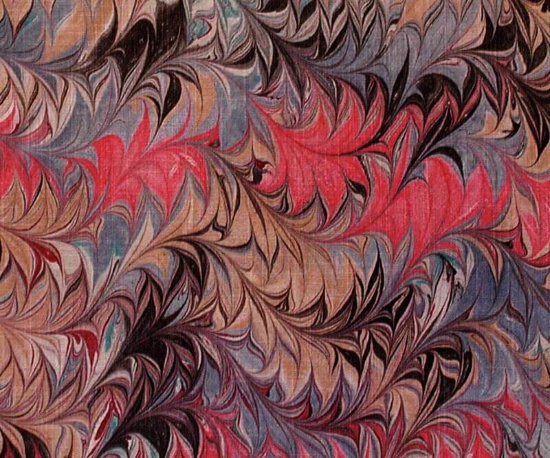
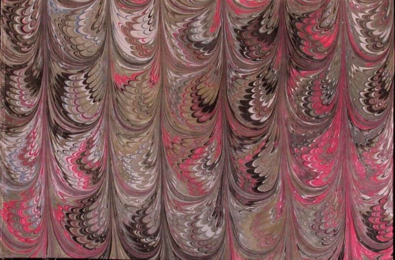
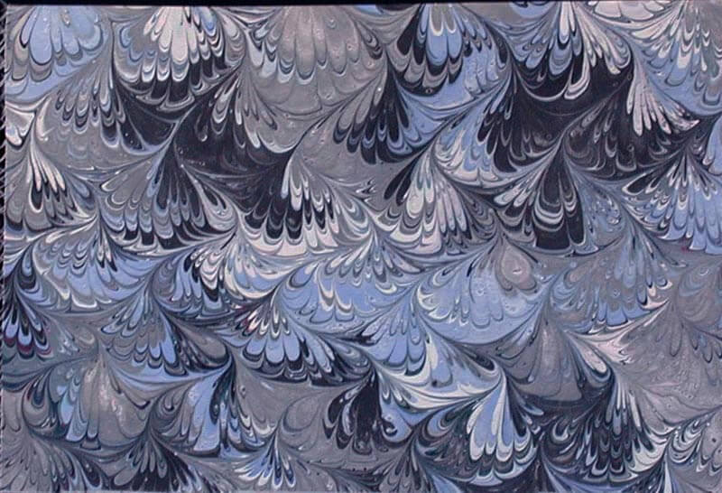
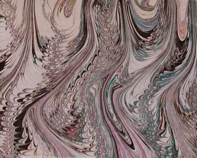
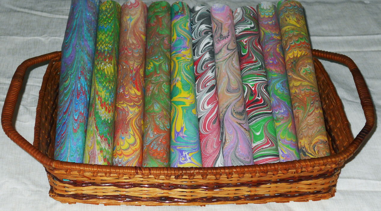
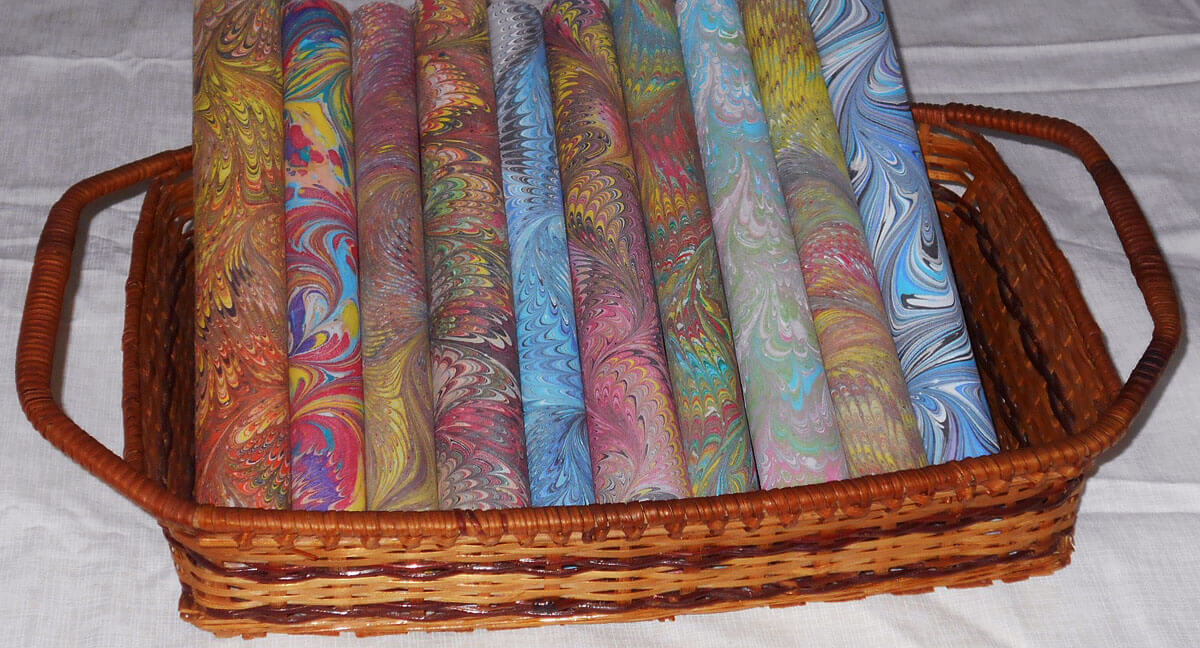
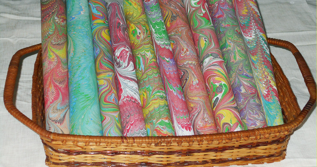
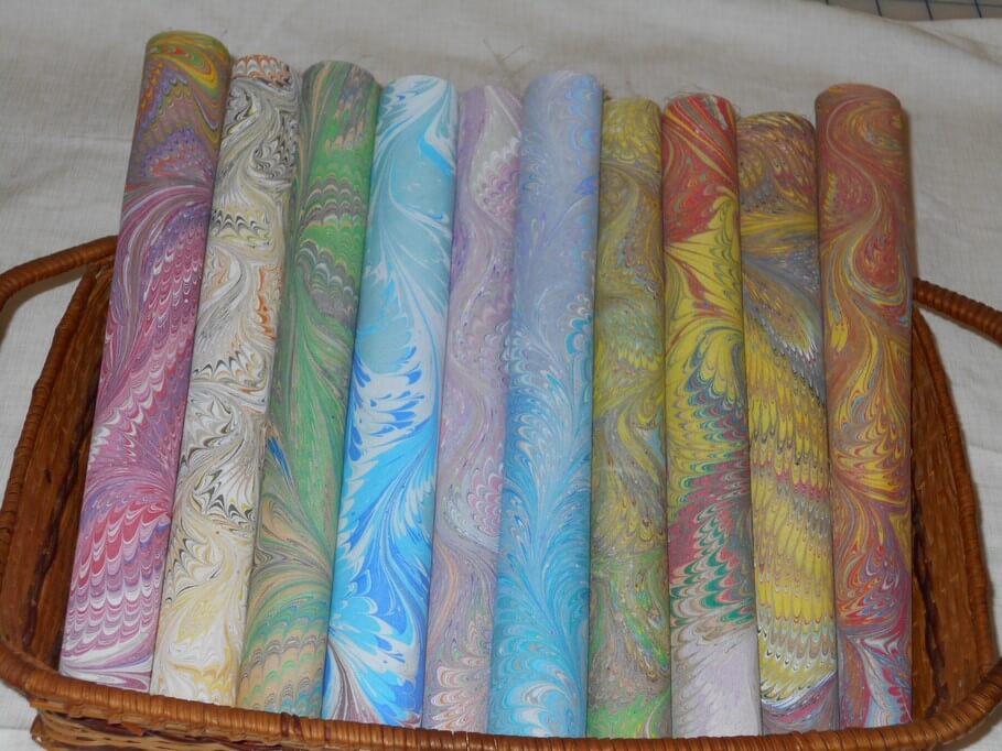
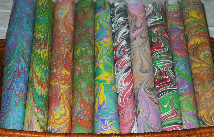
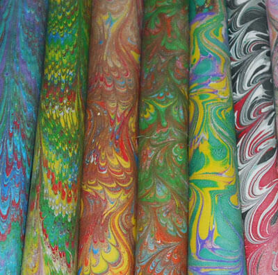
Samples of Marbled Fabrics
Cleaning out as part of getting into new ventures for the new year – resizing, sharpening, rephotographing fabrics – here are some sample fat quarters we have created over the years. We get tremendous joy out of creating – some look similar, but it seems like endless opportunities available to us to play with fabric and paint. Remember, we can customize for you! Let us know what you think….THESE ARE NOT FOR SALE – just pieces we have photos of from the past!
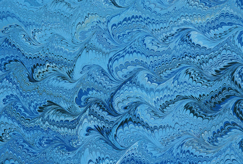
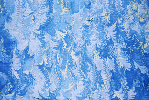
 So many iterations of traditional patterns! All from toothpicks, Popsicle sticks, straight pins, t-pins, small hair pics – lots of balsa and a huge amount of time to make the combs and rakes. It’s the prep that takes so long before you can have hours of fun!!
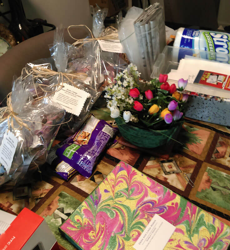
Photography and Packaging…Oh, My!
Vermont Open Studios, 2016
When we did Vermont Open Studios last May with artist Mary Hill, one of the great things about sharing the space was all the time we had to talk about our various art and marketing attempts. Mary had some GREAT ideas for us concerning packaging. We continue to process everything we thought about, with some definite changes in what we are doing. Thanks to Rachel of The Textile and Fiber Art List, we have also been improving photography – both how we shoot items and how we present the finished product.
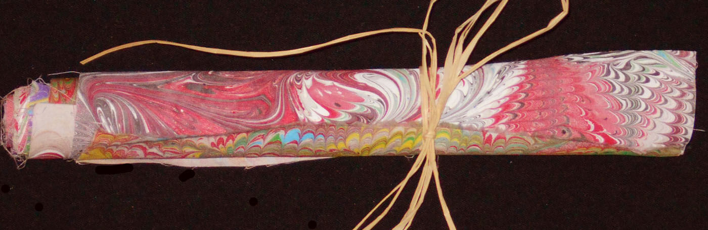
First, the photography. Our pictures have a “muddy” cast to them, and we are basically rephotographing everything we have. The place we are living now doesn’t allow for much flexibility for setting up good lighting. Hubby experimented with a lot of options – including moving to a rolled fabric presentation rather than each piece in a haphazard manner. Give an overall idea as opposed to every thing about each piece. In this manner we can still send the packages flat and save customers money (on international orders – domestic shipping is free). Some “before and after” ideas –
Getting the overall set-up of the product looking good –
Lighting and color still issues….but against the white background looking better. Also, we discovered that we needed to save pictures at a larger size in order to get more detail in the pictures. Next is better with a good cropping and some adjustments in Photoshop to correct the lighting.
Definitely getting there –
Uh-Huh…..
 Definitely brighter –
Close-up shot for the Twitter picture, which I am slowly getting back to using…..
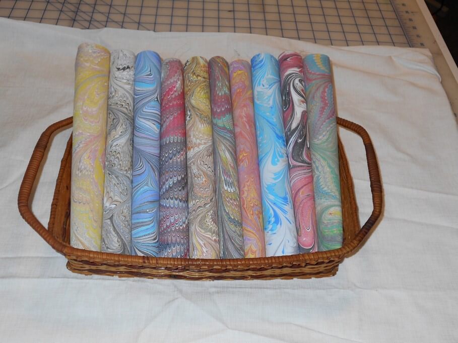
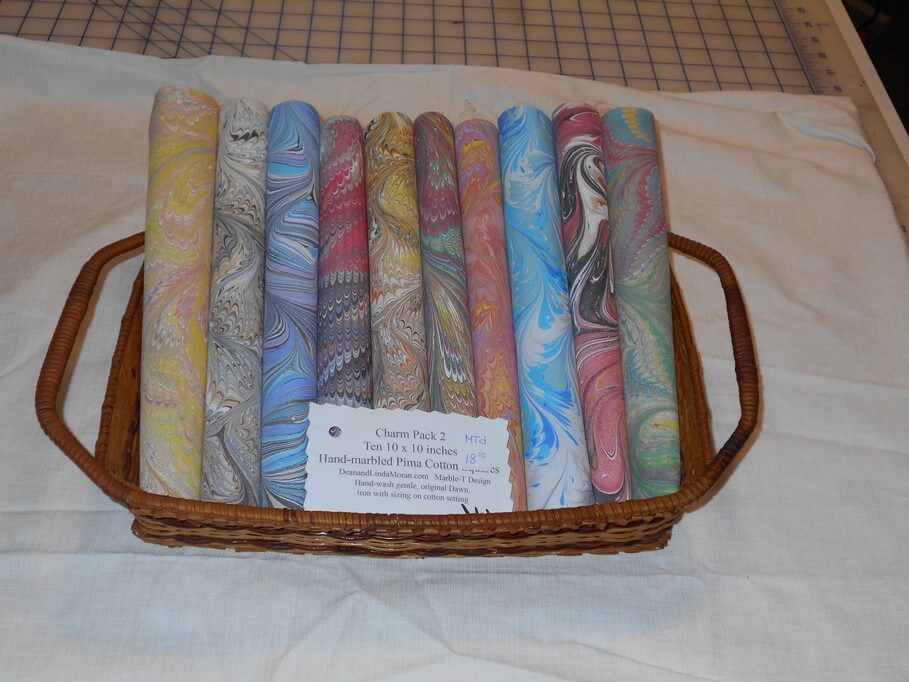
 This is just for our Charm Pack 2 – ten pieces of hand-marbled pima cotton, assorted patterns and colors, 10 x 10 inches each. Slowly working on others. The pieces need to be appealing, hence all the work on presentation in the pictures. The mailing is easier than a rolled item, which costs more to ship and doesn’t give customers a good look at the fabrics.
This looks better in person when displaying for a show – but not for online sales.
 Much more ahead for us as we continue adding new items…let me know your thoughts and how you solved packaging problems.
Monday Marketing – First of the Year!
“Partly Sunny, Chance of Storms”
I have a list………….
Don’t we all? I start one every year – but this year seems to be somehow different. I have a small composition book (like we used to use in elementary school, back in the day, and I got myself organized very differently. I have a page for yearly goals, then a page for monthly goals. I have separate pages for each of the weeks of the month. Right now the notebook is set up though March.
I can at a glance see what I’ve accomplished, and I have a way of listing items ahead in the month they’re due, and I can backtrack to begin working on them. This helps me see the bigger picture much better…..and I love crossing things off my lists.
I think the thing that is also different is that I am feeling so much better than probably the last five years. The weight is slowly rearranging itself, clothes are fitting, the knee doesn’t hurt, I’m getting stuff accomplished (more than I thought), and I feel calm, centered, and productive. A great way to start the New Year!
We are concentrating on our Etsy shop,(small listing on the right side of the blog…) in preparation for moving to the market on Artizan Made.
 Lots of new pictures, revising items, getting ready to do a “retirement sale” of older items that have been around the country one or two times. We’ve lived in places where we could have better photography set-ups, but we are making do. Lots of great suggestions and tips from Rachel Biel of The Fiber and Textile List – she is amazing when it comes to set-up, marketing, and all-round general encouragement.

 I am looking for a royalty-free piece of music for our second marbling video, finishing up pieces that have languished for years, taking apart a major piece from 2003 and modernizing it with my new skills, keeping up with blogging (I WILL hit 1000 blog posts this year…….) and constantly looking for new venues and ideas.
Here’s to 2017! What are you doing to start your year out right?
Art in 2016 – Part 6 in Review – More Small Works
 There were a lot of other small items completed – some UFO’s and some brand new. The small piece at the left (24 0nches square) was an OLD top from many years ago – part of a pattern kit for customers using marbled fabrics. The quilt top had some serious rolls of fabric where the iron (and the user…) had pressed wrong. So I to0k out all the stitches, fixed it, made the sandwich, and then requilted it with my practiced free motion skills. A lot of new patterns from Lori Kennedy’s The Inbox Jaunt – she has amazing tutorials.
Then there were pieces where I looked through pieces of marbled fabric we had saved and waited for one to speak to me. A lot of them did in the course of the year. “Sonoran Desert” was one of those. this was done on white denim, and it was a pattern I’ve not quilted before – but it spoke to me of the saguaros of the Sonoran Desert.
 Didn’t like this binding – too sloppy to control, so did a regular fabric binding. It hung in our library show and now has a new home with a woman who lived in Tucson for a number of years. Added a few semi-precious pieces of turquoise, agates and lava.
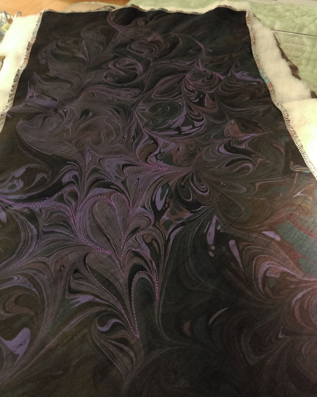
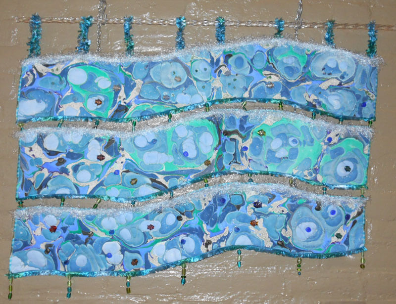
A friend keeps us supplied with all sorts of remnants of cottons, polys and silks. We used a couple to see if they would marble – and they did – spectacularly. One of them went immediately to our son in Seattle – he loved the dark colors – said they were “sexy.” The one he received was “Sliver of Moonlight.” First pic is of the plain marbled fabric, second is seeing the stitching. Unfortunely no final pic of it mounted.
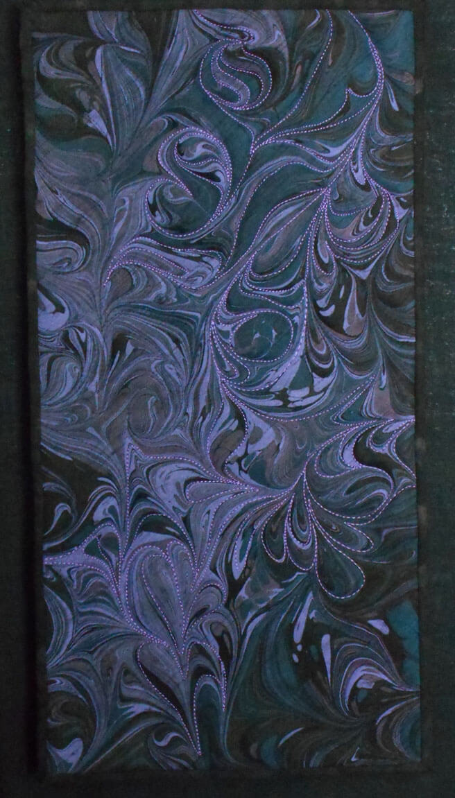
This one is same fabric – black poly-silk, and is called “Whispers in the Moonlight.”
 The finished piece is mounted on a canvas frame covered in black linen, and it “floats” about the frame.
There are more pieces, but I need to move on to new projects…..more on an upcoming sale we are having – next blog post!
hitting 1000 b logposts……
Art Year in Review – Part 5 – Other Shows in 2016
 Our first solo show was wonderful. We were guest artist the month of August in the Essex Junction Library, a wonderful space in the community room. The fiber pieces hanging on the brick walls softened the room a great deal. Great reception for folks, hosted by our dear friends the Williamsons. Lots of good discussions, and I tried something new – a “completed” piece that I still am not happy with, and I asked for suggestions for re-doing/changing the piece- great ideas, and I will certainly do an interactive piece again for future shows.
April through June, Jericho Town Hall, “Double Exposure” – artwork and a piece of literature/quote that goes with it.
June through September, Unsworth Law Offices, a selection of fiber and digital work.
Phoenix Books with the Essex Art League, 2016, small works.
Old Red Mill Gallery with the Essex Art League, digital work, as well as ongoing fabric sales
October through April 2017, Maltex Building with Burlington City Arts – large works. These are large pieces, and many of them have not shown anywhere before, so it was exciting to visit them in their 6-month home. Third floor, so go visit!
Misfiring Synapses
Ocean’s Bounty
Endangered: Rainforest
Nature 1: Rock Garden
The Shallows
Black and White with a Hint
Jungle
Wetlands
Soaring
Art in 2016 – Part 4 Review – Classes and Shows…and a Book!
This was a big year for showing our work – many more options and acceptances than most of our time in Arizona. We taught a beginning marbling class at BluSeed Studios in Saranac Lake, NY, and in the process of chatting, we became part of their arts curriculum grant project. I’m really looking forward to this activity; I miss the days of working with The Kennedy Center to bring integrated arts into the classrooms in the Chittenden East School District in Vermont.A lot of great memories from the conferences, and then great memories from arts work within the district (need to do a blog post and reflect on the work we did….)

A couple of pictures from our Saranac Lake class, followed by an individual machine quilting class I did for a fellow artist who wanted to expand her techniques. Mary Hill is a mixed media artist, with vibrant work.

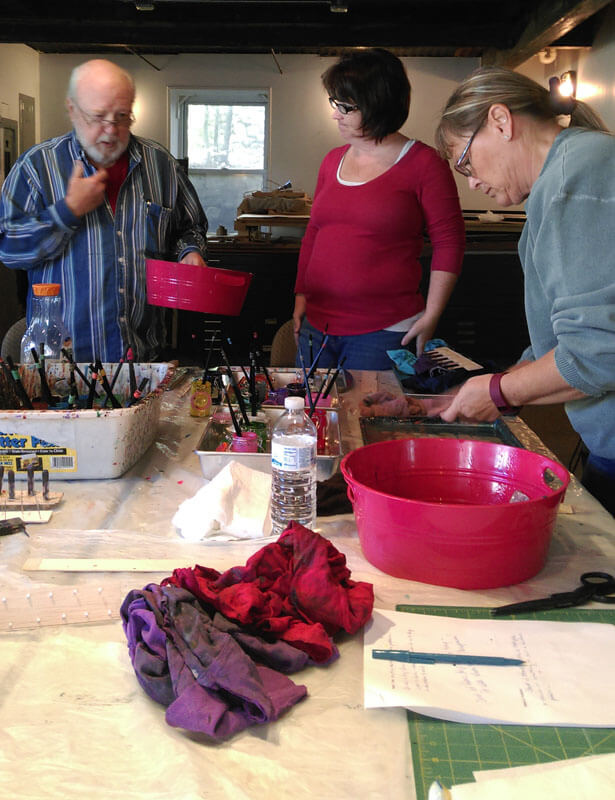
We spent Vermont Open Studios sharing space with Mary over Memorial Day Weekend. LOTSSof great discussions on marketing!!
It was a challenge to plan for what could take Mary’s already wonderful art to the next level.
 Mary Hill’s “experimenting as a result of our machine quilting class:
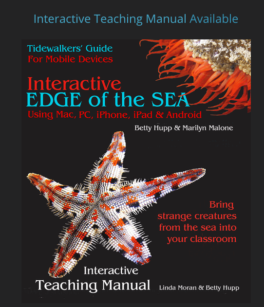
Plus, since May I have been working on an interactive teaching manual for the ebook Interactive Edge of the Sea. This takes all I have worked on in curriculum in 40 years of teaching and brings it together for teachers, with a modern update on using all forms of new assessment and social media within the classroom. My hope is that this manual becomes a template for other disciplines, as there are a lot of useful interactive teaching techniques – and everything is correlated to current educational standards. A labor of love with my second mom, Betty Hupp. Here’s the cover:
 A snippet of the lesson plan section….
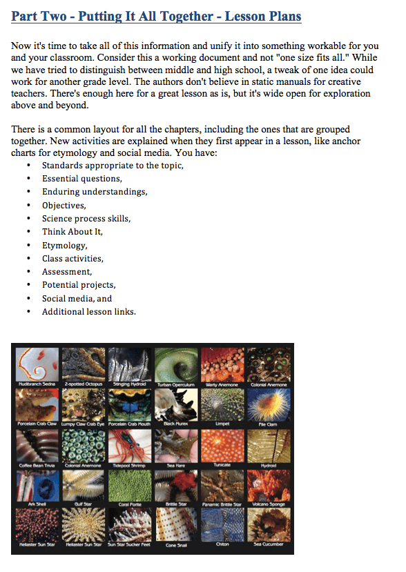
We are just about done with final edits, and after the first of the year it heads off to coding. I have a lot of links to check to be sure they all work!
Bunches of shows…..here are pictures of our small pieces at Sweet Grass Gallery in Williston, VT for the month of November.
There’s still more…..stay tuned!
Art in 2016 – Part 3 Review – A Few Other Commissions
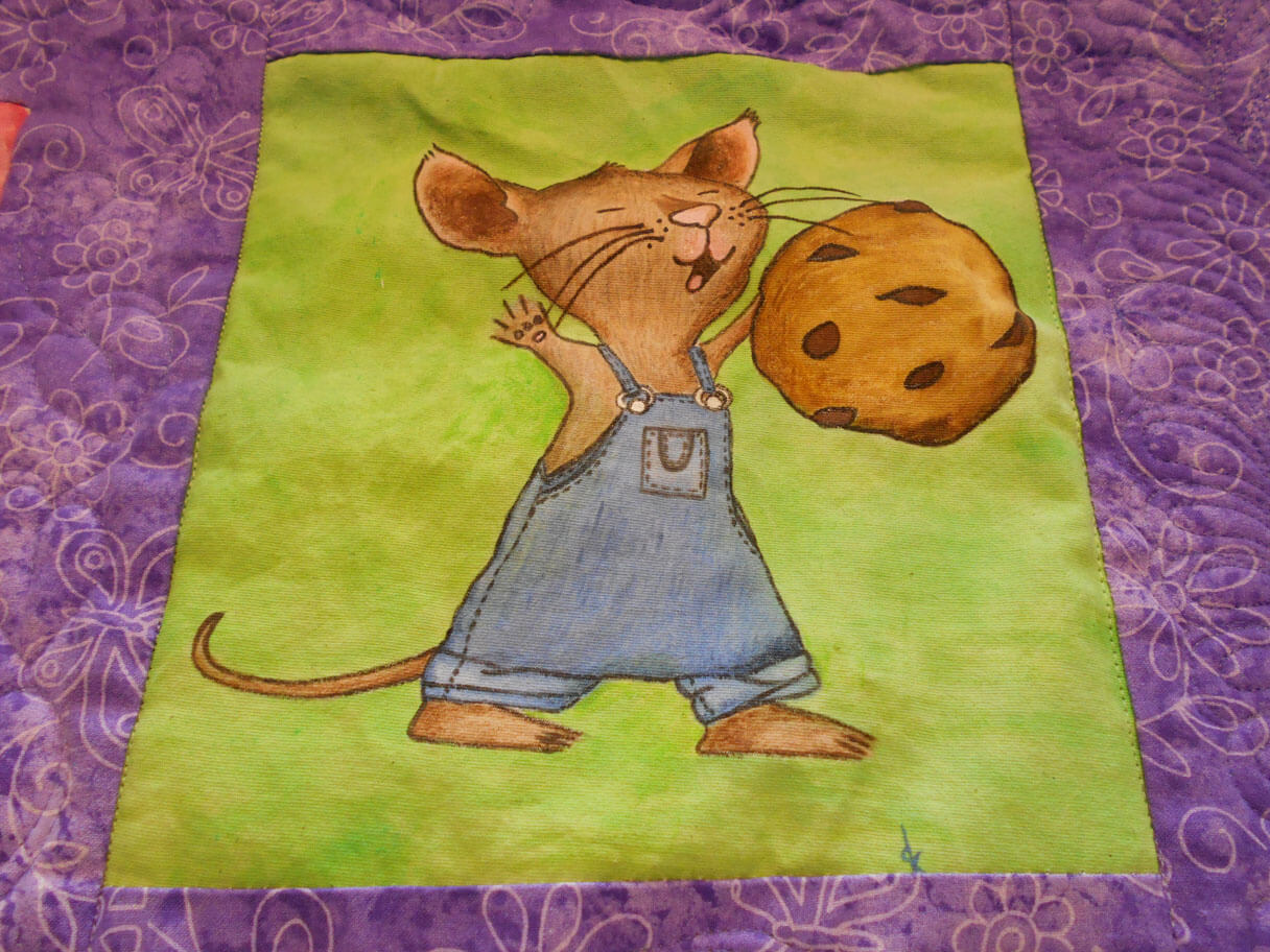
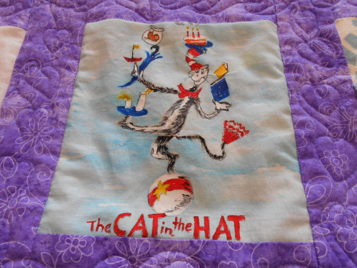
I was very involved this year in helping others create some wonderful fiber art. First up was a baby quilt for a teacher at a former school of mine. The teachers all created blocks based on children’s books, and then along with the baby quilt, gave the books to the new mom. It came out so cute!
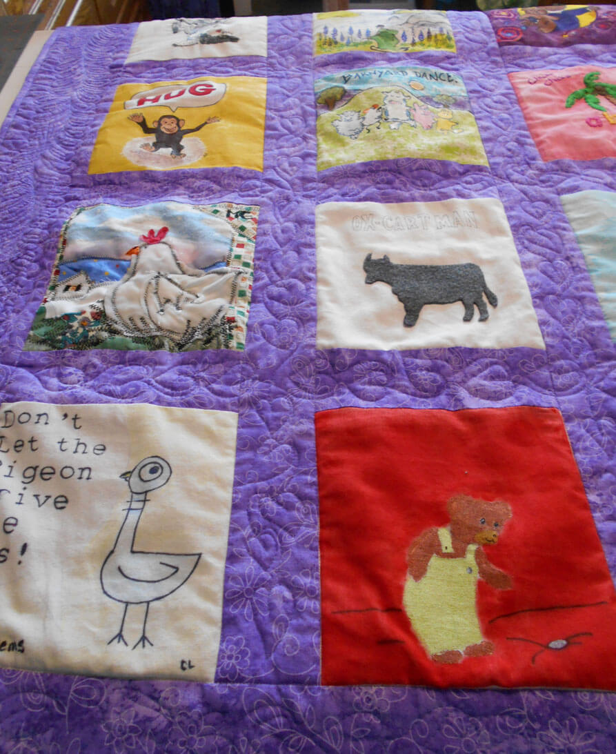
Children’s Book Baby Quilt
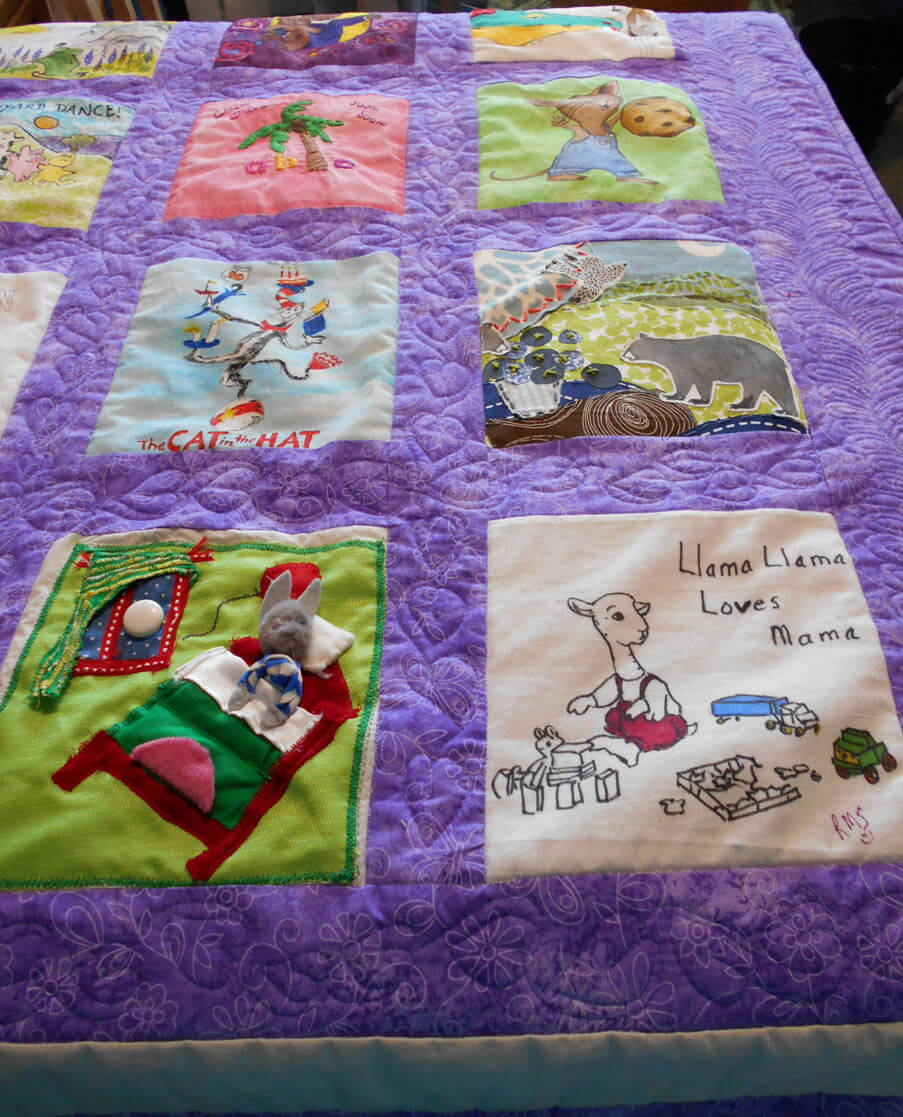
You can see the machine quilting – “leaves” for the pages of books – the leave of a book……a lot of fun to quilt. Next time….stabilize the pieces before they are sewn into blocks….
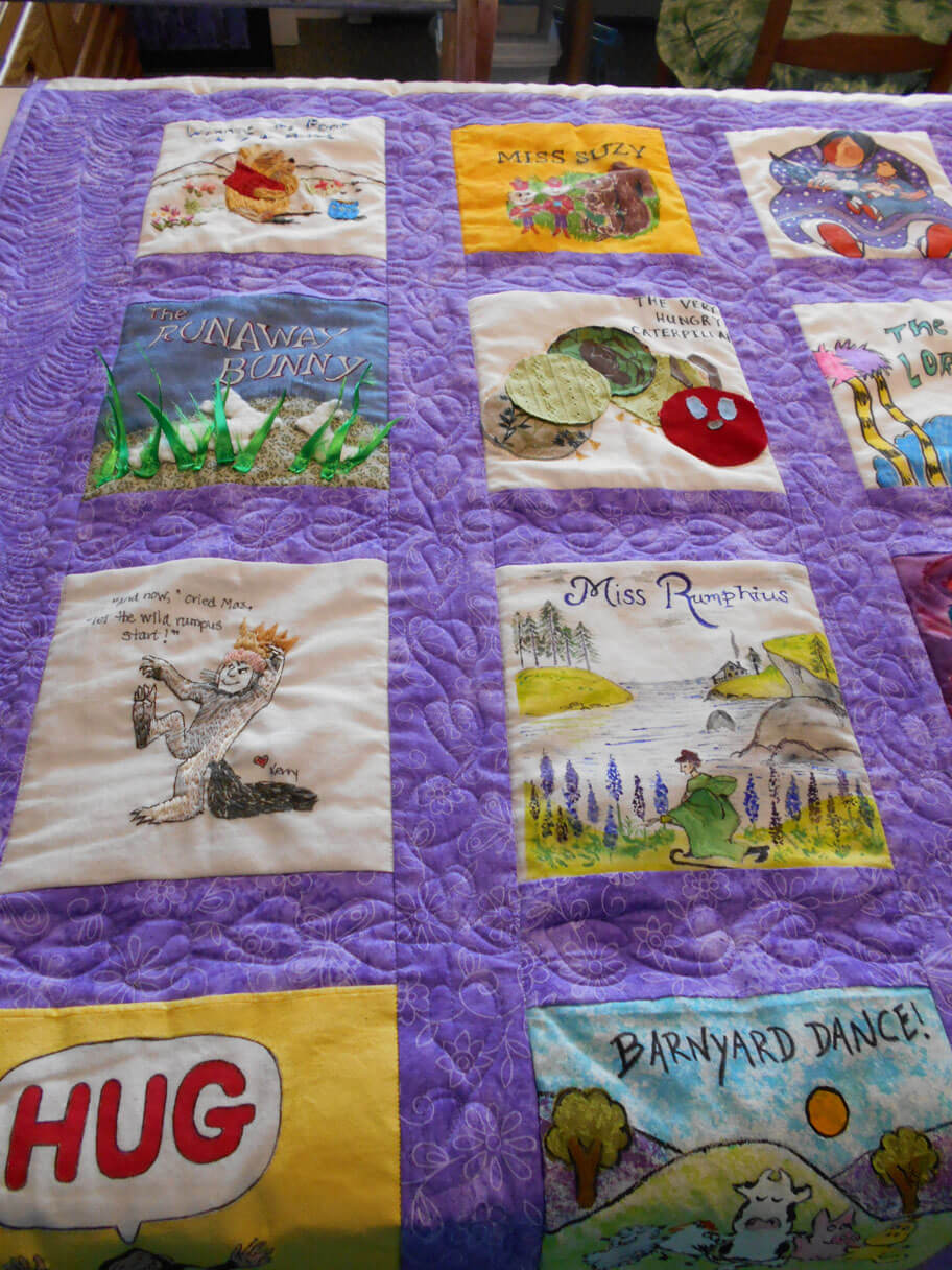
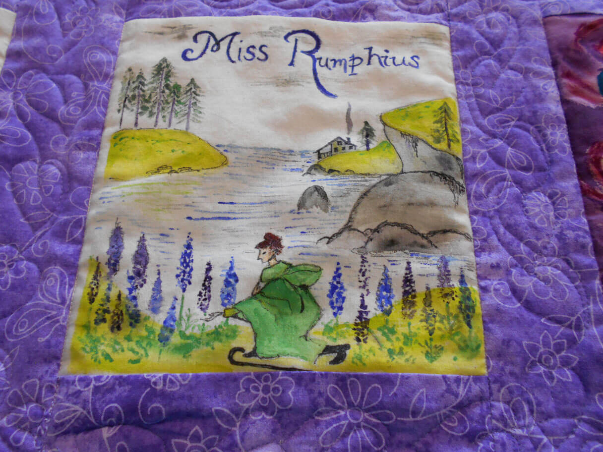
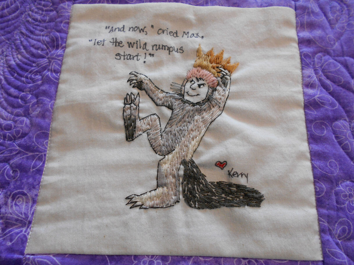
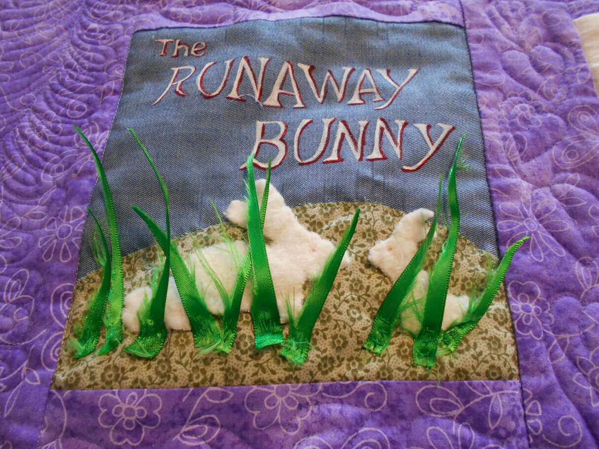
How many books can you identify?
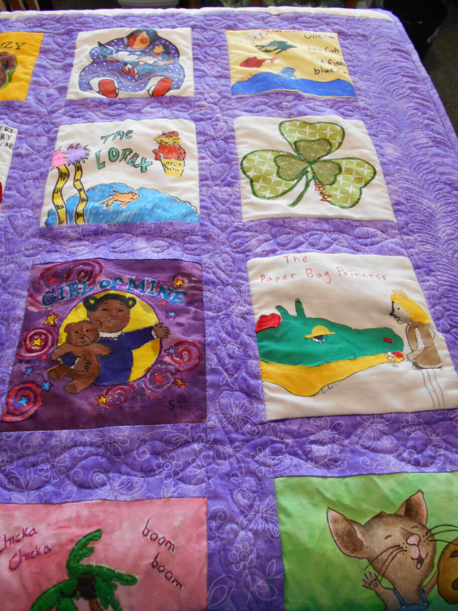
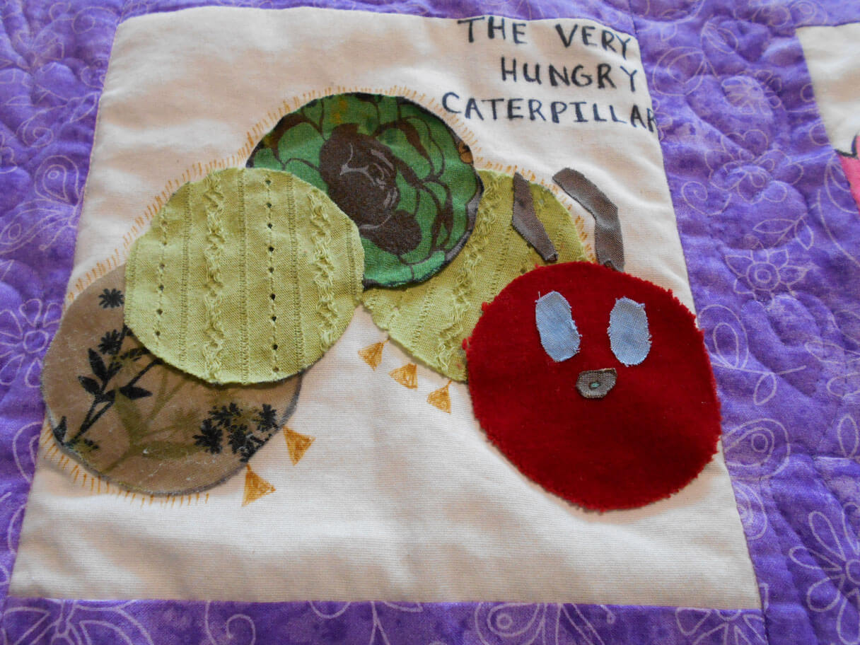
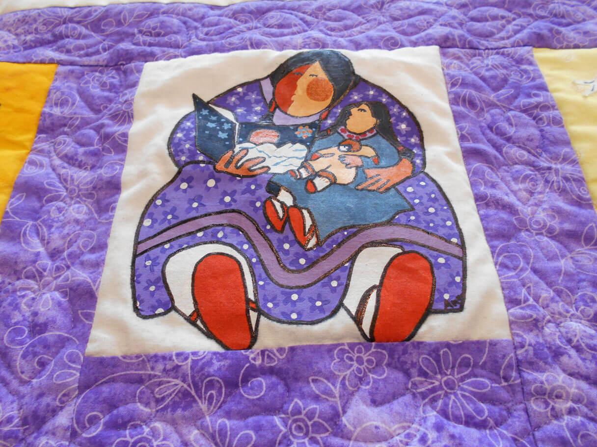
LOVE Patricia Pallaco!
Two more baby quilts scheduled for the new year….prolific bunch at Camels Hump Middle School!
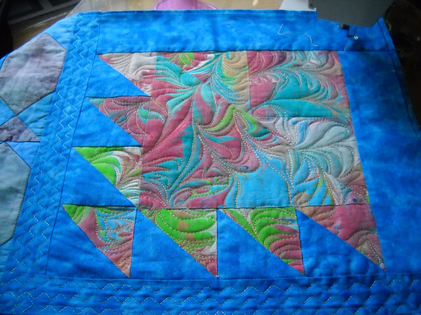
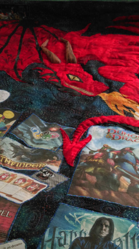
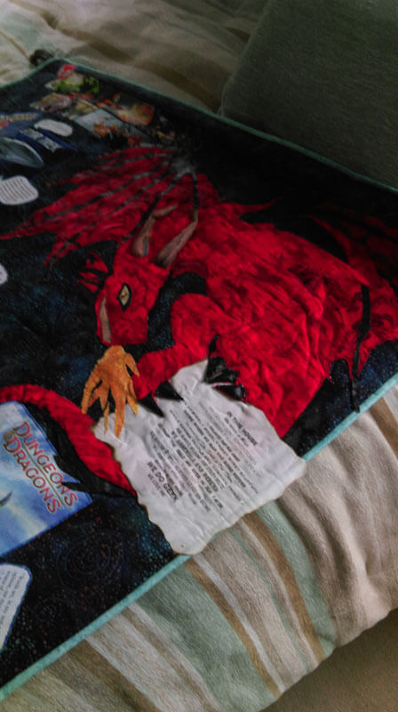
A good friend made a “science fiction” quilt for her son – a gamer, doctoral student, and avid reader. It was SO MUCH fun helping in the process, from using spray basting, to zigzagging quotes, to creating the dragon (a “must-have in this quilt). It hangs from a curtain rod that is very “Lord of the Rings” in design. I was responsible for the machine quilting of dozens of galaxies within the quilt. The dragon has a lot of marbled fabric within it, and it works so well! Kathy did an amazing job. Teeth, flame, wings, and horns all crafted from marbled fabrics. Hubby Dave did the design for the pattern, Kathy did the contruction with vinyl and a few other fabrics.
 The last heavy sewing/quilting happened when my friend Kathy wanted to recreate a marbled wall hanging of ours that one of her daughters loved. Sure…..to find she wanted it reversible…and a few other changes….


 The story of the original piece is here.
I don’t have any finished pics at this point – just an in-progress. Oh, did I forget to mention she wanted one for each daughter? Different colors for reversible? Different quilting patterns? It really was a lot of fun, and it challenged me to revisit a reversible binding….but I made Kathy do all the hand-stitching……
A close-up of in-progress……
 Can’t wait for pictures of both the blues and the greens!
The year started with this commission: The Arroyo –
Starting stitching
Embellinging
On the wall at Frog Hollow Gallery
…and we’re not done for the year!!
Art in 2016 – Part 2 Review – Small Works
A lot of smaller work was started, finished, and revised this year – part of the need to create more pieces, and part to experiment with new ideas. We also tried more framing (pretty successful) and mounting on canvas (very successful, and not that all expensive). The biggest issue seemed to be people didn’t know what to do with small wall hangings or table-toppers. By framing them we are leading our customers to see the piece on a wall, looking like artwork. This is also working well for galleries and stores with small spaces.
The “Chocolate Box” piece on the left was done some 18 years ago as part of a challenge on the QuiltArt list to create an 8 x 8 piece with the theme of “brown.” I pulled all kinds of browns from my stash, including some marbled fabrics, and then I zigzagged them together with the idea of creating a “Whitman’s Sampler.” I have always thought it looked very cute. I rediscovered it this summer, adding batting and backing, variegated thread in a more prominent zigzag, put on a binding, and mounted it on fabric. Lots of good feedback on the piece.
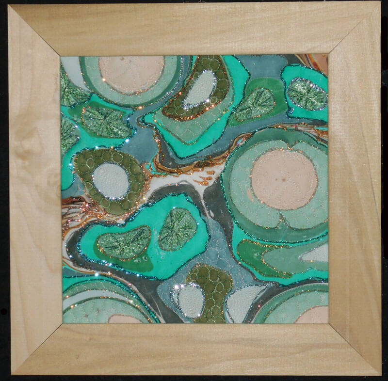
Another piece that saw framing was a small piece of marbled poly-satin that a friend (Suzan Drury of Saltwater Systems) added glitter to at least 10 years ago. Loved it, but it didn’t translate into something someone would want to buy – so on a whim I added batting and backing and then quilted it – thus “Pond 3” – a favorite topic. I learned to do sand dollars as part of a tutorial from Lori Kennedy (theinboxjaunt.com), so you will see clam shells, sea urchins, and sand dollars throughout the small piece. It looks quite striking. One thing I learned in the framing process was to move to lighter-colored frames to keep a piece from feeling constrained.
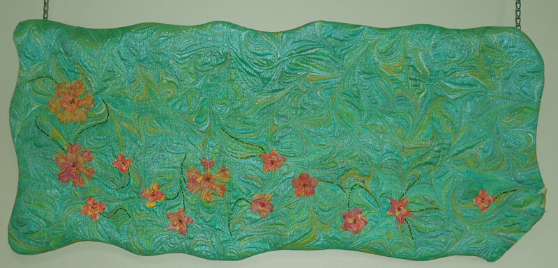
this year saw the debut of a new series – “Leftovers.” The idea for this came about when we would clean the marbling tray after a session. There were wonderful designs of leftover paint as we emptied the carrageenan. We started saving some small pieces to capture to designs – all of which are very organic and “earth strata.” Two pieces made their debut at Phoenix Books in Essex as part of a rotating display of work by the Essex Art League. There are LOTS more to come – all of which need me to stare at a piece for a while to determine how it wants to be stitched. They are all simply framed and look almost like photographs.
Leftovers 1: Sunrise
Before stitching on From Above:
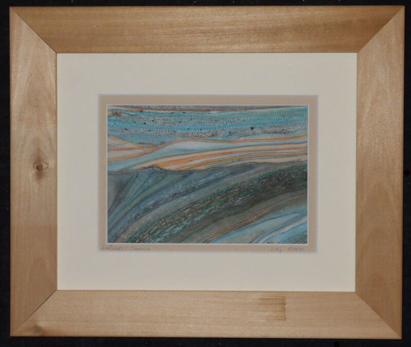
Ultrasuede marbles wonderfully. Over the past couple of years we have been doing yards of this for Bead My Love to sell at the various bead and gem shows. We get to keep a few pieces for ourselves, and this year I finally attacked quilting one – with some interesting lessons….the fabric feels like suede, but it doesn’t translate to a puffiness when quilting (note to self: use extra batting for the next piece). Also, the various colors didn’t show well, which is why I went with Superior Threads New Brytes yellow – a thicker thread. this is a 12 x 12 piece of ultrasuede. Introducing “Partly Sunny, Chance of Storms.”
Partly Sunny, Chance of Storms
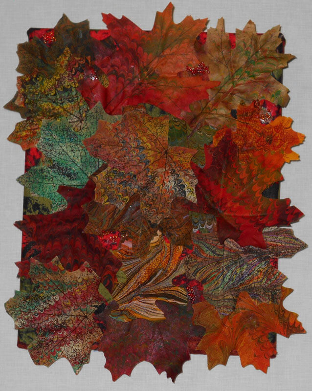
One more piece – we also started marbling flowers and leaves from the silk flower sections of the craft stores – another way to use up left-over paint in the marbling tray. Here’s “Autumn,” a collage of some marbled silk leaves. Covered canvas, 8 x 10 inches.
More next time as I continue to review the year. Comments welcome!
Art in 2016 – Part 1 Review
It has been a banner year for art – especially in the making of art. When I stopped to reflect, I realized we created more this year than any other year – some big, many small, and all taught us something! I’m doing several blog posts, since I don’t have pics for a bunch of gifts – awaiting the jpgs in the email….
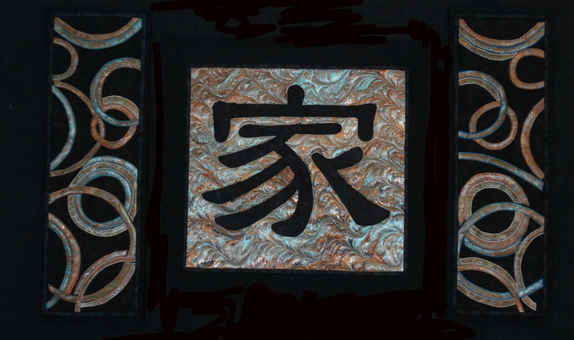
Yesterday was the presentation of a commission for dear friends of ours. It was supposed to be for their anniversary in September, but just didn’t happen….Once knee surgery was over and I could move around fairly easily, I set to work. The marbled fabric had been done since April, and I had been mulling designs since then. It was time….
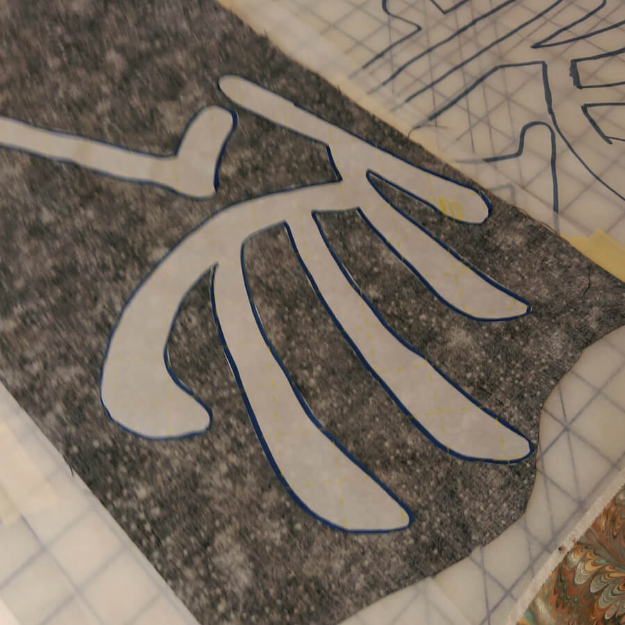
I started working with the Chinese symbol for “family,” and after just this first littyle bit, I have even more appreciation for the art quilts of Kathy Nida. This involved tracing the symbol, determining which side would be “up” when ironing onto the front of the fabric, adding WonderUnder, and then making sure it actually worked – especially since I had a limited amount of the fabric choice for the symbol. First success.
Next was creating the pattern for the side panels, loosely based on a table runner by Lonnie Rossi and definitely made my own. Same issues with being sure of right and wrong side, since there would be two panels, and the designs would mirror each other. Much angst – especially on the choice of the background – I had a peach silk that worked with the overall colors, but looked terrible with the small pieces actually on it. The fabrics were extra marbled fat quarters that didn’t make the cut in terms of main color, but they were all complementary.
I put off for the longest time doing the zigzag satin stitch and then discovered that the fabric frayed very easily. A lot of adjustment, sharp pointy scissors, and FrayCheck got me through this section.
The satin stitch….forever…..
I had one panel completed and then started on the second panel. It probably would have been easier doing them both at the same time, but I wanted to be sure the idea could be executed before I was completely committer.
The request was for some apple blossoms quilted into the design – originally to be on the border….but it worked out differently. I Googled images of apple blossoms and determined a free motion pattern, and then began. As long as the petals had ragged edges, the pattern worked.
Starting the apple blossoms
Lots of flowers over both panels – really liked how subtle the patterns are.
Checking to see if the three panels really do work together….
Time to square off and do the binding – the side panels had a LOT of ironing as they were becoming distorted. Note to self – allow more edging next time around…..
Preparing the canvas for mounting the panels. We have started mounting much of our work on canvas frames covered with a complementary fabric. Much sturdier, easier to hang, and people seem to view them more as “art.”
20-inch square canvas covered in poly-linen.
Thinking it’s going to work…….each side panel is three 8 x 8-inch canvases, mounted together and covered.
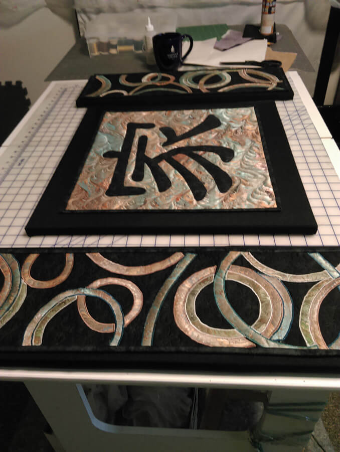
The final product – “Family.”
Playing Catch-Up…..
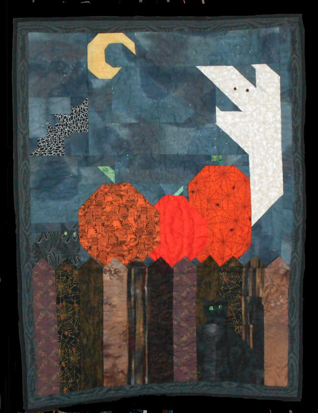 A piece I started about 15 years ago and finally finished this summer – will be adding loops to the back to hang on our door for Halloween. I still have plenty more to work on, and slowly,over the winter during knee recovery I plan to work on them – plus lots of new ones.
Speaking of new ones, in organizing Bridge yesterday (some 7000 photos and a lot of saved duplicates, I think I can make sense of some of the new process pictures. This first piece, Chocolate Box, was done YEARS ago, as part of an 8 x 8 challenge from the old QuiltArt list. I think the theme was “brown,” but who knows? Originally I just sewed pieces with a zigzag stitch – and then I realized I needed stabilizer on the back – like I said, a long time ago. This summer I came across it, added backing, re-quilted it in a variegated thread, and added a border. Still love the piece!
Chocolate Box
This piece was done for us years ago as part of a challenge to use marbled fabric in a traditional pattern. I made a sandwich, added waves to the bottom of each boat, and quilted semi-circles around the sails to represent the sun. If you made this for us, please let me know so I can credit you.
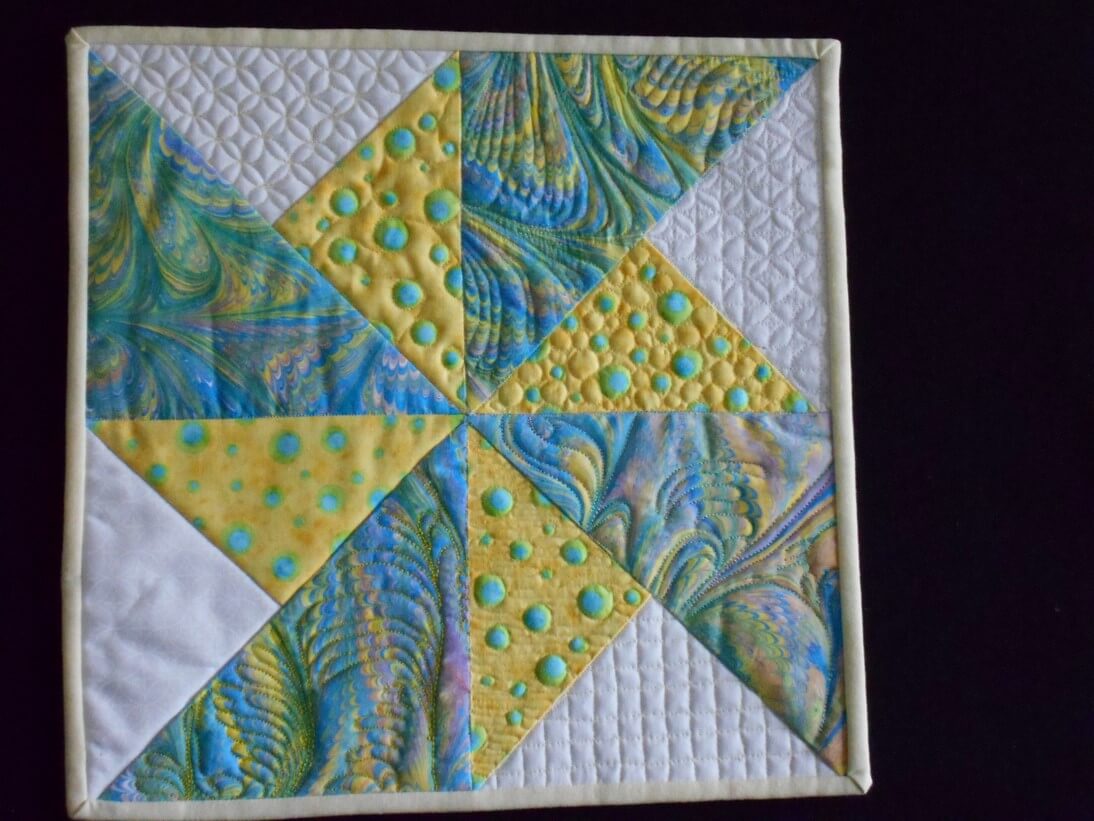
This next was also part of a challenge, and I use it as a sampler for using free motion quilting on a traditional block. One of the sections is plain, the others have a variety of patterns, some following the the pattern, and some walking around. I love how the marbled fabric quilts up.
Pinwheel
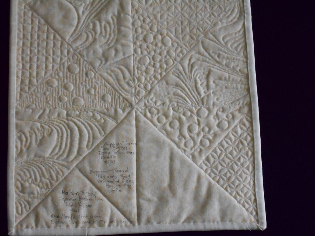
I like to use my backs to show errors- and then in the blank area I added details about threads and needles.
So I continue with cleaning and organizing, and hubby is busy marbling every fabric we seem to have in the house. He’s having a ball!
More Lessons from the Coloring Books – Part 1
Throughout all the stress of medical issues this winter and early spring, I resorted a lot to coloring at night – one BIG take-away from the coloring is that it controls my appetite….no small thing. But I’m learning something almost every piece I do. You can catch up with what I learned so far here.
So here are some pics – and lessons learned.
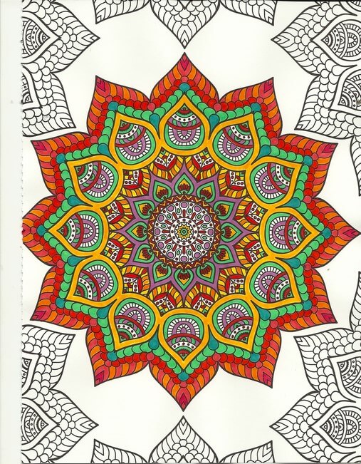
One of the things I’ve been playing with is amount of white space. You can see in the above that not everything is colored. Pus, I was trying to play around with oranges and color combinations, like mixing colors that are close together. I love the way the turquoise is accented. No point in doing the edges – I was concentrating on the center – which is an interesting move for me – to just let things “be” without having to “finish” everything.
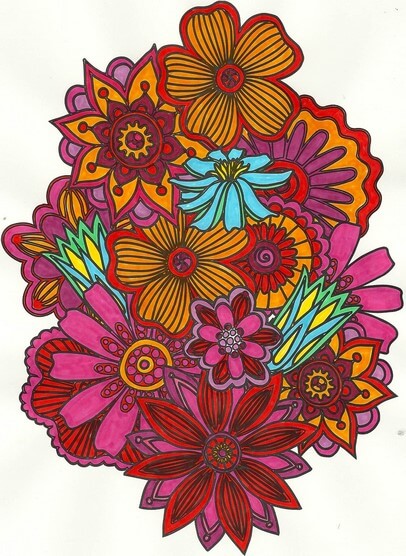
Again with the reds, oranges, purples, but I decided to add an unexpected color – my fiber work tends to lack strong focal points – so I added the blue – makes the piece. I also rotated the scan because the “bottom” was too heavy when on the “top.”
Here’s where I figured I really need to spend some time with colored pencils, especially when I can do shading – which I love doing with regular pencil. And again the oranges and reds.
I left white space with this, and I discontinued finishing the design – it was getting too busy. Here’s where I kept hearing Tim Gunn’s voice to “edit.” The yellow in here really glows.
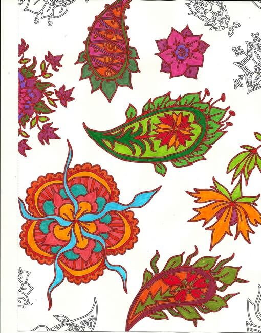
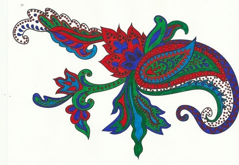
 This was playing around with oranges and blues – a combination I am starting to like a lot. Lots of white space, and I used the designs on the edges to play with color combinations. The lower right looked too much like a super-hero costume for me……
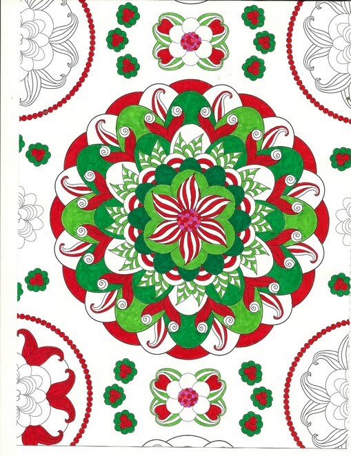
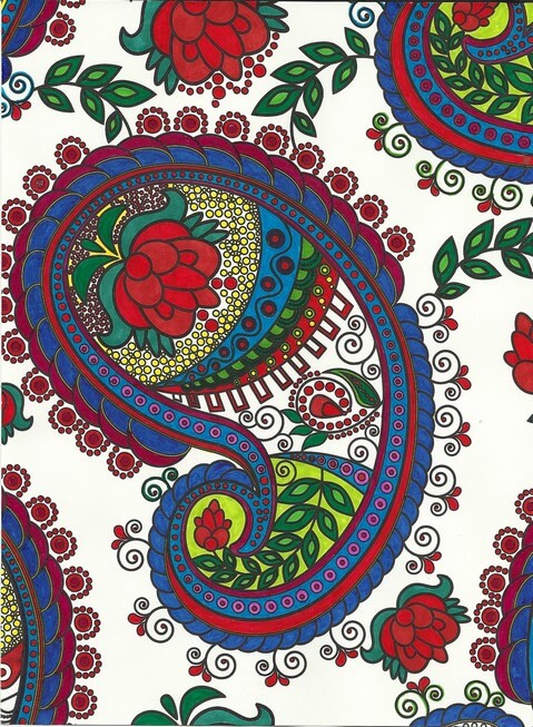
Christmas colors – meh. These were better than some I tried. The colors – for me – need to be true, but I am happier with mottled shades of reds and greens.
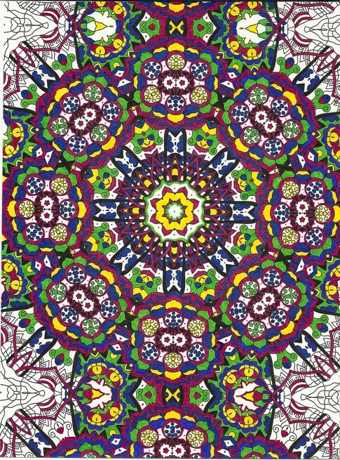
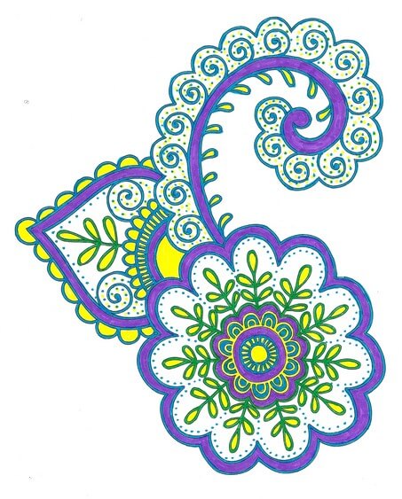
Interesting as I was working with what colors glowed – the yellows, but especially the purples in the center. I also discovered differences in black – flat and shiny, which I should know because of all the black fabrics out there. Overall a fun design, but it bugs me that the books consistently cut off complete designs.
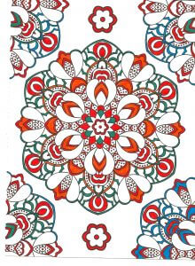
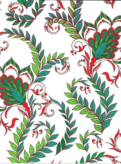
Blues, reds, greens and white space. I am finding not everything needs to be colored. I find this quite pleasing.
Love the delicacy of this one. Even though the design is completely filled in, there is an airiness to it.
Same for this design – and I really like the colors – very vibrant.
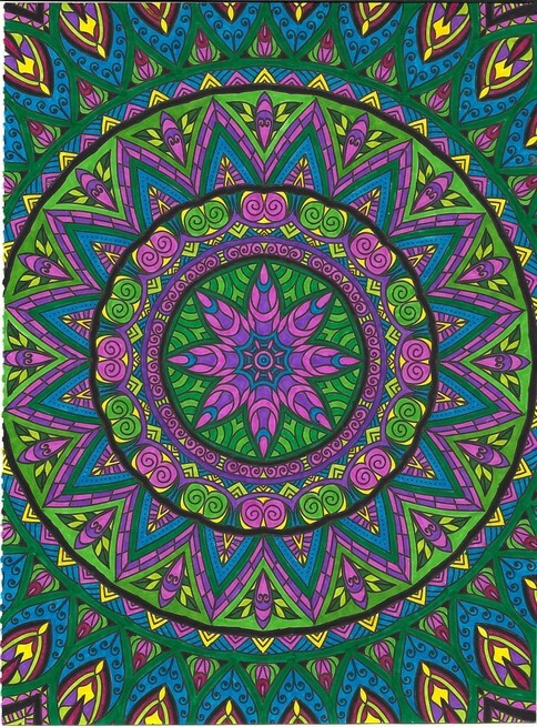
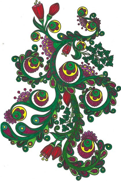
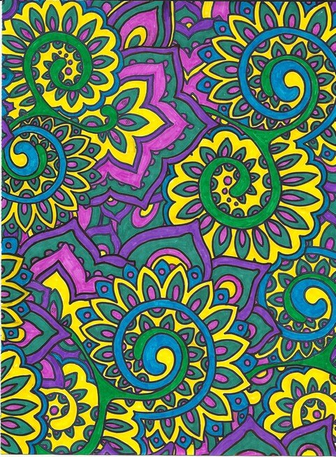
Again oranges and greens – would make a great wall paper.
Nice and lacy – I like incorporating some of the zentangle motifs when I feel there is too much white space.
The original dominant color here was going to be the pink-purple, but yellow won out. Interesting to me how that happens.
Really need to spend some time with colored pencils, but I SO like the intense color of markers. Like I said before, surprising for me, since they are so unforgiving.
I definitely can see some of the effects of the coloring in the most recent fiber work – more on that to follow.