Posts Tagged ‘commissions’
Art in 2016 – Part 1 Review
It has been a banner year for art – especially in the making of art. When I stopped to reflect, I realized we created more this year than any other year – some big, many small, and all taught us something! I’m doing several blog posts, since I don’t have pics for a bunch of gifts – awaiting the jpgs in the email….
Yesterday was the presentation of a commission for dear friends of ours. It was supposed to be for their anniversary in September, but just didn’t happen….Once knee surgery was over and I could move around fairly easily, I set to work. The marbled fabric had been done since April, and I had been mulling designs since then. It was time….
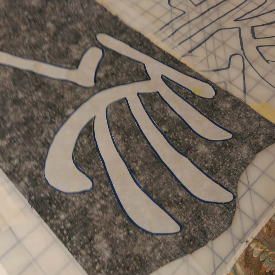
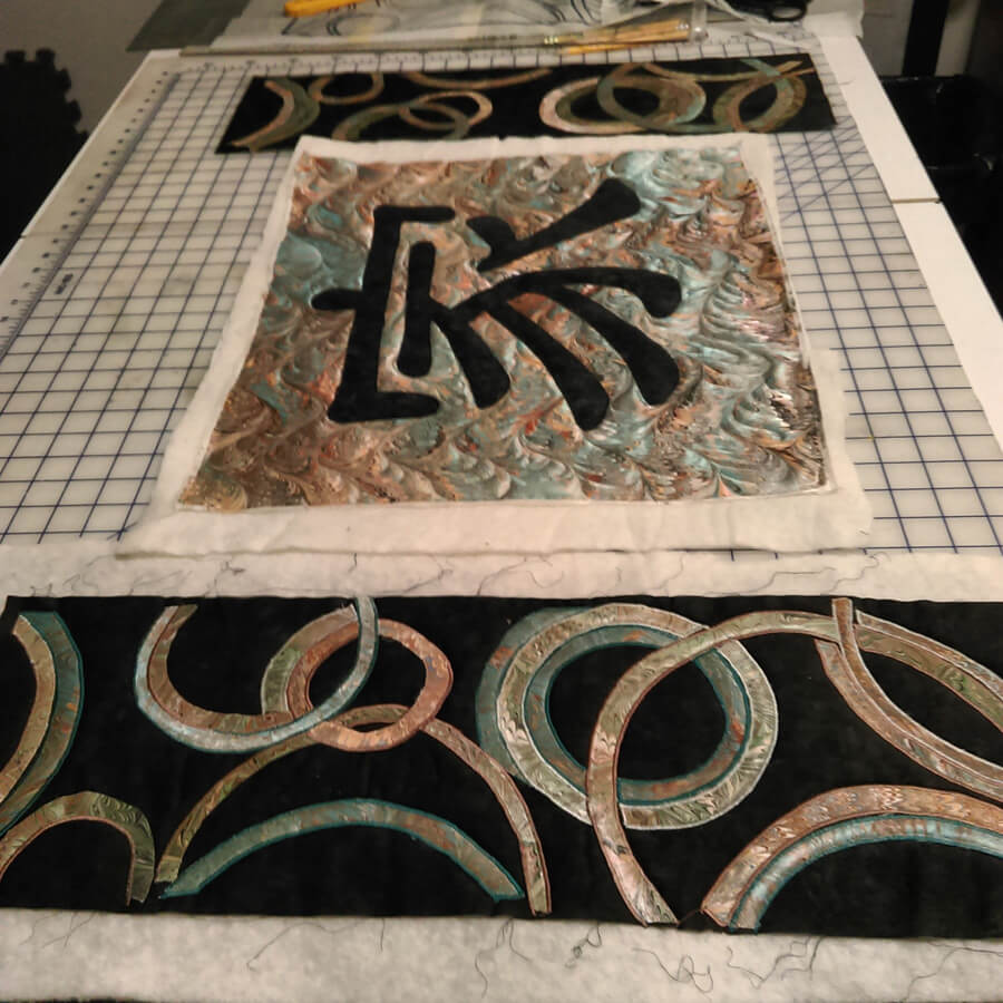
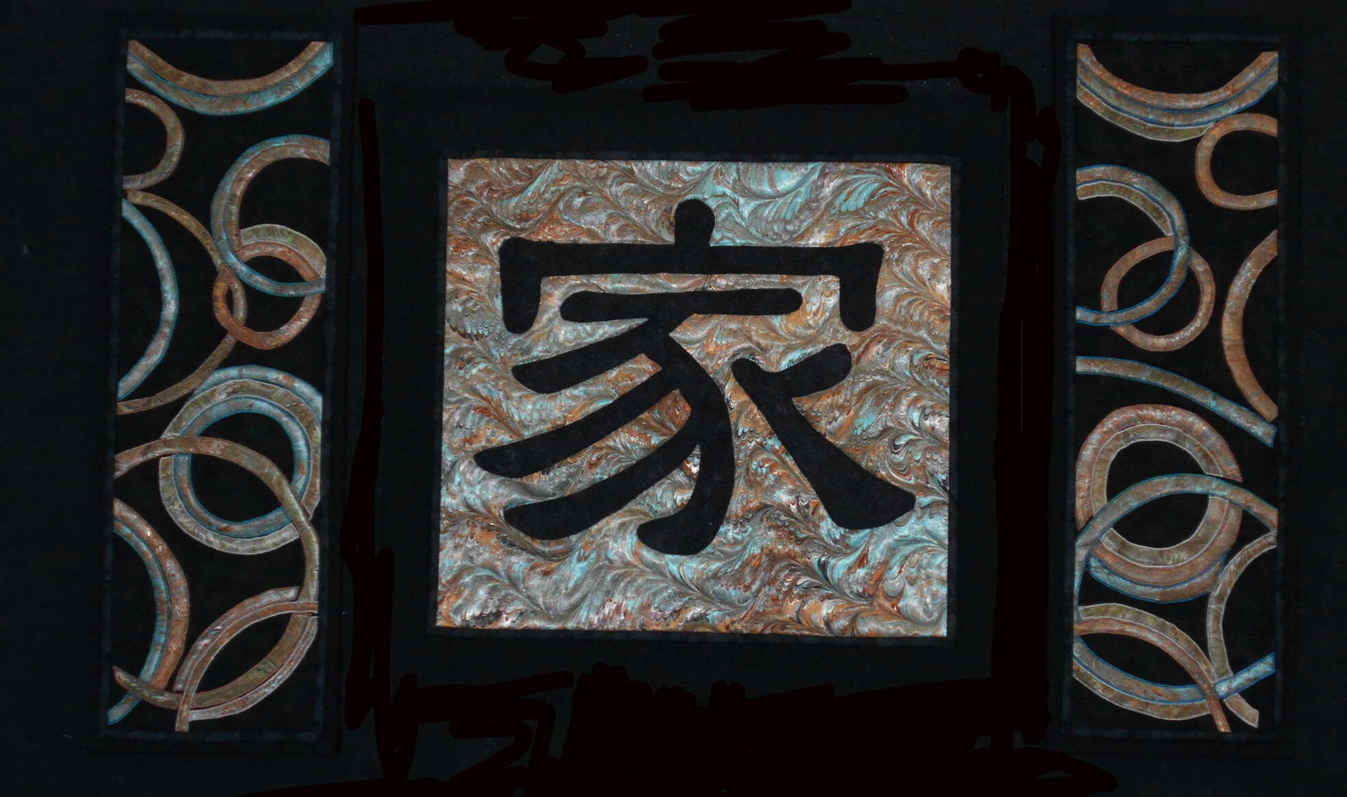
I started working with the Chinese symbol for “family,” and after just this first littyle bit, I have even more appreciation for the art quilts of Kathy Nida. This involved tracing the symbol, determining which side would be “up” when ironing onto the front of the fabric, adding WonderUnder, and then making sure it actually worked – especially since I had a limited amount of the fabric choice for the symbol. First success.
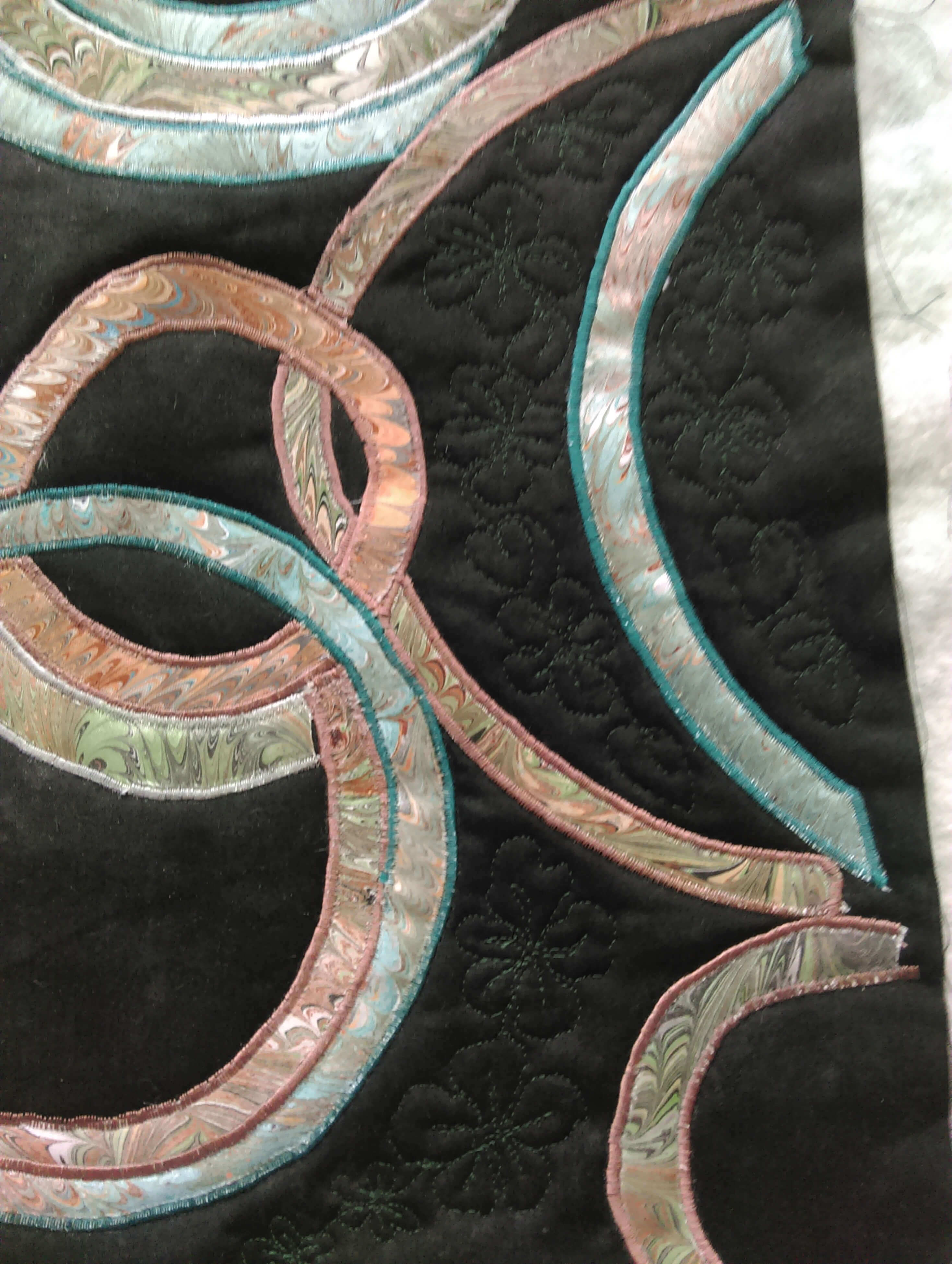
Next was creating the pattern for the side panels, loosely based on a table runner by Lonnie Rossi and definitely made my own. Same issues with being sure of right and wrong side, since there would be two panels, and the designs would mirror each other. Much angst – especially on the choice of the background – I had a peach silk that worked with the overall colors, but looked terrible with the small pieces actually on it. The fabrics were extra marbled fat quarters that didn’t make the cut in terms of main color, but they were all complementary.
I put off for the longest time doing the zigzag satin stitch and then discovered that the fabric frayed very easily. A lot of adjustment, sharp pointy scissors, and FrayCheck got me through this section.
The satin stitch….forever…..
I had one panel completed and then started on the second panel. It probably would have been easier doing them both at the same time, but I wanted to be sure the idea could be executed before I was completely committer.
The request was for some apple blossoms quilted into the design – originally to be on the border….but it worked out differently. I Googled images of apple blossoms and determined a free motion pattern, and then began. As long as the petals had ragged edges, the pattern worked.
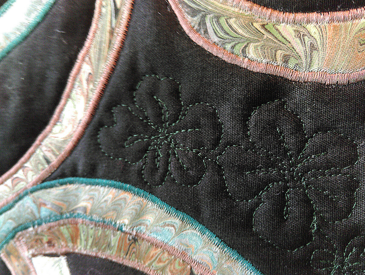
Starting the apple blossoms
Lots of flowers over both panels – really liked how subtle the patterns are.
Checking to see if the three panels really do work together….
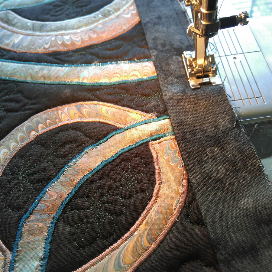
Time to square off and do the binding – the side panels had a LOT of ironing as they were becoming distorted. Note to self – allow more edging next time around…..
Preparing the canvas for mounting the panels. We have started mounting much of our work on canvas frames covered with a complementary fabric. Much sturdier, easier to hang, and people seem to view them more as “art.”
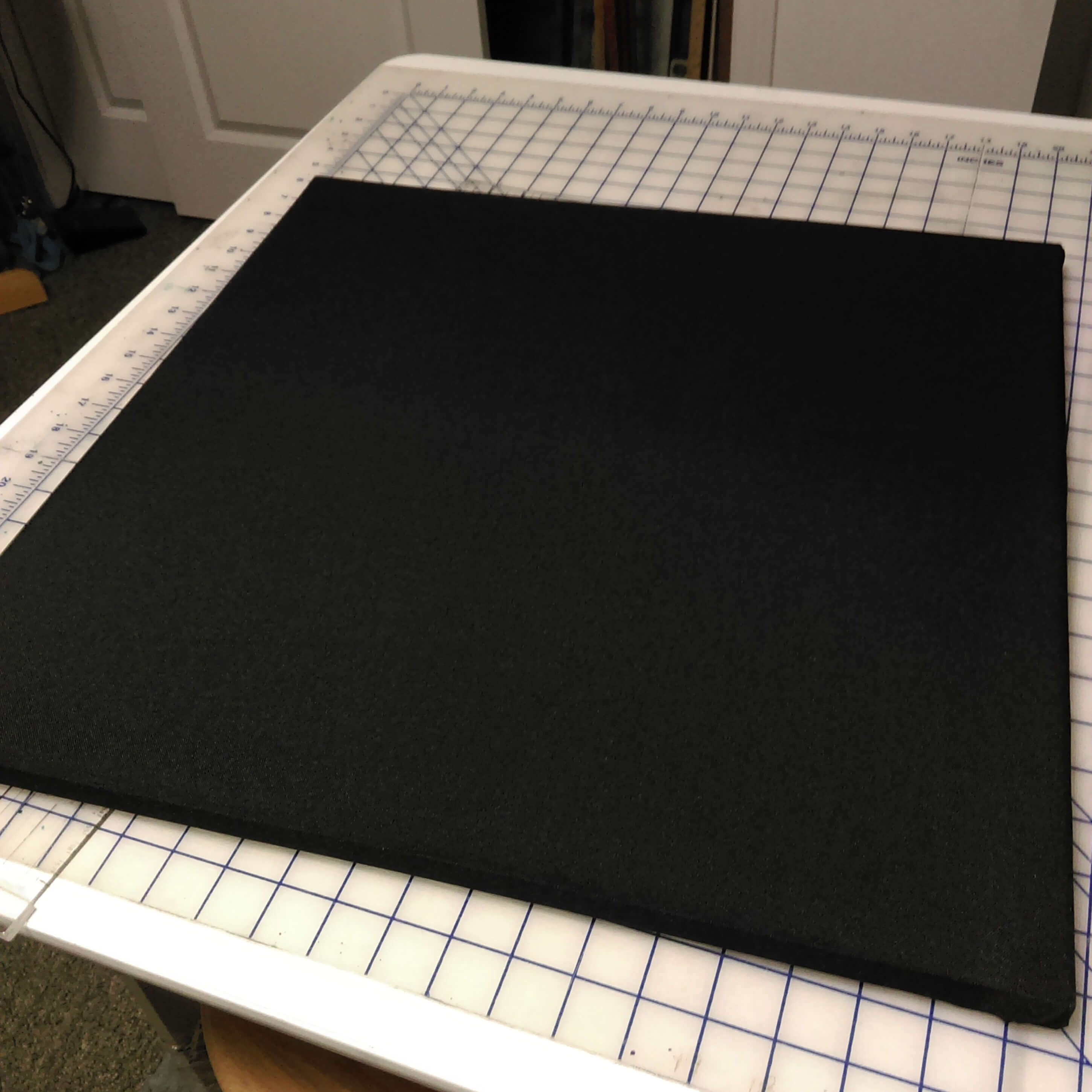
20-inch square canvas covered in poly-linen.
Thinking it’s going to work…….each side panel is three 8 x 8-inch canvases, mounted together and covered.
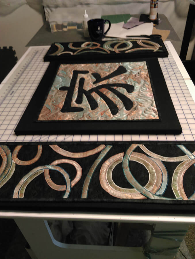
The final product – “Family.”
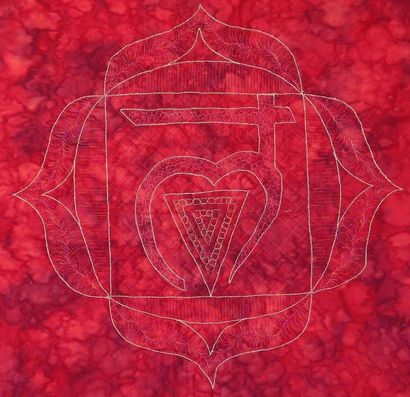
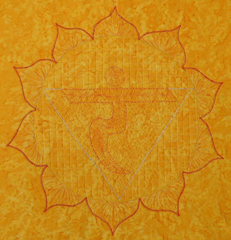
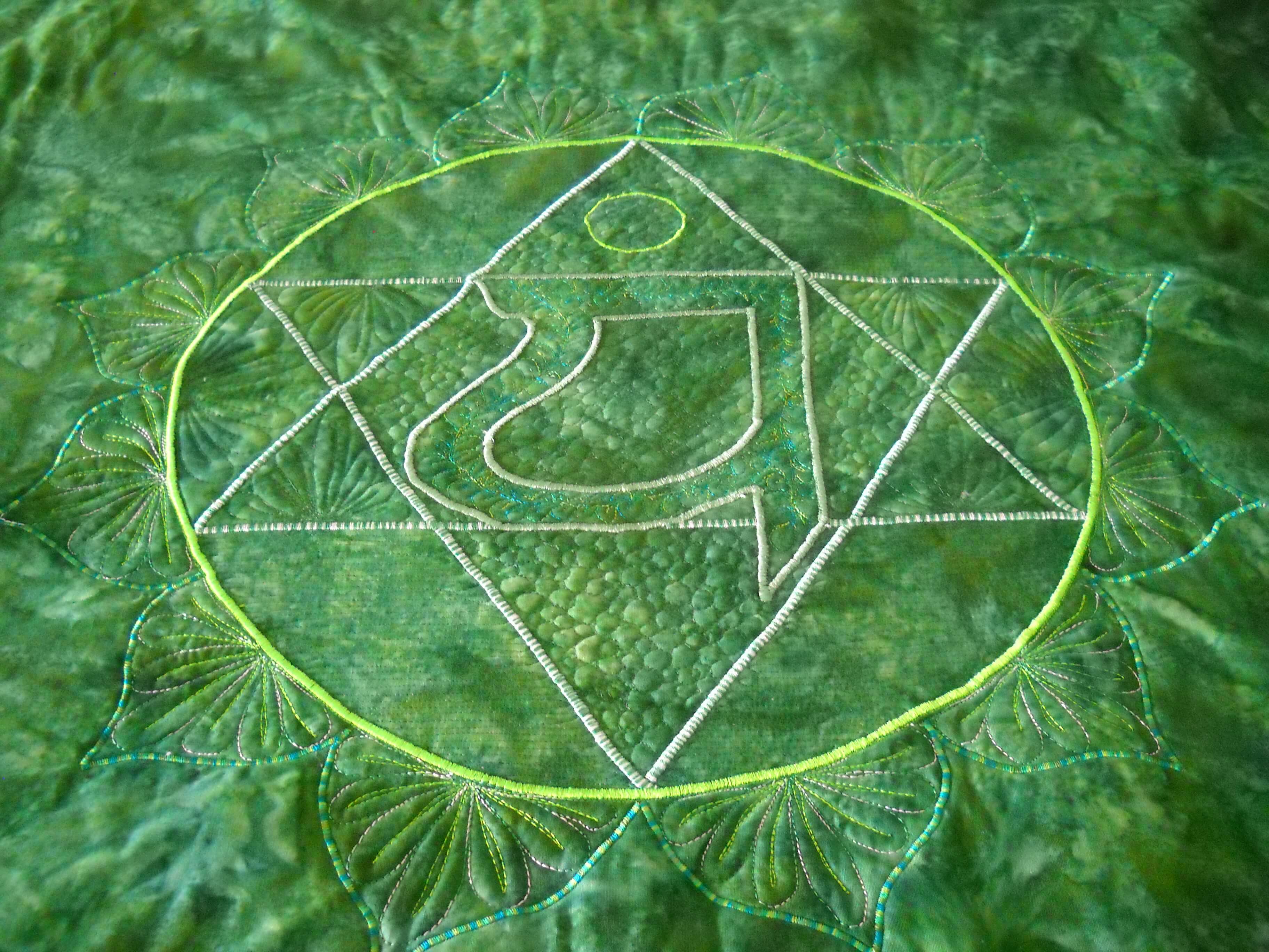
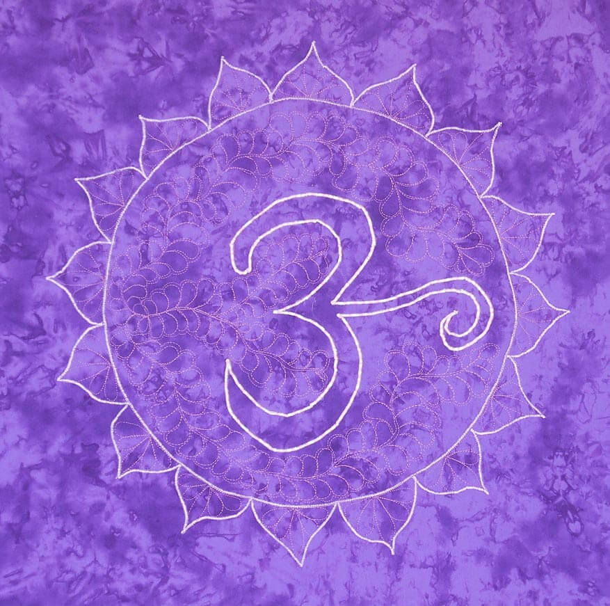
Sunday Stories – The Chakra Commission
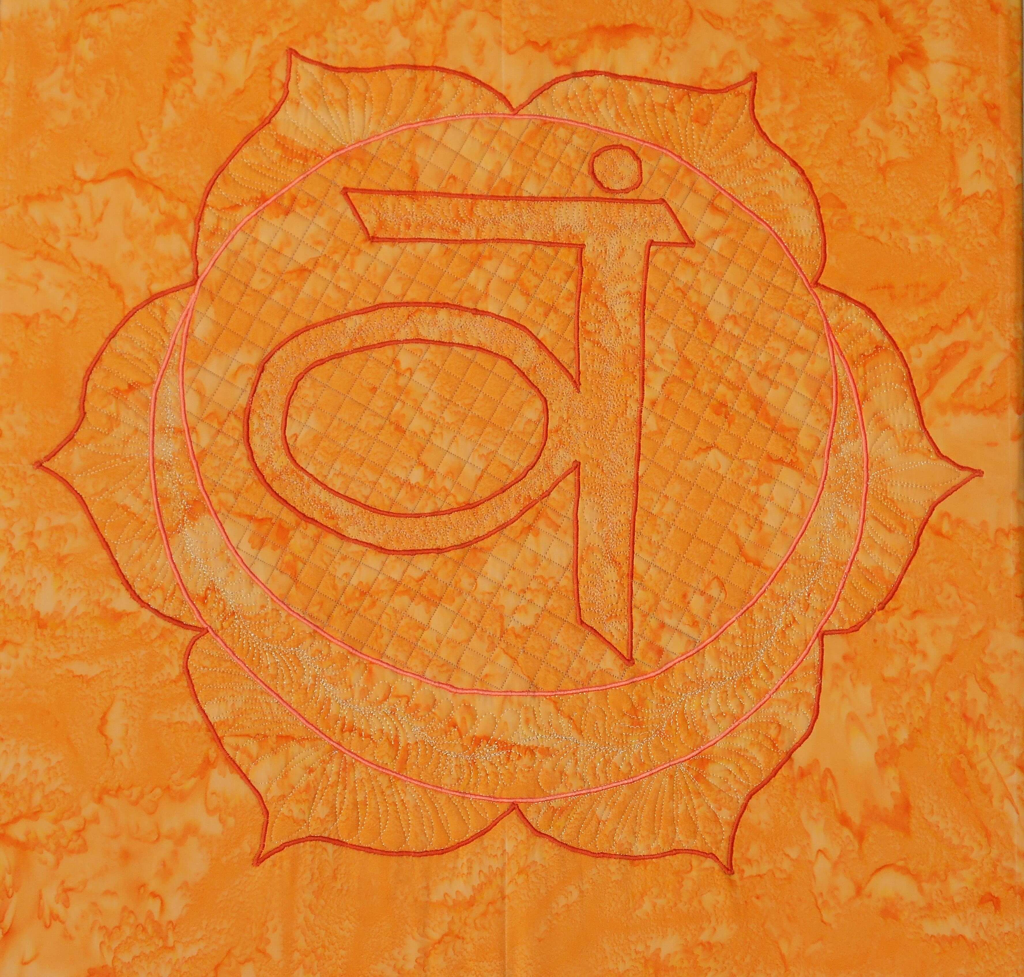
Last September my yoga instructor Susan asked me to do a series of chakras for her home, which is also her yoga studio. She had the idea to have the chakras around three sides of her “great room,” so she would be surrounded by their energies. I had previously done a small 10 x 10 inch thread-painted root chakra, and that one led to this new idea.
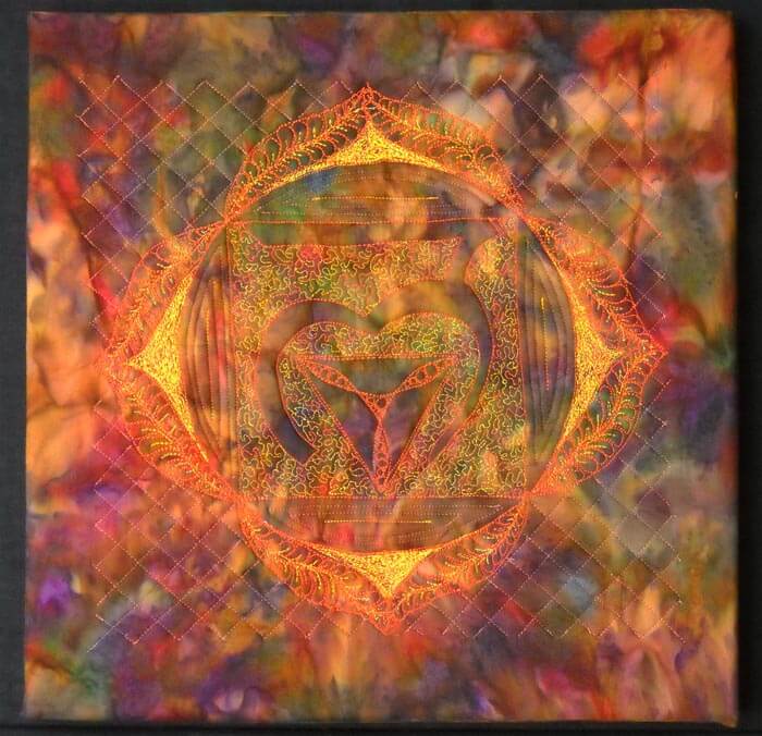
We debated about size, because the wall space is quite tall. Using the floor tiles as an estimate, we decided each would be 24 inches square – wrapped around four 12 by 12 inch canvases that we would put together.
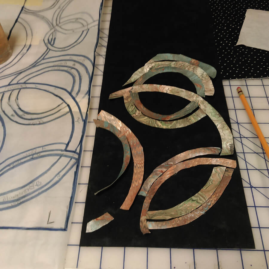
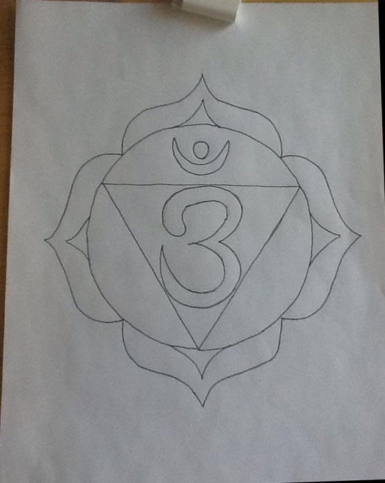
First challenge – choosing the fabrics. I wanted to purchase them all at the same time for consistency. I had thought about the Stonehenge line of fabrics, but the LQS was out of them. Susan found some hand-dyes that were what I call true crayon colors. It was a beautiful vibrant rainbow. This was when I first realized some of the attributes of the chakras. Second challenge – creating the patterns. I wanted the thread-painted chakra to finish at 20 by 20 inches, because that would give me enough fabric for wrapping the canvas. So I worked with a set of patterns from the Net and created a master set for approval. We tweaked some changes with the edges to better increase some of the symmetry. It is now the end of October and I am ready to start – I think.
In trying to explain to the copy folks at Office Depot that I wanted my design blow up to 20 inches by 20 inches, eventually we got a 24-inch-square canvas, with a 20-inch design on it. I had copies made as patterns.
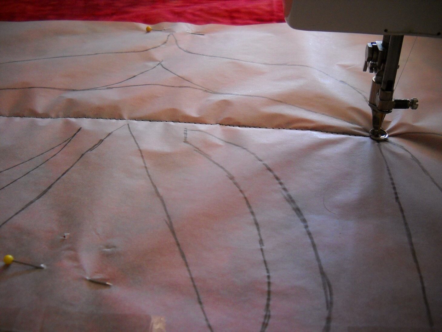
Once I had the pattern, I traced over it and then pinned the tracing paper onto the fabric sandwich. Speaking of fabric sandwiches, it too close to five hours to get seven sandwiches prepped: ironing the fabric (I cut each yard into a 30-inch square), matched it with low-loft batting, and found some unused fabrics for the backings. Then they all sat over a chair for a while.
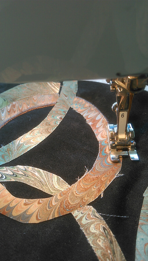
Finally around the end of November I started the actual sewing. I pinned the tracing paper carefully to the fabric sandwich and, using washable thread, I outlined the pattern. Tearing off the tracing paper took a very long while….
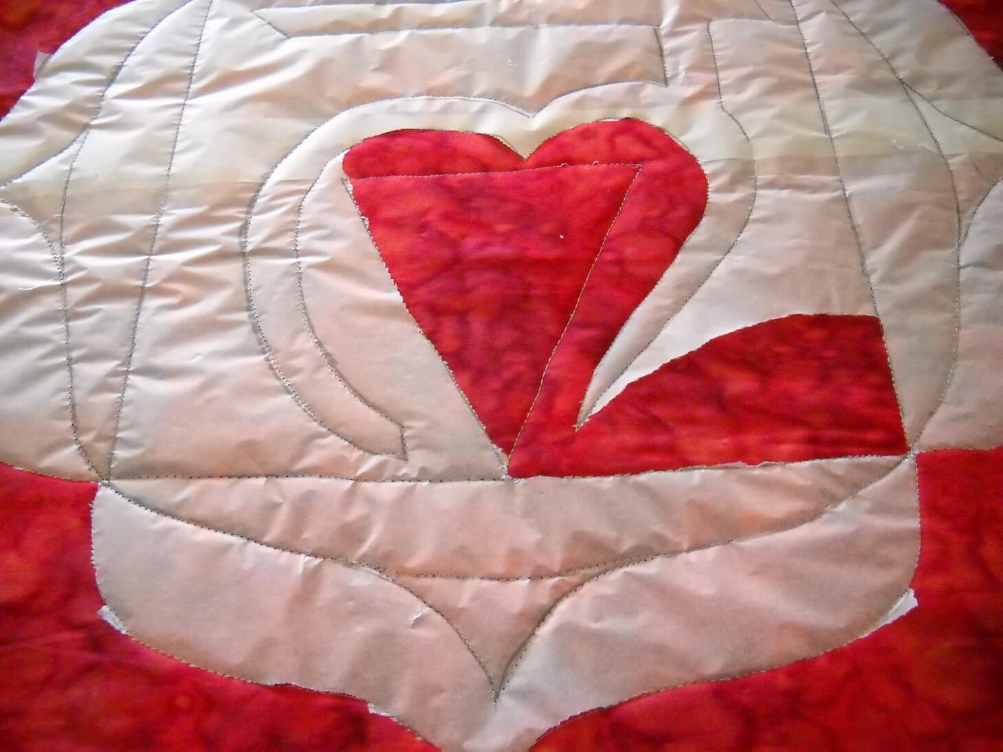
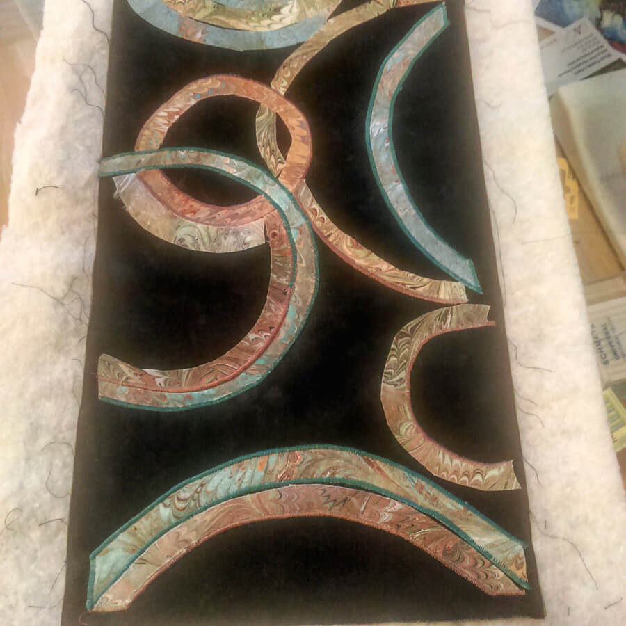
For the Root chakra, I decided to do some bobbin work with a gold thread. I was so-so pleased with the results, but not enough that I was going to continue with the bobbin work. Each of the other chakras used satin stitch on the major elements and a lot of free motion patterns for fillers. The chakras got progressively better in their sewing….until the last one – same elements but a much simpler design.
I thought about redoing the Root chakra, since it didn’t seem to fit with the others. But the more Susan and I talked about how these were developing, the more I liked the first and the last. As I worked on them, I added more quilting elements that added to the design. I used colors in the same family as the background fabric, with hopefully enough contrast. Up close they were all looking gorgeous. From a distance, they faded away. That bothered me for a while, but I realized as I was working on them that everything in the design was meant to be meditative. Up close, you could lose yourself in the design. From a distance, the more you looked the more your saw.
Susan summarized it pretty well. The root chakra is our beginning, and it can be very shaky and unsure. We develop from there, with whatever impurities becoming who we truly are. The crown chakra, the seventh, is the Divine, and as such doesn’t need to be ornate. The Divine in us can be very simple and beautiful.
So here they are, in order.
(Have to find this one – will update……)

I learned a lot. There are some stitching patterns I would change. I would probably use a much lighter background fabric and have the stitching pattern show more. Yet they move in complexity, much like the chakras do. I one I am missing is the one I think is the best design, yet in viewing it, the design seems very faint. The more you look, the more you see. This is also the chakra that is my weakest, so I find that fascinating. My yoga instructor is extremely pleased. The room is surrounded by color and it just vibrates. And she says she can easily meditate on whichever one she wants or needs. A very happy conclusion.