Author Archive
Top Ten Tuesday – 10 Reasons Not to be Depressed
Yeah, this is a kinda different post. Life is intruding on art, in that I go back to school tomorrow and all the art work comes to a screeching halt. I’m hoping not….so here goes….my attempt to convince myself I’m really not depressed.
* 1. I have a job. Between RIFs and pay cuts and unfunding of education, I still have a job. It may not be ultimately what I want to do, but I have a job and I do like it – and I’m making a difference.
* 2. I got a lot of art done this summer. Usually I get a piece done in August when I get my act in gear – not this summer. I managed to complete 5 projects and one major piece of art, plus loads on the business.
* 3. I have three more years of teaching. After this year, two years, and so on. Three Augusts from now I won’t be depressed.
* 4. I could still be at my two earlier schools and not at the high school I love. The two middle schools I spent 7 years at turned out to be hell on wheels. SO GLAD that’s not the case any more.
* 5. With hubby getting Medicare this year, that’s $500 a month I’m not laying out for health care. While I am turning into the care given, at least medically this year it shouldn’t be too bad.
* 6. First three-day weekend is Labor Day. I think every teacher has the holidays mapped out ahead of time.
* 7. Hopefully Sedona in mid-October for a long weekend.
* 8. I’m almost finished the art piece whose deadline is September 3. I need to try to get in to shows other than Fish Follies – and I need the validation.
* 9. As long as I eat properly, I can keep the depression generally at bay. I am very sensitive evidently to certain foods, so I have to be very careful what I eat.
*10. I have great friends: Michelle, Alison, Suzan, Kathy, Carolyn – you know who you are!
Fibonacci Poetry
I love Fibonacci – I discovered his math sequence about 15 years ago when teaching in a gifted elementary program. I was reading the curriculum and was astounded that I had never heard of him before. Since then I am always astounded at how Fibonacci shows up in nature….and now in poetry.
I was pulling materials today to take back to school, and I rediscovered these poems, from my bulletin board of favorites. The task was to use the Fibonacci sequence and create a poem, with each line having the requisite number of syllables – 1, 1, 2, 3, 5, 8, 13, 21 and so on. Just a little something different this week, as we get ready to go back to school
Here’s Elizabeth Kinn:
Mind,
Words,
Phrases,
Poetry,
Dances on the page.
Put together makes a meaning.
It’s from the full heart of a poetic writer’s soul.
A great mind full of creative twists ad turns makes a black pen whirl on a blank page.
Books
Are
The best!
They take me
From reality,
Places beyond imaging.
Enough subjects to let me read to jy heart’s content.
Boks are made to extend the imagination, made for the mind to travel away.
Here’s Rebecca Edmonson:
I
Love
Theater!
Best to act,
Dancing and Singing.
Characters and music change/
Putting on a new face and stepping out of the box.
The stage: a fantastic place to be yourself and just let loose in a different world.
Photoshop Friday – Repeats!
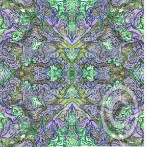
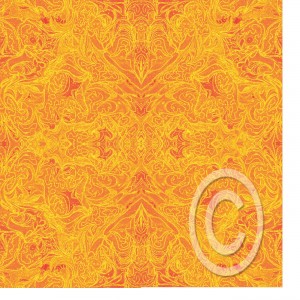
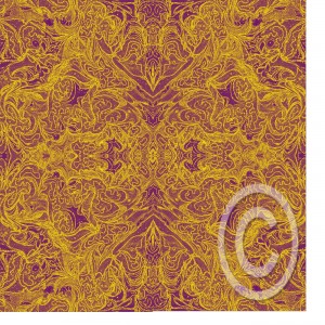
![]() That’s design repeats, not repeat columns…..I think I finally got this figured out. Readers of the blog know I’m interested in getting more mileage out of my marbled fabrics. I’ve been trying to see what would happen in Photoshop, and I end up with some great ideas. But for me to pursue licensing, I need to be able to create repeats…..so I think I’m on my way. Now, these are all copyright, so if you’re thinking about “borrowing,” don’t think any further….Nope.
That’s design repeats, not repeat columns…..I think I finally got this figured out. Readers of the blog know I’m interested in getting more mileage out of my marbled fabrics. I’ve been trying to see what would happen in Photoshop, and I end up with some great ideas. But for me to pursue licensing, I need to be able to create repeats…..so I think I’m on my way. Now, these are all copyright, so if you’re thinking about “borrowing,” don’t think any further….Nope.
I don’t know that I even have the original quilted piece of this fabric, but I have played around with it a lot. But here’s the deal…I’m posting these and then I want you to go to our Facebook fan page (link on the right) and tell me which one you like the best, and what you might do with it. Let’s see just how creative everyone is!
Here it is in its first incarnation…looks pretty springy to me. Version A:
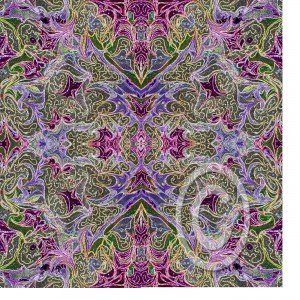
Here’s Version B:
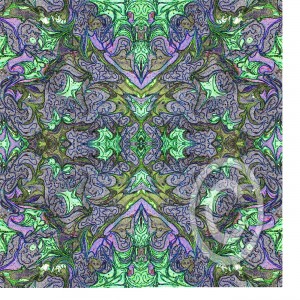
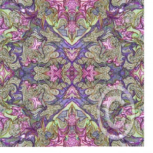 Version C: (Wouldn’t this look great with gold?
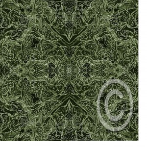
Version D:
Version E:
Version F:
Version G:
Can you tell I had a lot of fun? I have learned that if I get stuck on a project, to just put it away to “ferment,” and eventually I solve the problem. Now get over to Facebook and Vote!!!
Thursday Thoughts – Digital Marbling (TN)
Sometimes a piece of marbled fabric just begs to be used more than once – or find rebirth in a new form. That’s how our Digital Marbling (TN) was born. Playing around with the fabric and Photoshop leads to some very interesting effects. One thing I am hoping for with all this playing around is the development of some fabric lines, so I’m working on the idea of repeats right now.
Over the last decade or so there have been several runs of marbled fabric designs among some manufacturers. While the patterns are bold and colorful, I think there is a missing element in designing marbled fabric. A variety of colorways, bolds and subtles, and patterns that look like they would be easy to work with. I know when I started making fabric in 1993 it seemed like I was only comfortable putting the bold colors with blacks and whites. I want more flexibility, and to a certain extent I have found it.
But as I work toward designing fabric, I’m using these new artistic creations as my learning. In our newsletter, I posted a pic of “Alaskan Whales,” a piece my digital partner Suzan and I had entered into a show at the Cordova Historical Museum in Cordova, Alaska. It was our first really successful digital collaboration, and I’m going to pull it apart for you.
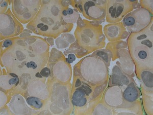
Here’s the original piece of fabric. I am amazed at just how blah that piece of fabric was, yet there was something appealing…if just means you have to do a lot of playing around to see what happens.
 This is the same fabric with a duplicate copy and some adjustments added.
 Now it’s approaching the water effect we were looking for. Then we looked for a graphic to use. We liked the whales, just rotated them a bit. We also added some adjustments: bevel, outer glow, some transparency. It looks like there are extra colors added, but it’s a transparency with some curve adjustments that adds in the extra colors. There are a few more things done to this piece, but I have an old version of Photoshop, so it doesn’t show.
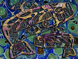 Here’s another version, saved from the layers we chose not to use…never know when you will come across something unusual with stuff you didn’t throw out, but just left “invisible….”
Who’s manipulating fabric digitally? I’d love to hear from you!
Don’t forget to become a subscriber and be entered to win some marbled fabrics. Check the box at the top right.
Work-in-Progress Wednesday
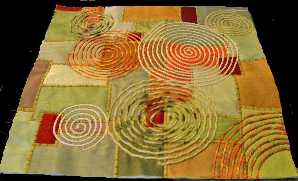
I managed to finish up the two small quilts based on the work of Carol Taylor and her “arc-i-texture” style. The DVD is from Interweave, and they have some scrumptious ones to choose from. I learned a few things, particularly about couching, and I finally got my satin stitch to work. I do want to try one with printed fabrics, but I really like the pay of light on the silk pieces.
Here’s the first finished one, in greens for Shelby, one of the twin girls I have know for a long time.
The edges were finished by adding a facing all the way around. I also showed you last week the beginnings of the quilt for Brianne, the other twin.
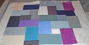 It’s pretty darn bland at this point, and I was worried about how it would finish. I next did my satin stitch to couch down the pieces of silk.
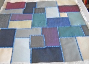 Definitely looking better. I do like the effect of the satin stitch, with a King Tut variegated from Superior Threads. From here I started the couching. I found some fuzzy blue yarns to try, one of which I liked, and one of which I ripped out.
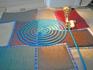 Once I got the hang of how to use the couching foot, I really liked adding the circles. I learned to trust the machine and the foot and not to pull.
Finally the finished product:
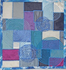 Still not totally pleased with it. It’s missing that certain spark, definitely in the picture. It looks better in person – you can’t see the rumpled silk. I used a regular binding on this one, because I felt the blues helped accent the main part of the design. But this is all part of The Process Pledge…writing about what I am doing and learning, and I did learn a lot. And I know the twins will love them.
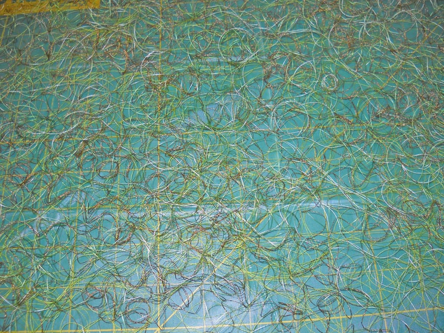
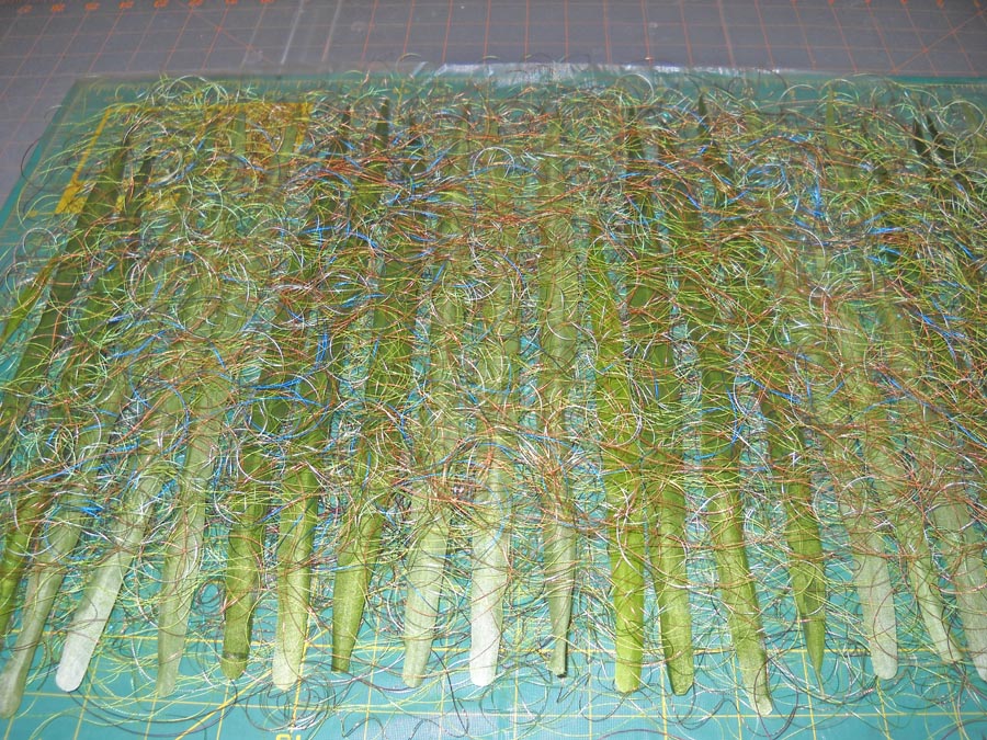
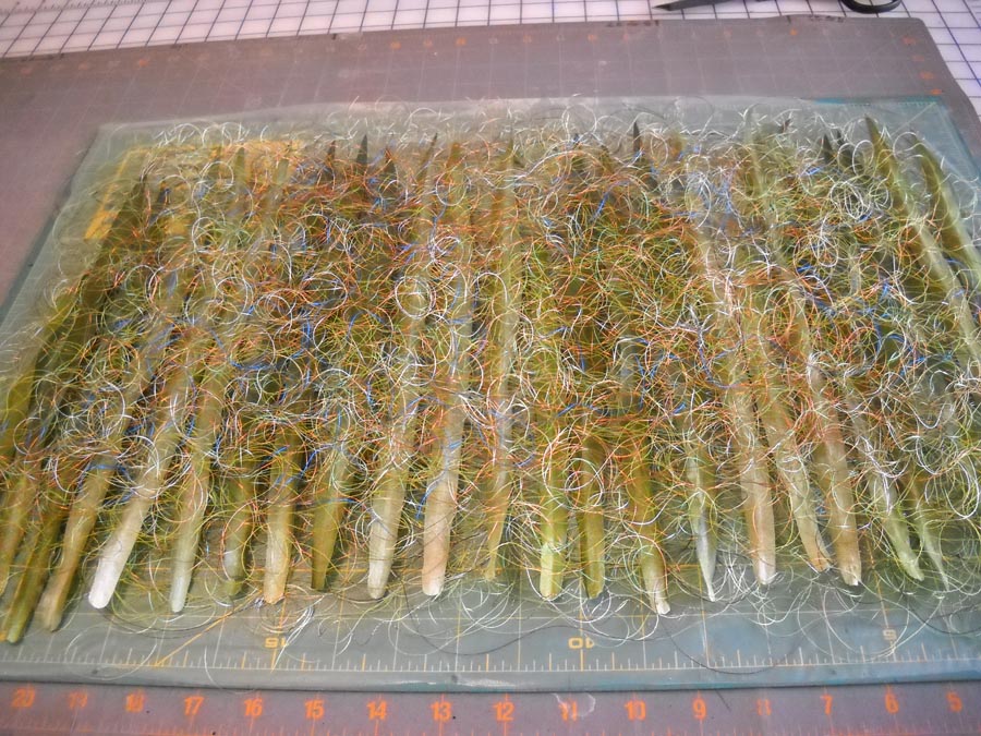
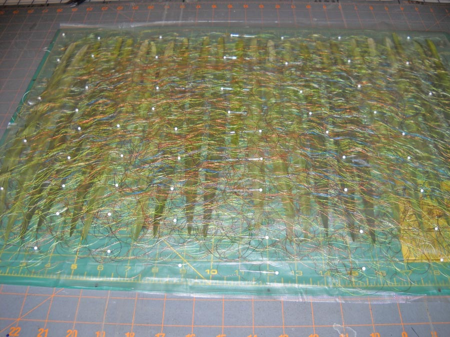
This pic is a current shot of the bamboo leaves in progress. I started with those about three weeks ago, sandwiching the thread between sheets of Dissolve to create thread fabric. I started doing the free motion on the top, using a variety of different threads. Still have no idea how this is going to turn out. Hopefully I will have the completed piece next week – or at least the leaves, as I start back to school next Wednesday. We’ll have to see…
DON’T FORGET – sign up for our newsletter to get entered into a drawing for a Sampler 1 package of marbled fabrics! See the sign-up at the top of the page.
Monday Marketing
How did it get to be August? We returned from vacation on June 21st, and I started working on the business on June 23. A lot happened, I can tell that from my sheets of lists, but part of me is thinking, Oh my, so much left to do before schools tarts again.
One of the marketing things I did over the weekend is to make a list of what has to happen with social media for each day, once school starts. I have gotten so many things in place that I was swimming with all the details. Once I took the time to think about how I could work with these pieces each day, in a 30-minute time block, I could feel the stress start to diminish. This looks to be very do-able, and I have this week to make refinements.
As you can see from the graphic on the left, I was busy getting this symbol ready to attach to artwork on line, which means going back and protecting a lot of my earlier images. I did some reading about the legalese that should be on our blogs and websites, and I know now what I need to take care of – pronto. The logo is transparent, done in Photoshop, so I can just add the layer to my images. The problem will be actually getting to the images from earlier posts.
Another thing I did was to start a master list of the “long-range” projects for the next five-six months. Anything on the list this week is a priority – like a new newsletter – before I go back next week. This list will go above the sewing table with reminders of what is coming next. I find it is very helpful to do this type of exercise, primarily because now I won’t have to spend the mental energy trying to remember everything. Items on the list:
* Affiliate information and applications
* Licensing information, pattern repeats and developing a collection
* Spoonflower.com for printing fabrics
* Zazzle.com artwork and potential items
* Cafe Press items in preparation for the holiday season
* An Etsy store
* A tutorial on quilting marbled fabrics
* Feedback pages
* Updating links (and collecting new ones, so send yours along) on the website
* Linked In
* Update the Polyquilt pattern
* Confer with an attorney to vet all the legalese (copyright notice, disclaimers, FTC guidelines for affiliates, privacy policies, just to name a few)
* And…foremost with all of this – to continue making art.
What’s on your long-range list?
DON’T FORGET – sign up for our newsletter to get entered into a drawing for a Sampler 1 package of marbled fabrics! See the sign-up at the top of the page.
Sunday Stories – Gaia 2
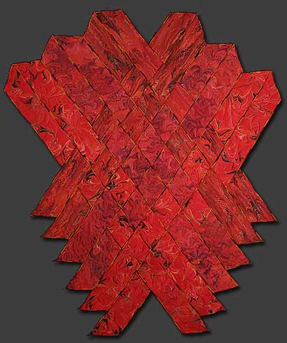
I love this piece, absolutely my favorite so far of everything I’ve ever done. I really had no idea going in to this just what would emerge…everything was trial and error, but thankfully, very little error.
This piece started as a result of finishing a commission that was done on red unpolished satin. Six half-yard pieces were marbled, with my using a total of four of the finished pieces. My idea was to create a piece that would represent the volcanic origins of the earth and the goddess Pele. For the longest time this piece was known simply as “Pele.” I used a different marbling pattern on each of the half-yards, as I wanted interest within the piece.
Ever since my first teaching job on Maui, I have been fascinated with the stories of Pele, the Fire Goddess, and I was always on the lookout for the Lady in White when I drove home over the Pali at night. I didn’t realize it then, but Pele and fire have woven their ways through much of my work.
I really had no idea how these were going to weave together. I experimented and ended up with this weaving, starting with a tighter bottom and then “exploding,” much like magma does as it reaches the surface and becomes lava. The only problem with this shape came as I realized I had to figure out a way to anchor everything together. The strips are heavily hand-stitched together on the back – twice, as I discovered I had to make it much tighter to hold the weight of the piece.
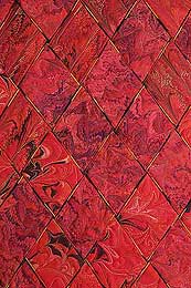
A free-form pattern makes up the bottom four strips. The next four strips are the “wave” pattern, and the last four strips are what we call the ”fountain” pattern. A fourth pattern of a very small feather was ultimately not used in the weaving.
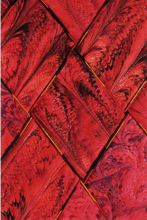
Each piece was sandwiched and serged with a variegated thread before any quilting was done. I liked the effect from the variegated thread, and I use that technique a lot now. But I have since changed how I put the individual strips together, with serging only one side or none at all, leaving another design element for later. The free-form strips were quilted using a variegated Sulky thread to accent the pattern. The four “wave” strips were quilted by following an initial curved line throughout each of the pieces and then coming back with a different metallic thread to accent the marbled pattern. The four “fountain” pieces were quilted in a distinctly different shade of thread to accent the eruption of lava.
Now, you have to understand I hadn’t done a whole lot of machine quilting to this point, beyond stitch-in-the-ditch. This was brand new territory for me! But ultimately I was hooked….I quilt most of my marbled fabrics now, and the patterns can be very zen-like to quilt. Here’s another close-up:
I truly love this piece, and I know I’ll never get another one just like it. It’s a little bold for any of our walls where we are living now, but one day, when I retire and the place is a little bigger, it will hang again!
For those of you who haven’t subscribed to our newsletter, we are doing a drawing again from all our subscribers for a FREE Sampler Package 1. You can visit our website to see this. Be sure to sign up – the form is at the top on the right.
And…tell me the story of one of your favorite pieces. I’ll include stories in a future “Sunday Stories” post.
Friday 5 – Brain Fried….
There is so much going around in my head today, between school starting again in two weeks, projects unfinished, next steps for the business, planning a new algebra class….My kids have learned about brain farts – when your brain just isn’t engaged with your mouth. We all know about brain freezes. Now I’m coping with fried brain…..How do you know?
1. You can’t even think about making a list of things to do. There’s too much going on in your mind.
2. You still have three lists left from the past month, each one with additions to them as you think about more stuff. It’s like it never ends.
3. You started thinking about lists of holiday gifts – and it’s only a day away from August…4 and a half months away…….
4. You can’t move in your studio with the projects you have going, and yet you want to head to the quilt/craft store for mor ideas…and perhaps anther project…..
5. The dust bunnies have become a legion of warriors, creeping up your list of things to do…almost making it into the priority column.
I’m thinking about the post last Thursday on niche marketing and the very last item…make a new plan. That is what I have to do – sit down with some quiet time and think about what has to happen next. How will I be most productive with the next week?
Work-in-Progress Wednesday
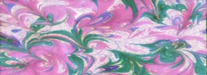 My thread arrived yesterday!! Lots of new greens, so I want to start in on the bamboo leaves tomorrow. Expect an update next Wednesday – and maybe even finished….
I wrote a while ago about using some dvd’s for professional instruction and how much I am enjoying this new manner of learning. One of the dvds was by Carol Taylor, about design. She called her method “arc-i-texture,” and by the time the video was done, I wanted to try it out. A long-time friend has twin girls whom we got reacquainted with in Vermont, so I am making them housewarming presents. Shelby likes greens, and Brianne likes blues. This started because Shelby gave me lots of small pieces of various silks to try and marble. For whatever reason (I think too much sizing) they didn’t marble well, so I decided to use them for this project.
While I finished Shelby’s, except for the facing, here’s Brianne’s to show you how I started out.
 All I did was arrange some rectangles into a fairly pleasing design. At this point, ho hum – doesn’t look like anything. The next step will be to anchor each of the pieces, which I will do using a satin stitch on each of the edges. That will provide another layer of interest. Once that is done, I will couch down a variety of threads for a third layer of interest. What I found with this project is that as I attacked each new layer, the piece not only became more and more complex, but also more interesting. Here’s Shelby’s, so you can see what the final piece will look like:
Way more interesting! While I have a couching foot, I haven’t used it before this, and I do like how it works. I learned to give the yarns some play and let the machine and the foot do the work. Next piece shouldn’t have the drawing up of the fabric from my pulling the yarns. I will say for the blue one I tried a whole bunch of stores trying to find some interesting yarns and trims.
Carol mentions in her video that she’s made something like 400-plus of these, and I can see getting addicted. I like the sheen and play of the silk, especially since the “nap” is going in different directions and takes the light differently, but I want to play with some lights, mediums, and darks from my stash for the next couple.
I want to know what videos and dvds you’ve watched for instruction and inspiration!
Top 10 Tuesday – Plus 5…A Busy Week on the Web!
It has been a busy week on the web for marketing. Two weeks ago in a post for Top Ten Tuesday, I had a number of comments about how helpful some of these marketing links are. I hope this is my way of giving back through my blog, with some of the best information I am finding as we artists navigate our way to building a viable business. I didn’t post last week, as these posts take a lot of time, as I want to have pictures from each site to enhance the appeal of this blog and make your reading experience more enjoyable. At the bottom I’ve given you a couple of links back to other Top Ten posts for your information.
* From Fine Art Views, the Triple Impact. Keith Bond describes this as Triple Impact or the 3-2-1 Impact.
3. The work catches your attention from afar and draws you in.
2. The work holds your attention from normal viewing distance.
1. The work delights and captivates you upon close inspection.
This resonated with me, as one of our early pieces (which we just don’t have a good pic of, so scroll down to the bottom) is The Wave – marbled on blue cotton. From a distance you see a huge rolling wave. The closer you get, the more you see of the texture of the breaking wave, until you are right on the piece, watching the wave break. This was our first piece where I realized it worked from close up and afar.
* Also from Fine Art Views, “Say the Right Thing.” Interesting look at comments from viewers of your art – what’s the intention behind what might seem like a stupid comment. If you’re serious about your art and not following this blog, you need to do so.
* Stock Xchng – the leading free stock photography site – free photos – since good blog posts are also very visual.
* Blu – you just need to go to this site – some very cool journal sketching – loads of ideas….someday I will actually do this!
* From the folks at Wishful Thinking comes “Why Artists and Creatives Have an Unfair Advantage at Internet Marketing.” This is not something we artists would think is working for us…very interesting article and worth the read.
* Six Facebook Applications to Sell Your Products – I am learning so much as I surf! I didn’t know you could set up a store on Facebook….
* Top 10 Features of a Winning E-Commerce Site – got your privacy statement? Got legal in the works? Lots of things to think about here.
* Three reasons You’re Not Charging What You’re Worth – from The Launch Coach – as artists we really undervalue ourselves…again, some very good points here.
* Art Licensing: Achieving Brand Recognition. Joan has a great blog if you are interested in licensing your artwork. But you need to know what your brand is before you start….
 *
Mike’s Life – 11 Things I Learned When I Became a Professional Blogger. So many of us blog and are thinking about going “professional.” So just what does that mean??
* From PluginID – 7 Luxuries You May Forget You Have….like running water. We all need to read this periodically.
 * Also from PluginID – How to Live on Your Terms – very interesting idea, and those of you who are journal artists are way ahead of the rest of us.
* Joanne Mattera ArtBlog – Co-op galleries and vanity galleries – a look at both, and artist beware.
* Maria Brophy – 10 Questions to Ask Before Hooking Up Your Art with a License. Distribution channels, top retail clients, product categories, distribution markets, and so much more.
And now, just for fun…. from The Best Article Every Day – go see the big version!
Let me know what interesting things you found on the web this week!
Another Top 10:
Monday Marketing – Guest Post via Tara Reed and David Darrow at Art Licensing
I have been very interested in licensing my art images for quite a while. I’m doing a LOT of reading, as it is a complex issue. The first source I found that got me started in the right direction was Tara Reed’s Art Licensing Blog.* I confess at this point I am still in the reading stage, but slowly moving in the direction of working on patterns, repeats, and mock-ups. Funny how full-time teaching gets in the way….
However, I am a firm believer in doing my homework. One of the things the “big boys” in internet marketing talk about is the actual format of your blog, and that the recommended format is Word Press. I was wondering about why the need to move from Blogger, and I was disconcerted when I learned I would have more difficulty protecting my images on Blogger. So when I had this opportunity for a guest post from Tara – and David – I thought this would be appropriate. Plus, as Tara mentions below, I wanted something classy for my blog.
Tara writes: David Darrow has been in my online life from the very beginning of this (Art Licensing) blog… he was one of the first subscribers to my Art Licensing Info eNewsletter and I remember him sending one back to me with a note: “Do you realize this is what this looks like?” That was when I was “following directions” and keeping it all text, never more than 70 characters per line, like I was told to do.
David wasn’t the only artist to think this was a BAD IDEA so I realized artists want something a little more visually pleasing. David helped me figure out how to do it. A talented artist and techie – he’s passed on more good information that I can “Share with the group”. When he was listening to the replay of last week’s Ask About WordPress for Artists call (do you have your copy yet?) he sent me the following information that I thought would be helpful.
He knows of what he speaks since he has a blog – on blogspot – called “Where art meets technology”…
I believe there is a misconception about Blogger vs. Blogspot.
Even that phrase is misleading, because they are the same thing.
The best way I understand it is that
1. Blogger is the on-line tool which allows one to create new
2. posts, which are individual, chronologically ordered in reverse “entries” or “posts” in your
3. “blog,” which is your journal, diary, log or web-log, from which we get the word [we]blog.
Blogspot is actually blogspot.com, a domain where all the Blogger-created blogs are stored or hosted.
You cannot use Blogger to create a blog and store that data ANYWHERE else but on blogspot.com — Both are owned by Google. Additionally (corollary) you cannot create/edit a blog with any other tool but Blogger and have it stored or hosted by Blogspot.com .
***Every Blogger-created blog is stored as a unique “subdomain” of blogspot.com , which is why every Blogger blog address has in common “blogspot.com.” A subdomain is the unique “areacode” that comes before the phone number, and the phone number is always 2 items: domain name and venue, “terareeddesigns” and “com” — you could have a separate site at store.terareeddesigns.com ; it would be a “subdomain”
Like Kim said, one issue to consider is that all Blogger.com blogs cease to exist the moment Google decides to stop supporting them. WordPress blogs will only disappear if you delete them or stop paying your domain-hosting bill. You control that. If WordPress.org disappears, you will still have all your data and your most recent installation of the version of the code that runs it.
Wordress.org is a group of programmers worldwide that work together on standards for an Open Source blogging service. WordPress.com is a Blogger-style tool that allows a simpler blogging method and can raise money (through more premium blogs) for WordPress.org costs.
One other thing; people with Blogger.com blogs VERY often misaddress their blogs, adding a “www” ahead of their blog address. Both will work, but one is wrong.
http://www.EverydayPaintings.blogspot.com is wrong
http://EverydayPaintings.com is right
Thanks David!
Learn more about David Darrow at www.DaveThePaintingGuy.com
Be sure to check out his painting classes too – I’m told they are amazing!
Here’s to your creative success!
– Tara Reed
P.S. To learn more about how to earn an income licensing your art, visit www.ArtLicensingInfo.com* for a wide array of free and for-fee information from experts in the industry.
* FTC disclosure: any links with an * is an affiliate link and if you make a purchase, I will earn a commission for the referral. This helps me keep buying art supplies – thank you for your clicks!
Thursday Thoughts – 7 Steps to Niche Marketing
It has been a very busy July for marketing and the business. I think those of us who are artists wonder at times about 1) the need to market, 2) continuing to make our own art, and 3) how we pull it all together. I sure don’t have all the answers, but I think at this point I have some insights on the process.
* You need a plan. You may not know what you’re going to do in the plan, but you need one. Sounds contradictory, I know, but you can make it work because part of your plan is to plan your plan. At this point my high school students would look at me and say “Huh?”
* You need to set aside time to read about marketing. What should you be doing? What tools should you be using? Set a deadline, so you don’t spend months at this stage, like I did until I finally started to do some of the things. When I ran my learning center and we had no money, I would do what I called “shoe leather marketing.” I was out talking to everyone I could about our learning center. Nowadays that “shoe leather” is social media, so spend time learning about that. You don’t need to be a net nerd for this step – there’s lots of available materials to read to get you started. Look at Social Media Examiner for a quick tour of Facebook and Twitter and what you need to do. Read Problogger about setting up and running a successful blog. Buy a book or two…or sit with a coffee in Borders or Barnes and Noble and browse the books.
* Set up Twitter and Facebook and start posting. Set up your blog and start posting. Read other blogs and start commenting. This becomes very important as you write more and create more of an active social media presence.
* Make your art. There is no point doing all this if you have nothing to offer the public. In our case, we have already established a few outlets: Ebay and website. Our website has a gallery with art work available for sale. Ebay has small pieces of fabric for buyers to create their own artwork.
* Decide who your customers are. This was a big issue for us, as a result of all the reading I did. I want to sell our larger artwork, but we have a great market in selling small pieces of marbled fabric for others to use in their creations. The more you read about selling on lie, the more you will see the suggestion to develop a product to “launch” and make money. I stumbled with this one. What would I do? Then came the proverbial 2 by 4 over the head – we already had customers. I needed to refine what we had already been doing. Consequently we continue to sell our fabric as well as put our artwork out in shows, galleries, and on line. It’s not an either-or. I am after art collectors who like fiber and mixed media, as well as quilters and crafters who like to do their own thing. Two worlds come together.
* Just do it. To quote Nike, nothing’s going to happen if you don’t do it. Just thinking about it will give you lots of ideas…and will make you go nuts in the “to-do list” department. (Ask me how I know this….) But there comes a point when you have to do it. Then…..
* You need a plan. Yup, all over again. I have discovered that I will need to have a very set plan for how to handle all of this once school starts again and my art/marketing time is limited. So over the next two weeks I will set up a calendar: 1) what gets posted each day, 2) when to write and schedule the blog posts, 3) how to schedule Twitter posts, 4) maintaining the Facebook Fan page, 5) writing a newsletter, and 6) making art.
I’ll keep ya posted! Any suggestions????
Work-in-Progress Wednesday
I have been thinking about the leaves for the bamboo piece. As I mentioned last Wednesday, I think the silk leaves would be too plain, and I didn’t like how they marbled, and I think thread leaves would be too fragile for such a sturdy plant. Then it occurred to me to do what I do in the classroom – it’s not an either/or, so why not combine the two.
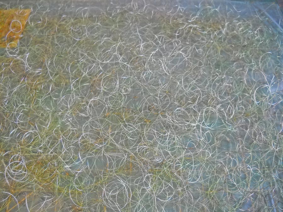
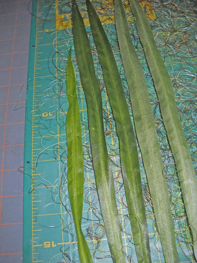
I started by cutting a piece of Dissolve from Superior Threads and taped it to an old cutting mat – that stuff is slippery. Then I started layering some of the old yucky threads I have.
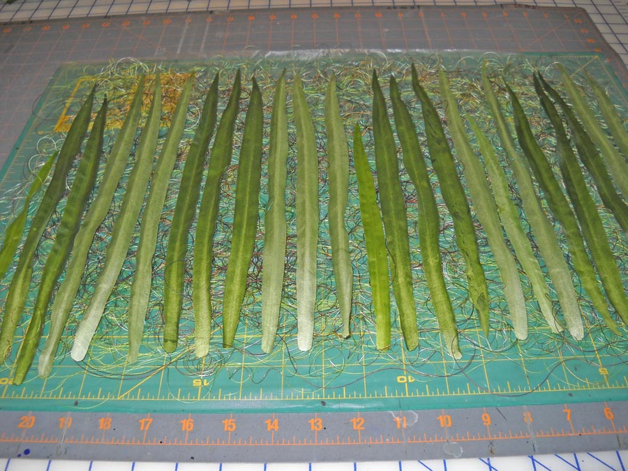
At this point it occurred to me that I could layer the silk leaves across this base of thread, after I pulled off the wire from the backing.
I turned some of them wrong side up, figuring I would be stitching on both sides of the sandwich, so I would get some additional effects front and back.
I am pleased to say it occurred to me earlier not to run the overhead fan in the studio while I was working on this….At this point I am ready to layer more thread on the top of this. Keep in mind I have no idea if this is going to work….
Now at this point I need to cut another piece of Dissolve to go over the top of this.
Now it is ready for stitching. I need to order some thread – Razzle Dazzle to use in the bobbin, and some green Lava for top and bottom. I figure I can order this week and while I’m waiting, I can finish up the bamboo strips. Once I cut everything apart, all the little slivers will become part of the base where the strips are mounted. I don’t know if I will need more leaves. I am counting on the leaves at the top to hide the hanging system. I do have plenty of silk leaves – I would need to get some more cheap thread if I need to do more thread work.
Any of you try anything like this? Suggestions? Ideas? Pitfalls? Inquiring minds and all that….
(Think Horschak) Oooh, Oooh, Oooh……I have some great tree agate I have been collecting from the gem shows….they would add some interest and weight to the bottom of the piece…I knew there was a reason I was collecting them……
Monday Marketing – Art Display Systems
As promised, here is the third part of Moshe Mikanovsky’s articles on preparing for art fairs. This third part looks at display systems, complete with pictures. This is great stuff! i did the same thing at an art fair – I went around and snapped pictures (with permission) of the hanging systems I saw. This is one of those areas we just don’t pay enough attention to until it is actually time to display our work. I know that as I develop more of my marbled pieces, I am more conscious of how it should and will hang as I construct the piece. So enjoy!
Art Display Systems for Art Festivals
by Moshe Mikanovsky
This article is by Moshe Mikanovsky, Regular contributing writer for FineArtViews. You should submit an article and share your views as a guest author by clicking here.
Last time, in My First Art Fair Checklist – Follow Up, I promised that I would dedicate this post for the display system at the art festival (or art fair, whichever term you prefer). My display system was of the “Made in Home Depot” variety and couple of readers commented that I should really invest in proper, professional display system.
I do agree that professionalism is key and important in displaying yourself as an artist, the respect you give your creations, and the respect you want to get from everyone viewing, and more importantly, buying your art.
But, and here I want to list several reasons, there are quite legitimate reasons why you may want to go a different route, not the most conventional or “academically” professional:
· The budget factor. Not trying to raise the worn mantra that we are starving artists, therefore we can’t afford spending money on a professional system, some of us still have budget constraint. Whether it is your first experience doing an art festival and you want to try it out before you spend into it, or you honestly prefer to spend your budget on quality art materials and framing to create the best art you can possibly do, your budget might be squeezed and not much left for the display system – which is really, just the background for your artwork.
· Do it differently. We like to say that artists can break every rule and still make great art. So why not with how you display your art? I have seen several displays that were just different and unique and that made me want to look at them. But maybe that’s not the best thing since the idea is to focus on the art really…
· Practical means. Some DIY display systems are much easier to carry and transport and therefore could be ideal for artists who travel far, don’t have a car, live in the city and use the subway/taxi/bicycles, or all of the above. Imagine trying to carry around on top of your art also a big display system, professional as it might be.
· Everything works. I have seen it myself, and I am sure many of you can testify, that also without the professional display system, artists sell their art! There are many reasons why art is sold, or not sold, at art fairs and festivals. But not having “the right” display is only one piece of the puzzle.
OK, so with no further due, here are few of the display systems I have seen during my first art show. I was amazed with the varied options I saw with only 90 artists showing in the park! I am sure there are many more excellent ways and when I’ll find more, I will keep you updated. So here we go:
The Double Twines
Couple of simple twines tied to the tent’s frame at the top and to the artwork’s back wire at the bottom. This is the simple version of The Double Chain (see below).
Pros: Very inexpensive and simple.
Cons: Can only carry one painting, which should be fairly light. Paintings sway in the wind.

Julia McNeely www.juliamcneely.com
The Double Chain
Couple of metal chains hang from the top of the tent’s frame. The hanging of the chains can be by cable ties (as seen in the pictures) or by double length of the chain wrapped around the frame. The artwork is hung on S hooks suspended at any of the chain’s links.
Pros: Inexpensive and simple. Can hold more than one painting on long chains.
Cons: I have seen paintings sway in the winds.

|

|
The Clothes-Lines
Two clothes-lines or similar twine is stretched across the width of the tent’s wall. The artwork is hanged off the clothes-lines using clothespins. Suitable for non-framed art on paper.
Pros: Inexpensive and unique look.
Cons: Might look too DIY/crafty. Doesn’t fit for all type of artwork. In this case the artwork are prints on wrinkle-free “peel and stick” cloth, so they are well protected and suited for this hanging system.

|

|
The Leaning Boards 1
Two 1”x2”x8’ wood strips, attached at the top with metal hinge. The top is leaning on the tent’s frame and the bottom is open couple of feet wide. Throughout the entire length of the wood strips, angled grooves were made in order to hang the art from. The wood can be pre-primed with white paint, or you can paint or leave natural. For extra stability, the top is tied to the tent’s frame with some twine.
Pros: Inexpensive and simple look. Can fit several paintings.
Cons: Stability might be an issue, but it seems quite stable. Need some DIY know how to make the grooves properly.

|

|

|
John Visser, http://johnvisserart.com
The Leaning Boards 2
Wide boards, in this case old barn boards (over 100 years old!), leaning on the tent’s frame. To protect the frame, a foam material was used to wrap around the frame where the board is leaning against it, and the board is secured with some twine. For hanging the artwork, wooden pegs were installed in equal intervals.
Pros: Looks really nice! Old barn boards are not a must, although they make the difference, having a very unique look. More than one piece can be hanged on each board, and as extra touch, another board was made into a narrow table.
Cons: I won’t go out of the way to find or purchase these old boards, only if I happen to have them lying around. Stability might be an issue if someone kicks the bottom of the board. Quite bulky to carry and transport. Some DIY know how is required to install wooden pegs.

|

|

|
Jennifer Toliver, www.jennifertoliver.ca
The Leaning Boards 3
This one is made of metal railing that already comes with some holes in them. The railing was tied to the tent’s frame with bungee cords. S hooks are used on the holes to hang the artwork.
Pros: Inexpensive and easy to install. More than one painting can be hanged on each railing.
Cons: The look is quite cold and industrial.

|

|
Nicky Hindmarsh, nickyhindmarsh@hotmail.com
The Fencing 1
A metal fencing stretched across the width of the tent’s wall, attached at the side with some cable ties. In order to make the fence more stable and not buckle in, a long and narrow strip of hard plastic was inserted throughout a section of the fence. S hooks are used to hang the artwork.
Pros: Metal fence is durable and can carry multiple art.
Cons: Also a cold look and a bit industrial.

Scott Brewster
The Fencing 2
Similar to Fencing 1, but using a plastic fencing. I have seen someone using the orange color fencing in the past and it looked terrible. So if you opt to use this option, try black or white.
Pros: simple and inexpensive.
Cons: Wear and tear might be high. Looks like a construction area.

The Framed Fence
In this more elaborate usage of the fencing, they were stretched over wooden frames, stapled all around with a staple gun. The frames are attached to the tent’s frame, and to each other, with cable ties. In this example the frames are quite tall – taller than the lower portion of the tent’s roof structure. The frame panels had to be separated with a gap in the middle to fit in.
Note the special feature of this setup – the noodles. In each wall mid-section, a twisted noodle in inverted U shape is attached to the fence with cable ties. The purpose of the noodles is to stretch the tent’s roof outward, so that any rain falling on the tent will immediately spill over and not remain on the roof. I believe this can be achieved with other systems as well.
Pros: Can hang many paintings in many configurations. Not too expensive to setup.
Cons: Seems bulky to carry and transport. Require DIY know-how.

Steven Crainford, www.stevencrainford.com
The Fencing Rollup
I personally loved this system! In this display the 3’x15’ plastic fencing roll was cut to 5’ lengths. Each length of 3’x5’ was attached to a 1”x2”x3’ wooden strip on each side using washers and screws. Couple of eyelet screws were attached to one of these wooden strips. These were used to hang the fence from the tent’s frame, using a couple of large size S hooks. Similarly it can be hanged with cable ties or bungee cords. The nice thing about this system is that each fence is rolled up nicely around the wooden strip for carry and transport.
Pros: Light and easy to carry. Inexpensive and fairly simple to assemble. Can hold several paintings, depends on the size.
Cons: Need to make quite a few of these to cover all three walls, which might defer the size advantage. If it is not required (as in the picture), then it’s less bulky.

Jon Muldoon, www.jonmuldoon.ca
The Concrete Wire Mesh
Concrete enforcement wire mesh size 4’x8’, hanged from the tent’s frame with twine. The artwork is hanged using S hooks.
Pros: Inexpensive and light weight. Can hold many paintings, depends on the size.
Cons: the wire mesh rusts very easily, so it must be treated somehow beforehand, either painted over with rust resistance paint, or some anti-rusting spray. Edges can poke and scratch you. Not heavy but still bulky to carry and transport.

Moshe Mikanovsky, www.mikanovsky.com
The Gallery-in-the-Park
A gallery hanging system is attached to a 1”x4” board of similar length. Eyelets screws are attached to the top of the board, which is suspended from the tent’s frame using cable ties.
Pros: Small and simple.
Cons: Depends on the gallery hanging system, only one row of paintings can be hanged. Might be more expensive than the average DYI system, but needed to be compared with other professional systems.

The Coat Hanger
This DIY coat hanger style system is constructed of a 1”x1”x8’ wood strip attached to a small board for a base. The base is held with a small weight and the top of the strip is attached to the tent’s frame with wire. Hooks are attached to the front in intervals.
Pros: Simple and inexpensive.
Cons: Does not look very stable or fit for big and heavy paintings.

|

|
Sheetal Sehgal, www.sheetalsehgal.com
The Stained Glass Window
This system is quite unique. It is constructed of a wooden frame, and metal construction built together especially for this purpose. It’s easier to have a look at the picture and see what I mean. The final look is of a stained-glass window without the glass. The artwork is suspended off the metal-work with S hooks.
Pros: Special look that gave the booth a unique design.
Cons: Need to be very handy to create. Heavy for carry and transport.

Liz Menard, liz.menard@utoronto.ca
As you can see, there are so many creative ways to hang your art in a tent! I didn’t even mention The Easels Field and The Professional Grids. I am sure there are many more ways out there. True, being professional is very important and everyone should strive to present their art in the most professional way possible but if you are on a tight budget, want to try what an art fair is all about, or just want to be a bit different, why not try one of these displays? And if you have more ideas, please share them with us; we would love to hear from you.
Cheers
Moshe
PS Thank you to all the artists who allowed my wife and I to take pictures of their displays and use them in this post.
———————————————-
This article appears courtesy of FineArtViews by Canvoo,
a free email newsletter about art, marketing, inspiration and fine living for artists,
collectors and galleries (and anyone else who loves art).
This article originally appeared at:
http://fineartviews.com/blog/20870/art-display-systems-for-art-festivals
For a complimentary subscription, visit: http://www.fineartviews.com
———————————————–
Sunday Stories
I love reading blogs about the stories behind the art we create. It occurred to me I could document (primarily for myself) the process and story behind some of our pieces in our gallery on the website. There is a page on the site with some very early quilts, including an original design for a math program I participated in.
This is the PRIME quilt – the name of the program was Promoting Reform in Mathematics Education, and it was a total of 6 weeks over three summers at the University of Arizona. We gave this quilt to our professors at the end of the third summer, and it still resides in the math department.
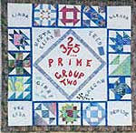 The center is the program itself, with the first few prime numbers. Each triangle attached to it is the name of one of the professors, with a little graphic representing each one; Fred, for example, had the calculator. The four corners are the teacher assistants we had, and each of the blocks is made with marbled fabric and a PRIME number of pieces. Let me tell you, the block with 37 pieces was a doozy to do.
We all signed the back of the quilt and presented it with the message that a puzzle was built into the quilt. Five 9 years later I filled in two of the professors as to what the puzzle was – the prime number of pieces. This was a fun quilt to design.
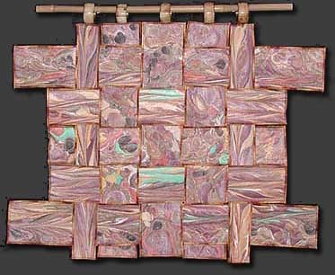
The quilt that started me on my present journey with marbled fabric is Gaia 1: Interdependence.
This is kind of a cross between a traditional stone pattern, some basic combing of paint, and some chevron pattern. When the fabric came out of the tray, I liked the interplay of the turquoise with the earthy colors. The turquoise reminded me of the gifts from the earth. I don’t know why I started to cut into strips – maybe just because I wanted to try weaving something. I really don’t remember.
I had five strips and nothing was working. Then I decided to just weave it back and forth and see what would happen. I liked where it was going and cut the strips in half so I would have more to work with. I used a thin batting (which I since use exclusively) and backed it with a fossil fern fabric. Then I started to quilt, just by following the lines of the fabric. I went for three hours without stopping because I was loving how it was working.
I didn’t want bindings. I thought it would detract from the message of interdependence of all the elements on earth. Then I hit on serging the edges. Now this was before I really understood what a serger can do. I still hadn’t figured out rolled edges. But I knew I wanted some type of variegated thread, so I just experimented.
Then came trying to hold it together. I used a LOT of pins and very carefully pulled the weaving off the design wall onto the quilting table upside-down and started to stitch all the strips together. Let me tell you, that took forever….
Well, the problems weren’t over. A basic sleeve wasn’t going to work for hanging, so I spent a few weeks trying to figure that out. I ended up buying a set of napkin rings with an earthy feel to them and looked for a piece of bamboo. The big problem was anchoring the napkin rings to the strips – with a lot of delicate sewing….but the piece has hung for five years in an office in Tucson with not a single problem.
I knew when this was finished I was on to something. The bamboo I am currently working on will be the fourth in the Gaia series of weavings. I do want to do more…the images I saw of rice paddies in southern China would make another interesting weaving…..

