Archive for the ‘Photoshop’ Category
A New Zentangle
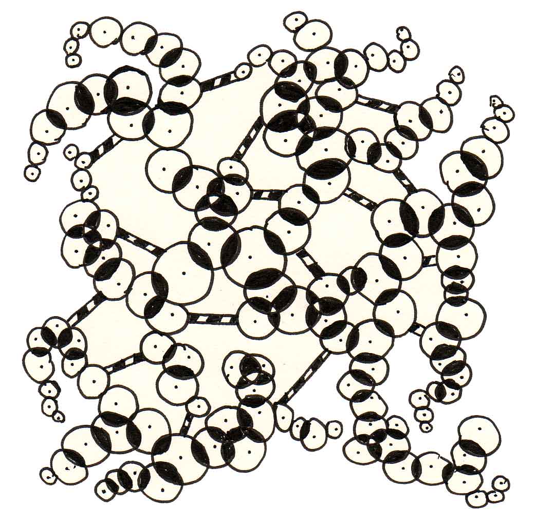
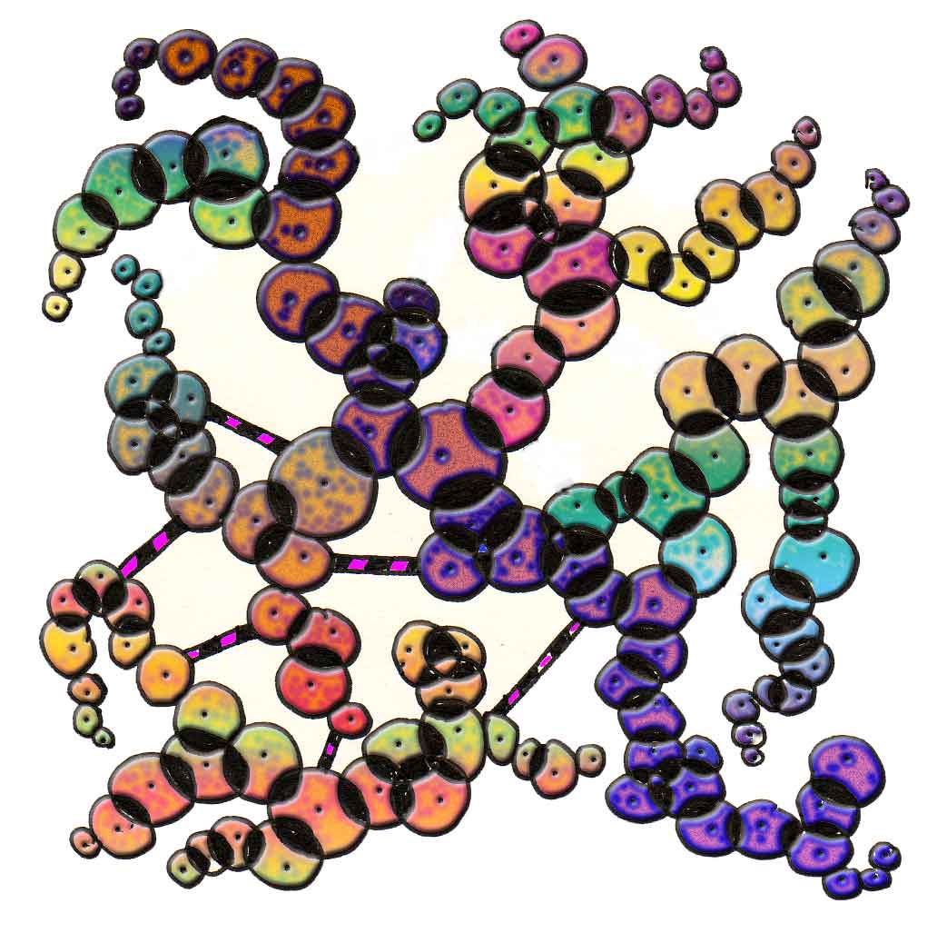
I have had a great couple of days, even if I couldn’t get to all the art I wanted. Yesterday, after grading papers and getting organized, I worked on a new Zentangle. I am so hooked on these – so very relaxing. This time it was just circles, and you can see from above how it worked out. Needless to say, I had to try some effects in Photoshop, and you can see below the layer styles and gradients. Reminds me of those feathery puppets on strings that jangle all about.
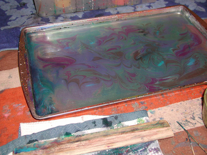
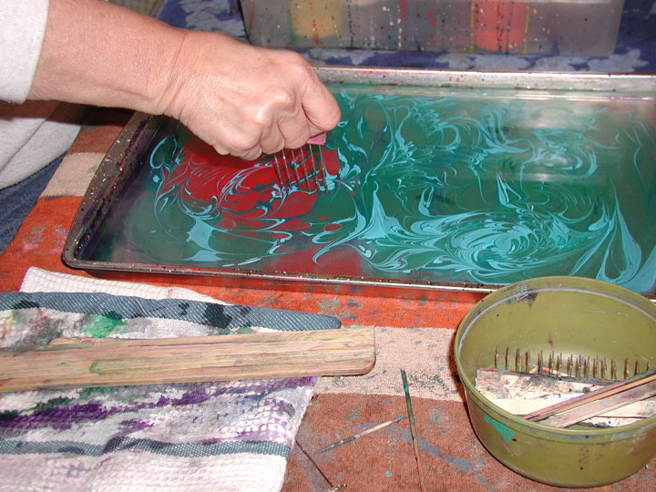
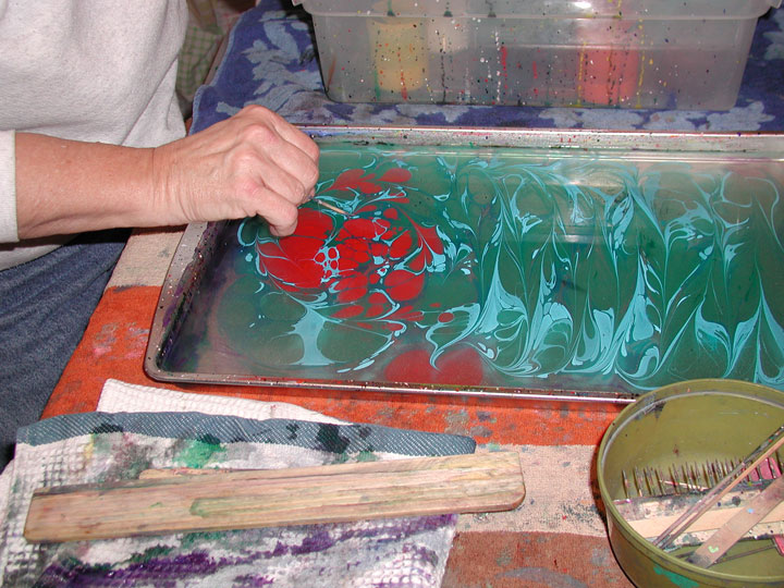
Pics from Monday’s art group and our paper marbling. You can see us dropping paint and manipulating patterns, and finally a finished product. Paper is so different from fabric – I am enjoying the paper, but I need to spend a lot more time working on designs in order for the papers to look really good! But we had a great time!

"Art Every Day" Month – Day 5
I was so busy with school work last night, and it made me realize how much I was missing being in the art groove. Now that I really am committing to the practice, it is becoming tough to not do art when I get home from school, especially since I am really enjoying these zentangles. So here is day 5, but I have a whole 3 days planned with art – quilt class tomorrow, Sunday at an art fair, and Monday with our mixed media artists’ group. So I should have plenty to make up for missing last night!
Here’s tonight’s zentangle. I really like it. I actually erased two little sections from it when I scanned it in, as it seemed too jarring to the overall effect. I had to force myself to stop, as I was liking it as it “was,” and I was afraid I would go overboard and ruin the effect.

Of course, I had to see what I could do in Photoshop – I am learning a few new techniques and shortcuts. When I did the inversion, I REALLY liked the white on black.

I decided to work with the inverted version and started adding colors and using both the embossing and gradient styles.

Here’s what is finished so far. I will probably leave it at that, although I think I may do a little more playing around – until the new zentangle, that it!

"Art Every Day" Month – Day 4

I have loads of papers to score tonight, and an observation to prepare for tomorrow. But all day all I have really wanted to do was play around with another zentangle. So I did – and am….I tried for “less dense,” this time, focusing in on straight lines only. I am pleased with how it came out, as I realize I LOVE working in black and white pen and paper. But…I still couldn’t resist playing with the design some more in Photoshop….

With this one I started out trying some bright colors, but I didn’t want it flat, like yesterday’s…so I played around with some layer styles. This first is just some embossing.

I’m adding more colors here, and several have an “inner glow” effect. Combined with the first effect, I started seeing rods of clear colored glass, almost like a mosaic. So I continued until I had everything filled…

Overall I am very pleased with the result, but as I mentioned two days ago, I am truly enjoying making the original zentangles. Definitely meditative and calming, especially after a hectic day at school.
"Art Every Day" Month

I joined Art Every Day Month, the art answer to NANOWRIMO (National Novel Writing Month), and I had been thinking of doing something like this for a while. I decided today would be a good day to start my Zentangle. This is an interesting site – very zen-like meditative doodling, and I have to agree – it is very meditative. I spent an hour with my new pens, and what you see to the left is where I stopped to take a pic before continuing.
The idea behind Zentangle is “one stroke at a time.” I waited till I bought some new pigma pens, using a 3-year-old gift certificate from one of my students. I bought several widths, and I’ll continue to experiment with them all. This first one is pretty dense, and I want to do some that are not nearly as detailed. But this is definitely fun!
Once I stopped to take the scan of this one in progress, I decided to try some filters and such in Photoshop. This could be an amazing way to look at new digital art. Here is the above partly-finished one with a marbled pattern behind it – looks pretty good for a start.

Now here’s the finished Zentangle, along with a couple of adjustments – a marbled pattern behind one, an inversion to black, and a gradient to totally change the colors. I think I’m hooked!


Sunday Sampler

It’s back into the high 90s again – I think we won’t be seeing many 80s any time soon. Weather patterns sure have changed in the Southwest – by this time of the year it should be in mid-seventies and gorgeous. I was very productive these last two days – started “repurposing” some bookcases (I’ve obviously watched too much HGTV….) and moved one into the studio to hold all the art books plus miscellaneous supplies. Rearranged the dining room wall with just the baker’s rack minus one bookcase and looks much more spacious. Loads of bags of books for the local used bookstore. I do read some weird stuff….
But the room looks better, and the bookcases near the computer are cleaned off, ready to be sold for a newer, sleeker bookcase and a new desk to replace the two oldies we are using. Just have to wait until we can afford the new furniture.
In the meantime, the photo to the left is of a piece of pima cotton, a half-yard with a Halloween appeal – the oranges are not as subtle in the pic as they actually are. This is available on Ebay this week. There are also two other half-yard pieces available. One is a pima cotton in purples, and the other is a 16 mm habotai silk – the picture just doesn’t do it justice!
Stripper’s Club at the quilt shop yesterday was loads of fun. Quilter’s Market is just the nicest group of people, and they know how to market! The strip quilt was called Sonoma, so everything had a wine theme, including purple feet and a real live bunch of grapes! Not going to make the quilt this month, since I’m already trying to finish last month’s, but I did sign up for a class in November, just to improve my piecing skills. Maybe this one will become our queen-size bed quilt……
I did try some Photoshop work today, and what follows is the completion of my lesson – using sketches to create realistic painting effects. I learned a lot – customizing brushes, blending – obviously loads to learn in this lesson, and I will be repeating it. The book is *Creative Photoshop CS4* by Derek Lea – I don’t have CS4, but what I didn’t realize was I could do the lessons with CS, since most of the lesson is about design. This isn’t great, but there are possibilities with some of my own drawings.

Welcome new followers! The Virtual Quilt Festival this past week was wonderful eye candy, and I hope to spotlight a couple of new quilters I found. I’ve only been through about 100 entries – over 500 to go!
Playing Around on a Thursday….
 I wanted to play with Photoshop this afternoon, as it has been a crazy week, had a half day today, went to lunch with hubby, and finally felt healthy AND relaxed for the first time in several weeks. So I started with a piece of marbled fabric in a stone pattern. I then went looking for one of my pics from the Tucson Botanical Gardens, as I wanted to work on texture as part of my Garden Fantasy series. The pic below is the original.
 This is it cropped.
 It’s a little out of focus, and sharpening didn’t seem to help, so I started looking at basic shadow adjustments.
 I like the way the background just faded away, and the flowers took on a nice light and delicate pink. Then I started thinking about adding the marbled fabric as a new background. Here’s the first attempt, with the background the original colors.
 It’s a little dark, but I do like the way the veining in the stone pattern shows up in the background. Here’s the second, after I changed the colors of the marbled fabric to some blues. Very misty, very Asian – to my way of thinking.
 These next are all playing around with the order of the layers, to see what I get for different effects.
 I like the lighter background – I want to play with this one some more.
 What you can’t see in this one unless you click and REALLY look with the additional texture in the veining that makes it look like it is raised off the paper. It also looks to have water droplets on it, which is kinda cool!
 On second thought, the “droplets” are distracting – may have to “erase” them. Fun to play again – amazing how much you can do when you feel good!
Open to suggestions!
Sunday Sampler – Fun with Photoshop!
 So I didn’t get to Photoshop on Friday – SORE from stairs at school, and generally tired after the first few days back, but boy, did I have fun today! The pineapple block on the left was my starting point for today, in designing a quilt. WAAAYYYY back in 1996, after we had been marbling about 2 years, I knew I wanted to design quilts with marbled fabric, and using Photoshop (obviously a very early version) I wanted to be able to put the designs on t-shirts. Try as I might for MANY years, I just couldn’t seem to get the hang of “pasting” fabrics, let alone creating a grid to work on. Those days are gone – I did it! I took the block on the left and did several iterations of it to change colors:


Here’s my first quilt design – I know there’s loads of room for improvement, but this is a good start.

Not content with that playing around, I went back to the photo from Thursday’s blog to see what I could do with that one. The first is the original, the second is “underpainting,” one of the filters. The third is totally different – the watercolor effect. It really changes the meaning of the image. I am quite partial to the second – reminds of the line from the sone “Evergreen” from “The Way We Were” – mysty water colored memories….


Now to finish up emails and get wardrobe set for the first week with kiddoes!
Photoshop Friday

This is the original fabric for today’s experiment. I managed to clean out the computer, back up all the files (first time in 3 years) and sort/file the digitals. I put a folder together of interesting fabric to use for backgrounds. Hence, this first one.

This is the first playing around with lighting. Then I got fancy!

You know I love gradients, and when I applied this one, all I could think of was coral beds. It has sat this way for at least two years. So I pulled it up today to see what I could do with some shapes.

I started adding turtles, one at a time, picking up color from within the background, and trying to use “Rule of Thirds” for a pleasing composition.


Here’s the final – I’m pleased – I didn’t continue with manipulation because I pretty much had the effects I wanted. This would make a good print!
Photoshop Friday – Stained Glass
 I wanted to work with the stained glass images I bought a while back in a Dover clip art book. I chose the one at the left, after figuring out I had to download it a a GIF and then to Grayscale, to RGB, and then to a jpg to get the size I wanted. Learned a lot right there! The primary marbling patterned used was the Italian vein, color adjusted for the different effects you will see. I used two other patterns from the papers we marbled:


Here’s the progression to the finished design.


Monday Marketing – Updates

For being out of commission for a good chunk of last week, I am pleased to say the momentum is continuing. The quilt is done and I hope to post pics soon. I’ve rescheduled our artist group for August, set up the Etsy store, and did some new marbling. The pic to the left is a traditional stone pattern that FINALLY looks like a piece of marble. We have tried for years to do this, and now with the new paints from Galen Berry, we are having success. This design is on a piece of black cotton, so all the colors are subdued. In good like it looks like an expensive piece of marble countertop. I’ve already tried experimenting with Photoshop, and this should make a good background piece for other work.
The Etsy store took time, but I am hoping it will begin to move a few things. I have started a list of new things to marble and put just in the Etsy store. I want to continue my Geode series, and I think this might be a good outlet for small pieces as gifts.
Nothing new on Cafe Press this week – I will be making new changes for next week – have some new designs to start with.
I am going to attempt to dye fabric this week, and then marble it and see what happens. I also want to marble some more paper for people who like collage. And – ta-da – after watching numerous videos of Turkish masters marbling, I have attempted with some success to create marbled flowers right in the tray. As I do more, I will post the results. There’s still a LOONNGGGG way to go to be good, but I want to practice them for some other commissioned work.
Goals for this week:
* maintain the blog
* get pics up for Brenda (weaver) and Yvonna (clay artist)
* check on December show
* update Cafe Press
* get started on Operculum store for CafePress
I hope everyone has a great art-filled week!
Photoshop Friday

It has been a rough week. I haven’t even read other blogs since getting home from the hospital – with still no answers. It’s none of the big stuff, so I am very grateful for that. But…no trip to Colorado for the artist reception for Fabric of Legacies. I am bummed with not being able to do more traveling this summer. Right now I have to focus on getting my strength back for when school starts again in mid-August.
But I did get some time to work today on Photoshop. I chose another tutorial, this one working with colors and a filter with text to develop an interesting background. I got the basic idea, as you can see here.

This is okay – nothing great, but it was helpful in learning more about layers and gradients. In case you’re wondering, Marble-T Design is the name of our business.

With this one, I played around with the gradients and added the Italian vein marbled pattern. The overall effect is one of marble – I like how it came out.
This third one is so-so – nothing spectacular in the background, but I was very happy with the way the letters came out. I used the Italian vein pattern to fill the letters.I tried for YEARS to fill text and could never figure it out – finally!

I took the background from the third one and added the turtle – did a lot of blending and playing around – couldn’t tell ya how it did the last part of the turtle, but I do like it! This has potential for the Garden Fantasy series.

Photoshop Friday

I’m still playing with blending and filters and gradients. This is one of my favorite photos. This is the original, taken at the butterfly exhibit at the Tucson Botanical gardens. It’s a beautiful flower, just as it is. I like using the photos just to learn more of the techniques in Photoshop.

This is with a basic lighting adjustment, trying to lighten the leaves in the background. I have started focusing more on backgrounds and cropping, trying different filters to make the background more interesting.

With this I tried a filter just for the background, trying to add more interest to the background leaves. I also tried a color balance to accentuate the orange and yellow of the petals. Keep in mind I can turn any of these layers on and over at any time for different effects.

This is with a couple of filters to the background. I am practicing with the lasso tool and was able to put the flower itself on a separate layer and then work with the layer effects.

More playing with filters and gradients, going for an “other-worldly” look.

This would make really great fabric!
Let me know what you think – anything in particular that you like in Photoshop?
Saturday Special

This is a variation of one of our earlier images, with just a different gradient. I really like the way this image works, and there are so many cool variations of this. The background is a piece of marbled fabric, “deconstructed” – which I take to mean being brought to a basic line drawing, and then manipulating from there. This is a new item available this week in Cafe Press.

I love my gecko. You can read here about its development. I am ordering one of these bags – I want to carry this image with me, as I am quite fond of it!

You’ve seen the moon images before. Once again, I took a piece of fabric and deconstructed it in Photoshop until I had a line drawing. Then it was gradient after gradient, cutting some shapes and moving them. I learned a lot created this image. I’ve added it as a magnet.

I want to try some posters, because I think some of these images would be fabulous “living room” art. This is another example of marbled fabric being used within the plant shapes themselves.
Thinking about these? Think of all your friends and relatives who don’t “need” anything, but would enjoy something totally different.
Photoshop Friday

One of the more interesting plants we saw in San Diego is this tree/bush – great green leaves that were VERY fuzzy, and stalks that were perfectly cubed – really unique – and if you look closely in this photo, you can see the stalk. The only adjustment I made with Photoshop was to lighten some of the shadows (the shadow/highlight adjustment feature, which works almost every time).
I have been experimenting with blending modes and finding some very interesting effects. The first picture is a photo of a palo verde tree. It’s pretty true to what it looks like in the backyard during spring blooming.

Now I added my first gradient layer and then played with the blending sliders. This is the copper/bronze gradient that I like, and I reduced the opacity in the blending mode – kind of a nice metallic effect.

This next one changes the angle of the gradient and allows more of the original photo to come through. I like the blue effect that shows.

This next is a gray gradient, and it gives a foggy appearance to the trees.

With this, I opted to try a patterned layer, based on a piece of marbled fabric. The fabric is originally orange, but with changing the size and adjusting the gradient, I got a “Northern Lights” effect. This one has potential, I think.

This last is my favorite, and I think has a potential “wow” factor. I need to redo it and blur some of the pattern lines so you can’t see the repeating lines. This is “Sunset,” and I really like how it worked.

Gonna try something new this weekend!
All photos copyright by the artist – write and ask for permission!
Sunday Sampler – Random Thoughts

A few random thoughts for today, a nice almost too hot Sunday in the desert. Anne of El Milagro Studio posted this week about looking large and looking small, which reminded me about wabi-sabi, which loosely translated is looking for the beauty in small things. I knew I had written about this before, so I went looking (so THAT’S why we put labels on posts!), and here is the link to a two-year-old post, after a trip to Flagstaff. I still find it fascinating that a passing tourist commented on the drawing and knew it was an example of wabi-sabi.
I am playing with blending modes in Photoshop, something I stumbled on in the tutorials through NAPP. This is a whole new way to look at blending and layers, and I have had fun with this. I’ll post the results on Photoshop Friday. Oh, heck, here’s a sample….

Getting ready to go to San Diego. Gotta tell ya, I am impressed with booking on line. Used to be we would take “pot luck” as we traveled, looking for a place to stay that seemed okay. Well, as age kicked in, now we need a frig for meds and decent beds. I’ve used a few online sites, but this time I really started to compare pics, rates, opinions from guests, free breakfasts, shuttles, and just what it was we wanted to do. Too much traffic for us to stay outside a city and drive in each day, especially as my eyesight doesn’t catch signs and such as quickly.
Tomorrow cooler weather awaits!