Archive for the ‘Photoshop’ Category
Crater photos – Redux

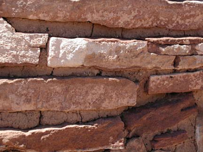
I have gotten hooked on reading Catherine Coulter, as I wanted a break from some of the more intense non-fiction I had been reading. Her FBI series is well-plotted – and some nice escapism. But I did get back to working with another photo from the Sunset Crater trip. This was taken at one of the remains of a village at Wupatki, another section of the national park. Here’s the original:
I decided to crop and focus on one little section of brick, just to see what would happen. Then I looked at levels.
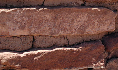
I had some fun with Curves, just moving that line in any ole direction. I keep seeing a mouth with teeth in this particular section.
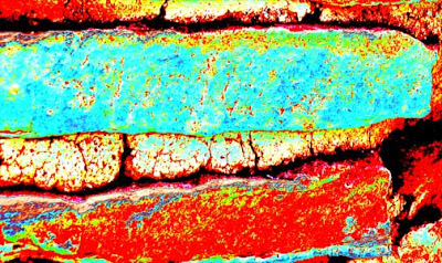
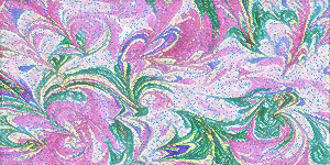
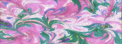
Gradient fun as always, now that I see what to do! I superimposed a pattern I created from a piece of marbled fabric.
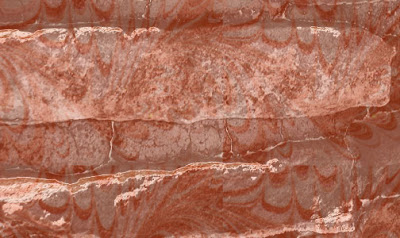
I love Invert – this one looks like an x-ray.
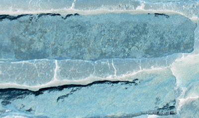
Crater Photos – being selective….
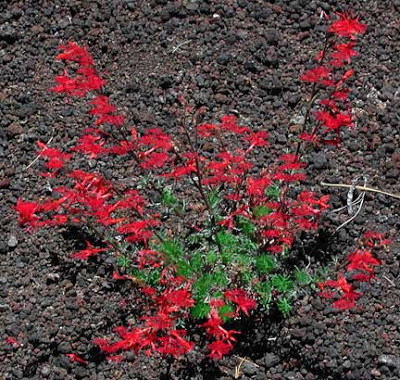
I found as I started manipulating this picture that I was more selective with what I decided to save. I started with a large photo, with the red bush in the center. I cropped out most of the rock so the emphsis was on the flowers.
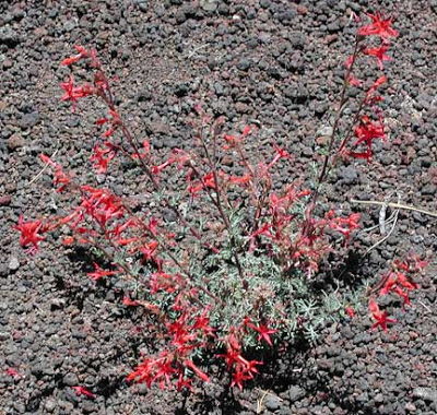
I found I wanted to emphasize the red in this particular bush, through the curves adjustment.
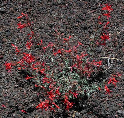
Using the bright/contrast adjustment – one of the favorites for adjusting photos.
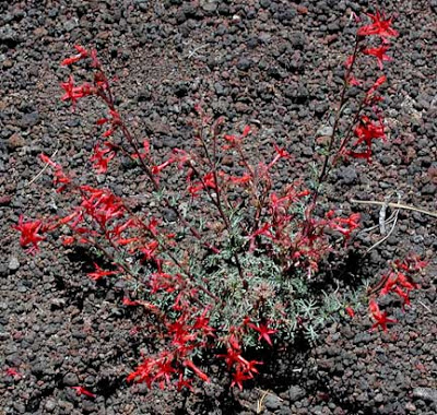
There is something about the negative look that really appeals to me – here’s the invert adjustment.
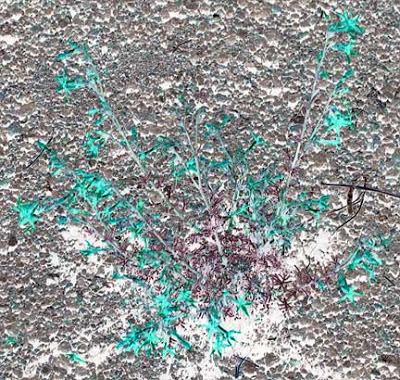
I hadn’t tried the wet paper filter, and I like it.
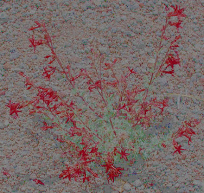
Now I’m getting bold – I wanted to emphasize both the green and the red, so I worked with developing a couple of brushes – changng sizes until I found something I really liked. And I am pleased with the end result.
The Crater – using a repeat…

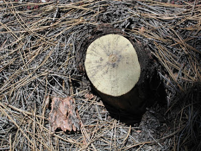
For this picture, it originally was an interesting stump, surrounded by pine needles. What I didn’t see initially was the lone piece of bark. The initial picture was pretty blah as it was.
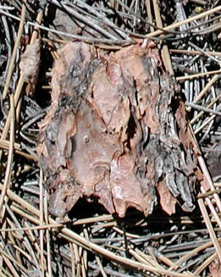
Then I cropped just the small piece of bark to start.
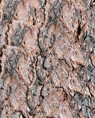
For the next, I decided not to try so many gradients and filters. I cut the bark and copied and moved it around the whole piece, trying to avoid any specific look of a repeat. Then I looked at embossing with contour and texture marked – except for the upper right, which seemed fine and added a little depth. So along with looking like bark, it also looks like a photo from a plane of the topography of the earth.
Crater Photos- More Fun
This is so much fun! This was the second picture of a nice bush among the lava. I cropped it down to one small section so we could focus on one small area of the bush.
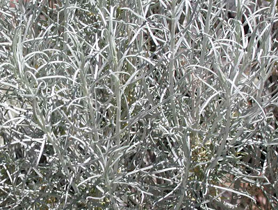
Then I adjusted for levels.
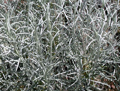
This one I looked at brightening, as the day really was quite bright at the Crater.
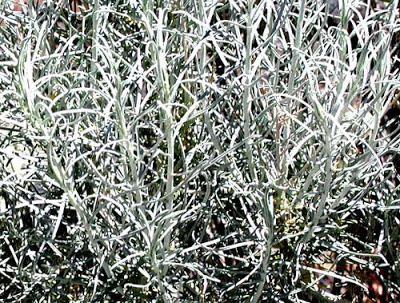
I looked at emphasizing shadows with this, using the black eye dropper to empasize the little hidden spots.
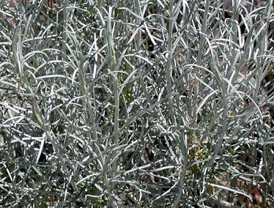
Now that I have some understanding of gradients, I really like fooling with them- and then adjusting each layer for additional effects.
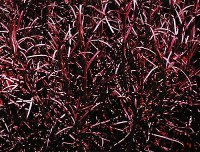
The ocean filter does some interesting thngs…
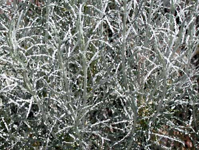
THis is a gradient (I think red, blue, yellow) with the “difference” used on the layer.
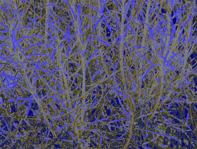
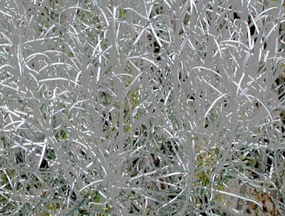
These are two different looks from the curves adjustment.
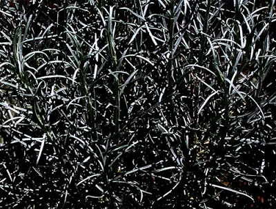
Craquelure filter…
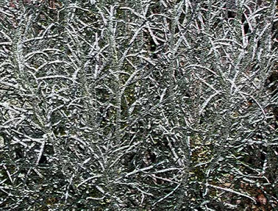
Copper gradent with some additional work on the layer…
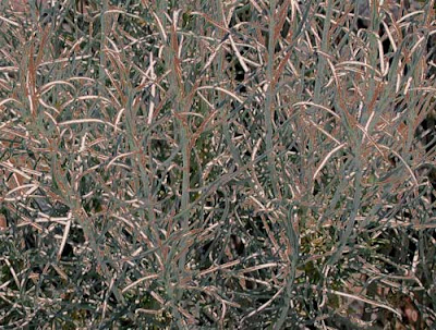
Emphasizing the color green…
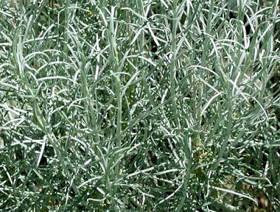
Sunset Crater – a beginning…..
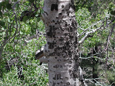
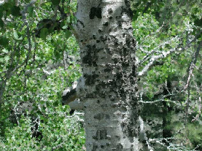
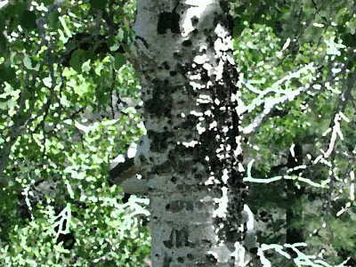
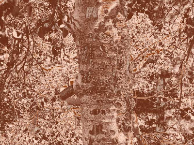
I downloaded the photos we took at Sunset Crater and Wupatki, just to see how I had done. Great shots! I have to do some light corrections on a few, but overall I am very pleased. The bark closeups look great! Here is the first original of an aspen growing amidst layers of lava.
Then it just became fun to play with the photo, using all I had learned in my Photoshop classes. This next is with levels and color corrections.

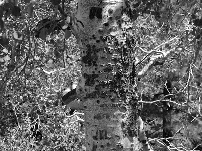
Now for some filters! In order: black and white, glass, palette knife, and gradient.
More on Sharpening…

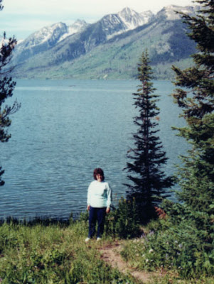
I am on a roll now. I decided to use a photo to finish the sharpening that I cropped this winter. I did the adjustments and a new cropping first. Here’s the original, me by Yellowstone Lake in 1989, early one morning.
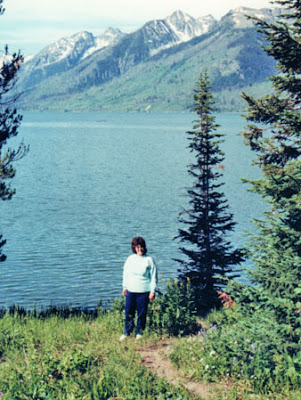
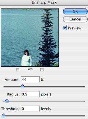
Then I worked on the sharpening. I am not quite sure what I am doing here, but I guess it’s another example of needing to spend time on several of these before it begins to make sense. Here’s after the sharpening, and the screenshot of what I did.
On the threshold, I went with 0 because I got more detail in the lake water – without the sharpening the lake looked flat. I took the amount way down because the trees looked “clumpy,” too fat and dark for what they actually were. And the radius is low because any higher and there was too much distinction between the elements in the photo – nothing seemed to blend. Plus, I think there is more a feel of early morning to the photo now than in the original. That’s my story and I’m sticking to it….
Sharpening and Lesson 6

Reading through Lesson 6 makes me realize all the things I did wrong when I undertook over Christmas to scan all the photos for a disk – and get rid of the originals. Didn’t know about destructive edits, and now most of what I have is too small for prints – I guess it means I will just have to take more photos!
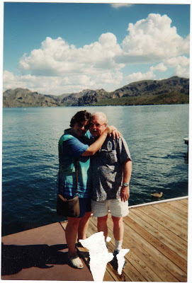
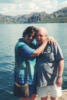
I’ve started with a photo of the two of us taken at Saguaro Lake about seven years ago. Not a great photo, can’t see much of me, and the photo got stuck under glass, so there is a lot of damage.
I did all the adjustments and levels before cropping. i have always cropped using the rectangular marquee, and I didn’t reaize the options within the crop tool. I like that. I also did a lot with the clone stamp, trying to get rid of the dust particles. Overall I am happy with the new photo. I liked the part in this lesson about resizing – I have been coming to some of these ocnclusions as I work through the lessons, so this is really making some sense now.
Revisiting the Logo…
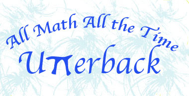
Spent some more time thinking about the logo and decided I hadn’t done it in a plain black. I like the blue of the school colors, but here it is in black. The shadow in the top can easily be done away with, but I think it give it a little more interest and doesn’t detract from the Pi.
I also decided to redo the “splash” on the coppper one to highlight the word “math.”
Finally – a Logo….
Well, it’s been a long time coming – I am working on week four of being sick with strep and who knows what else. I haven’t felt like doing anything, including Photoshop. But I finally tackled the rest of lesson 5 – I had a lot of trouble really understanding about paths and working with them, but I think it’s beginning to finally make a little sense. I realized what the problem was at work with the logo – a rasterized version that they were trying to use as a vector – turns out they finally hired someone to “fix” their problems. At least I figured that out. Good on me.
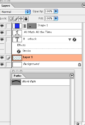
I worked on a logo for a math shirt next year. We have screened shirts for our school for the various departments, and I wanted to work on something that would fit in. So I used my Pi shape to take the place of the 2 T’s in Utterback, and I think it looks pretty cool. THis should be relativbely easy to silkscreen for a shirt.
Then I started playing with some other effects. I like the gradient with the copper because it really makes the school blue show up.
Here’s my screenshot, and now on to lesson 6.
Working with Paths…

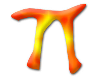
Interesting lesson 5 – working with vector graphics and continuing to work with paths. Just when I felt all amuddle, I finally created a pi-shape, saved it as its own shape, and started playing with a shape layer. Now I think it is beginning to come together. With the creating of the shape, I tried playing around with the pen tool more and realized I just had too many points. I worked at adding and deleting, using the convert pen tool, and I finally ended up with a Pi I could like. Once again I have to remind myself that I can’t learn and understand everything about paths all at once.
It was cool to open the shape library and see the Pi already there. I opened it and worked with a shape layer. I noticed that as you chose a style, all of a sudden in the layers, everything that had been done to create that style showed up – you didn’t have to do anything else. I got up enough courage to play with the style layers and came up with some interesting ideas.
What finally gave me the “wow” in this lesson was realizing I could create the basic math symbols (and they may already be out there!) in preparation for some math t-shirts next year.
Lesson 4

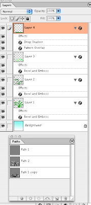
Lesson 4 is about the pen tool – and sure explains why I couldn’t get it to work like a “pen.” Interesting tool- still having trouble with the little handles getting them to smooth curves, but I’m guessing that’s just a problem with practice. I opted to try some cactus – especially the century plant. I wanted a very “hard” look, and I love what I ended up with.
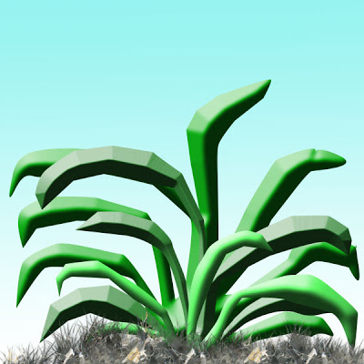
I have three separate paths – this final after I tried this on three other canvases. I was able to give each path a different color of green, and had lots of fun trying to work with the embossing to get the hardness that I wanted. Remembered to do other layers for the gradient background and the grass. The grass I checked “pattern,” forgetting which pattern I had already, and I love the effect – hard dirt. I had used the airbrush to build up lots of grass, so I think that’s what added to the extra “dirtiness” of the ground. So I accomplished a “hardness” feel to the whole drawing. Screenshot follows of what I attempted.
Another Card…

I tackled another card last night to see if I had mastered the elements of this lesson. I completed it this morning and printed it out – not bad for a start. There are still lots of places where I am not happy: sizing images at the start so they fit the card when I bring the image over. Lining things up – certainly getting better. In the practice card I printed out I saw where I would need to move the black design over further to center it.
Primarily it is in the initial sizing of images – mostly at 100 – and then when I want to import them into something else, the size becomes a problem. Well, I know I am making progress, so I can’t beat myself up on it.
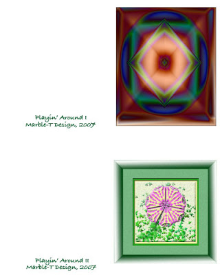
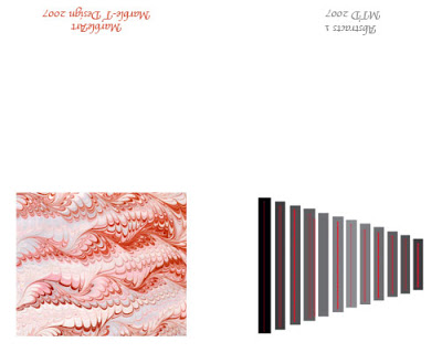
Front of the cards (I wanted to see what I would need to do to do them with a horizontal fold), back of cards, and a screen shot.
Making a Card….

Whew! This has been a tough lesson. The pattern piece has only been part of it. The last part is setting up a template and making a card. I really did struggle through the directions, but eventually got the template set up. Then I ran into problems transferring artwork to the template – another sizing issue, which I still need to work on.
The template is set up to run two cards, but overachiever that I am, I did two distinct cards, just to try some things out. What follows is the outside of the two cards.
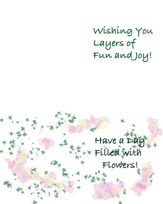
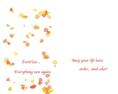
Now for the inside of the two cards.
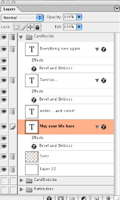
The interlocking groups to keep layers organized is a nice piece. I think I did quite well on that! I helped out at school today with redoing a school project in Photoshop. Had to start from scratch, and I amazed the teacher with just how much I was able to do in 10 minutes time – redid the whole project, shortcuts and all! Thanks, myJanee!
Patterns Redux….

Okay, so I couldn’t stop. This one is two gradients – chrome and a blue/yellow/red – which I offset by 50 on both horizontal and vertical. You can see the offset but I like it – gives a better flow than without the offset. I also took the opacity on both layers down to about 70%. I applied several filters – noise, crosshatch, and something else. Then I finished it up with a liquify – and I like the effect – not so much as a pattern to be repeated, but as a small work of art.
More on Patterns…

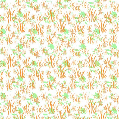
Today in class we reviewed the basic types of symmetry, and I used my wallpaper example with the paw prints to look at translations – well-received by the kids. I decided after my school work was done to play around a little more to see what I could come up with – and it seems like I have the process down. With one of the patterns below (mostly grasses) I kept trying new layers for different patterns, and then tried all the layers together to see what I came up with – and I liked it.
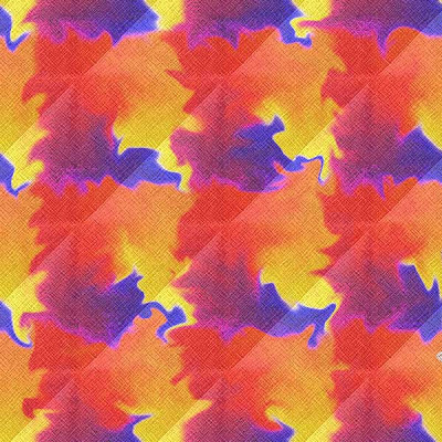
Here are the two new patterns – I could get into designing wallpaper!
