Archive for the ‘Photoshop’ Category
Creating – Part 1
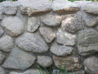
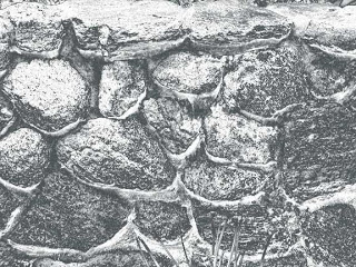
I’m going to start out trying to document the process I am going through to create some of these “garden fantasy” images. You have a basic stone wall, much more interesting in person. I have been fascinated with walls and the interplay of textures, so I want to see what I can do to make this a more interesting image. I usually start with basic adjustments, and what you see below is the application of shadows and highlights – which I only discovered a few months ago. You should see that the cement mortar holding the rocks together is now light enough to see.
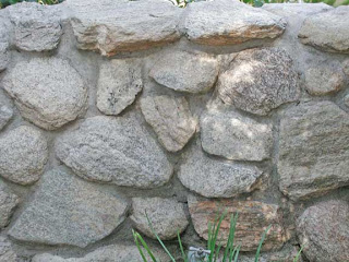
From here I usually look to balancing any color issues. I ended up with adding to the blue tint, as it makes the rock wall have some more depth. PLus, it’s more appealing to me, and it seems more like the actual wall on the day we were at the gardens.
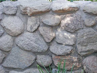
This next is intriguing – I tried a hue filter, and it looks as if a few of those rocks are bottom-lit – it’s somewhat intriguing.
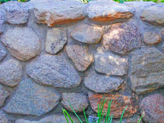
I love gradients. When I finally started to work with them, I discovered interesting effects. This one looks like underwater, with bioluminescence on the rocks – or are they shells of some underwater life form?
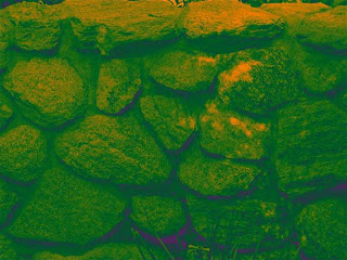
This is another gradient that reminds me of satellite imagery from space. I can see snow, and the popping up of land forms – which seems like it should be reversed, but now I feel like I’m in the “definitely intriguing” area.
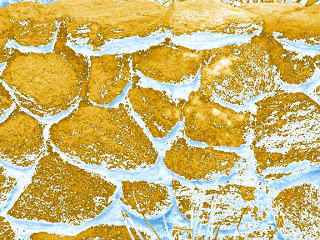
Oohhh, dinosaur eggs! Looks fairly menacing – from yet another gradient.
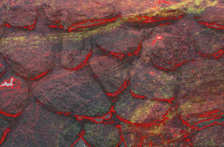
Now I feel like I am really in the realm of fantasy. I added a marbled pattern after selecting the rocks and adding them to another layer. I also cropped out the grass at the bottom. I used a stroke in a fine orange, and now this wall looks like a volcanic eruption, with the magma just below the surface. This is where I’m going to continue.
Comments welcome – what else would you suggest?
And – check out our contest!
Contest Time!
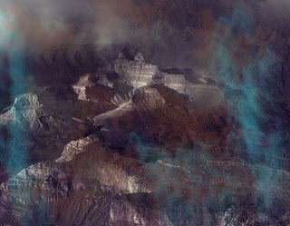
I will preface this by saying I have never done this – either contest or gallery show, so it’s all new! But as you can see from a previous post, I m in need of a title to unite all our work. There are three (and possibly a fourth, who is a photographer) of us putting this together. The only restriction from the park gallery is that the focus has to be Southwestern, which is not a problem at all. And – I want something more exciting than “Southwestern Art.”
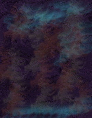
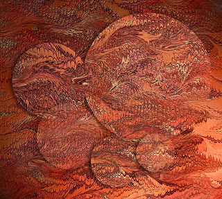
That said, we have fiber art from marbled fabrics, digital manipulation of images, both with and without marbling, and some great stand-along photography of the Southwest. You can see some examples here, and you can scroll through older posts. Plus, The Art of Fabric, our website, has examples of fiber art. The image at the top of this post is an example – and the drama is lost on this size! The show isn’t just about marbling, which would simplify our title tremendously, but in the directions some of the marbling is taking us, as well as digital experimentation with Photoshop. We are trying to be unique in the marbling niche, and the digital work seems to be providing that.
But – we also don’t want the show to be exclusively digital marbling. Consequently, we want suggestions. And to the winning suggestion, you will get a four-pack of note cards with original digital marbling images. You get to see some of our new work before too many others do.
So comment away – if there are several title suggestions that are the same, the one submitted first will be judged the winner. I’ll keep an ongoing commentary as we develop the show, piece by piece – even if it is 4 years away. We will be ready!
Additional examples of art work – scroll through the past posts – there is usually some art work that is included in each posting.
The Digital Generation
I have spent a little bit of time today surfing sites on creativity – just to keep up with what’s new on the Net. I came across this from hypography – a forum for science and technology: Will the Digital Age Destroy Creativity? Certainly provocative!
One thing about teaching at the high school level. I have become very aware of digital devices and teenagers. My students still can’t understand two things: why I always know when they are texting (head down, hands in lap, not listening), and why my phone doesn’t do anything more than make a call. I’ve been reading a lot about the changing technologies and their impact in the classrooms, and I am trying to understand and utilize more of what the kids know and can do with these new digital devices.
But I gotta tell ya – I truly believe there is more to life than always texting or having earphones stuck all the time. And loud? I tell the kids if I can hear their iPod it is definitely too loud! I wonder about hearing loss in the next decade. I wonder about the ability to read a book, rather than opt for music – not that I have anything against music. I’m enjoying all the portable availability of lots of tunes.
This takes us back to the initial question: is the digital age destroying creativity?
For me personally, an unqualified NO! My artwork is taking advantage of technological wonders – Photoshop, blogging, eBay, networking, and the like. But I still like my quiet time, and I still will always want to own books. However, I don’t always want to be “on call” with a phone/computer that never lets me rest. I just want to let hubby know if I am going to be late, or if the bus is delayed – those kinds of things.
Marc Prensky writes about what he calls “Digital Natives, Digital Immigrants.” I would definitely qualify as a digital immigrant – I’m new to all this. I’m adapting (all right, to a point), and I love what I can now do.
But – what about this current generation? They’re immediately on their cells or listening to music. Are they so plugged in that they will be content with texting and always listening to music? BUt am I so much of a dinosaur that what I think truly is valuable is outmoded and ancient?
What do you think? Is the digital age destroying creativity?
Orange Blossoms
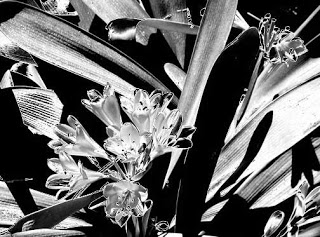
I plan to continue with these, hoping for feedback and some strokes of inspiration. I fell in love with gradients early on in my Photoshop work, once I figured out how to play with them. The effects can be really intriguing, especially if you keep running through the various selections. I’m very partial to the copper gradient, but it made the flowers on this one look very indistinct. There’s something about black and white/gray that is so dramatic. Probably why I love Ansel Adams.
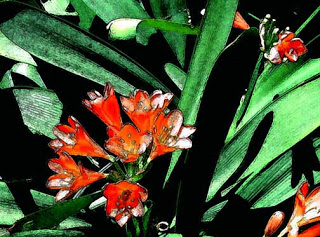
I discovered the fresco filter with an earlier piece and I really like the effect – sort of like water color, but not quite. I had learned that “fresco” was a type of painting done on wet plaster, and then the paint would dry with the plaster and become part of the wall. I love the “vagueness” that comes with this filter. The orange color is also deeper with this image.
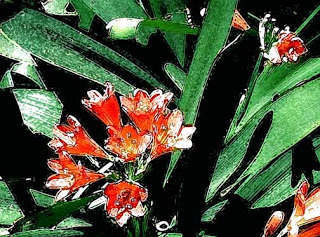
I like the dry brush, but not with this image. Nothing really seems different, not a hint of “wow.” But one thing about Photoshop is that you never really know when something will work out. And – the orange washes out….

The crystal filter here is interesting – seen close up, almost as individual pixels, reminds me of the hydrangeas from back East, which I always loved. In terms of fantasy? I think the gradient achieves that, but I’m thinking I’m not done with this set of images….
New Work

In the midst of talking about learning, and folks on Facebook celebrating their 100th posting, I thought I would go back to the beginning of this blog. It was originally set up to record my work in a beginning Photoshop class. Now it has become my creative journal, and as I build my audience, I really am hoping to get feedback on a regular basis about some of the things I am trying. That said, here’s one of the first attempts…and I was so proud of myself!
The beginning exercises were to help us learn about layers and basic drawing tools. I spent hours playing around with them. I knew I wanted to go much further, but while the initial learning curve wasn’t too bad, I felt I plateau’d with filters. I need to get back to the NAPP tutorials and try to expand what I can do. I went a long time between images, and I found I had forgotten a lot of the steps, like importing patterns from the marbled fabrics.
Dean went back the the Gardens yesterday to fnd irises and roses galore! He took some great shots. I picked this one to work with, and cropped it to this image. I’m liking the off-center images, especially since I have always been SO linear and symmetrical.
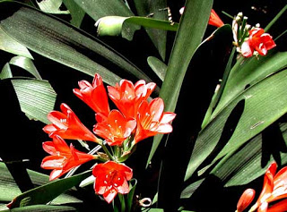
Keeping in mind I am trying to develop a set of 12 to 15 images to fit the theme of Garden Fantasy, I get the basic cropping and adjustments done, and then I start to play. So this is the first attempt-
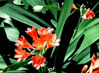
What I notice, now that I can see them both (note to self: work at tiling on the desktop…) I adjusted the bottom one to enhance the greens, and it seems like some of the deep orange was lost. I will need to relook at that. This one also has the use of the clone tool to eliminate some “flaws” on the leaves.
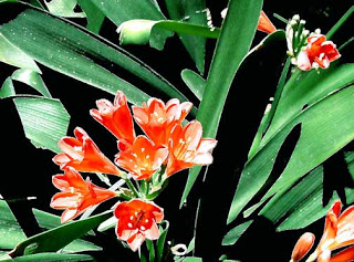
This is a filter – the blur filter, and generally I like the effect. Again, I have to watch the color – these flowers really are a deep orange. But I like the blur effect….
More tomorrow – I have papers to grade……
…..but I just discovered Picasa……
Agua Caliente, Mata Ortiz, and the Gardens

What a glorious day! Even though it started with an MRI, we ended with a great walk through Agua Caliente Park, a series of small ponds and a wonderfully restored 50’s ranch house. There also is a wonderful little gallery there, and we try to check each month to see the new artist. We are scheduled as the artists in 4 years – never too soon to start planning! The weather also was amazing today – why we come to Tucson for the 70’s and gorgeous blue skies! We also looked at an exhibit of Mata Ortiz pottery at the Tohono Chul park – rapidly becoming another favorite haunt, but we keep forgetting our camera each time we come!
I spent last night going through iPhoto at the shots Dean has taken at the Botanical Gardens. There are some pretty great ones, so I pulled those up and started doing cropping – in most cases I think the cropping made for a more interesting picture. Now I will slowly play around with Photoshop to see what I can create for my Garden of Fantasy, one of the shows I would like to see get curated.
So here are some of the ones I have chosen, along with some comments about some of them. I haven’t really decided what to do – this right now is a lesson in working with Photoshop and learning more – and hoping for a few “a-ha’s” along the way.
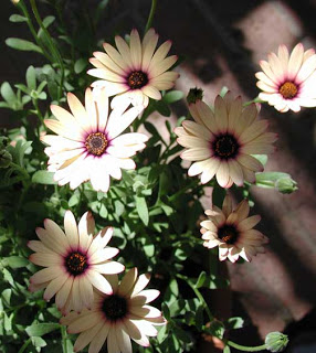
I’m quite partial to these daisies, especially with the lines of shadows running diagonally through the picture. There’s straight, round, diagonal – a nice mix of shapes. And the close-up of the flower centers has gorgeous details.
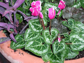
I love cyclamen, but I can’t grow it! This is (I think) spectacular for the water drops – taken by me on an early morning at the Gardens after a rainy night. You don’t find dew often here in the desert!
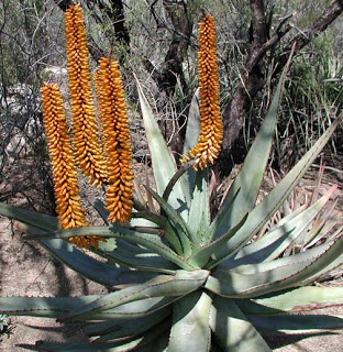
With my new backyard, I plan to have lots of agaves and aloes. This one is huge, so I am aiming for the smaller type, but I love the blossoms.
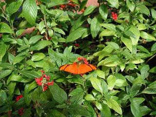
Butterfly Magic at the Gardens – the orange amid all that green is beautiful.
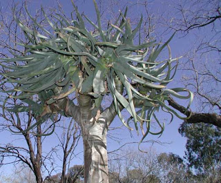
This is a really intriguing plant – it’s as tall as a tree, with a trunk like a tree, but with succulent leaves. I cropped out a lot of the background to get a better focus.

This color is spectacular. I’m curious if I can improve on it….
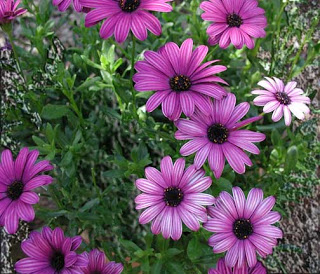
To see this in person just takes your breath away. I’ve started “roughing up” the background to accent these petals even more.
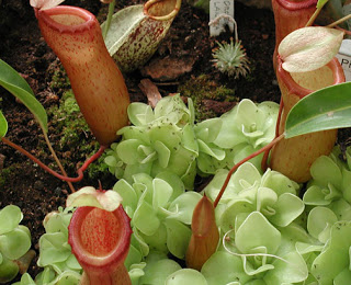
I absolutely love the mix of colors in this – these are pitcher plants – carnivorous plants that eat bugs. They are intriguing-looking plants.
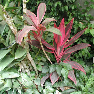
This photo doesn’t begin to do justice to the red of these leaves. That will be my challenge.
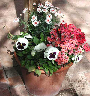
I love this one – nice mix of colors.
On Second Thought….
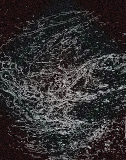
…maybe if I actually start detailing some of the projects I can make a start at something….
Website – change of address on pages, update links (not a priority), have Dean check to see all links are working, new work up (A PRIORITY), info page, garden page, start re-evaluating what will be for sale.
Which leads me to Cafe Press – make some decisions about what will actually be there. Amazon – do I want a list of books? – account is already set up – just work on my part (which is not working on MY art).
Look at Shutterfly and iBook for creating new portfolios (and stay away from family pics – just another delaying tactic). Where is it cheaper to get some prints of some of the new Garden work?
Actual art – work on Glacier – MAKE THE DECISION! This show or not????
Marbling – try out new techniques from workshop on fabrics.
Above all, stop trying to do things because you think you “should…” – (like the G-Team project from school)- I don’t need the money (whoa, when have I ever said that??) and I don’t really want the commitment. I want to come home, read, sew, sit outside and enjoy the yard, and relax.
So – Suzan, here I come….
PS – maybe I should switch the two photos. This one is the “line drawing” for the one before. This is more a “maelstrom” and the bottom one at least indicates I’ve moved somewhere….
Garden Fantasy, continued
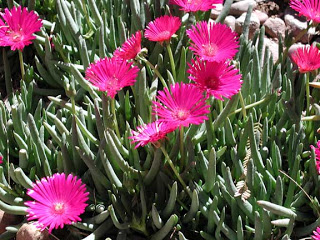
I really want to work again on Photoshop and increase my skills. To this end I want to work on a series of actual images from the Tucson Botanical Gardens, and create a kind of fantasy garden. I looked at a show hung in one of their galleries, and the images were beautiful colors, all taken at the Gardens, but nothing really spectacular. I’m hoping to take the Garden a step in another direction.
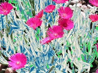
The original photo at the left is of an ice plant, a succulent in this area. We had lots of them on our yard in Phoenix many years ago, but none as healthy as these. Dean did an amazing photo of these. I tried cropping, but I still like it just the way it is. I started playing with some of the adjustments, especially gradients (I really love gradients, and they do so many cool effects). I have learned how to get certain sections (based on color) onto different layers and then adjust them that way. There are about 5 gradient layers to this one, and I really like the “ice” effect to go with the “ice plant.”
Transforming…
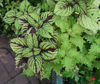
Last fall when we went walking in the Botanical Gardens, there was an absolutely beautiful coleus plant in a pot. I sat and sketched for a bit, trying to get the wonderful purples within the veining, without much luck. That was the picture I pulled up to work on this evening (before I head to bed to nurse this cough). I’ve tried a few different croppings and realized what I don’t like about them. I settled for this one to play with.
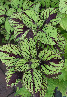
Since I’ve learned about layers and all the effects, I can try new things and “turn them off” when I want to try something else. It certainly frees the creativity. Then I can also combine some of the layers for even more effects. All of this in preparation for a page on the website of garden photos.
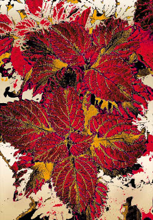
This is a couple of filters combined – ink and accented edges. This is on top of various gradients that I’v already tried. I’m partial to this – I can see it made into fabric – check out spoonflower.com. They’ll print custom fabric, and it’s pretty reasonable. I’ve actually seen (and grown) coleus in these colors.
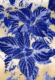
This one reminds me of some of the older fabrics used in Hawaiian shirts. I got quite a few of those effects with the gradients. Also – great possible fabrics. With the bottom one, again very Hawaiian – I can see it in a typical Hawaiian applique. I tried a film grain and cutout filter combined for the effect.
More Playing Around with Focal Point
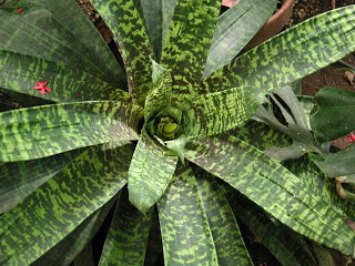
Agaves, aloes, bromiliads – there are so many wonderful plants at the Botanical Gardens. My favorite is the Cape Aloe, but I haven’t worked on those pictures yet. This bromiliad is in the rainforest area that hosts the Butterfly Magic each year. I didn’t make many changes to the composition of the plant, as I like how it spirals in to the center of the plant. What I did do was crop the right a bit, to put the center of the plant just a little off-center itself.What I did do was play with a couple of filters and enhance the texture of the leaves.
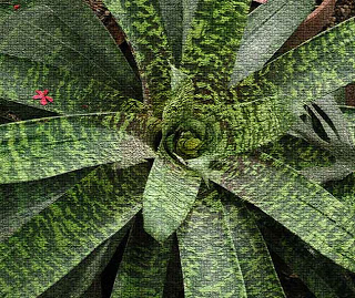 This is the mosaic filter, and I like the roughness it adds to the plant. I still want to play around with this, but I think I’m on to something. I’m intrigued with the little pink blossom just laying on that one leaf.
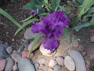
I love irises. I would have a whole garden if I could. At our house on Nastar, we had “desert irises,” which were small delicate blossoms. I love all the colors! The Gardens have a nice area kept by the Tucson Iris Society, and I thought, given the number of plants, that there would be loads of flowers. Evidently most of the plants are new and not ready to bloom. But there was one cluster with HUGE blooms. This is the original.
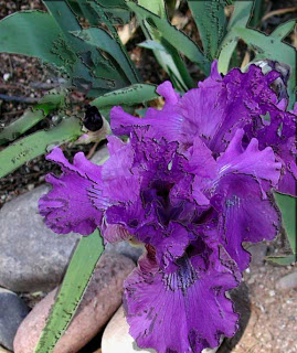
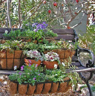
I did quite a bit of cropping, and I think it worked. The new pic really shows the size of the flower, as well as the incredible purples. I had some fun with the filters, as I think it increased the magic of the flower by roughing the texture a little more. Overall I am pleased with the effort with these two.
What’s New – Again….

I started playing with the image again. It feels good to be back working with Photoshop and staying at a task until I am satisfied with it. Here’s the original again:
There are 2 revisions – can’t decide which I like better – and of course, have to take into consideration the way the monitor shows colors….
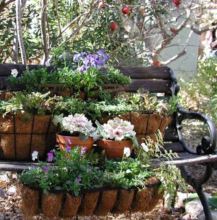
I am partial to this second one. The contrasts seem stronger, whereas in the first one, too much seems to blend to one color of gray. I don’t know that I’m willing to leave it alone, but for now I am pleased with what I’ve learned.
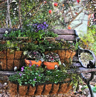
And since Photoshop has such cool effects, here’s one more, using the fresco filter. I love the effect of the “water colors” – certainly in the “fantasy” mode that I am working toward!
Makin’ T-Shirts

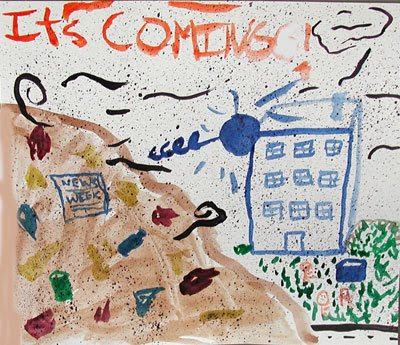
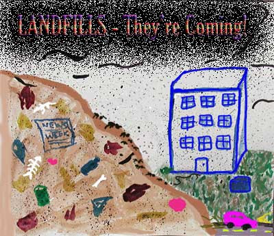
We are getting ready with our panels for the opening of our Contemporary Issues museum with my GATE class in May. Two of the girls want to do t-shirts about their project on landfills. One of the things with art class this time around has been having the paints out and available any time someone wants to use watercolors. Well, one day a few weeks ago they just started painting lots of water color about landfills. Friday they chose one and started to work on a t-shirt design. Here’s their original watercolor and their t-shirt one.
I anticipate a run on Photoshop as the rest of the class gets ready!
New Directions

Last night I was working with one piece and came up with an incredible background (if I do say so myself). Sent it to Suzan, because I just couldn’t get the pot working, but I loved the background. One thing I am discovering is the need for a stronger story in the fabric, through shapes or other pictures. I don’t have much of a picture library, but Suzan managed to create some amazing stuff. The other thing I am discovering is the need for the fabric to show through as an integral part of the piece – so you can see the marbling background. Here’s the original background:

That said, here’s what Suzan did with the pot:
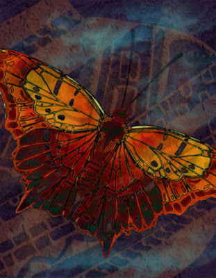
Certainly interesting, but this is where I realized I want to fabric design to be a stronger part of the piece.
Then Suzan did some mind-blowing manipulations:
And some even better stuff:
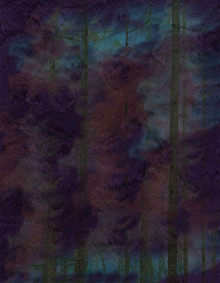
And finally, the piece de resistance….Marbled Canyon….

On Being Creative

It’s a nice, lazy Saturday, and I am cleaning and sorting, and generally playing with Photoshop. This time a year ago I was probably into week four of the first Photoshop class. What a difference a year makes! Thanks to MyJanee
I have been able to zoom with my Photoshop skills. Her courses gave me a strong set of basics, so when I started getting creative, I had already learned a lot.
There are a lot of questions now that need answers, now that Suzan and I have developed a body of work in digital marbling. I need to think about the website, and that needs to be done soon, as Eric Maisel’s blog writings are going to start happening in March, and I want our site ready for additional traffic.
Things to do:
1 – plan the new pages
2 – go back and review Cafe Press to see what has to be done for prints
3 – decide on framing possibilities
4 – decide on pricing of prints and originals
5 – continue to produce new work
6 – revise digital portfolio for submission to new galleries
7 – decide on some new galleries – anything available in Tucson?
That should keep us busy for a while.
Snowy Arizona….

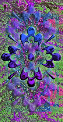
It’s snowing up on the Rim, so we ended up having to cancel our trip north – which gave us more time to try some new work via email. The purple flowers from a few entries ago got Suzan’s expert advice, and now we have a new one –
Then I was playing with a new piece, trying to use a Native American pot shape. Great background, lots of possibilities. I was able to get some nice texture to the pot, but nothing really was happening overall.

I tried using some of the whispy brushes for the background.

Then I decided to just do away with the pot, added a gradient, and the background was amazing – very stormy, tornado spinning…..
