More Lessons from the Coloring Books – Part 1
Throughout all the stress of medical issues this winter and early spring, I resorted a lot to coloring at night – one BIG take-away from the coloring is that it controls my appetite….no small thing. But I’m learning something almost every piece I do. You can catch up with what I learned so far here.
So here are some pics – and lessons learned.
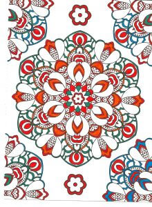
One of the things I’ve been playing with is amount of white space. You can see in the above that not everything is colored. Pus, I was trying to play around with oranges and color combinations, like mixing colors that are close together. I love the way the turquoise is accented. No point in doing the edges – I was concentrating on the center – which is an interesting move for me – to just let things “be” without having to “finish” everything.
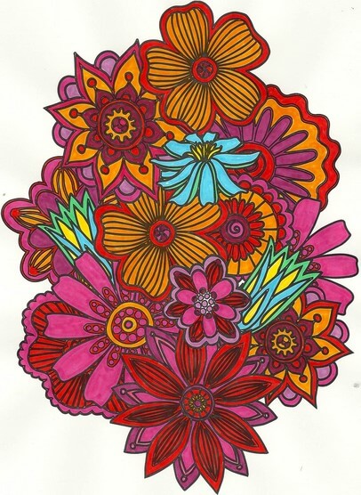
Again with the reds, oranges, purples, but I decided to add an unexpected color – my fiber work tends to lack strong focal points – so I added the blue – makes the piece. I also rotated the scan because the “bottom” was too heavy when on the “top.”
Here’s where I figured I really need to spend some time with colored pencils, especially when I can do shading – which I love doing with regular pencil. And again the oranges and reds.
I left white space with this, and I discontinued finishing the design – it was getting too busy. Here’s where I kept hearing Tim Gunn’s voice to “edit.” The yellow in here really glows.
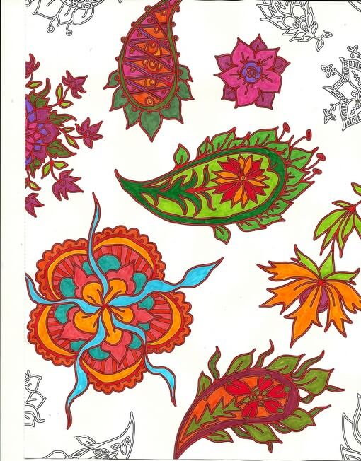
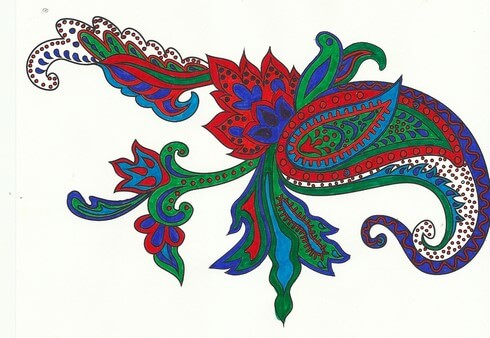
 This was playing around with oranges and blues – a combination I am starting to like a lot. Lots of white space, and I used the designs on the edges to play with color combinations. The lower right looked too much like a super-hero costume for me……
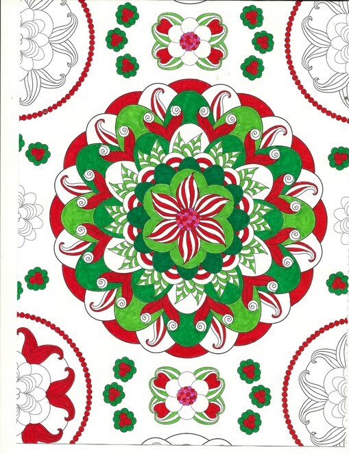
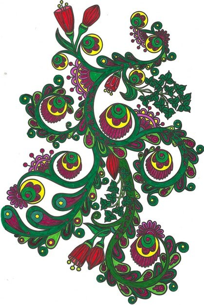
Christmas colors – meh. These were better than some I tried. The colors – for me – need to be true, but I am happier with mottled shades of reds and greens.
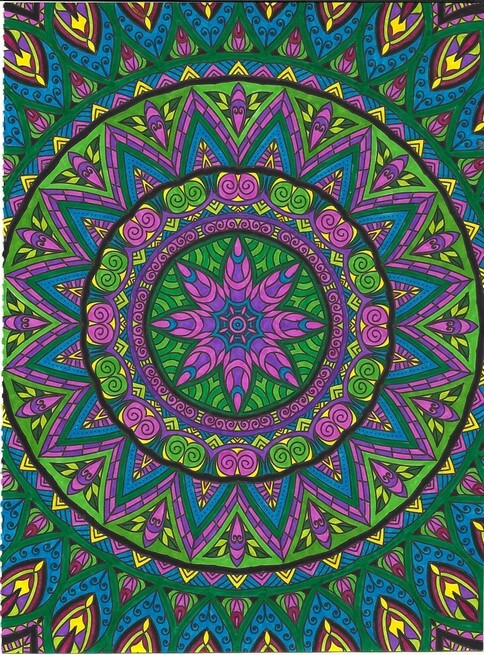
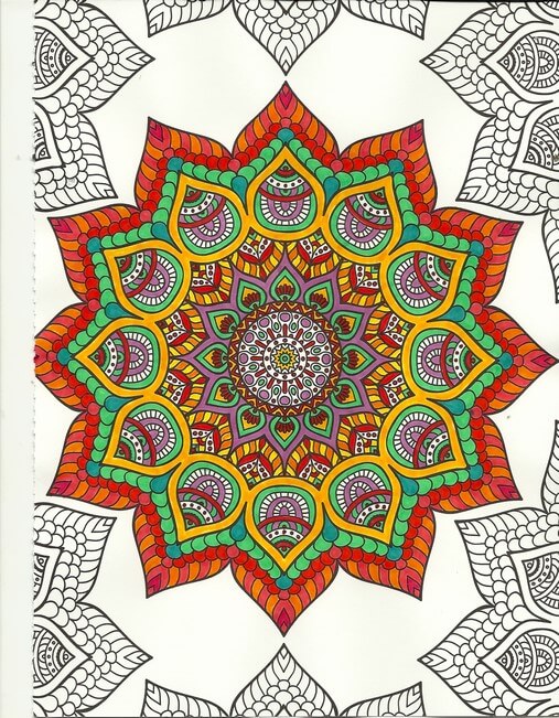
Interesting as I was working with what colors glowed – the yellows, but especially the purples in the center. I also discovered differences in black – flat and shiny, which I should know because of all the black fabrics out there. Overall a fun design, but it bugs me that the books consistently cut off complete designs.
Blues, reds, greens and white space. I am finding not everything needs to be colored. I find this quite pleasing.
Love the delicacy of this one. Even though the design is completely filled in, there is an airiness to it.
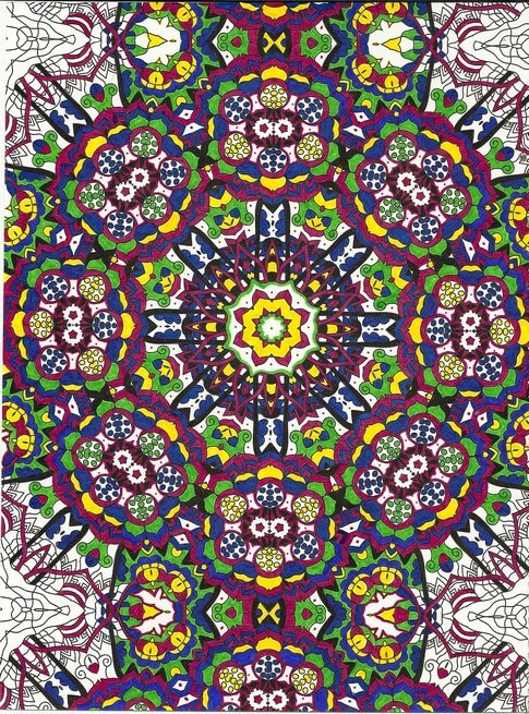
Same for this design – and I really like the colors – very vibrant.
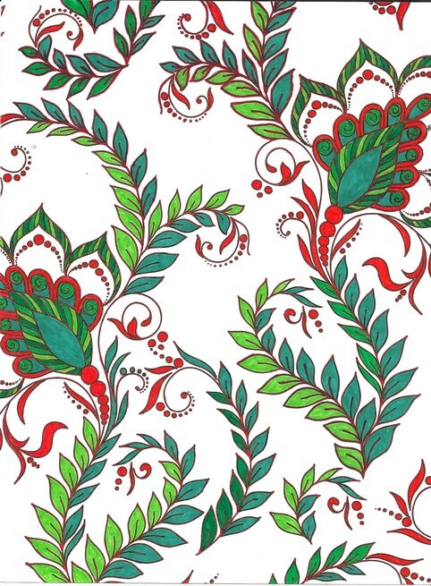
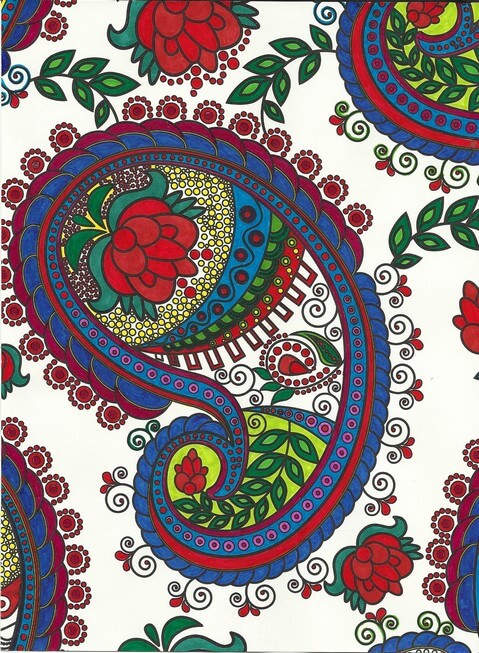
Again oranges and greens – would make a great wall paper.
Nice and lacy – I like incorporating some of the zentangle motifs when I feel there is too much white space.
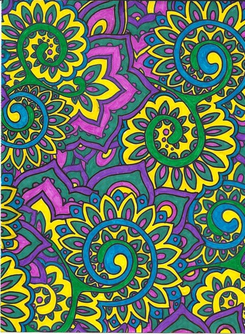
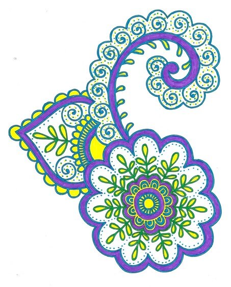
The original dominant color here was going to be the pink-purple, but yellow won out. Interesting to me how that happens.
Really need to spend some time with colored pencils, but I SO like the intense color of markers. Like I said before, surprising for me, since they are so unforgiving.
I definitely can see some of the effects of the coloring in the most recent fiber work – more on that to follow.