Posts Tagged ‘color’
More Lessons from the Coloring Books – Part 1
Throughout all the stress of medical issues this winter and early spring, I resorted a lot to coloring at night – one BIG take-away from the coloring is that it controls my appetite….no small thing. But I’m learning something almost every piece I do. You can catch up with what I learned so far here.
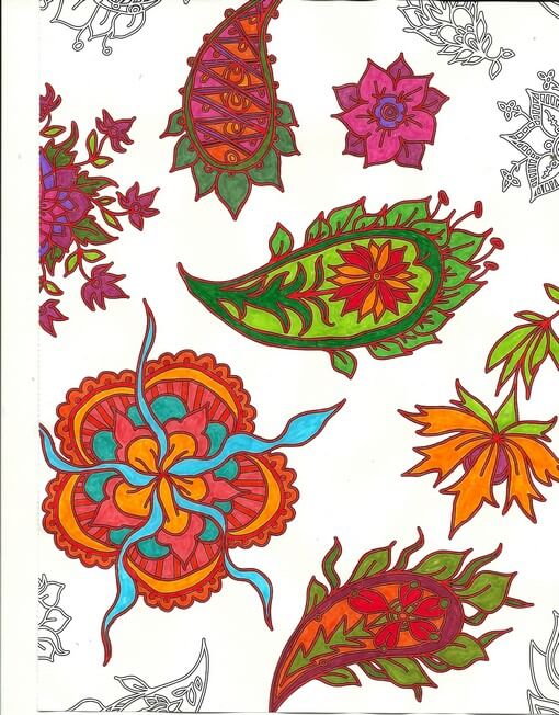
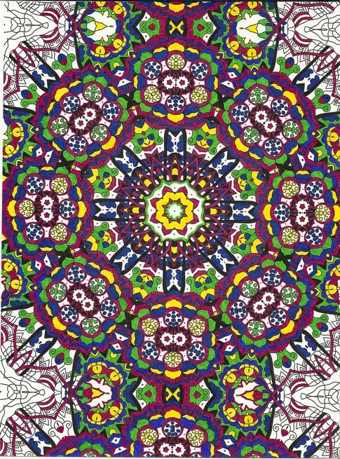
So here are some pics – and lessons learned.
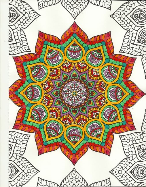
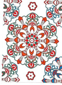
One of the things I’ve been playing with is amount of white space. You can see in the above that not everything is colored. Pus, I was trying to play around with oranges and color combinations, like mixing colors that are close together. I love the way the turquoise is accented. No point in doing the edges – I was concentrating on the center – which is an interesting move for me – to just let things “be” without having to “finish” everything.
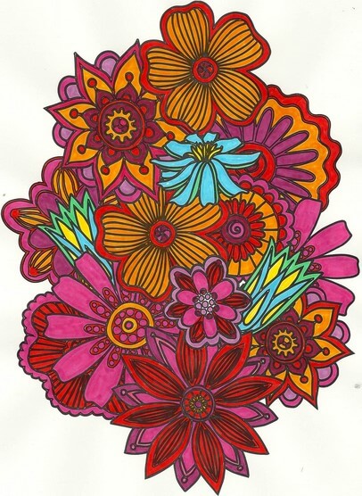
Again with the reds, oranges, purples, but I decided to add an unexpected color – my fiber work tends to lack strong focal points – so I added the blue – makes the piece. I also rotated the scan because the “bottom” was too heavy when on the “top.”
Here’s where I figured I really need to spend some time with colored pencils, especially when I can do shading – which I love doing with regular pencil. And again the oranges and reds.
I left white space with this, and I discontinued finishing the design – it was getting too busy. Here’s where I kept hearing Tim Gunn’s voice to “edit.” The yellow in here really glows.
 This was playing around with oranges and blues – a combination I am starting to like a lot. Lots of white space, and I used the designs on the edges to play with color combinations. The lower right looked too much like a super-hero costume for me……
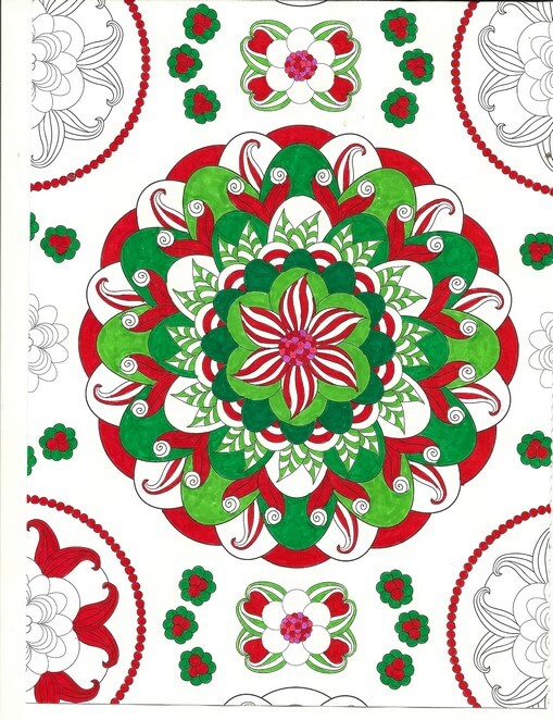
Christmas colors – meh. These were better than some I tried. The colors – for me – need to be true, but I am happier with mottled shades of reds and greens.
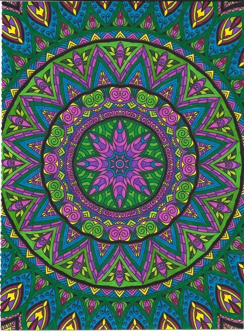
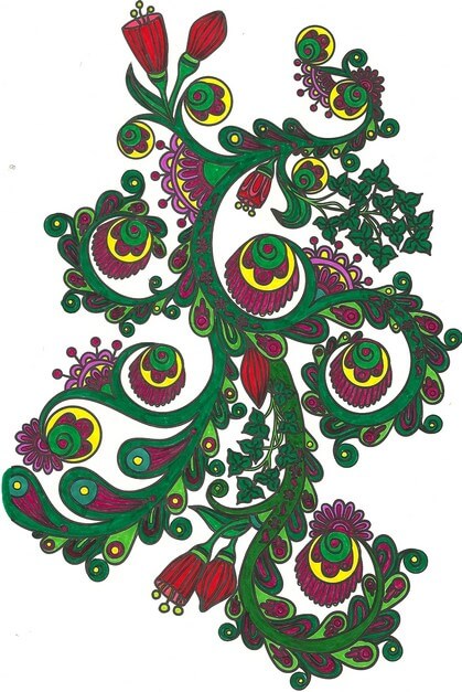
Interesting as I was working with what colors glowed – the yellows, but especially the purples in the center. I also discovered differences in black – flat and shiny, which I should know because of all the black fabrics out there. Overall a fun design, but it bugs me that the books consistently cut off complete designs.
Blues, reds, greens and white space. I am finding not everything needs to be colored. I find this quite pleasing.
Love the delicacy of this one. Even though the design is completely filled in, there is an airiness to it.
Same for this design – and I really like the colors – very vibrant.
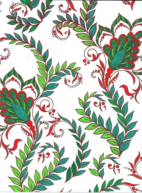
Again oranges and greens – would make a great wall paper.
Nice and lacy – I like incorporating some of the zentangle motifs when I feel there is too much white space.
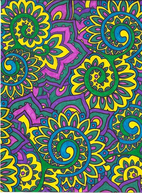
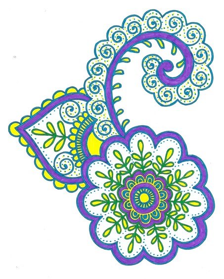
The original dominant color here was going to be the pink-purple, but yellow won out. Interesting to me how that happens.
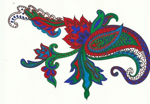
Really need to spend some time with colored pencils, but I SO like the intense color of markers. Like I said before, surprising for me, since they are so unforgiving.
I definitely can see some of the effects of the coloring in the most recent fiber work – more on that to follow.
Top Ten Tuesday

A long, hard week, but we can always count on the internet to provide something interesting. Enjoy!
A really cool look at some Photoshop work from The Best Article Every Day:

Things maybe you never knew about cleaning and organizing….and might want to – some very clever ideas here!

From the 365 Project, once again some amazing photos:

NYC Has Big Balls by Michael Elliot
This is a dance performed at the closing ceremonies for the 2004 Paralympics. The dance, called the Thousand-Hand Guanyin, is making the rounds across the net. Considering the tight coordination required, their accomplishment is nothing short of amazing, even if they were not all deaf. All 21 of the dancers are complete deaf-mutes. Relying only on signals from trainers at the four corners of the stage, these extraordinary dancers deliver a visual spectacle that is at once intricate and stirring. Its first major international debut was in Athens at the closing ceremonies for the 2004 Paralympics. But it had long been in the repertoire of the Chinese Disabled People’s Performing Art Troupe and had traveled to more than 40 countries. Its lead dancer is 29 year old Tai Lihua, who has a BA from the Hubei Fine Arts Institute. The video was recorded in Beijing during the Spring Festival.
From the TED Blog – 100 Websites you should know and use…..when you want to surf……

A great dance video – will make you feel good all over!
From Buzzfeed, 26 images from the year that will make you believe in humanity again:
 Some color for your enjoyment….this is one continuous picture, so click and be sure to scroll…..from The Best Article Every Day.
A lace comeback? Really interesting look at a possible resurgence of interest in lace from Surface Design Association.

And for us fiber junkies….3-D fabric with laser printers.…..

Have a great week surfing – let me know what you find!
Second Design Photo Analysis
![]()
I worked with another photo last night, and I didn’t have nearly the success with adjustments and filters as I did with the first photo. Now I need to think through why that is so. Here’s the new photo – driftwood from Vashon Island in Puget Sound.

Well, crap….seems like I did it again in saving…or not saving. I need to remember to save everything as a psd file first to preserve the layers, and then save each piece individually. Okay, bottom line, nothing really spoke to me with the different adjustments, so I need to think through why that is so.
Is it because this is a fairly abstract image to begin with, mostly line and color? Perhaps that is why I am so fascinated with tree bark to begin with. The lines, shadows, differing colors to create the texture. And this picture, knowing it is driftwood, also reeks of a hidden history after being tossed in the water and then left high and dry. But how would I create some of that mystery?
What initially prompted me to take a picture of this? Probably all the smooth curved lines and the knot.

Looks like all kinds of interesting lichen within all those folds. The colors are so subtle, but at the same time I see a nice interplay of line and shadow.

I look at that knot and see a captured sea spirit. The more I look at this one, the more I am intrigued by it. The curves are so soft amidst all that hardness.
Now that I look at a couple of additional questions, I am stumped. Main idea? I like the thought of a captured sea spirit. Areas worth keeping? I can see leaving out everything else from these two crops. Other elements to add? No clue. But as I ponder, the first thought that comes to mind is to carry the lichen out into a border, and maybe the overall piece doesn’t need to be square or rectangular, maybe more oval so that the spirit seems encased and surrounded but is really still there. Don’t know if that is making sense….
How and where can more pizazz be added? Again, no clue. But…perhaps a lot of thread painting would be needed for surface texture.
I can see this going to sketches as the next step and seeing what develops from there. Comments?
Work in Progress Wednesday – Learning Lots!!
 Well, this has been a week of learning experiences, including running the machine needle through the tip of my finger. I’m somewhat frazzled deciding on a project, since I don’t have any looming deadlines. I do, however, have a list of projects that need doing, so I picked one from that list and then added another.
First, from the UFO list. Several years ago (going on three?) I took a class with a friend on a Judy Niemeyer pattern, Stepping Stones. You can see the pattern here. Originally it was going to be a king-sized bed quilt, but I was still teaching, so that got put on hold. When I reorganized the studio (twice), the blocks made it into the UFO pile, and when I made my list in May of projects, I listed these. But….I listed them as a potential table runner, figuring that way they would be done, and I could actually use the table runner, as we have a new dining room set (new to us – we’re babysitting it for a friend). I would also have enough for 6 placemats, too.
Well, there were loads of problems. Could I find the black fabric I was using for connector strips (three searches)? Could I do all the matching, since it had been about 3 years? How would I quilt it? What would I use for backing? I got the four completed blocks into one runner, and then I spent the next three hours taking out all the paper….note to self: you still need to vacuum. The blue I thought to use for backing was a stretchy polyester that wasn’t long enough, so plan B was leftover dark blue from another quilt back. Then I had to buy batting.
Finally everything is together and ready for quilting…..and I had no idea what to do for the quilting. Didn’t seem like feathers would work. Didn’t want to do a stitch-in-the-ditch. Tried some outlining, but I didn’t like it. Then I thought about the overall loopy pattern from the May challenge, but ended up picking all that out. I realized I would need to go with monopoly thread, so the stitching wasn’t obvious. And I was playing around with tension, including two more ripping sessions.
I tried doing some partial circles on each block, so it would look like rippled water. And then I discovered the settings on my machine were set for the decorative stitch I used in the black borders. Seems like I still had the setting on one of the decorative stitches, and I was trying to free motion and there was a lot of drag. I also discovered that I could use a variation of a zigzag stitch and still have the feed dogs up. Turns out I liked the ripple effect, and that’s what I went with for the rest of the runner. Here’s a pic:

Here’s the finished table runner, which is absolutely perfect on the table. It will work with any of the leaves when we put them in.


Then I was feeling somewhat at loose ends. I had been watching The Quilt Show and following the color lessons from Michelle Jackson. I decided to do the first color study, and again I learned a huge amount. The first lesson was really interesting, especially since I have a lot of trouble choosing and working with color. This was to take a monochromatic color and determine dark, medium, and light. I chose greens, because I have a lot in the stash. I discovered that when I’m choosing, I really need to analyze tones and hues. I also need to be sure there is definite contrast. The first study I did was the one where you had a light, medium, and dark, with not a huge amount of contrast. I did not have enough contrast within those three colors.
I also was working with fusing for like the second time ever, and my pattern pieces were not always meeting up. I spent a lot of time trying to make this piece look like something – going back to linear me and not being able to just work without it having to be “something.”
I finally got all the pieces ironed down, and I felt I was moderately successful. Mostly because I learned a great deal about choosing the colors. I was still trying to figure out what to do with the piece. Yes, it’s just an exercise, but the linear part of me needs it to be “something.” Ideally I want to be able to work with light, medium, and dark marbled fabric, but I can see I have a long way to go.
Again, I couldn’t figure out what to do with quilting it. I tried out one decorative stitch and didn’t like it. I reverted back to the satin stitch I was doing two table runners ago. All of a sudden I began to like the piece more. It began to look more “painterly,” and pretty abstract in a pleasing way. I ended up binding in, and the piece would work as a nice little runner or table mat for a vase. It’s going up in my Etsy store.


Who knows where I’m headed next? There are 6 placemats to finish…..