Archive for the ‘Photoshop’ Category
Botanical Gardens – Part 2

Still lots of photos from Thursday’s trip to the Tucson Botanical Gardens. Plus some cool art the kids at school have done, and lots of great images from a bookbinder’s convention here in Tucson. All in good time…….To recap, I was looking for texture, color, interesting combinations, trying some new things for framing beyond centering items, and playing with my exposure settings. No color touch-ups.
 Pineapple rooted and growing – I will need to try this.
 I love the orange against all that green.
 This is one of the more successful pictures of this fountain I have gotten – you can see the water dripping.
 I love the variety of greens as you head up to the sky, with the first pomegranates.
 Interesting lines with the stones.
 My zen garden – one of my favorite spots in the whole garden.
 Another shot of the zen garden.
 Great leaf, lots of greens – and so big!
 I really like the composition of this one – I’d like the purple to be stronger.
 I love the light and shadow in this one.
 Great lines…..
 Spider plants
 These look so velvety.
 More fence throughout the garden.
 I want to take the gate and work with it some more in a collage.

Let me know what you think – ideas, suggestions, improvements……….
Photo Friday – The Botanical Gardens
![]() It is so good to be back doing some photography, some Photoshop, and just generally playing around. Hubby and I went for a two-hour stroll through the Tucson Botanical Gardens, since it now is mid-80’s, and you can be out and about and not feel like you’re burning up.
It is so good to be back doing some photography, some Photoshop, and just generally playing around. Hubby and I went for a two-hour stroll through the Tucson Botanical Gardens, since it now is mid-80’s, and you can be out and about and not feel like you’re burning up.
Took the camera and just looked at texture and framing. Color has not been adjusted at all. I did play around a bit with exposure…discovered that on the camera, so had to try it out.
It always amazes me that no matter how many times I go to the Botanical Gardens in Tucson, I always find something new. Yes, it’s still comparatively green here in the desert, even in mid-October. Take a look, and let me know your favorites. What would you change, which ones do you like, what suggestions do you have for framing?


So what do you think?
Monday Marketing….So Many Outlets, So Little Time

This has been my latest project. Rachel of Rayela Art does an amazing job, having only started this in February. Members include working artists, textile businesses, galleries, suppliers and other fiber/textile people. All have an established web presence. Our common connection weaves us together: a love for textiles and fiber art. Getting this together was not an easy task…biographies, store links – there is a LOT of thought put into developing this, and the site is getting a lot of viewers.
I’ve been analyzing all the various areas where I have a presence – some stronger than others. There will be an Etsy group on the Textile and Fiber Art list, and I am looking forward to being mentored, as I need assistance in creating a good Etsy shop. My current shop has a dozen items (as of tomorrow night), and part of what I was stressing over was creating new work just for my Etsy store. Well, duh – it occurred to me that I could list some of the work from our website that gets admired, but no one thinks to buy. So we shall see……
Now along with this was getting the connections to Twitter and Facebook and the Facebook fan page…all of which require time. It’s a good thing I have some basic computer knowledge and can find my way around the web and individual sites. Some just aren’t as intuitive as they could be……But I think Facebook is now linked to my blog, my networked blog, my Etsy…..
I’ve just begun to look at ArtFire as another outlet, but I need to read about that more. I can’t add widgets for Cafe Press and Ebay because I am still using just the free listings for Cafe Press (limited items) and weekly auctions for Ebay. I know you have to spend money to make money, but a store on Cafe Press and Ebay costs additional….need to make good use of marketing dollars, as we still need to buy supplies to continue to make art to sell in these various outlets.
I did enjoy yesterday – spent the majority of the day at the computer, working with Photoshop on some new images, writing bios, and looking for a pic of hubby and moi for the TAFA site. Those of you who know me know it’s not really a current picture, but it is a good one!

Had a great time doing all this yesterday, and then it’s always coming down to reality when Monday morning hits and it’s back into the classroom. I also got the new newsletter out – special on Sampler Package 1 – 20% off….check it out – perfect for collage, mixed media, small quilt projects….
Didn’t get to read my blogs this weekend, and I miss knowing what people are up to. But I do have some good stuff for tomorrow’s post on the Top Ten on the web this week. Stay tuned for Wednesday with unveiling of two pieces that are either home from shows or aren’t traveling to any at this point.
Make art this week! Tell me what you’re working on!
Thursday Thoughts – Digital Marbling (TN)

Sometimes a piece of marbled fabric just begs to be used more than once – or find rebirth in a new form. That’s how our Digital Marbling (TN) was born. Playing around with the fabric and Photoshop leads to some very interesting effects. One thing I am hoping for with all this playing around is the development of some fabric lines, so I’m working on the idea of repeats right now.
Over the last decade or so there have been several runs of marbled fabric designs among some manufacturers. While the patterns are bold and colorful, I think there is a missing element in designing marbled fabric. A variety of colorways, bolds and subtles, and patterns that look like they would be easy to work with. I know when I started making fabric in 1993 it seemed like I was only comfortable putting the bold colors with blacks and whites. I want more flexibility, and to a certain extent I have found it.
But as I work toward designing fabric, I’m using these new artistic creations as my learning. In our newsletter, I posted a pic of “Alaskan Whales,” a piece my digital partner Suzan and I had entered into a show at the Cordova Historical Museum in Cordova, Alaska. It was our first really successful digital collaboration, and I’m going to pull it apart for you.
Here’s the original piece of fabric. I am amazed at just how blah that piece of fabric was, yet there was something appealing…if just means you have to do a lot of playing around to see what happens.
 This is the same fabric with a duplicate copy and some adjustments added.
 Now it’s approaching the water effect we were looking for. Then we looked for a graphic to use. We liked the whales, just rotated them a bit. We also added some adjustments: bevel, outer glow, some transparency. It looks like there are extra colors added, but it’s a transparency with some curve adjustments that adds in the extra colors. There are a few more things done to this piece, but I have an old version of Photoshop, so it doesn’t show.
 Here’s another version, saved from the layers we chose not to use…never know when you will come across something unusual with stuff you didn’t throw out, but just left “invisible….”
 All in all, loads of fun!
Who’s manipulating fabric digitally? I’d love to hear from you!
Don’t forget to become a subscriber and be entered to win some marbled fabrics. Check the box at the top right.
Photoshop Friday
 This is the original of a photo I snapped on vacation while at the Boston water front. Since it’s been 16 years since I saw east coast flowers (and trees and water…) I was snapping pictures of everything. I loved the purples in these flowers, and it is my desktop wallpaper now.
But – I knew when I took the picture that I would be playing with it in Photoshop. I haven’t done much playing around just for me, as I have been working on a licensing presentation and the issue of repeats, so my work has been focused in that direction. But it’s Friday night and I want to have a bit of fun. As I usually do, I applied a bunch of adjustments and filters just to see what would happen.
One of the tricks I have learned is to make a selection of various parts of a picture and jump it to a new layer. I get a very rough edge, raw kind of look that I really like. Here’s where I went next:
 I cropped the photo, tried to look at a heavier bottom, and changed the background with a couple of filters. You should be able to click to see this larger. The darker green (after trying about 8 other colors) has three filters to it, including the sponge.
 I was playing with hue and saturation for each of the sections of the plants. I’m thinking this looks pretty ethereal, which is how I like a lot of my plants (especially cactus…).
 This is continuing to play with the hue on other levels. I like the additional green in this and the fact that there is a more distinct background and foreground.
 Another variation, but i think I like the one before this better, although this is not bad.
 This is with a radial gradient, which givs it a very different feel – emphasizes the pink and to me gives it a distinct Asian feel.
There’s something to be said for each manipulated shot. Which one speaks to you? Which one would you like to see as a piece of stationery or a print? And…ideas for a title?
DON’T FORGET – You have till July 13 to sign up for our newsletter (link at the right) and be entered for our drawing of marbled goodies:
* A remnant package of 100% pima cotton, hand-marbled with assorted colors and patterns – 6 pieces.
* Three postcards for mixed media collage of digital marbling (TN).
* A few pieces of marbled papers, again for collage.
* A 10% Off coupon for anything on our website.
* A Polynomial Quilt Pattern, which would make a great present for the math teacher in your life, if not for you!
* 14 small pieces (about 2 x 5 inches) of some heavy-weight colored (not marbled) silk, again for collage or some crazy quilting or piecing – it’s all for your imagination!
* A set of digital marbled notecards (four cards, with envelopes)
SO SIGN UP!!!!
GIVEAWAY!!!!
![]()
GiveawayGiveawayGiveawayGiveawayGiveawayGiveawayGiveawayGiveaway! I’ve done 400 Blog posts – who knew I could keep going this long! I hated journaling as a kid, but with the advent of the computer, my writing took off. Now I love keeping track of and processing life.
When I started, the blog was solely a place to record my Photoshop work, as I was taking an online class and needed a place to dump my work. I started January 20, 2007, and I was so pleased with my ability to even set up a blog to begin with. And…if you’re interested, you can see the very first thing I actually created with Photoshop here. I periodically go back and look at the earlier posts to remind myself (when nothing seems to be working in Photoshop) that I really have come a LONG way.
These are some of my more favorite posts:
Absolutely Fabulous Glorious Day
My Wonderful Seventh Grade Art Class
Over the years I have met some wonderful folks through blogging and the accompanying social media, for which I am very grateful. Staying in touch with other creative souls is such joy. So to say thank you, hubby and I have put together an assortment of goodies, most related to marbling, but the occasional nod to the math geek in me.
Now to be eligible for the giveaway – you need to subscribe to our new newsletter. I am exploring a brand new format to our monthly newsletter (which has been “yearly” for the last three years), complete with pics and video about marbling. Subscribe and I promise you won’t be disappointed (and if you are, you can unsubscribe…). Just fill in your email on the box to the right of this entry. You have till July 13 to subscribe, and then I will use the Random Generator to choose a subscriber. Feel free to let others know about the giveaway.

Giveaway Goodies
Now let me explain what you could receive (and the pic is just a sample – not everything is photographed):
* A remnant package of 100% pima cotton, hand-marbled with assorted colors and patterns – 6 pieces.
* Three postcards for mixed media collage of digital marbling (TN).
* A few pieces of marbled papers, again for collage.
* A 10% Off coupon for anything on our website.
* A Polynomial Quilt Pattern, which would make a great present for the math teacher in your life, if not for you!
* 14 small pieces (about 2 x 5 inches) of some heavy-weight colored (not marbled) silk, again for collage or some crazy quilting or piecing – it’s all for your imagination!
* A set of digital marbled notecards (four cards, with envelopes)
So – it’s up to you now – the count-down to July 13 begins….sign up and spread the word!
Photoshop Friday – continued
I seem to be on a role with Photoshop and some of the ideas I want to try. Been playing around today with some more ideas, and I added a quote to the leaf. The original was taken at the Desert Botanical Gardens in Phoenix – it’s an amazingly HUGE leaf, with white veins and crinkly edges – really gorgeous to see. I hvae been taken with it, and after the success with yesterday’s, I decided to try “cutting” sections of the leaf and putting them on their own layers, then playing around with the layers. I am quite taken with the finished product.

A thistle leaf
When we were in Sedona over spring break, we took a Pink Jeep tour through the backcountry red rocks. We forded a stream, and stopped in the middle to take pictures of what the homestead probably looked like fifty years ago. I absolutely love the photos from the trip. Here’s the original, with a slight light correction for the tree trunks on the right.

This next is with a Smart Blur filter that lends a bit of water color to the picture.

Smart Blur filter
This last is with about five different adjustments, one on top of the other. I ended up cropping to just the right side of the photo because I fell in love with what was happening with the trees and the bank. I could definitely play around more with this image.

Brightness, curves, hue, and a few others
I’ve commented before as I have been learning Photoshop that one of the things I really enjoy is the ability to just “turn off” layers with what you thinnk are mistakes. To me it really frees up the creativity. But then every now and again you combine a coupe of layers and end up with something totally unexpected. An absolutely amazing program…
Up into the Snow

Mt. Lemon is an 8,000-foot high Sky Island right in the middle of the desert here in Tucson. It’s a 45-minute drive to the top, where there has been a LOT of snow – for Tucson, that is! There is a pull-off called the Seven Cataracts, which in 16 yeas of living here has never been running with water. Until this weekend – 70 degrees at the bottom, snow at the top and 60 degrees, and all seven waterfalls flowing. It was really beautiful, and unfortunately the camera setting was blurry and I couldn’t get all seven falls. But it was great just standing there for almost 20 minutes, watching the flowing water, and enjoying the lovely weather. There were hints of snow left on the ground, and we decided to go a little further up the mountain. Bike riders in their bike shorts, surrounded by snow. Shirt-sleeved children throwing snowballs. A great time! I did a bit of hiking to one of the look-outs and found an interesting camera angle. The colors were even brighter than the picture, with a marvelous blue sky.

I tried a posterize filter on the pic and like the results. Seems to have a little more depth. I’ll post more as the week progresses. Life is incredibly hectic at school right now, with grades due on Friday. There’s not much time for art to feed the soul, and I am really missing it.

Playing Around with Photoshop

On the way to the chiropractor’s yesterday, there was this beautiful tree in bloom with all these gorgeous white blossoms. No idea what the tree is, but it reminds me of the ornamental pear trees in Maryland, that would always signal spring was finally here. Well, this is the desert – white trees, genista in bloom, and African daisies started in many yards.
One of the joys of the new camera is the ability to snap a pic whenever I want to – like this tree. Since I haven’t done much with Photoshop later, I figured it was time to try out a few filters and see what I liked.

This was the basic shadow adjustment – I like what it does to the bark – lightens it considerably, so it seems truer to what the tree actually looked like.


This is an inversion filter. For some reason I am really taken with the inversions and the black/white effects. This makes it look very stormy.

This is the “find edges” filter, and I like the drawing effect of this one. You can see all the line elements in the photo. I’d like to try coloring this one, or using some gradients on it.


Gems from the Bead Show

Went to one of the big bead shows also in town with the gem shows and saw lots of great goodies, only one of which I had to have…these stones at the right. Don’t know the name of the stone, but it is gorgeous. Bought one strand – with 60 percent off because of my wholesale license, it was 19 dollars for the eight stones. Somewhere, somehow I will get at least a pendant necklace out of these, and then some lucky piece of fiber art will have the rest included in it. I have learned over the years that when I see stones I fall in love with, I better get them then and there, because it seems I never find them again.
There were lots of other goodies, like these gorgeous glass fish. I was sorely tempted, but I really don’t haave a project in mind for these – they certainly won’t fit the “glacier” piece that hopefully gets finished this year. But I have the card…

Lots of other stones with great textures:

These are glass hearts, and if you look closely you can see various marbling patterns in them Really gorgeous patterns and a great blue color.


I saw this wire lace “ribbon” a year ago and went specifically looking for some – but out of my price range (I still have the card…). Many widths, would be great in a fiber piece, let alone jewelry….


I really love this piece – taken from an Art Deco design, and then marbling added for textures.

One of my absolute favorites – not only cards, but I am using this for our Mixed Media Arts banner.

This is another favorite, done about three years ago. I did a little more work yesterday with some filters.
Lots of productivity, and even more today!!
Playing Around for the Weekend

I haven’t had much time on Photoshop these days, and I have been missing it, especially since I have some “ideas” to pursue during this year. So I decided to take one of my really scrumptious pieces of marbled paper (see the post below) and play around with it. The pic on the side is the result of a couple of filters – this one is the “conte crayon” with colors picked from within the original piece. I wanted something new for the blog posts, as the headings have been the same for going on two years now.
I also did a rendering of the full sheet of paper in black and white, through the “blur” filter. I had forgotten how to do that, and I really like the “deconstruction” to a basic line. I can see lots of possibilities with this one – I want to look at some gradients the next time. There is such texture and movement within this piece in the black and white – which you know from previous posts I really love. I think I’d like to drop bits of color into this one just to see what would happen. I also did loads of other filters, just to see, but I am quite taken with this one.

We have a couple of new pieces up on Ebay this week, including this scrumptious piece of linen. You can find us here on Ebay.

We had an enjoyable day yesterday down in Tubac, a small arts community south of Tucson. Dontcha just love this bird house? And how about winter in the desert? All in all a nice weekend!


A Fabulous, Glorious, Absolutely Magnificent Day!
 What a perfect ending to the year – we started at 7:30 this morning getting ready for a photo shoot for our small group of mixed media artists. Got the table set up, brought out the easel, found the black velour bought 8 years ago to make pants to cover the table, and we began the first round of photos. We needed to take individual photos of work, plus a group photo that would represent what our group booth might look like as we prepare the paperwork for a show entry in March. Three hours later, after our combined efforts, we had some great shots. It was such fun, taking everyone’s input, rearranging our work, commenting, making suggestions. Our pictures are better for the group effort – once everyone got comfortable, each jumped in with suggestions, leading to some nice arrangements of textures to show off all our work. While on the one hand we are hoping to become business-like, on the other we don’t want to lose the camaraderie and encouragement we give each other.
 This is a sample of the work we will bring – marbled fabrics, stationery, marbled papers, fiber art, marbled scarves, and digital marbling (TN) with Suzan.
 Brenda is a weaver and just getting into silk painting. Her scarves are so incredibly soft.

Karin is our water colorist, and we fell in love with her fairies. Those should definitely sell.
 Betty is our author and digital artist, and Suzan is one of our potters and another digital artist.
 Alison is our jeweler, and she works almost exclusively with semi-precious stones. Her work is really unique.
 Yvonna is our other clay artist, with a very unique style.
And finally, the group of us….

We then went out to lunch and saw “It’s Complicated” – and laughed till our sides hurt. I wonder if Apple realized all the details about their “product placement”….
And on the way out of the theater, we were treated to a spectalular moonrise – sunset turning the sky orange to the west, and the moon slowly peaking over the Santa Catalina Mountains, a beautiful yellow-orange – took our breath away!
Happy New Year everyone!!
San Diego – Part 1
 We headed for San Diego a week ago Sunday and had a fabulous 4 days. We stay near Old Town, and we had just unpacked the car, after a great trip over, and headed a block away to see what was new. The trip over had us singing along to the CDs, stopping to get pictures of unusual bark, and just generally enjoying each other’s company. Once we get to Old town, we stopped in our first gallery – Beacon Artworks – loaded with water colors of San Diego. As is our practice, we struck up a conversation with the artist and learned loads of info – he licenses his images and does pretty well, we shared websites for printing, and had a great chat. The painting to the left is of the Baby Del, one of the familiar sites on Coronado. Check out Randy’s site – a great site for inspiration for marketing.
When we stopped at a rest area in California (three border stops, two of them quite long – heightened terror alert the notice said…), I grabbed the camera and started the first of many photos of texture in plants, particularly bark.


I have found that since I started focusing in on texture, I easily find it all around me. Along with the bark were some wonderful succulents I hadn’t seen before – or hadn’t seen in such healthy form!


We ended the day with a great meal of Mexican food and enjoyed all the Christmas lights as we headed back. We were in time to see the fireworks announcing the beginning of the parade of boats, but we were too far away to actually see the boats all lit up – maybe next year!
"Art Every Day" Month – Day 22
I’m playing again today – figured out somewhat of a watermark to begin protecting these images, and I am really enjoying trying out all the filters and adjusting for different effect. The pic above is of a piece of fabric from about 10 years ago. We have a small scrapbook of pics from many years ago, before we used digital. There are some great pics for playing around in there. What has to happen next is figuring out setting up quilt blocks….that’s this week if there’s time….
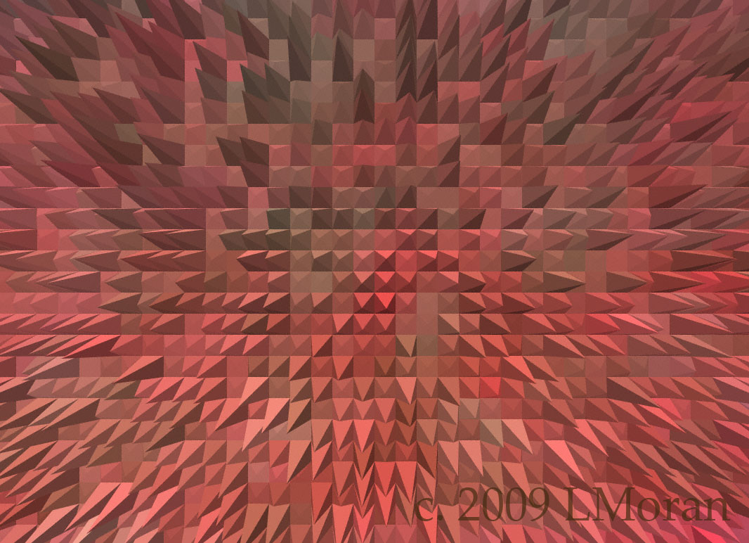
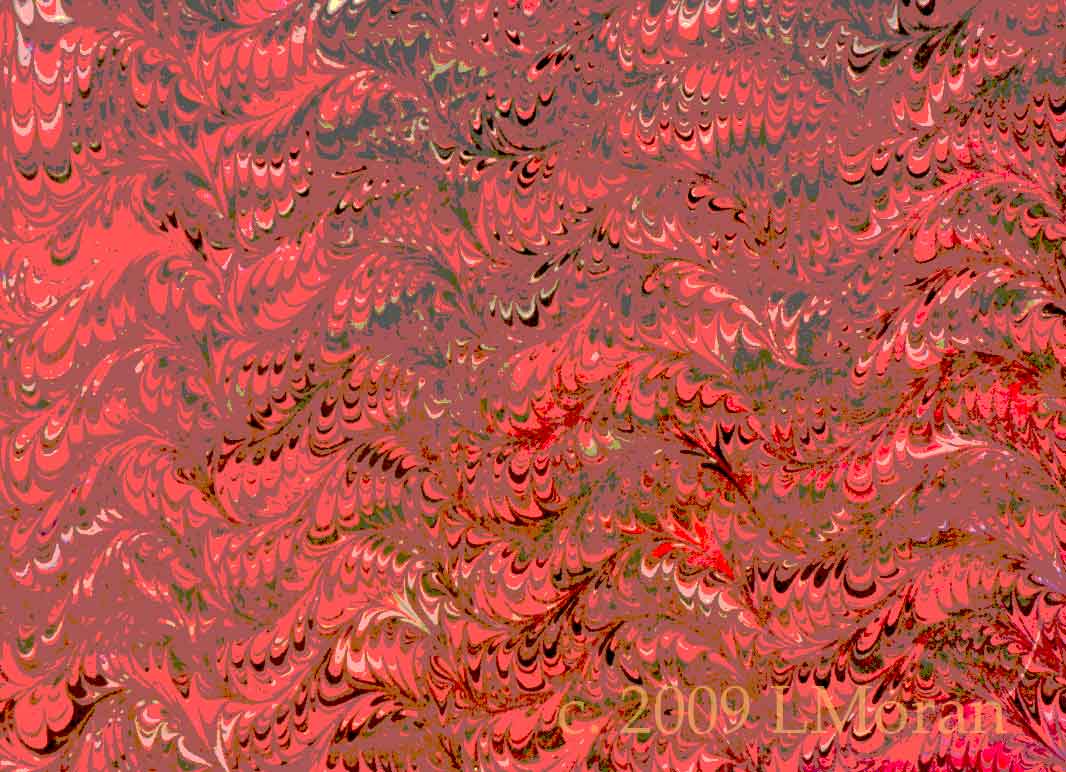
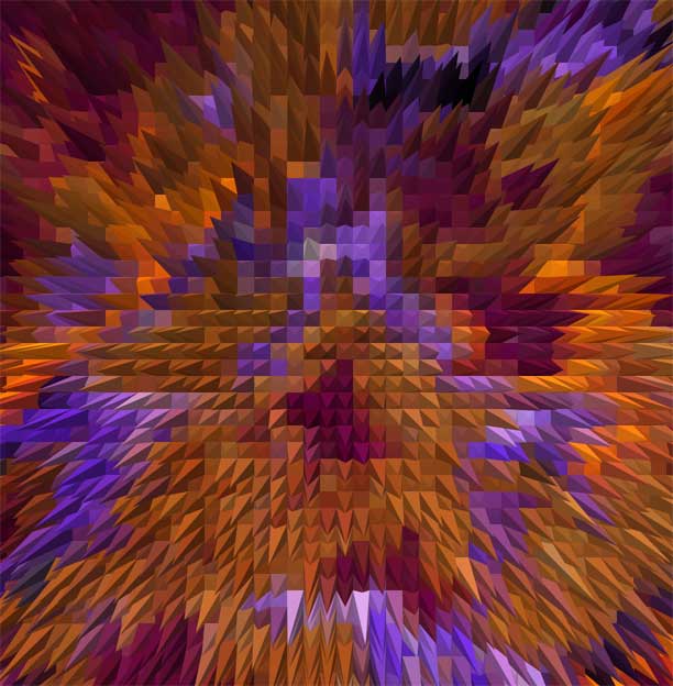
Texture Extrude – Pyramids
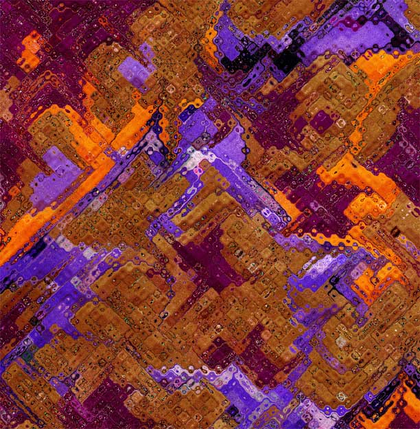
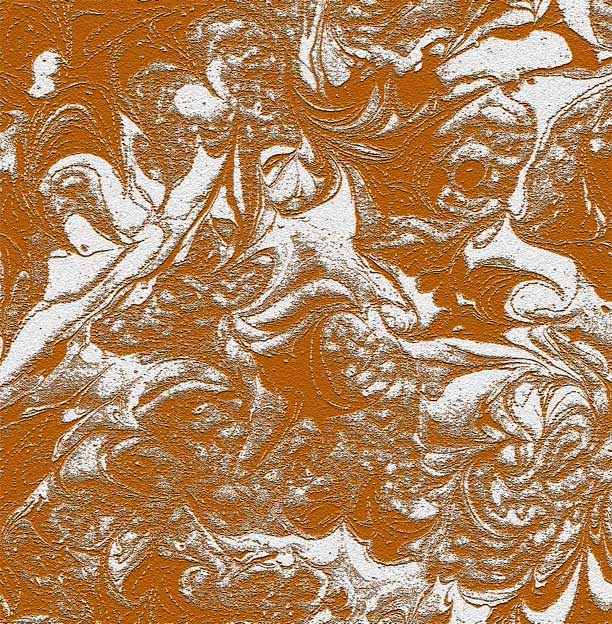
Texture craquelure
Texture craquelure
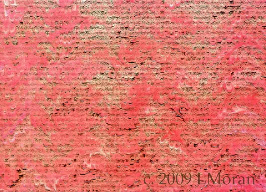
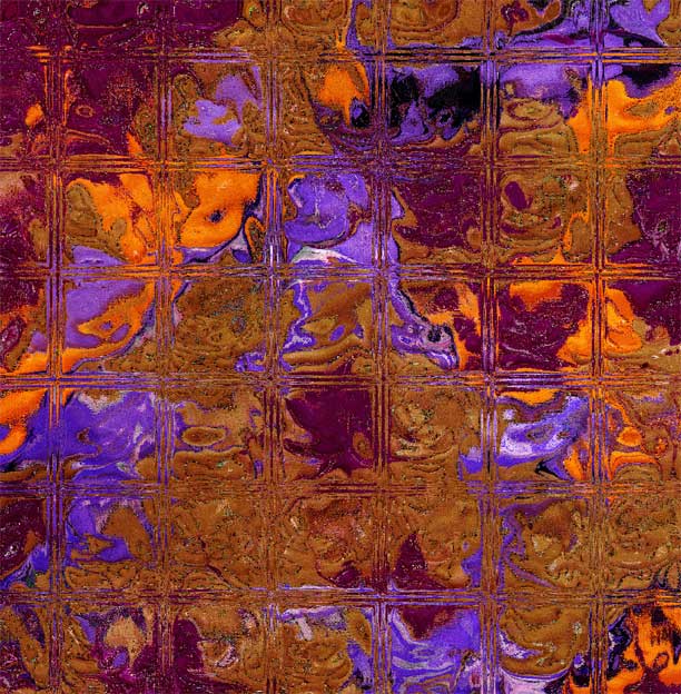
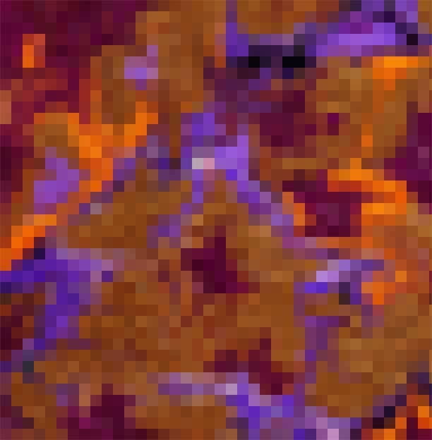
Texture mosaic
Levels – a beginning adjustment
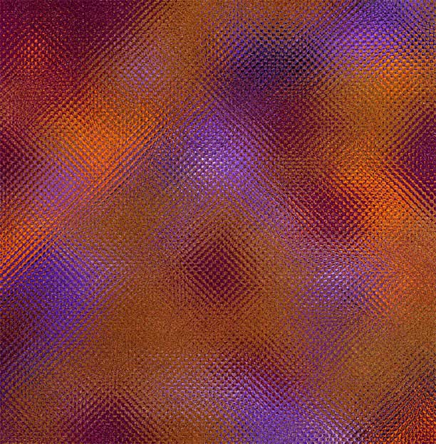
Texture grain
Gradient
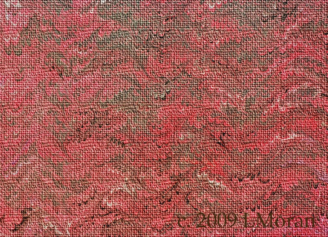
Texturizer burlap
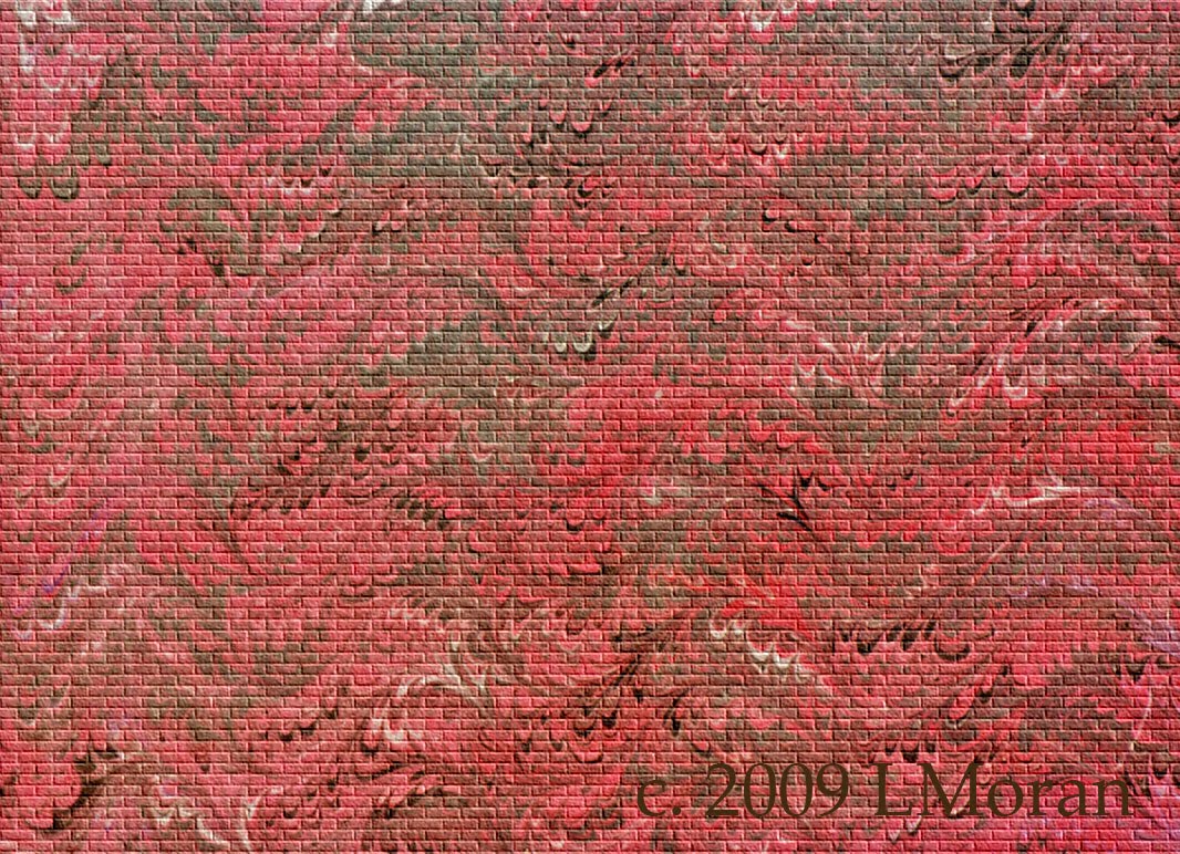
Texturizer brick
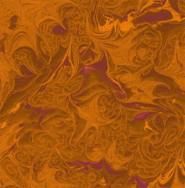
Texture posterize
Texture patchwork
Texturizer sandstone
I’m fond of the brick and burlap. Comments?
Art Every Day Month- November 21
While I haven’t kept up with the zentangles each day, I have managed to do something with art every day this month – mostly sewing, as I am taking an existing pattern from Judy Neimeyer and adding my own twist. It has made for a great bunch of days – I am so enjoying creating after work, and I hope it will continue.
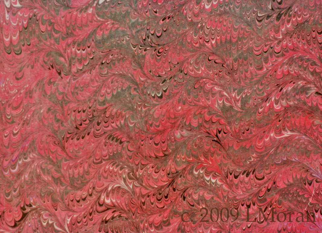
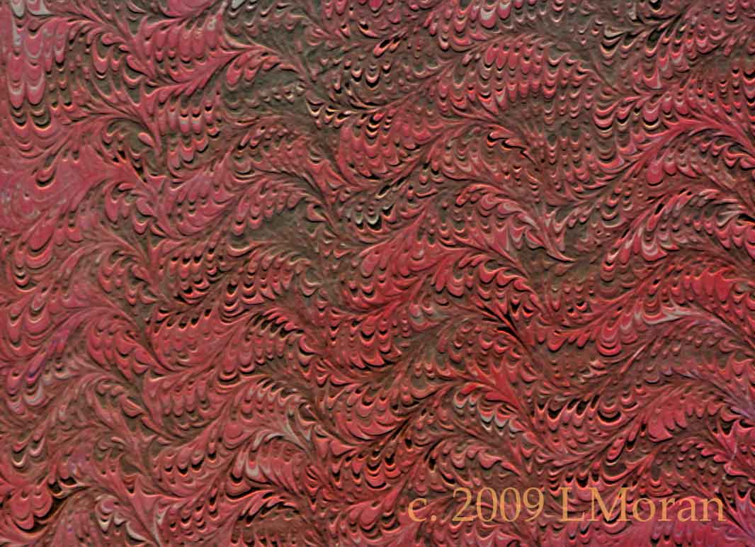
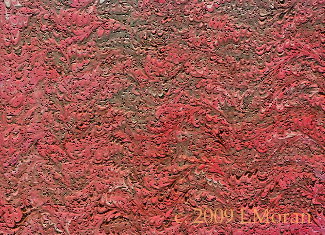
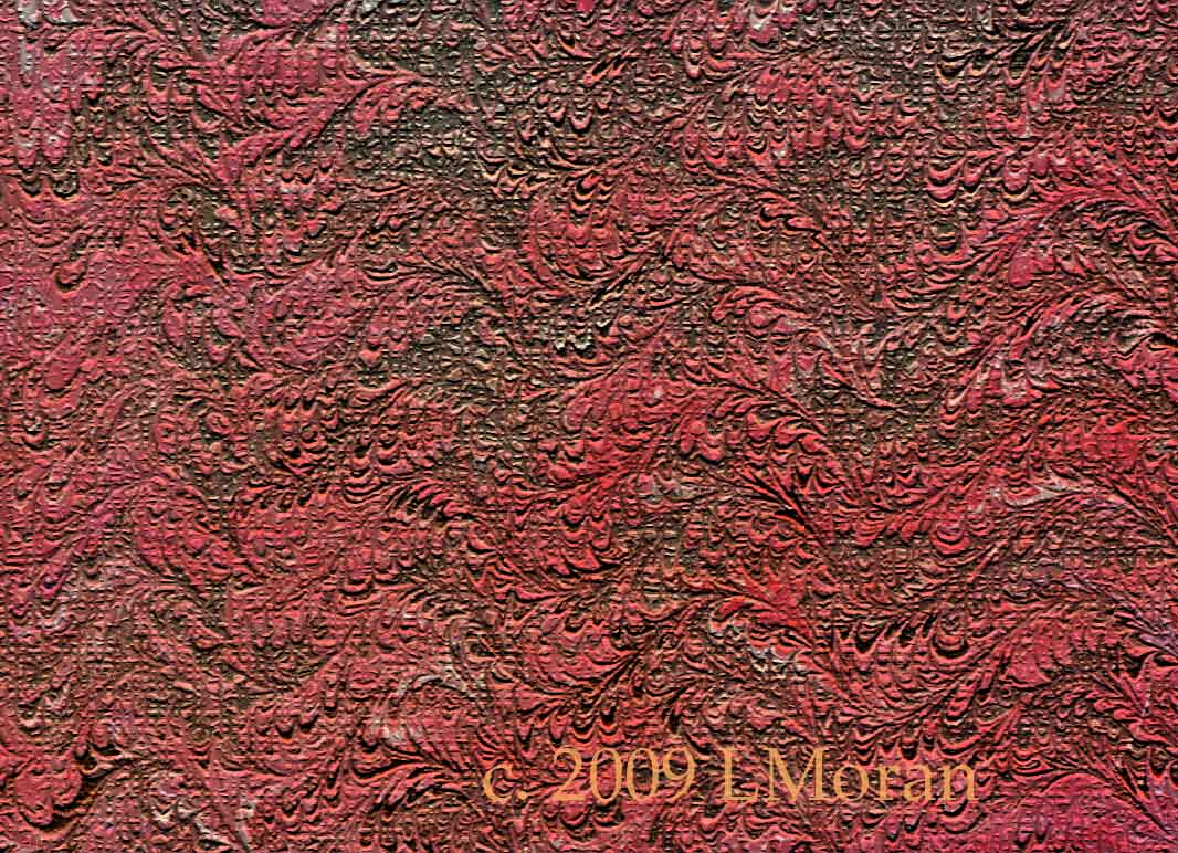
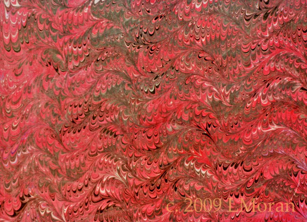
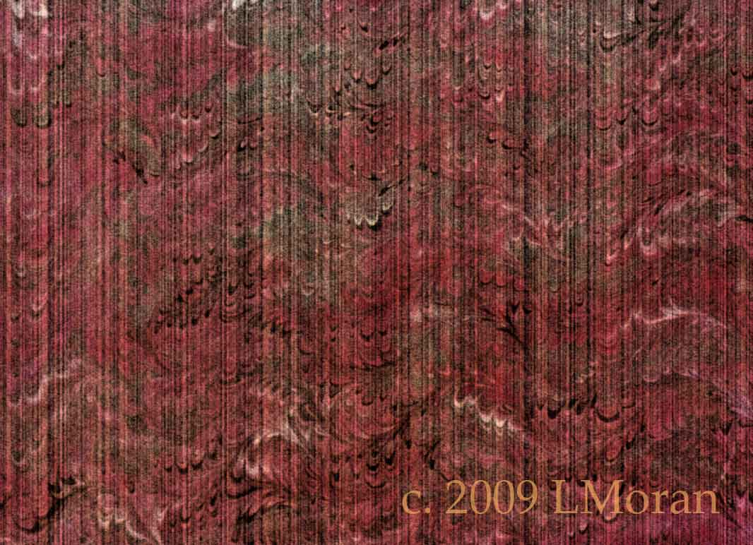
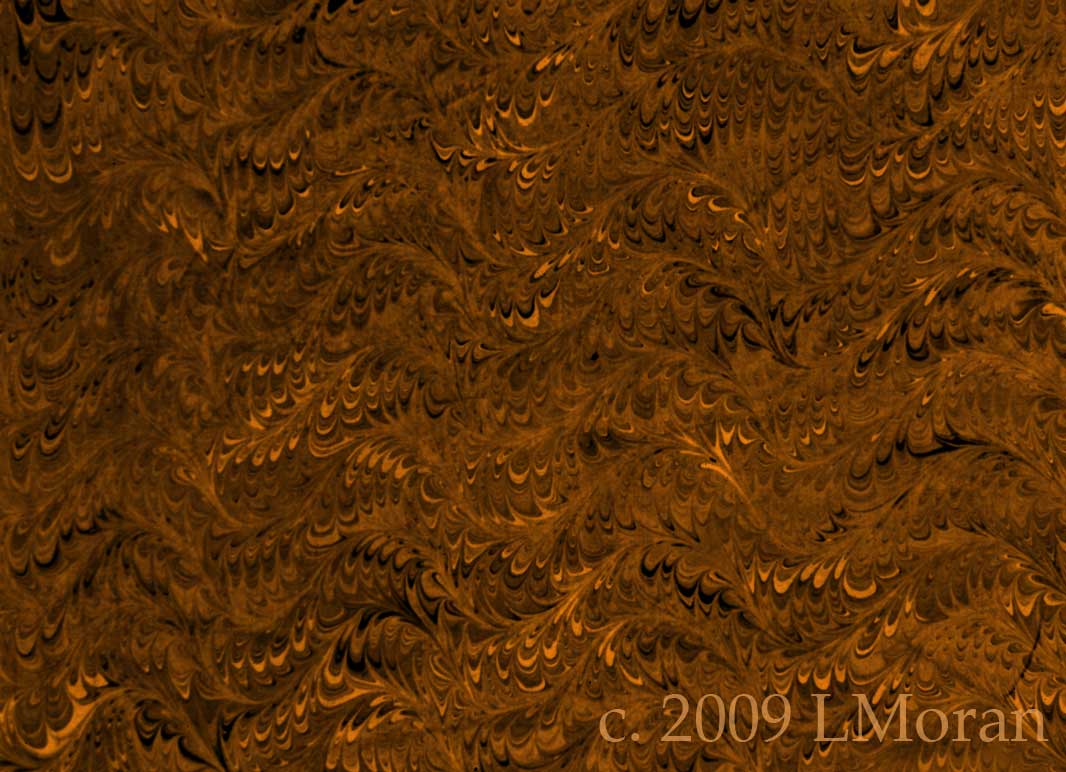
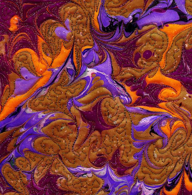
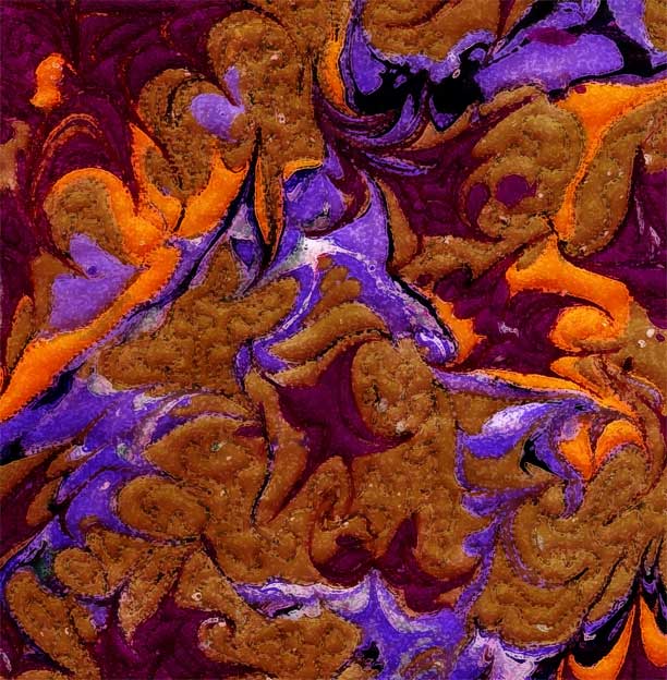
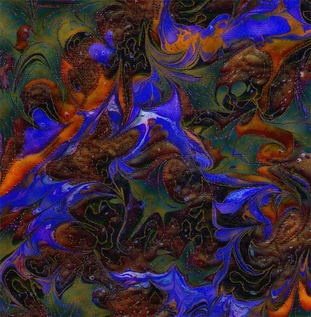
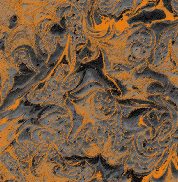
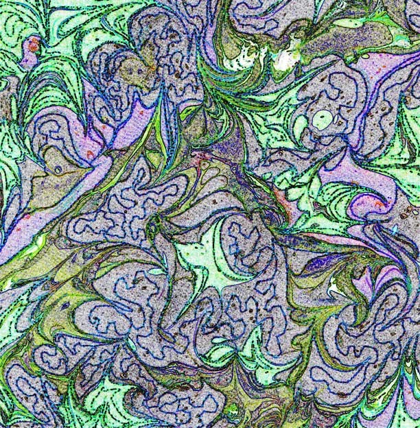
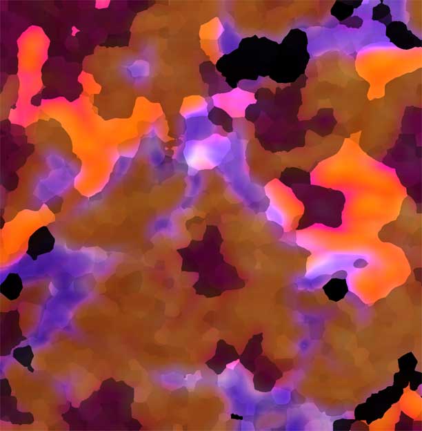
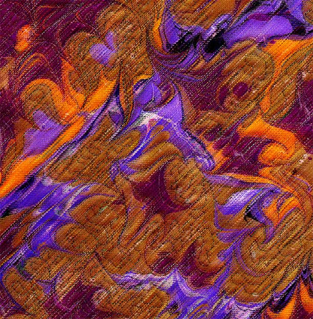
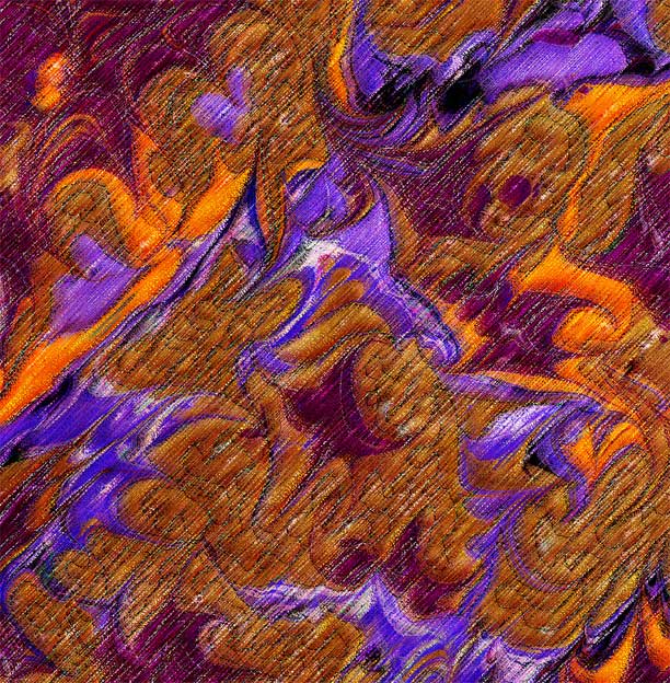
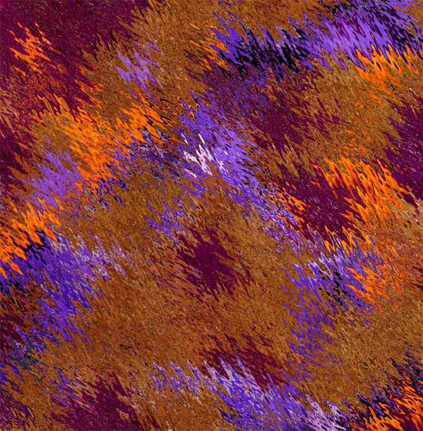
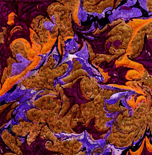
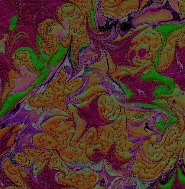
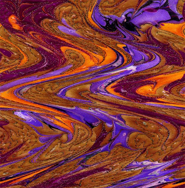
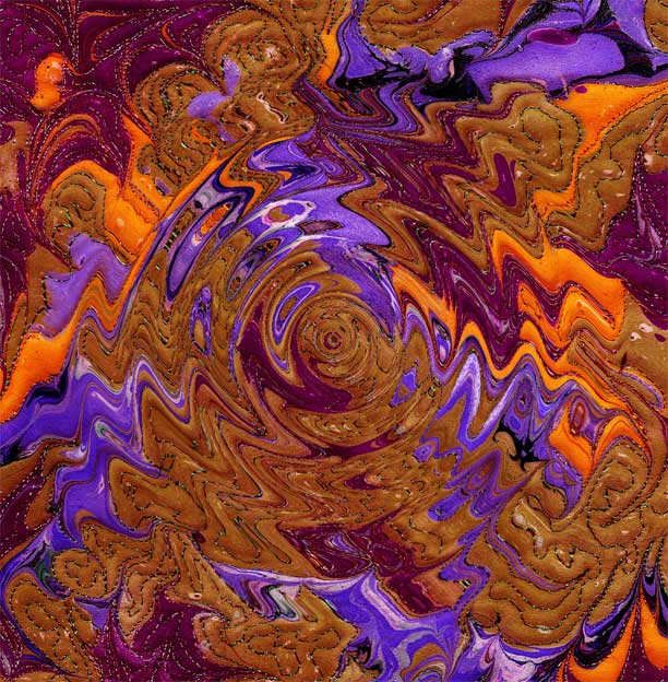
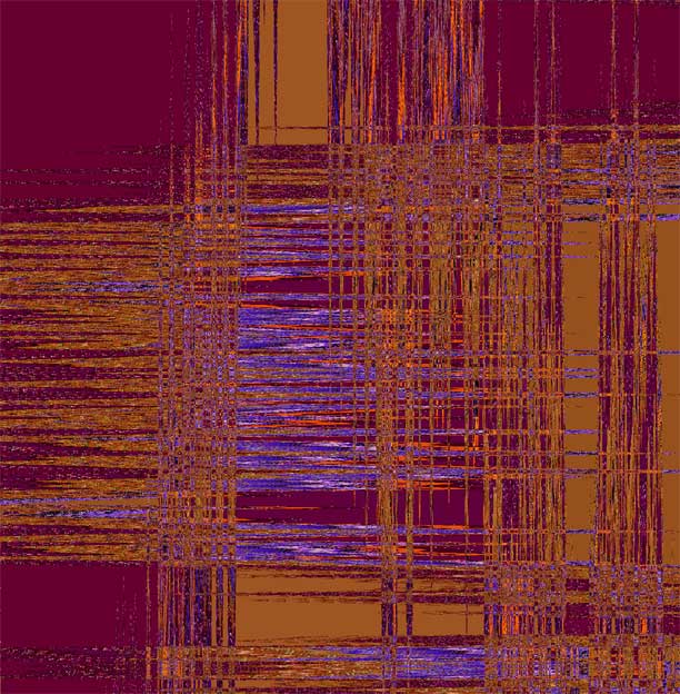
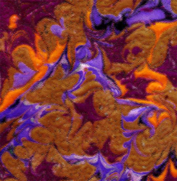
That said, I picked up a book last weekend at the quilt shop called Piecing with Pixels. I am very intrigued with doing more with my own fabric in digital imaging. One of the chapters is on taking your own images – in my case fabric – and using Photoshop to create a texture library. Which is what I did tonight – lots of fun, and all I did was take one piece of quilted marbled fabric and try a bunch of filters.
The photo above is of the original piece which I did about 6 years ago – I did some color changes through Photoshop at that time. What I discovered tonight was a totally different approach – in the past I have been trying to turn a piece of fabric into a design that will stand on its own. Now I realize what I want is lots of textures that could go together. Playing was definitely fun:
Dry Brush filter
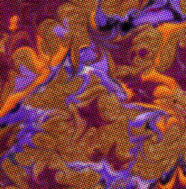
Halftones filter
Clouds
Charcoal
Find edges filter
Extrude
Extrude
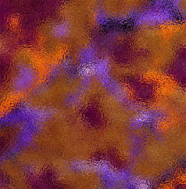
Glass
Glass
Glass
Glass
Notepaper
Neon glow
Mosaic
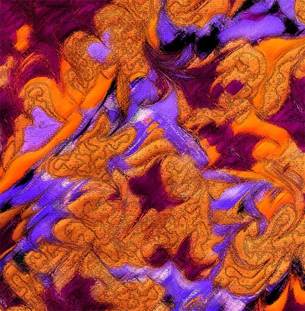
Ink Outlines
Halftone
Reticulation
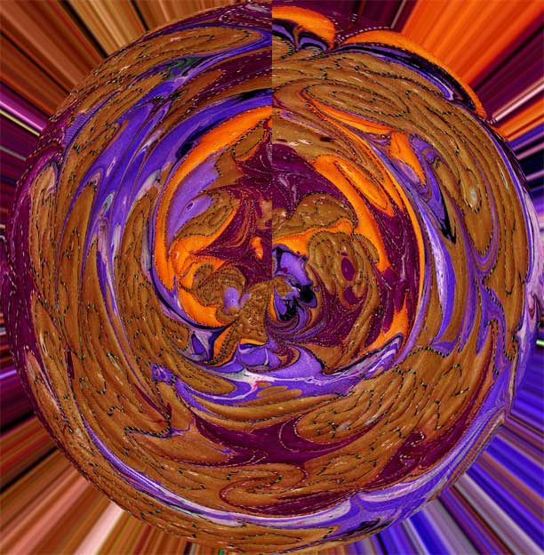
Polar coordinates
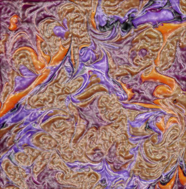
Plastic Wrap
Palette knife
Rough pastels
Rough pastels
Ripples
Ripples
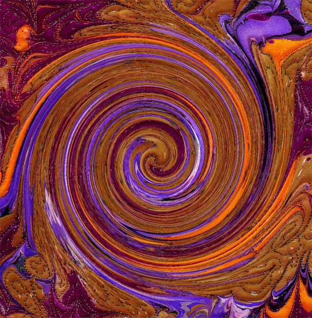
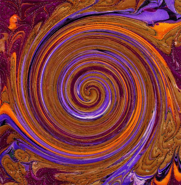
Twirl
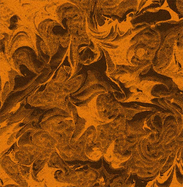
Sponge
Solarize
Shear
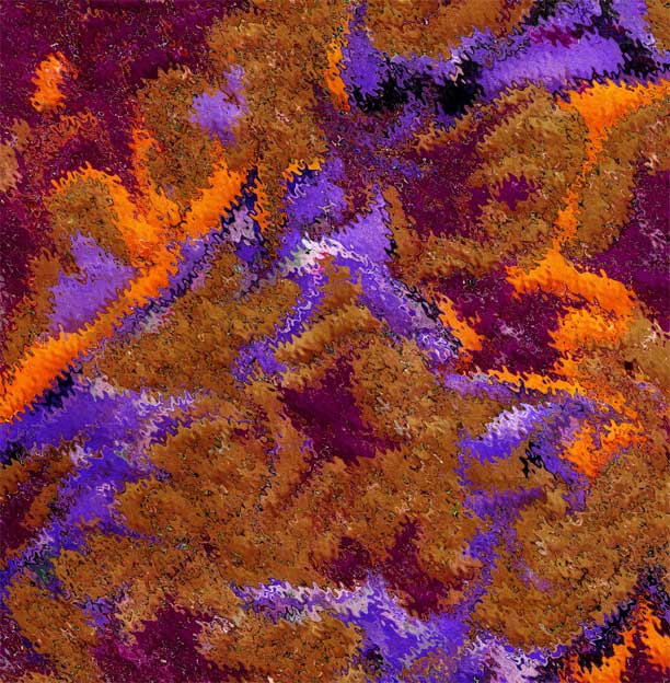
Zigzag
Wave
Underpainting
Twirl
My task tomorrow is to try and actually design a couple of quilt blocks just to see what happens. I welcome your comments – which ones do you really like?